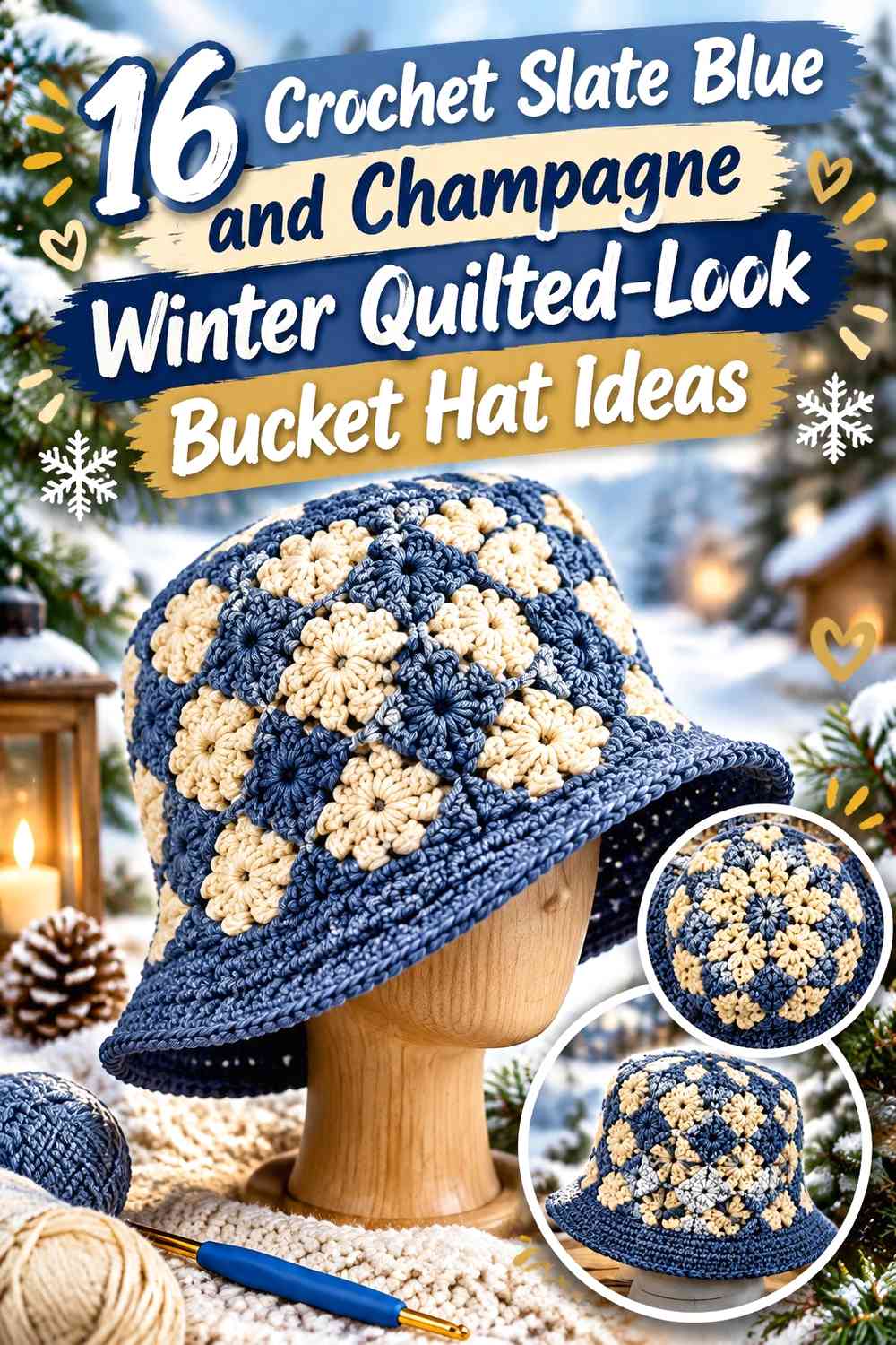

Slate blue and champagne make a useful winter bucket-hat pairing because they give you two clearly different color roles without forcing the design into stark black-and-white contrast. Slate blue can provide the deeper visual base, while champagne can separate blocks, brighten motifs, define a brim, or create seam-like lines that make crochet resemble patchwork.
For a convincing quilted look, color placement matters more than simply alternating the two shades. Squares, framed motifs, windowpane grids, diamonds, plaid bands, and repeated blocks can all suggest quilt construction while remaining completely crochet-based. The strongest designs also consider the hat as three visible zones: crown, sidewall, and brim.
The tutorials credited below support the bucket-hat construction concepts. The slate blue and champagne palettes are independent color adaptations, so follow each creator for the exact crochet construction while using the color guidance here to plan your own version.
Quick List
- Slate Blue and Champagne Checkerboard Crochet Bucket Hat
- Slate Blue Patchwork and Champagne Seam Crochet Bucket Hat
- Champagne Window and Slate Blue Frame Crochet Bucket Hat
- Slate Blue and Champagne Granny-Block Crochet Bucket Hat
- Slate Blue Crown Patch and Champagne Sidewall Crochet Bucket Hat
- Champagne Crown and Slate Blue Quilted-Brim Crochet Bucket Hat
- Slate Blue and Champagne Winter Plaid Crochet Bucket Hat
- Champagne Windowpane and Slate Blue Grid Crochet Bucket Hat
- Slate Blue Diamond and Champagne Center Crochet Bucket Hat
- Slate Blue, Champagne, and Soft Gray Shadow-Block Crochet Bucket Hat
- Slate Blue, Champagne, and Cream Highlight Crochet Bucket Hat
- Slate Blue, Champagne, and Charcoal Grid Crochet Bucket Hat
- Slate Blue, Champagne, and Dusty Mauve Accent Crochet Bucket Hat
- Tonal Slate Blue and Champagne Patchwork Crochet Bucket Hat
- Slate Blue Border and Champagne Center-Panel Crochet Bucket Hat
- Slate Blue and Champagne Heritage-Plaid Crochet Bucket Hat
How to Build a Quilted Look With Slate Blue and Champagne
A quilted-look crochet hat needs visible boundaries between its color areas. Instead of allowing slate blue and champagne to change at random, repeat blocks at predictable intervals around the sidewall or use one shade to frame the other. That repetition makes individual crochet sections read more like connected fabric pieces.
The brim is especially useful for reinforcing the idea. A hat with patchwork sides can look disconnected if the brim suddenly becomes an unrelated solid color. Repeating slate blue and champagne somewhere on the brim, even in broader bands rather than tiny blocks, helps the hat read as one coordinated design.
Balance Slate Blue Depth With Champagne Lightness
Decide which color will control the largest visible area before starting. A slate-blue-dominant hat gives the palette a darker winter direction and lets champagne function as a separator or highlight. A champagne-dominant version feels lighter and makes slate blue more graphic when it is reserved for frames, checks, or edging.
If the yarns look more similar than expected once crocheted, compare them side by side or view them in grayscale. Different hues can still have similar light-dark values, and insufficient value contrast can make small quilt-style blocks disappear from a distance.
Place Slate Blue and Champagne Across the Crown, Sidewall, and Brim
The crown is easiest to see from above, the sidewall carries most of the recognizable pattern, and the brim creates the final frame. You do not have to give all three areas equal color treatment.
For example, a mostly slate blue crown can settle a busy champagne-and-blue patchwork sidewall, while a champagne brim can visually lift the lower edge. Conversely, a champagne crown with a slate blue brim creates stronger dark framing around the face. Plan these zones together before committing to repeated motifs.
1. Slate Blue and Champagne Checkerboard Crochet Bucket Hat
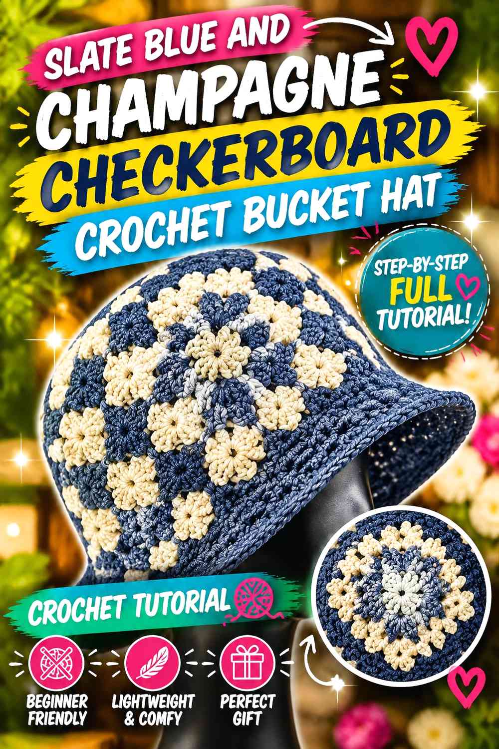
This version uses slate blue and champagne in a relatively balanced checkerboard arrangement. The alternating blocks create one of the clearest quilted-look effects because the eye can immediately follow repeated light and dark units around the bucket-hat sidewall. Keep the crown slightly simpler if the sides already contain many color changes, then repeat both shades on the brim so the checkerboard does not feel isolated.
Slate Blue Gives the Champagne Checkerboard Its Dark Anchor
Let slate blue occupy enough blocks to create an obvious dark rhythm rather than scattering it as a minor accent. On the curved sidewall, consistent slate blue repetition helps the check pattern remain recognizable even where the hat turns away from the viewer.
Champagne Keeps Slate Blue Checks From Merging Into One Dark Band
Place champagne directly beside slate blue wherever you want individual blocks to remain distinct. If the two colors are distributed in long uninterrupted bands instead, the result will read more like stripes than patchwork.
Slate Blue and Champagne Should Repeat on the Crochet Brim
Carry both colors into at least part of the brim. Broad alternating sections can work better here than tiny checks because the brim widens outward, changing the apparent scale of the pattern.
Creator Credit: HodgePodge Crochet
2. Slate Blue Patchwork and Champagne Seam Crochet Bucket Hat
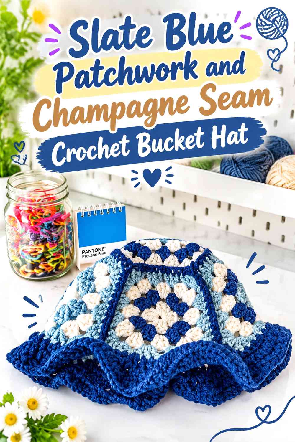
This direction makes slate blue the main fabric color and uses champagne like the visual equivalent of quilt seams. Rather than dividing the hat equally between both shades, keep most larger crochet areas blue and place champagne along joins, motif borders, narrow bands, or selected transitions. The effect is quieter than a checkerboard but still clearly block-based.
Slate Blue Should Cover the Larger Crochet Hat Panels
Allow slate blue to dominate the crown and much of the sidewall. Larger blue areas give the hat a calm winter base and make the smaller champagne divisions look intentional rather than accidental.
Champagne Can Define the Slate Blue Patchwork Boundaries
Use champagne where one visual block meets another, especially around motifs or between broad sidewall sections. Keeping these pale divisions relatively consistent is what turns them into seam-like design features.
Creator Credit: Stitch & Flick Crochet
3. Champagne Window and Slate Blue Frame Crochet Bucket Hat
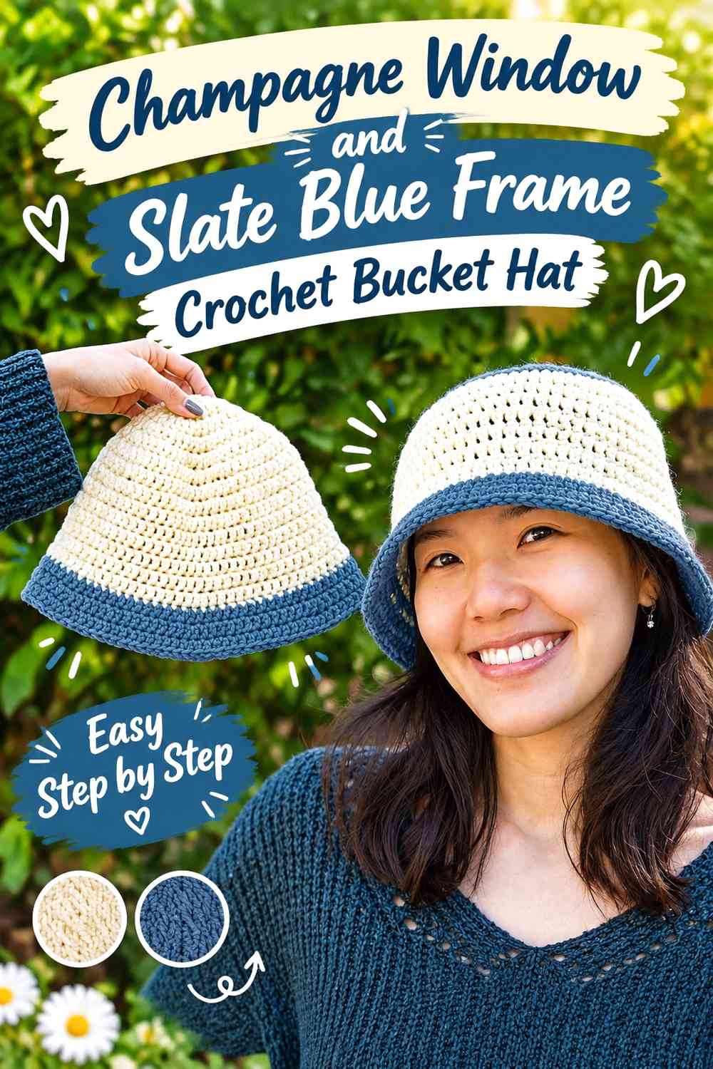
Reverse the visual hierarchy by letting champagne form the interior of repeated blocks while slate blue outlines or surrounds them. The darker frames give each champagne area definition, which can be particularly useful on the sidewall where small pale motifs might otherwise blend together.
Champagne Works Best as a Repeated Light Window
Keep champagne shapes similar in scale and repeat them around the hat rather than using isolated pale patches. Regular repetition strengthens the quilt-block effect and prevents the light color from looking like an unfinished color change.
Slate Blue Frames Make Champagne Blocks Easier to Read
Use slate blue around the pale areas or between them. The darker boundary provides visual separation and can also connect naturally to a slate blue brim, giving the lower edge a stronger finish.
Champagne Should Reappear Above a Slate Blue Brim
If the brim is predominantly slate blue, repeat champagne near the lower sidewall or outer edge so the pale color does not stop abruptly before the brim.
Creator Credit: VivCrochets
4. Slate Blue and Champagne Granny-Block Crochet Bucket Hat
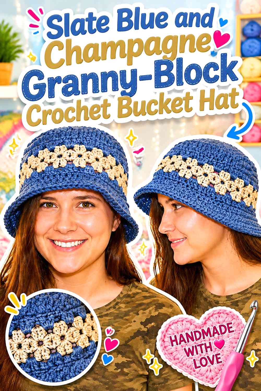
Granny-style motifs already have the visual logic of small joined fabric pieces, making them a natural base for a quilted-look bucket hat. Alternate slate blue and champagne as motif centers, outer rounds, or neighboring blocks, but keep one repeating color rule across every square so the finished hat does not become visually fragmented.
Slate Blue Can Unite Champagne Granny-Block Borders
One effective approach is to repeat slate blue on the outer area of multiple motifs while allowing champagne to change position inside them. The repeated blue edge helps neighboring blocks look related after assembly.
Champagne Centers Can Brighten Slate Blue Crochet Motifs
Putting champagne nearer the center of darker motifs creates a light focal point without needing a third strong color. This is useful when you want noticeable patchwork while keeping the overall winter palette restrained.
Creator Credit: Amy’s DIY Frugal Life
5. Slate Blue Crown Patch and Champagne Sidewall Crochet Bucket Hat
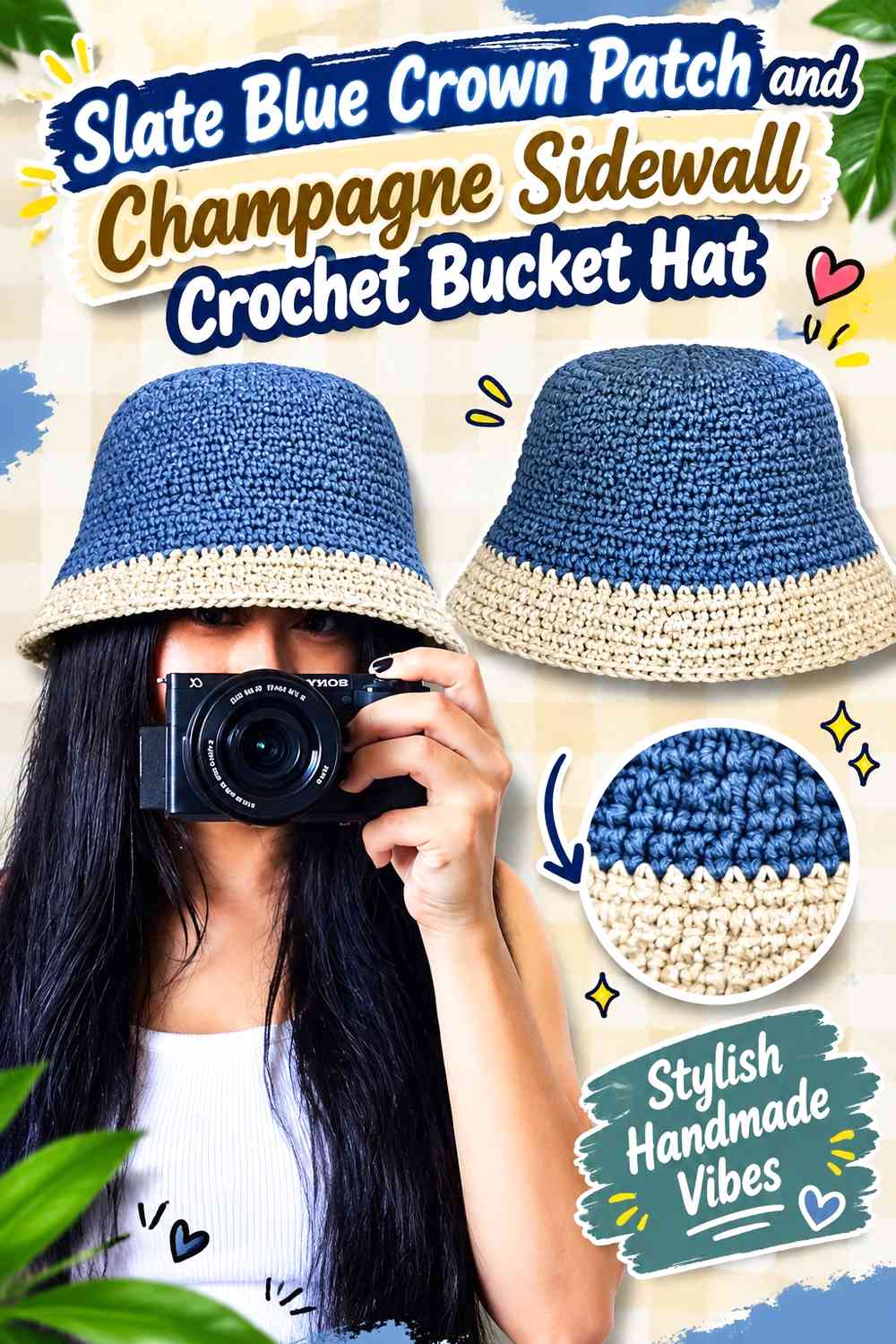
Here, slate blue controls the crown while champagne becomes more visible through the sidewall. The change in emphasis makes the top feel grounded and the middle lighter, creating variation without introducing extra hues.
Slate Blue Makes the Crochet Crown a Strong Visual Cap
A predominantly slate blue crown gives the hat a clear starting point and prevents the patchwork treatment from covering every surface equally. If the crown includes block divisions, keep them broader than the sidewall details so the top does not become overly busy.
Champagne Can Open Up the Slate Blue Sidewall Pattern
Increase the proportion of champagne as the work moves down the hat. Pale blocks between slate blue sections create stronger separation and help the sidewall carry most of the quilted effect.
Slate Blue on the Brim Can Balance a Champagne-Heavy Sidewall
If champagne becomes dominant in the middle of the hat, returning to slate blue on the brim restores darker visual weight at the bottom.
Creator Credit: Cherilyn Q
6. Champagne Crown and Slate Blue Quilted-Brim Crochet Bucket Hat
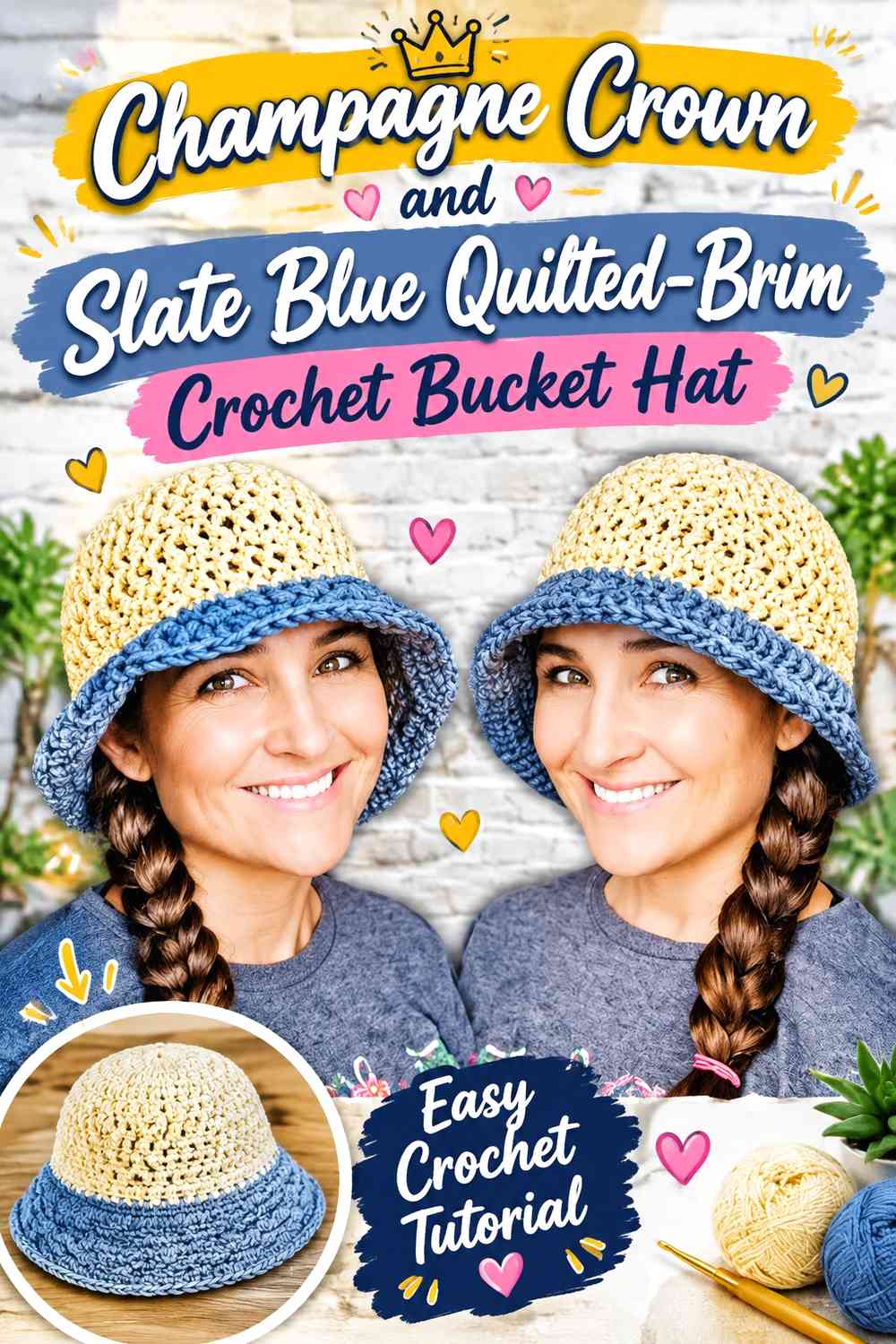
This version reverses the usual darker-crown approach. Champagne leads on top, slate blue becomes stronger through the lower sidewall, and the brim carries the darkest concentration. It is a useful layout when you want the patchwork effect to intensify as the eye moves downward.
Champagne Keeps the Crochet Crown Visually Light
Use champagne across most of the crown, then introduce slate blue in controlled blocks rather than dividing the top into many small pieces. That keeps the crown from competing with the stronger brim treatment.
Slate Blue Gives the Champagne Hat a Defined Winter Brim
Slate blue works well as the dominant brim shade because the darker edge visually contains the lighter crown. Small champagne repeats on the brim can keep it connected to the upper hat without weakening that frame.
Creator Credit: Yarn Geek
7. Slate Blue and Champagne Winter Plaid Crochet Bucket Hat
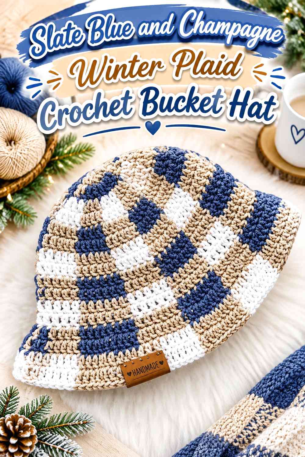
Plaid gives the slate blue and champagne pairing a textile-inspired direction that naturally fits the quilted-look theme. Rather than alternating equal squares, treat one color as the base and the other as crossing bars or repeated lines. This creates larger visual blocks with fewer color changes than a checkerboard.
Slate Blue Makes a Strong Base for Champagne Plaid Lines
Use slate blue across the largest proportion of the sidewall, then let champagne form repeated vertical or horizontal divisions. The lighter intersections become focal points without overwhelming the deeper blue field.
Champagne Plaid Lines Need Consistent Spacing Across Slate Blue
Irregular spacing can make a planned plaid look like unrelated stripes. Check the hat from several angles as the design develops so the champagne lines create a visible rhythm around the curved sidewall.
Slate Blue and Champagne Plaid Should Continue Into the Brim Carefully
The brim expands outward, so an exact continuation of the sidewall plaid may distort. A simpler slate blue brim with one or two champagne bands can preserve the palette without forcing the same grid onto a different shape.
Creator Credit: PassioKnit Kelsie
8. Champagne Windowpane and Slate Blue Grid Crochet Bucket Hat
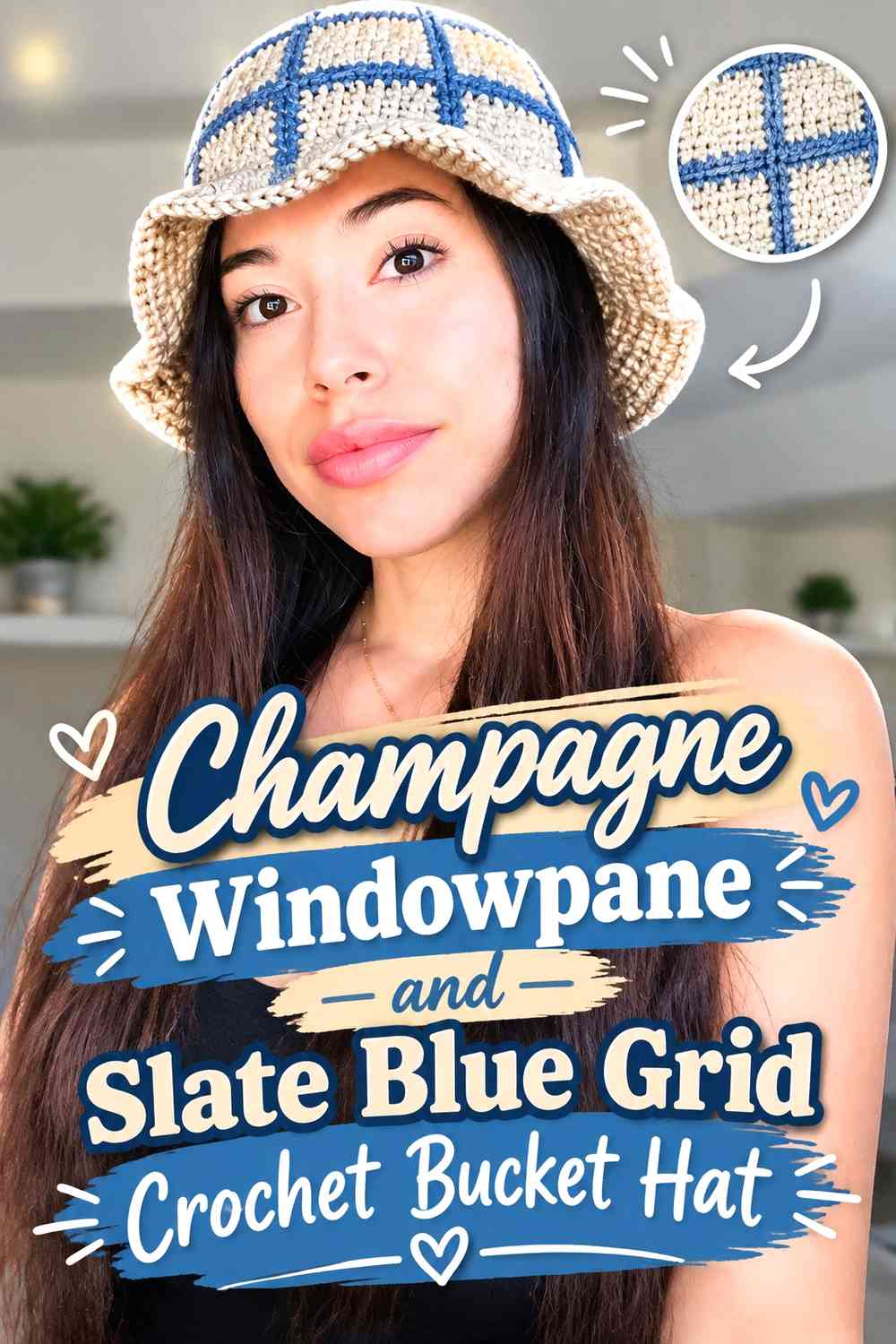
A windowpane treatment uses champagne as the larger background and slate blue as narrow crossing lines. It produces a lighter quilted look than the previous plaid idea while still giving the hat visible geometric structure.
Champagne Should Remain Broad Enough for Slate Blue Lines to Show
Avoid crowding the champagne field with too many blue divisions. Larger pale sections make the slate blue grid easier to identify and preserve the intended windowpane effect.
Slate Blue Grid Lines Can Define the Crochet Sidewall
Keep slate blue narrow and repetitive where possible. The goal is to outline the champagne blocks, not to compete with them for equal surface area.
Creator Credit: NoteswNat
9. Slate Blue Diamond and Champagne Center Crochet Bucket Hat
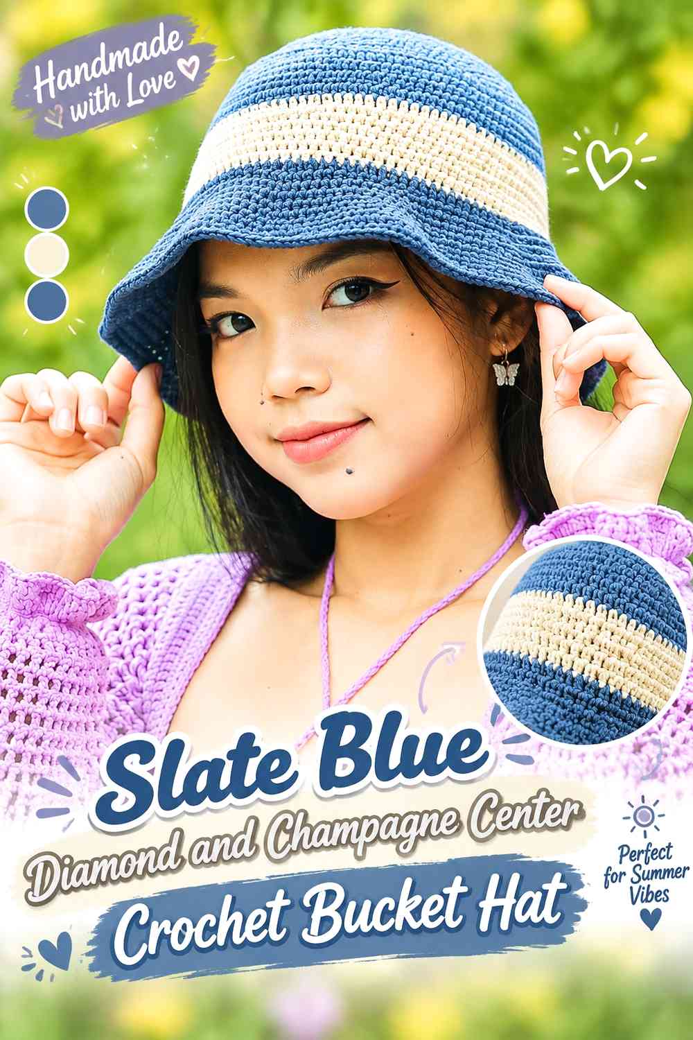
Diamond-shaped color placement creates a more decorative quilt reference than simple squares. Slate blue can define the outer diamond while champagne fills its center, creating repeated light points across the curved surface.
Slate Blue Diamond Frames Need Clear Champagne Centers
Keep champagne noticeably lighter than the surrounding slate blue so the central shapes remain visible. If the yarns are too close in value, the diamond effect may disappear once the fabric curves around the head.
Champagne Centers Should Repeat Evenly Across Slate Blue
Consistent repetition matters more than using a large amount of champagne. A smaller pale center repeated around several motifs usually gives a clearer quilted rhythm than a few oversized light sections.
Slate Blue Can Simplify the Brim Below Champagne Diamonds
Once the sidewall already carries a detailed diamond motif, a mostly slate blue brim can provide visual rest. A narrow champagne edge is enough to connect it back to the motifs.
Creator Credit: Molina.D DIY
10. Slate Blue, Champagne, and Soft Gray Shadow-Block Crochet Bucket Hat
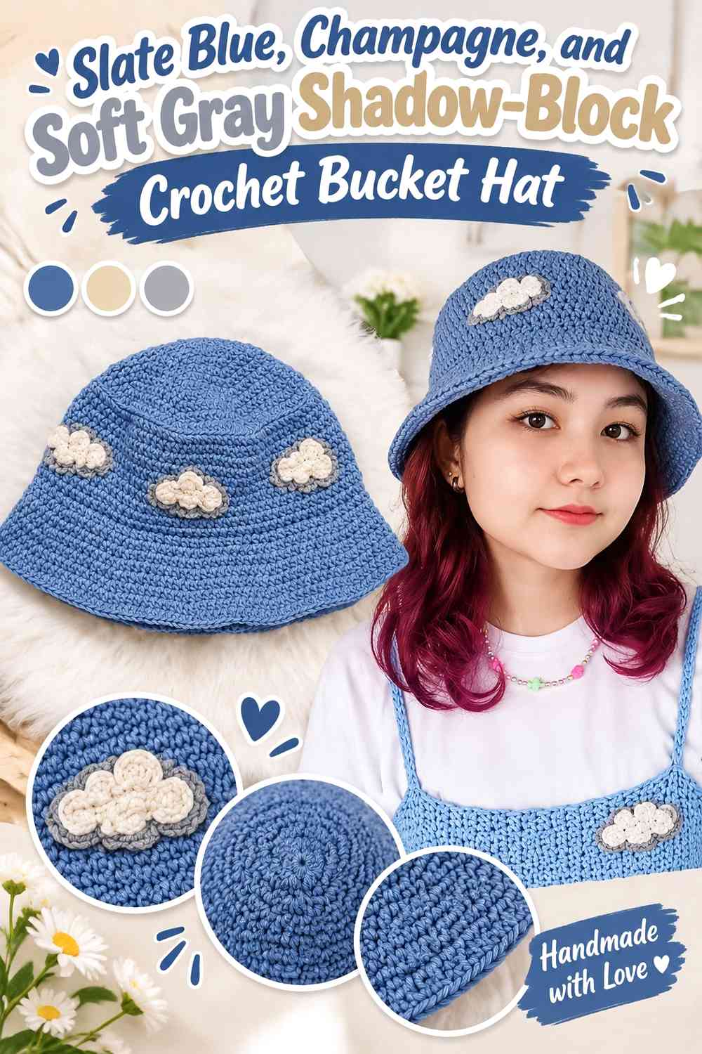
Soft gray can be introduced in small amounts to create a shadow between slate blue and champagne. The third shade should support the two-color identity rather than turning the hat into an equal three-color design.
Soft Gray Can Separate Slate Blue From Champagne Blocks
Place gray along selected boundaries where the blue and champagne areas need more depth. Narrow gray divisions can make blocks appear layered without competing with either main color.
Slate Blue Should Still Outweigh Soft Gray on the Crochet Hat
Keep slate blue as the stronger dark value. If gray occupies too much area, the winter palette may lose the distinct slate-blue character that gives the design its anchor.
Champagne Should Remain the Lightest Quilted-Look Accent
Preserve champagne as the clearest light point. That three-step value order—champagne, gray, slate blue—helps motif edges remain readable.
Creator Credit: Muzhi Crochet
11. Slate Blue, Champagne, and Cream Highlight Crochet Bucket Hat
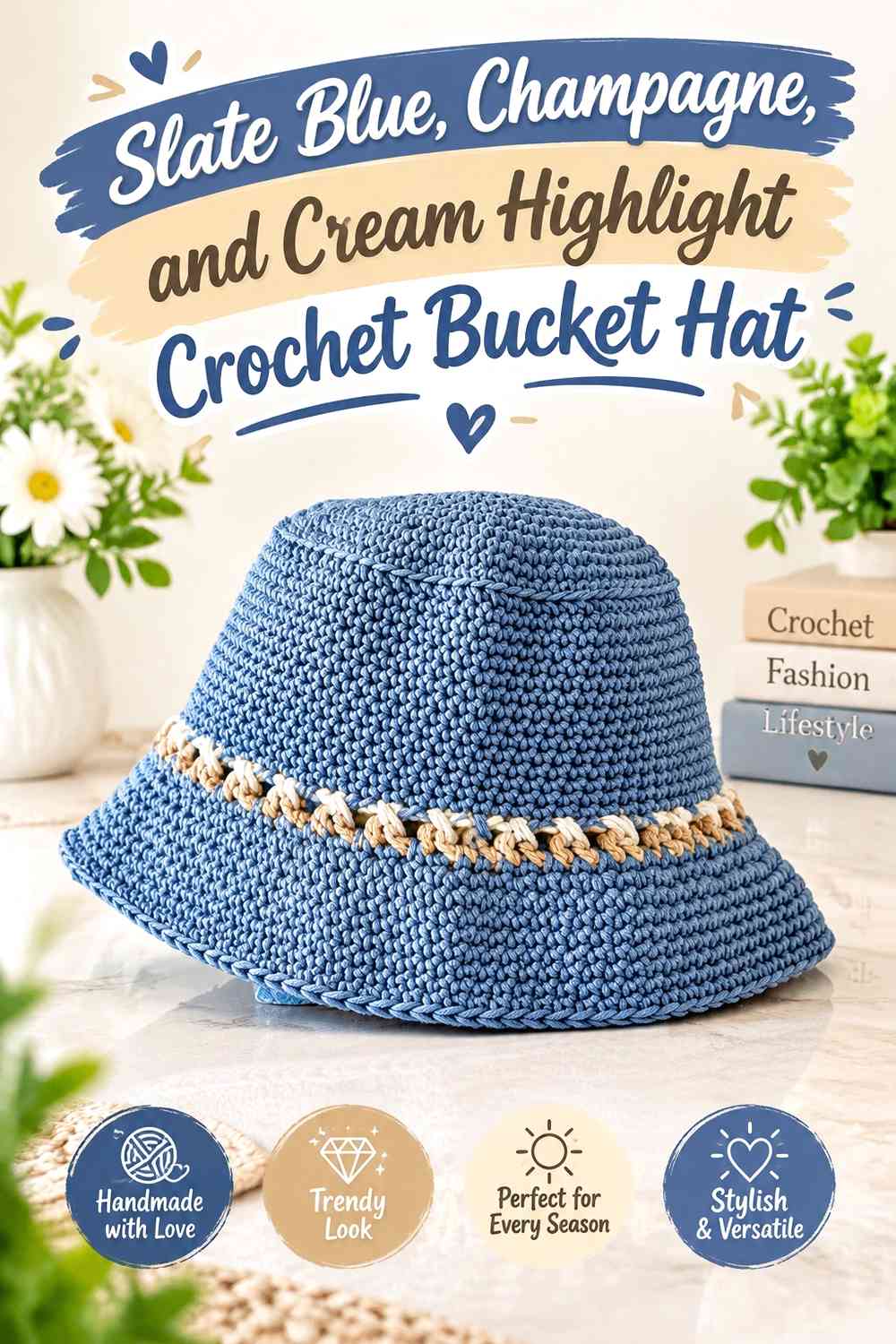
Cream can act as a very small highlight where champagne alone does not provide enough light-dark separation. Use it sparingly so champagne remains a distinct warm neutral instead of blending into a larger pale section.
Cream Should Highlight Champagne Rather Than Replace It
Reserve cream for tiny motif centers, narrow edges, or occasional intersection points. Champagne should still carry the larger neutral areas so the original two-color identity remains obvious.
Slate Blue Needs Enough Space Around Champagne and Cream
When two pale shades sit together, slate blue becomes important as a separator. Use it around motif groups or between pale blocks so the surface does not merge into one low-contrast area.
Creator Credit: Maricel Romina
12. Slate Blue, Champagne, and Charcoal Grid Crochet Bucket Hat
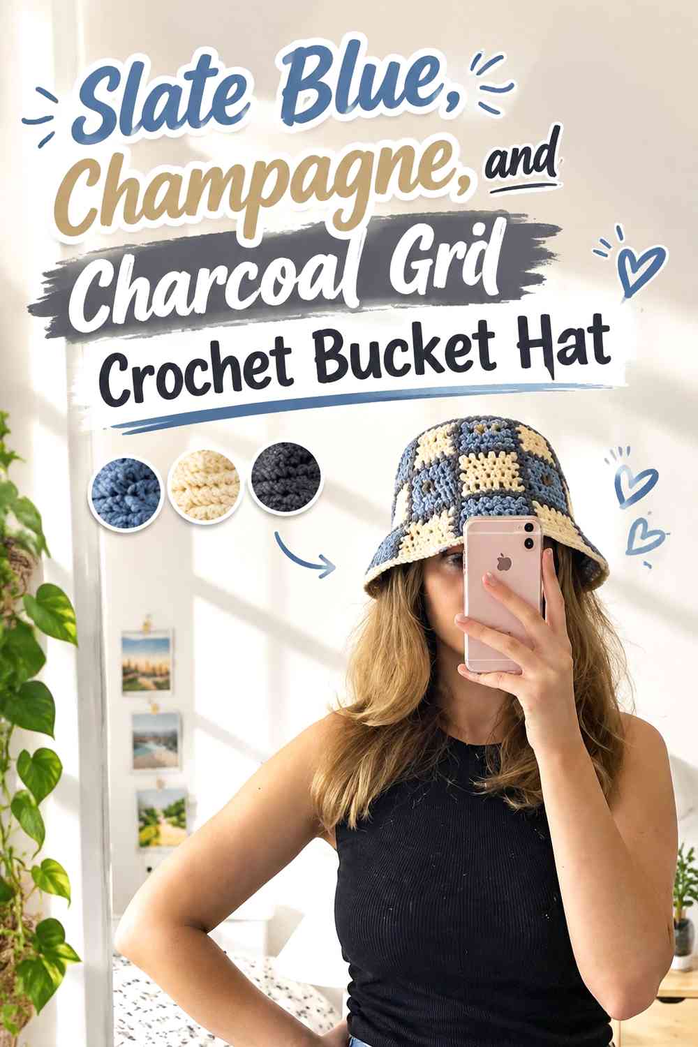
Charcoal adds a sharper seam-like line than slate blue alone. It works especially well when confined to narrow grid divisions between larger slate blue and champagne blocks.
Charcoal Can Outline Slate Blue and Champagne Quilt Blocks
Use charcoal as a structural line rather than another large panel color. Thin outlines make neighboring blocks easier to distinguish and can strengthen the illusion of joined quilt pieces.
Slate Blue Should Remain Distinct From the Charcoal Grid
Choose a slate blue that is visibly different from charcoal under the lighting in which the hat will usually be seen. If both shades collapse into the same dark value, the grid will disappear into the blue areas.
Champagne Prevents the Slate Blue and Charcoal Hat From Becoming Too Dark
Keep enough champagne visible across the sidewall or brim to break up the two deeper shades. Small pale repeats can be more effective than one isolated large section.
Creator Credit: Emma P
13. Slate Blue, Champagne, and Dusty Mauve Accent Crochet Bucket Hat
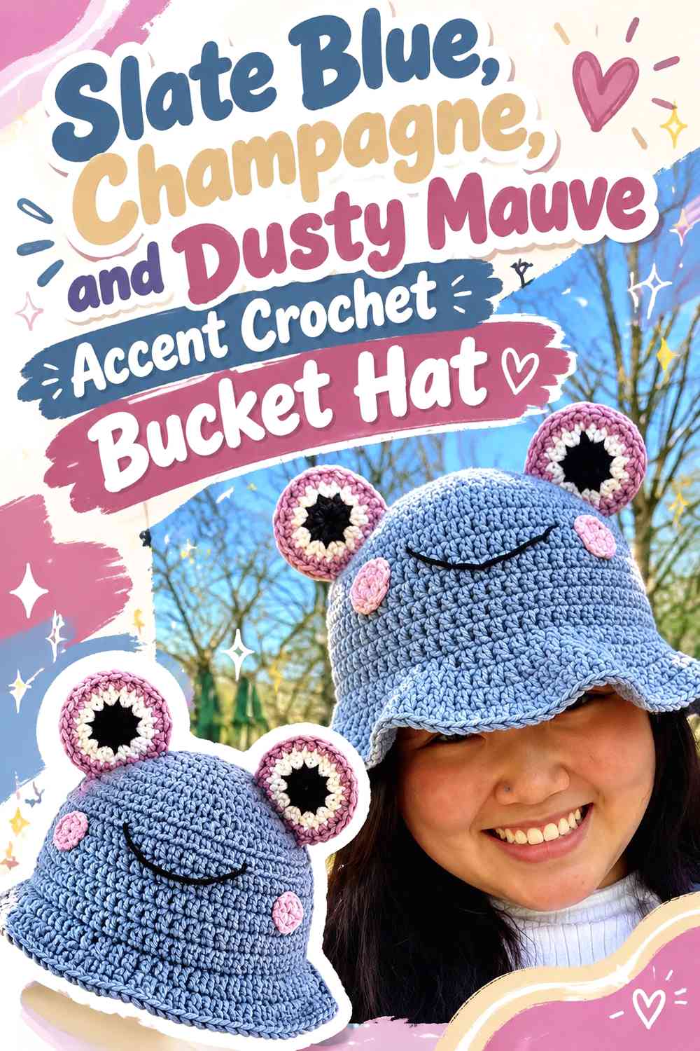
A small dusty mauve accent gives the winter palette a softer colored interruption without competing strongly with slate blue. It works best in isolated motif centers or tiny joining details rather than full alternating blocks.
Dusty Mauve Should Stay Secondary to Slate Blue and Champagne
Limit mauve to repeated small points. If it occupies the same amount of space as the two main shades, the hat stops reading as a slate blue and champagne color scheme.
Champagne Can Buffer Dusty Mauve Against Slate Blue
Place champagne between mauve and slate blue when the two colored shades feel too heavy beside each other. The pale neutral creates breathing room and preserves individual motif shapes.
Creator Credit: Shirley Designs Things
14. Tonal Slate Blue and Champagne Patchwork Crochet Bucket Hat
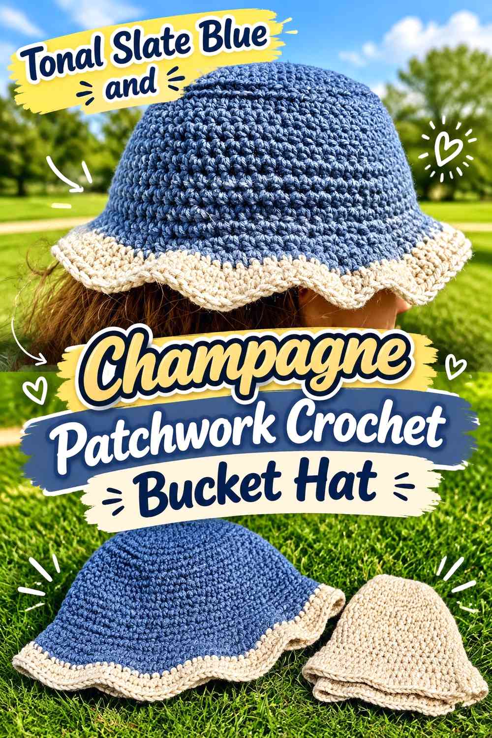
Instead of adding an unrelated accent, use more than one depth of slate blue with champagne. This keeps the palette tightly controlled while still creating enough variation for multiple quilt-style blocks.
Tonal Slate Blue Creates Patchwork Without Leaving the Blue Family
Alternate a deeper and softer slate blue across larger blocks, then use champagne to mark selected divisions. The subtle blue-on-blue variation makes the hat more layered than a strict two-color checkerboard.
Champagne Should Separate Similar Slate Blue Values
Because tonal blues may visually merge, champagne becomes especially useful around small motifs or at key block boundaries. You do not need to outline every section; use it where the tonal difference is hardest to see.
Slate Blue Tonal Blocks Need a Simple Champagne Brim Strategy
If the sidewall already uses several blue values, simplify the brim to one blue plus champagne. Too many tonal shifts on the widening brim can weaken the patchwork hierarchy.
Creator Credit: Lexi ♥
15. Slate Blue Border and Champagne Center-Panel Crochet Bucket Hat

This arrangement gives champagne a large central role while slate blue frames the hat from above and below. Think of the sidewall as a pale central panel held between a darker crown and brim, then introduce smaller slate blue blocks inside that middle area to keep the quilt reference visible.
Champagne Can Form the Main Crochet Sidewall Panel
Using champagne across a broad central band immediately distinguishes this idea from the blue-dominant layouts. Break the band with a limited number of slate blue inserts so it still resembles patchwork instead of a single stripe.
Slate Blue Crown and Brim Can Frame the Champagne Center
Repeating slate blue at both the top and bottom gives the lighter middle section clear boundaries. This is particularly useful if the champagne yarn has a very soft value and needs darker framing.
Creator Credit: Stringsandthreads
16. Slate Blue and Champagne Heritage-Plaid Crochet Bucket Hat
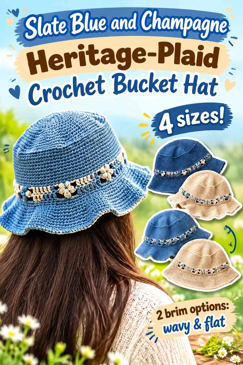
For a more traditional textile direction, use slate blue and champagne in broad plaid-style blocks rather than small checks. Let the pattern breathe by using fewer, larger divisions across the crown and sidewall. The result can suggest a winter woven or quilted fabric while remaining unmistakably crochet.
Slate Blue Should Carry the Darkest Heritage-Plaid Blocks
Use slate blue for the largest or most repeated dark areas so the plaid remains grounded. Keep the block proportions deliberate rather than alternating every color change at the same interval.
Champagne Can Create Wider Light Crossbars Through Slate Blue
A wider champagne section gives the plaid a different scale from checkerboard designs. Where champagne lines cross or meet, allow enough pale area to remain visible after the hat curves around the head.
Slate Blue and Champagne Need a Calmer Crochet Brim
A detailed plaid sidewall usually benefits from a simplified brim. Slate blue with one champagne repeat, or champagne with slate blue edging, keeps the lower section coordinated without adding another dense pattern.
Creator Credit: Alyssia Creates
Which Slate Blue and Champagne Quilted-Look Direction Should You Choose?
For the clearest quilt reference, start with the checkerboard, windowpane, diamond, charcoal-grid, or heritage-plaid ideas. Their repeated boundaries make the block structure visible even from a distance.
For a quieter winter hat, the slate blue patchwork with champagne seams, champagne-window design, tonal slate blue patchwork, or champagne center-panel version keeps the palette more restrained.
If you want more color complexity without losing the main pairing, soft gray, cream, charcoal, or dusty mauve can be added in small controlled amounts. The important checkpoint is whether the hat still reads as slate blue and champagne first.
Conclusion
Slate blue and champagne can produce many different quilted-look crochet bucket hats without changing the core two-color palette. The difference comes from deciding what each shade is responsible for.
Use slate blue as the dominant color when you want stronger framing, darker winter depth, or clearly defined patchwork. Increase champagne when you want more open light areas, stronger motif separation, or a softer overall result. For the most convincing quilt effect, repeat the same color logic across several blocks and connect the crown, sidewall, and brim instead of treating each section independently.
Use the credited tutorials for the exact bucket-hat construction, then adapt the color placement according to the visual direction you prefer.
Frequently Asked Questions
How do I make slate blue and champagne crochet look quilted instead of striped?
Create repeated blocks with visible boundaries rather than changing color only in complete horizontal rounds. Checkerboards, framed squares, windowpane grids, diamonds, and motif-based arrangements make the color changes read more like connected quilt pieces.
Should slate blue or champagne dominate a winter crochet bucket hat?
Either can dominate. Slate blue creates a darker visual base and makes champagne useful for highlights and separators. Champagne creates a lighter hat and makes slate blue more noticeable as a frame, grid, or brim color. Choose according to which part of the hat you want to attract attention first.
How can I check whether slate blue and champagne have enough contrast?
Place the yarns side by side and look at them from a short distance. You can also photograph them and view the image in grayscale. If they become almost indistinguishable in grayscale, small quilt blocks may need a clearer light-dark difference.
Can I add a third color to a slate blue and champagne bucket hat?
Yes, but keep the third shade in a supporting role if you want the original palette to stay recognizable. Soft gray can create shadows, cream can add highlights, charcoal can define grid lines, and a muted accent such as dusty mauve can be reserved for very small motif details.
Should champagne go on the crown or brim of a slate blue crochet bucket hat?
Champagne on the crown makes the top visually lighter, while a champagne brim puts more emphasis around the lower edge. If the sidewall already contains detailed patchwork, whichever section you choose for champagne should usually be simpler so the hat does not become busy everywhere at once.
How do I keep a slate blue and champagne patchwork brim from looking disconnected?
Repeat at least one color relationship from the sidewall. A complicated checkerboard does not have to continue unchanged onto the brim; a slate blue brim with a champagne edge or a champagne brim with one slate blue band can be enough to connect the sections.