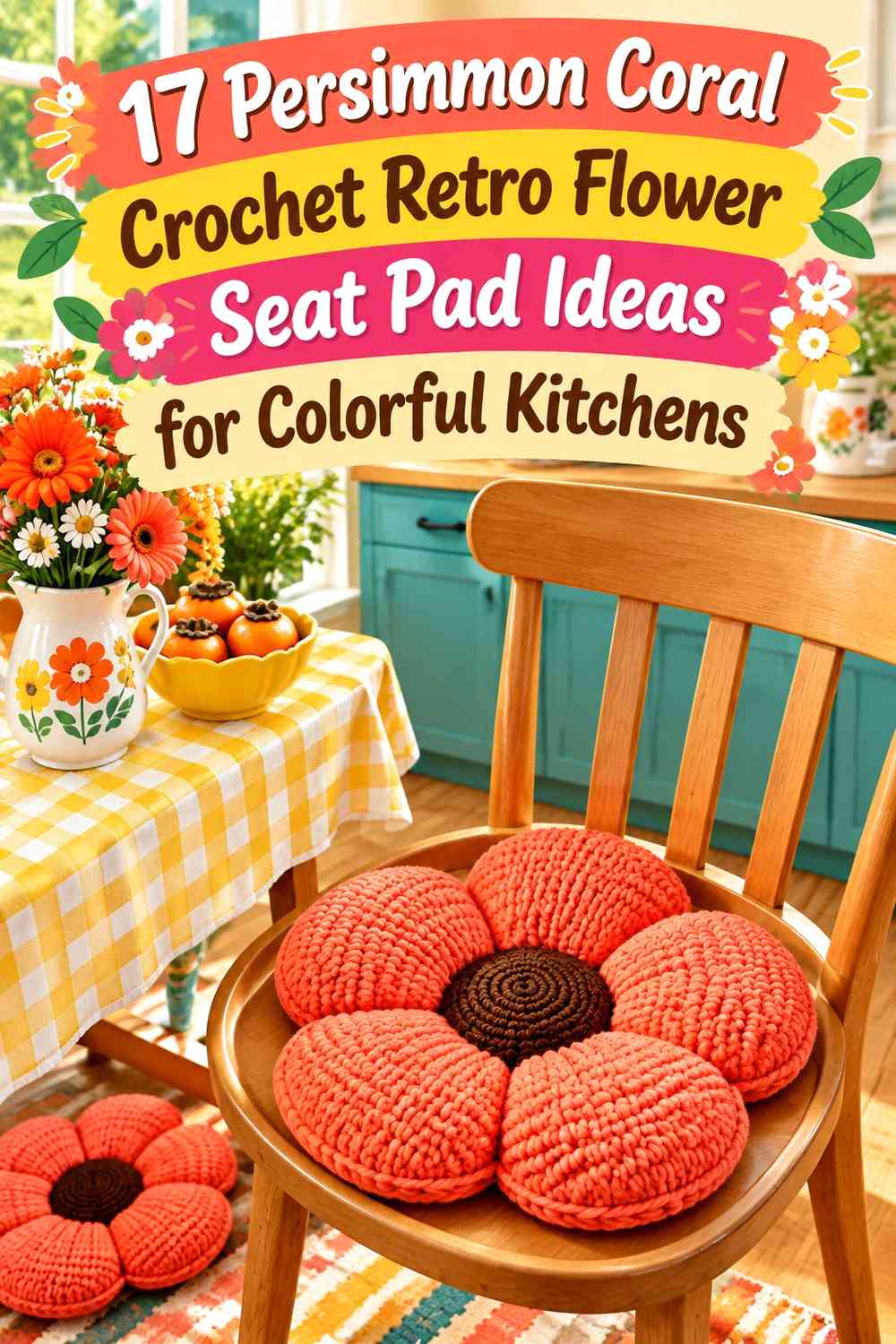

Persimmon coral gives a crochet flower seat pad the warmth of orange-red without pushing the palette all the way toward bright tomato red. On kitchen chairs, that makes it particularly useful for retro floral designs where mustard, cocoa, avocado, cream, teal, and other mid-century-inspired shades can support the main color.
A seat pad needs different color planning from a decorative flower pillow. Part of the outer edge may disappear beneath the sitter, against a chair back, or behind chair spindles, while the center and front petal edges tend to remain more noticeable. Persimmon coral therefore needs enough uninterrupted area to stay recognizable even when the whole flower is not visible at once.
The strongest ideas also consider construction. A flower-shaped cushion gives persimmon coral broad petals, while granny-square designs can distribute the color through repeated floral blocks. Round floral pads, sunflower-inspired motifs, and retro daisy panels offer other ways to use the same main shade without making all 17 options look alike.
The credited tutorials include direct flower cushions and pillows as well as floral squares and shaped flower constructions that can be adapted into seat-pad fronts. The persimmon coral palettes and chair-pad applications are independent editorial directions rather than descriptions of the creators’ original color choices.
Quick List
- Persimmon Coral Petal and Cocoa Center Crochet Retro Flower Seat Pad
- Persimmon Coral Center and Butter Cream Petal Crochet Retro Flower Seat Pad
- Persimmon Coral and Avocado Green Crochet Retro Daisy Seat Pad
- Persimmon Coral and Mustard Crochet Retro Flower Seat Pad
- Persimmon Coral and Deep Teal Crochet Retro Flower Seat Pad
- Persimmon Coral and Blush Crochet Layered Flower Seat Pad
- Persimmon Coral and Olive Crochet Sunflower-Style Seat Pad
- Persimmon Coral Flower Square and Cream Crochet Retro Seat Pad
- Persimmon Coral Petal and Chocolate Outline Crochet Flower Seat Pad
- Persimmon Coral and Sage Green Crochet Retro Round Flower Seat Pad
- Persimmon Coral and Burnt Orange Crochet Tonal Flower Seat Pad
- Persimmon Coral and Butter Yellow Crochet Retro Daisy Seat Pad
- Persimmon Coral Flower and Walnut Brown Crochet Granny Seat Pad
- Persimmon Coral and Dusty Aqua Crochet Retro Flower Seat Pad
- Persimmon Coral Daisy Grid and Ecru Crochet Kitchen Seat Pad
- Persimmon Coral and Ochre Crochet Sunflower Seat Pad
- Persimmon Coral and Plum Crochet Retro Statement Flower Seat Pad
Let Persimmon Coral Control the Flower Before Adding Kitchen Colors
A colorful kitchen already contains visual competition from cabinets, dishes, towels, wall art, appliances, or painted chairs. Giving persimmon coral the largest part of the crochet flower helps the seat pad remain one coherent object rather than another collection of small colors.
On a flower-shaped pad, the broad petals are the easiest place to establish that dominance. On a square seat pad, repeat persimmon coral in the same part of every flower motif so the separate blocks form a consistent pattern.
Avoid using every kitchen accent color simply because it is available. A focused combination of persimmon coral plus one darker anchor and one lighter supporting color usually gives the flower more definition than many equal accents.
Check Persimmon Coral Against the Actual Kitchen Chair
Chair color can change the apparent strength of the seat pad. Persimmon coral will stand out strongly against deep teal, blue, sage, cream, or dark wood, while it may blend more into rust, orange, warm red, or similarly colored upholstery.
If the chair is close to persimmon in color, move a contrasting shade toward the outer petal edge. Cream, ecru, dark cocoa, teal, or olive can create the boundary needed to preserve the flower silhouette.
View a sample on the chair rather than judging it only against a neutral work surface. The backrest, neighboring chairs, and kitchen floor all become part of the finished color composition.
Keep Persimmon Coral Seat-Pad Details Practical
Raised flowers and heavily dimensional centers can be effective on decorative cushions, but a seat pad benefits from considering where the body will actually rest. If adapting a dimensional flower tutorial, keep the central seating area relatively controlled and place the most pronounced petals or texture toward the visible perimeter where appropriate.
Also check the seat dimensions before committing to a motif layout. A granny-square front should fit the chair seat rather than forcing a square count simply because a tutorial uses a particular pillow size.
If ties or another chair attachment are added, treat them as part of the color plan. A supporting shade can make the ties visually quieter, while persimmon coral ties deliberately extend the main color beyond the flower.
1. Persimmon Coral Petal and Cocoa Center Crochet Retro Flower Seat Pad
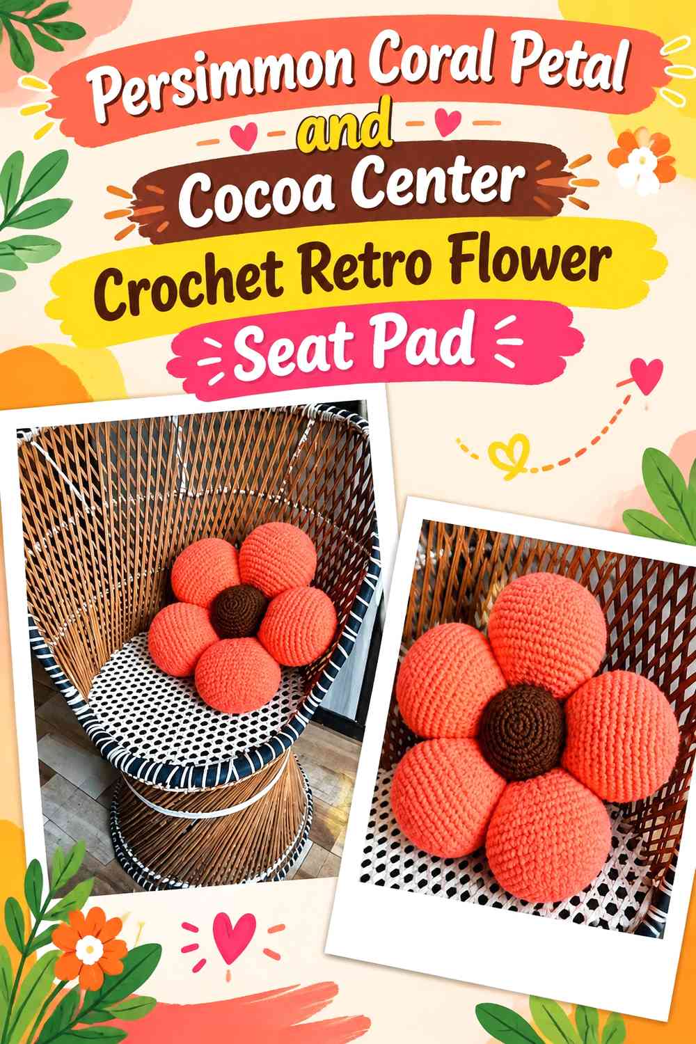
This is the clearest retro-flower hierarchy: persimmon coral covers the broad petals while cocoa creates a compact dark center. The combination works especially well when the chair itself is cream, natural wood, muted green, or another color that leaves the coral silhouette visible.
Let Persimmon Coral Cover the Largest Flower Petals
Keep persimmon coral continuous across the petal faces rather than interrupting every petal with another shade. Broad color areas make the seat pad recognizable as one flower even when the chair back hides part of the rear edge.
If the chair is already orange or rust, add more contrast at the outermost edge rather than reducing the coral across every petal.
Use Cocoa to Anchor the Persimmon Coral Seat Pad Center
A dark cocoa center gives the coral petals a clear point from which to radiate. Keep the brown relatively concentrated so it grounds the design without making the middle disproportionately heavy.
For a seat pad, also consider how raised the center becomes if adapting a stuffed flower-pillow construction.
Creator Credit: Cute Crochet — Tutorial
2. Persimmon Coral Center and Butter Cream Petal Crochet Retro Flower Seat Pad
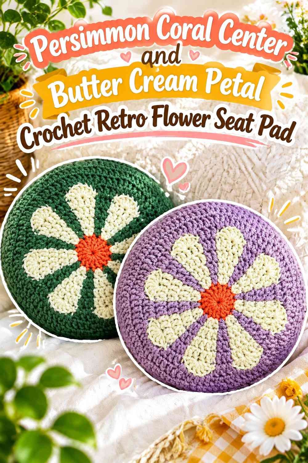
Reversing the flower creates a lighter kitchen option. Persimmon coral becomes the center while butter cream covers the surrounding petals, giving the warm accent a concentrated focal role instead of spreading it over the complete seat.
Keep Persimmon Coral Broad Enough in the Butter Cream Flower Center
Do not reduce the center to a tiny dot. A substantial persimmon coral disk makes the palette readable from standing height and prevents the pale petals from visually taking over the entire pad.
This arrangement is particularly useful on darker chairs where the butter-cream outer silhouette already has strong contrast.
Repeat Persimmon Coral Sparingly Around the Butter Cream Edge
If the center feels isolated, add one narrow coral outline or small repeated edge detail rather than alternating every petal between coral and cream.
The goal is to connect the center to the perimeter without losing the light-petal concept.
Creator Credit: VivCrochets — Tutorial
3. Persimmon Coral and Avocado Green Crochet Retro Daisy Seat Pad
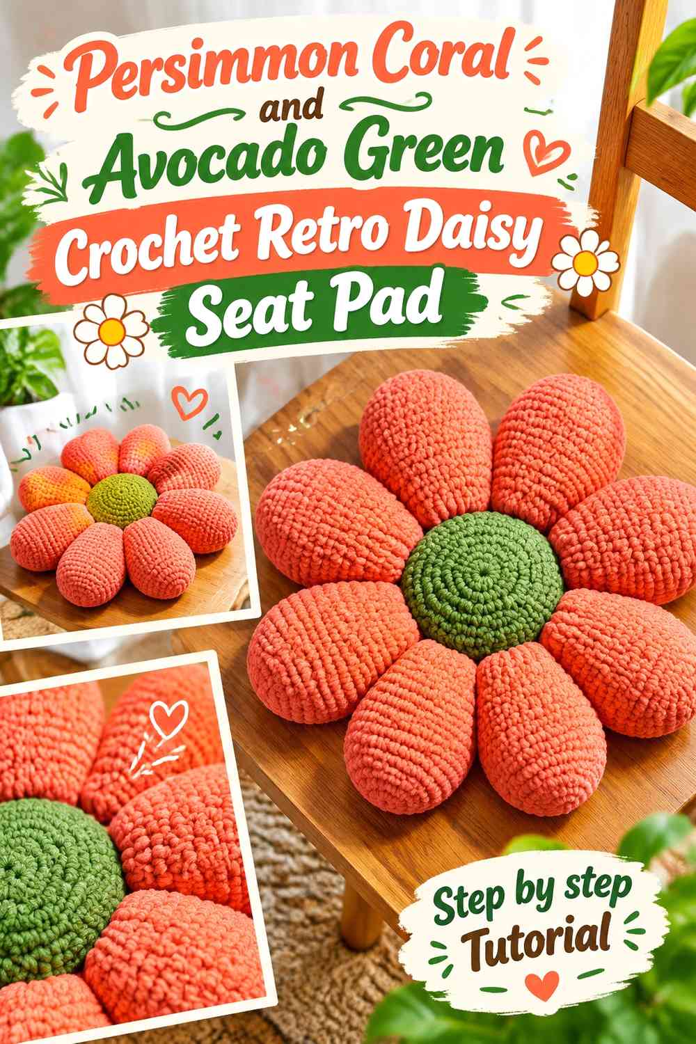
Avocado green immediately moves persimmon coral toward a 1960s- and 1970s-inspired kitchen direction. Keep coral on the visible floral surface and use green as a controlled inner ring, outline, or background rather than giving both colors equal petal area.
Keep Persimmon Coral Dominant Beside Avocado Green
Use persimmon coral across the main petals and reserve avocado for the center surround or selected outer sections. This keeps the seat pad floral rather than turning it into alternating orange-and-green wedges.
If the chair itself is avocado or olive, move more coral to the outer petal tips so the flower remains separate from the furniture.
Let Avocado Green Separate Persimmon Coral From the Flower Center
A green ring between a darker center and coral petals can create a botanical transition without requiring realistic leaf shapes.
Keep the avocado band broad enough to remain visible once the pad is viewed from above.
Creator Credit: Sahar Elkady — Tutorial
4. Persimmon Coral and Mustard Crochet Retro Flower Seat Pad
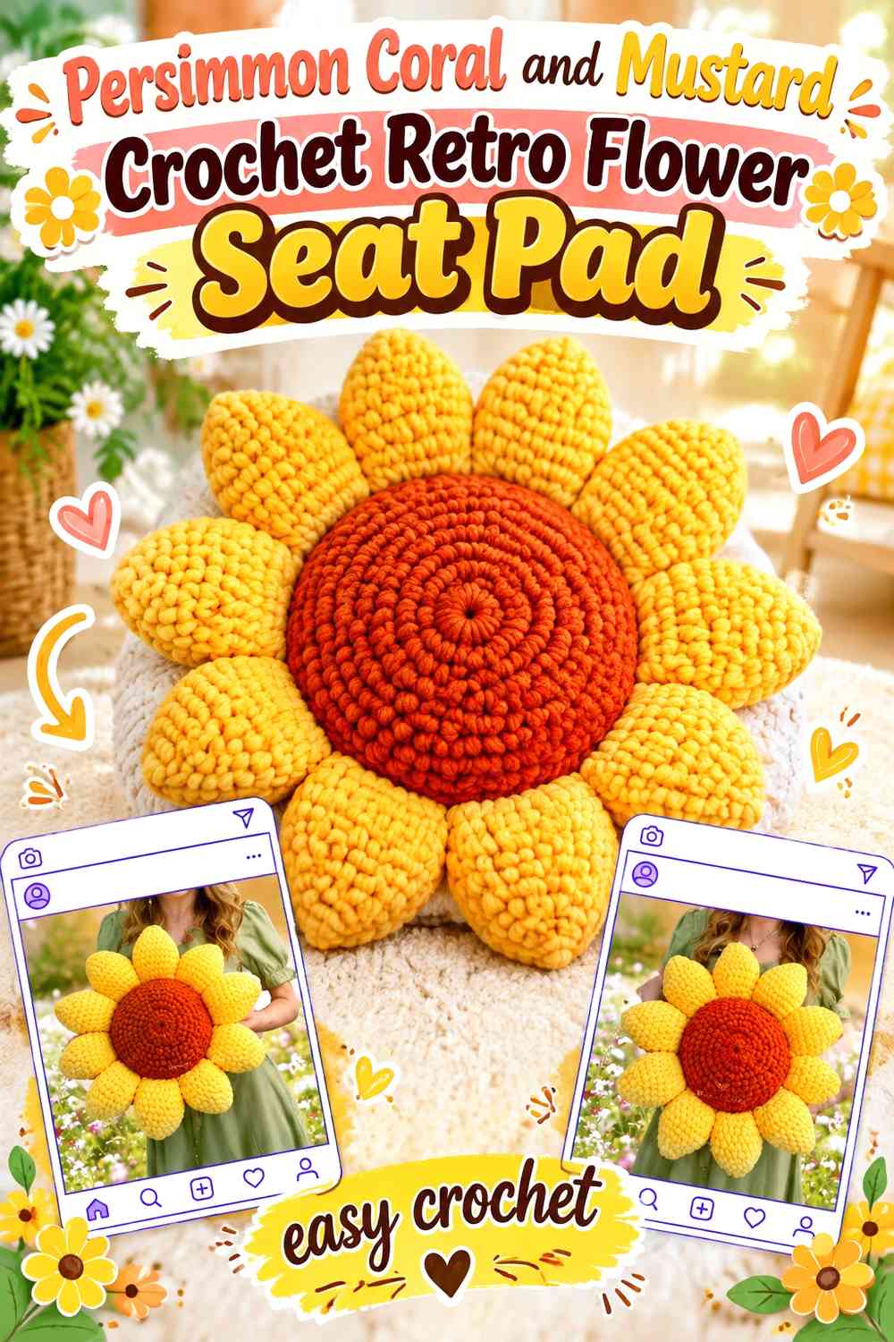
Persimmon coral and mustard create one of the warmest palettes in the collection. Since both shades carry substantial visual weight, use one for broad petals and the other for a controlled center or inner petal area rather than dividing the flower equally.
Give Persimmon Coral More Petal Area Than Mustard
Use coral as the dominant outer color and mustard closer to the middle. This creates a clear progression from warm yellow to orange-red rather than an evenly striped pinwheel.
On a honey-colored wooden chair, make sure the persimmon coral outer edge remains distinct from the furniture.
Keep Mustard Concentrated Inside the Persimmon Coral Flower
A mustard center or inner ring creates retro warmth without competing for the full flower circumference. If both colors start blending visually, add a small cocoa center rather than introducing another bright accent.
Creator Credit: Wonder Crochet — Tutorial
5. Persimmon Coral and Deep Teal Crochet Retro Flower Seat Pad
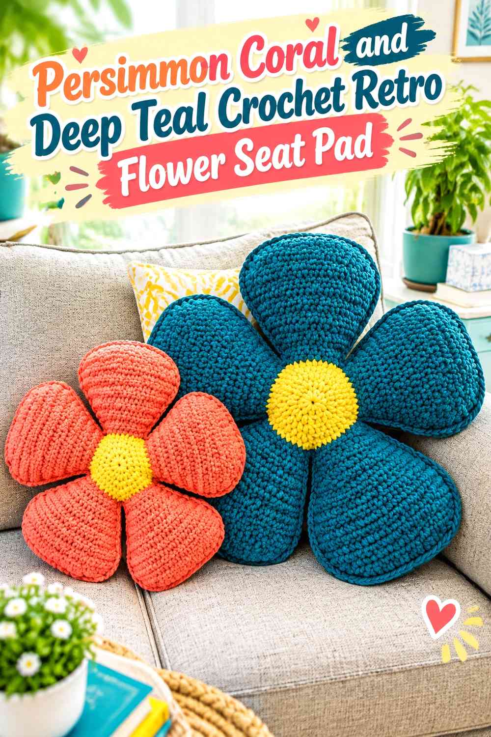
Deep teal creates a strong cool counterpoint to persimmon coral and can make the seat pad stand out in a colorful kitchen without introducing a pale neutral. The contrast is most useful when teal stays structural.
Let Persimmon Coral Lead Against Deep Teal
Keep coral across the largest flower surface so the pad remains warm rather than becoming predominantly blue-green. Teal can occupy the center, outline, or surrounding square if the construction uses motifs.
This pairing is particularly effective when other kitchen accents already repeat teal.
Use Deep Teal to Define the Persimmon Coral Petal Edge
A dark teal outline can preserve the flower silhouette on orange, terracotta, or warm wood seating. Keep it narrow enough that it behaves as a frame rather than another complete petal ring.
Creator Credit: Maria’s Blue Crayon — Tutorial
6. Persimmon Coral and Blush Crochet Layered Flower Seat Pad
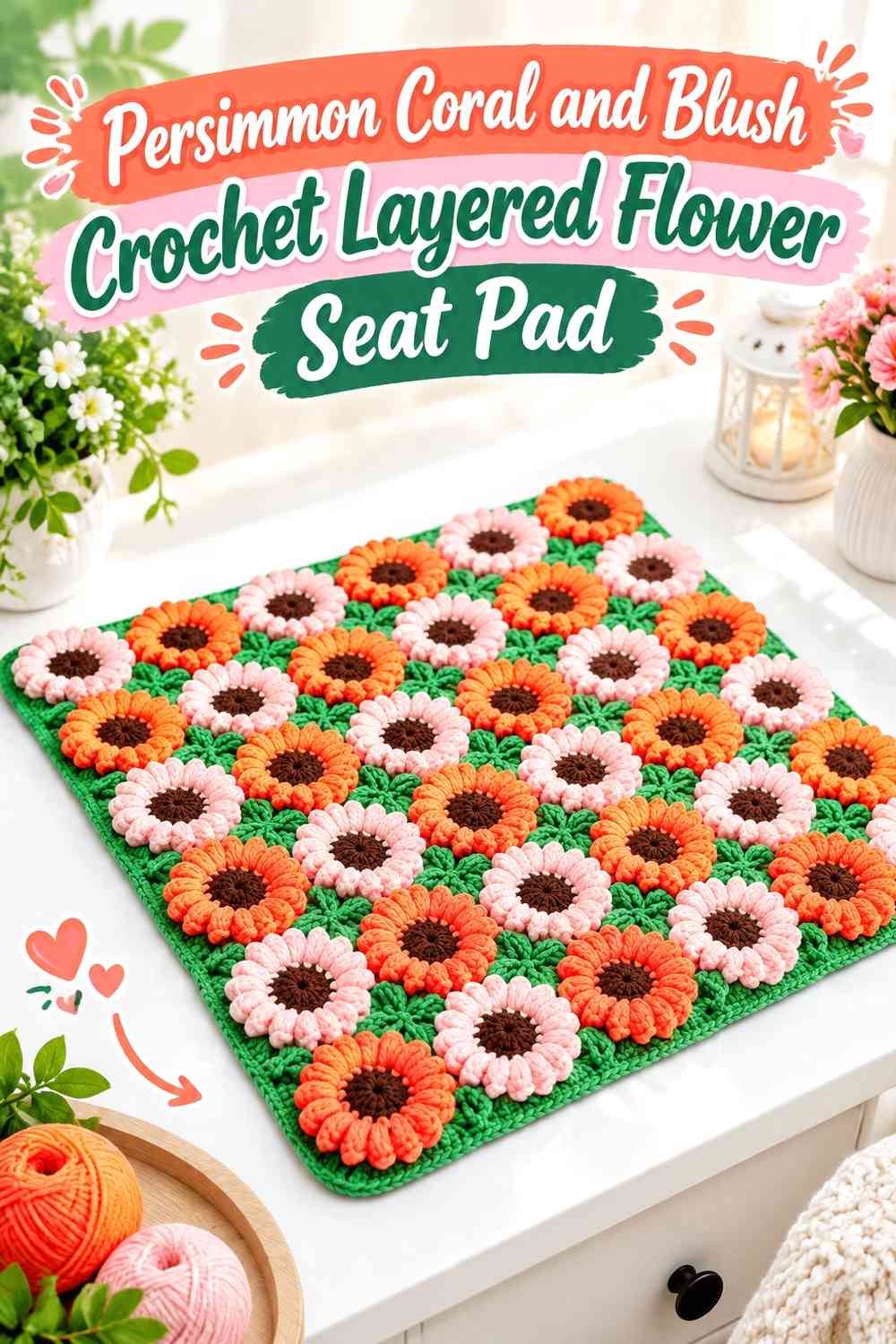
Blush creates a softer tonal relationship and works well when a kitchen already contains pink, peach, or cream details. Persimmon coral should provide enough depth to keep the flower from looking washed out.
Use Persimmon Coral on the Stronger Layered Petals
Place coral on the larger or more prominent petal layer and let blush soften the neighboring section. The darker warm shade gives the layered flower enough definition even when the values are relatively close.
Keep Persimmon Coral Visible Around Blush Petal Overlap
If the blush layer overlaps the coral too heavily, the main color can disappear from a top view. Adjust the color placement so a clear coral edge or inner section remains visible around the complete flower.
Creator Credit: Crochet Studio — Tutorial
7. Persimmon Coral and Olive Crochet Sunflower-Style Seat Pad
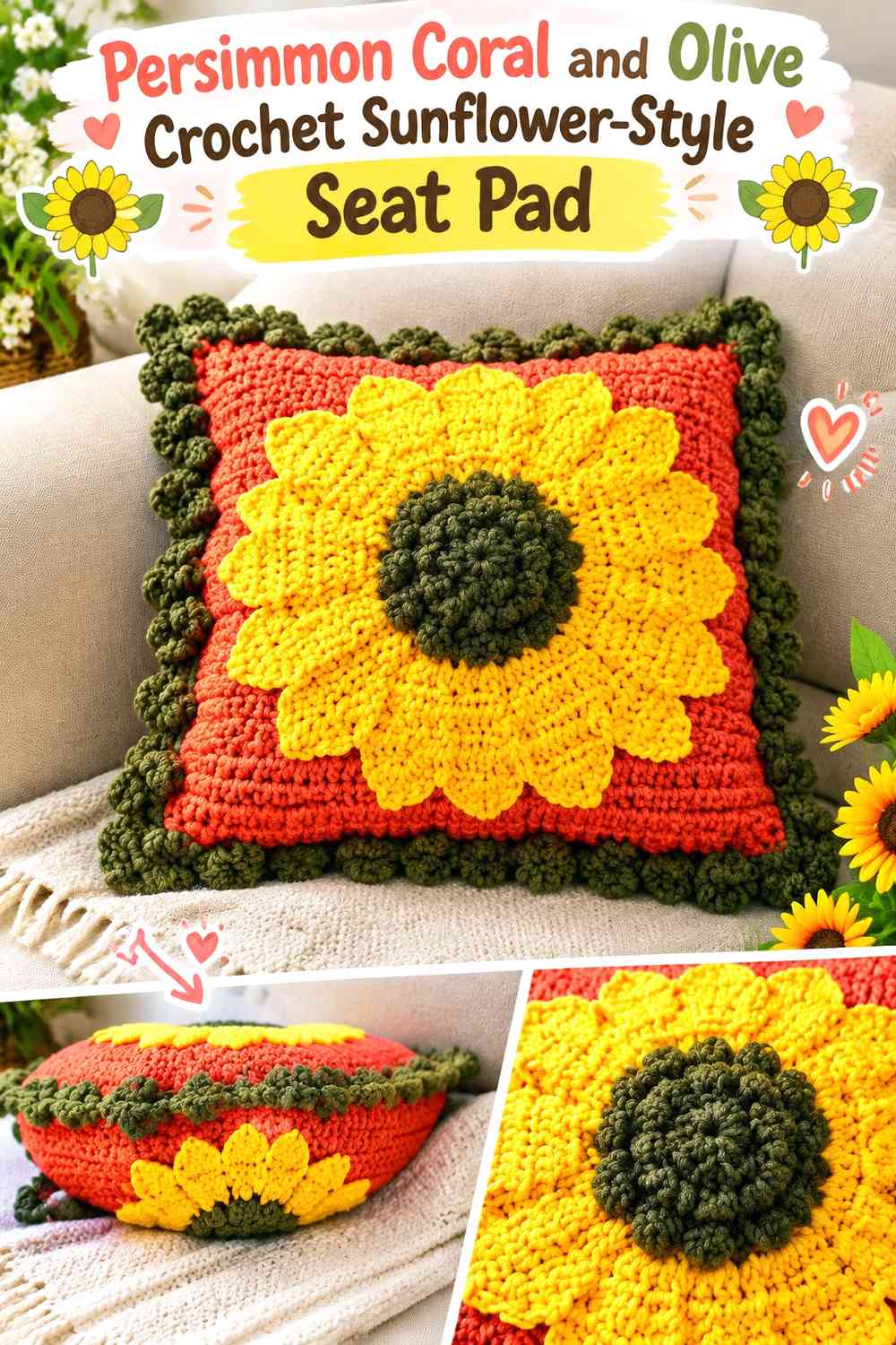
A sunflower structure does not have to stay yellow and brown. Persimmon coral can replace the conventional golden petals while olive introduces a muted botanical supporting color suitable for kitchens with earthy cabinets or green accents.
Keep Persimmon Coral Across the Sunflower-Style Petal Ring
Use coral consistently around the radiating petals so the flower shape remains bold. Olive works better as a limited secondary element than as an alternating petal color in this version.
Put Olive Near the Persimmon Coral Flower Center
An olive ring or restrained background area can connect the warm flower to other botanical kitchen colors. If the center needs stronger definition, use a deeper brown inside the olive rather than spreading green farther into the petals.
Creator Credit: Meladora’s Creations for Crochet — Tutorial
8. Persimmon Coral Flower Square and Cream Crochet Retro Seat Pad
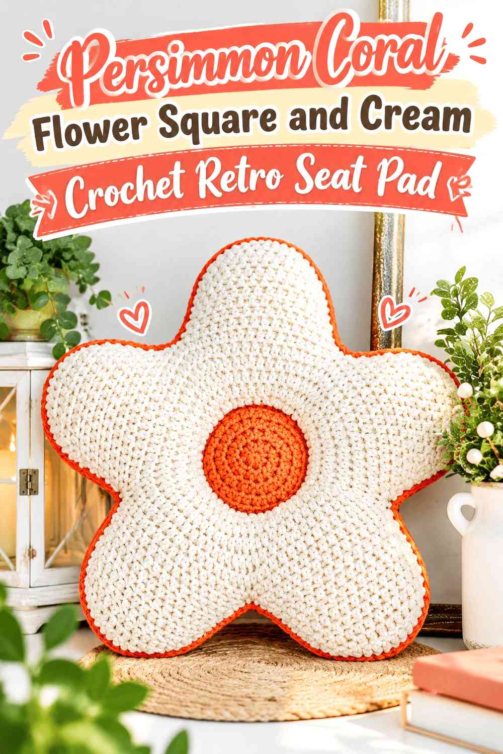
Flower granny squares are useful when the chair seat is more square than round. Persimmon coral can repeat inside each motif while cream converts the flowers into a unified seat-pad panel.
Repeat Persimmon Coral in Every Cream Flower Square
Keep coral in the same flower position from square to square. Consistency makes several small flowers read as one intentional retro seat pad instead of a scrap-yarn sampler.
Give Cream Enough Space Around Persimmon Coral Motifs
The lighter background separates neighboring flowers and keeps the seat pad from becoming one dense coral field. Keep the joining color consistent so the eye follows the floral repetition rather than the seams.
Creator Credit: Sweet Creek Patterns — Tutorial
9. Persimmon Coral Petal and Chocolate Outline Crochet Flower Seat Pad
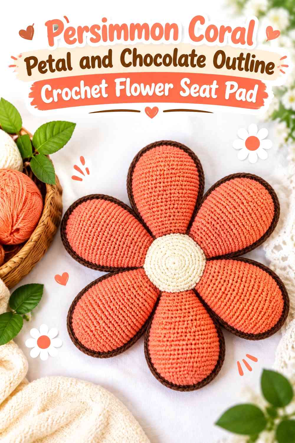
Chocolate can create a graphic dark outline around persimmon coral without changing the main flower into a brown-heavy design. This works especially well for chairs with pale painted finishes.
Keep Persimmon Coral Broad Inside the Chocolate Outline
Let coral cover most of each petal face and reserve chocolate for selected edges. A dark border is visually powerful, so it does not need much width.
Use Chocolate Only Where Persimmon Coral Needs More Separation
If the chair already contrasts strongly with coral, outline only the center or selected petal edges rather than surrounding every stitch. This prevents the seat pad from looking cartoonishly over-framed.
Creator Credit: Alexsandra Medeiros – Ami decor — Tutorial
10. Persimmon Coral and Sage Green Crochet Retro Round Flower Seat Pad
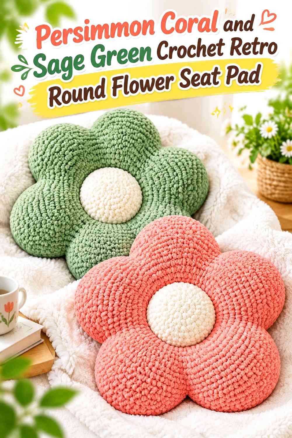
Sage green produces a gentler botanical contrast than avocado or deep teal. It works well in kitchens with muted cabinetry where a very dark outline would feel too strong.
Let Persimmon Coral Stay Warmer Than the Sage Green Seat-Pad Ring
Use coral for the main petals and sage near the center or in one supporting outer section. The contrast comes from temperature and hue rather than an extreme light/dark difference.
Check Persimmon Coral and Sage Green From Standing Height
Muted coral and sage can become surprisingly similar in visual weight. If the petal boundary disappears, broaden the sage section or introduce a small cream separator rather than making the whole palette brighter.
Creator Credit: Let’s crochet — Tutorial
11. Persimmon Coral and Burnt Orange Crochet Tonal Flower Seat Pad
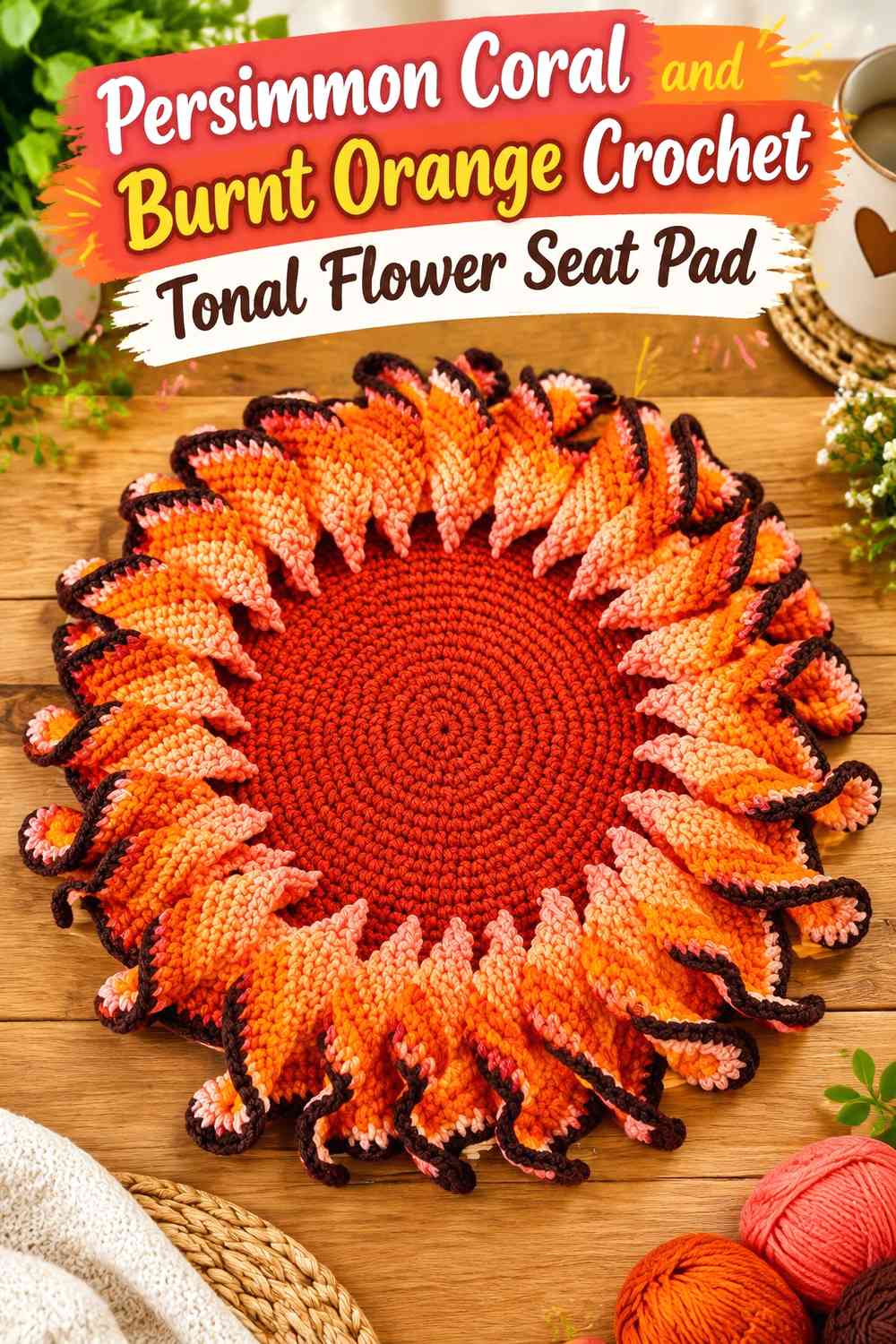
This is the closest tonal palette in the collection. Persimmon coral and burnt orange stay within the same warm family, so the design relies on deliberate placement rather than sharp contrast.
Keep Persimmon Coral Clearly Distinct From Burnt Orange Petals
Choose which warm shade is lighter or brighter and preserve that relationship across the flower. Persimmon coral can carry the larger outer petals while burnt orange sits nearer the center.
Use Persimmon Coral in Wider Areas Than Burnt Orange
Broad coral sections help the main color remain identifiable despite the tonal palette. If the two shades merge from a distance, add a small dark center instead of dividing the petals into more stripes.
Creator Credit: Nicoles-kleine-Haekelschule — Tutorial
12. Persimmon Coral and Butter Yellow Crochet Retro Daisy Seat Pad
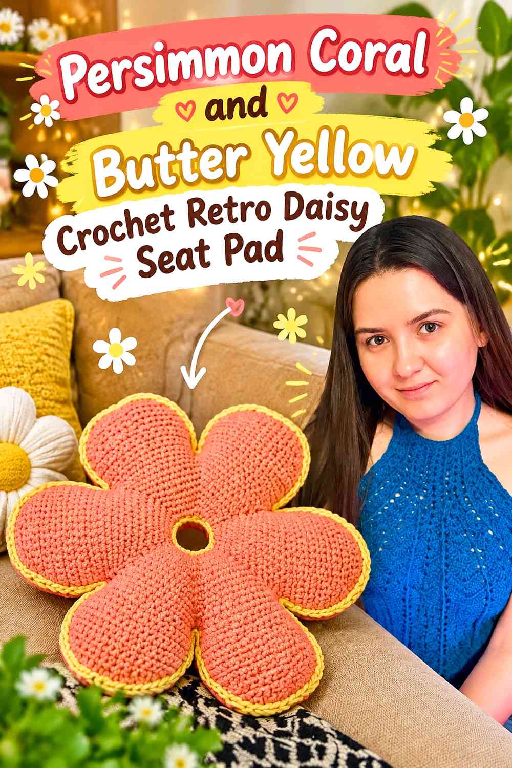
Butter yellow creates a cheerful retro kitchen combination without competing with persimmon coral for the darkest warm tone. The lighter shade can form the center or inner petals.
Use Persimmon Coral Around the Butter Yellow Daisy Center
Place coral on the larger petal ring so the seat pad reads as persimmon first. The yellow center provides a compact light break and makes the flower easy to identify from above.
Keep Persimmon Coral Strong at the Outer Seat-Pad Edge
Because butter yellow attracts attention despite occupying less area, keep a continuous coral perimeter or petal tip visible. This prevents the small center from unexpectedly becoming the dominant color feature.
Creator Credit: #связаны — Tutorial
13. Persimmon Coral Flower and Walnut Brown Crochet Granny Seat Pad
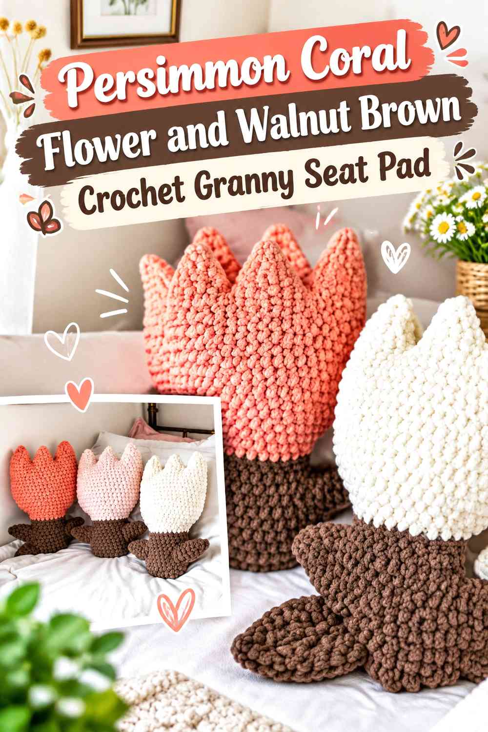
Walnut brown creates a classic earthy retro foundation and works particularly well when persimmon coral appears inside repeated floral squares.
Keep Persimmon Coral Floral Motifs Clear Against Walnut Brown
Give the coral flower enough width that the dark background does not visually shrink it. A small cream or mustard center can add separation if the two warm colors feel too close.
Use Walnut Brown to Join Persimmon Coral Seat-Pad Panels
A consistent walnut join can turn several flower squares into a coherent chair pad. Keep the joining area narrower than the floral sections so the seat does not become predominantly brown.
Creator Credit: Stitchberry — Tutorial
14. Persimmon Coral and Dusty Aqua Crochet Retro Flower Seat Pad
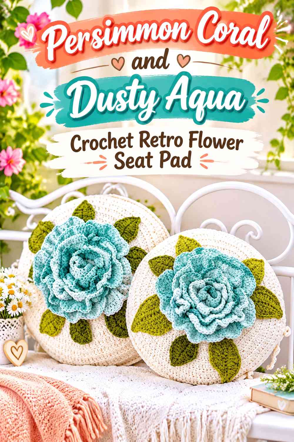
Dusty aqua creates one of the coolest contrasts with persimmon coral and can work well in kitchens with pale blue, turquoise, or vintage enamel accents.
Let Persimmon Coral Stay Central Against Dusty Aqua
Use coral through the main floral area and keep aqua on the background, joining round, or selected inner section. This protects the warm flower from becoming equally divided with the cool shade.
Use Dusty Aqua to Separate Persimmon Coral From a Colorful Chair
On a patterned or already colorful chair, a controlled aqua boundary can give the coral petals a cleaner edge. Avoid adding several extra colors simply because the room is colorful; the two-color contrast may already be enough.
Creator Credit: Лиля | Вязание, Вдохновение и Жизнь в Канаде — Tutorial
15. Persimmon Coral Daisy Grid and Ecru Crochet Kitchen Seat Pad
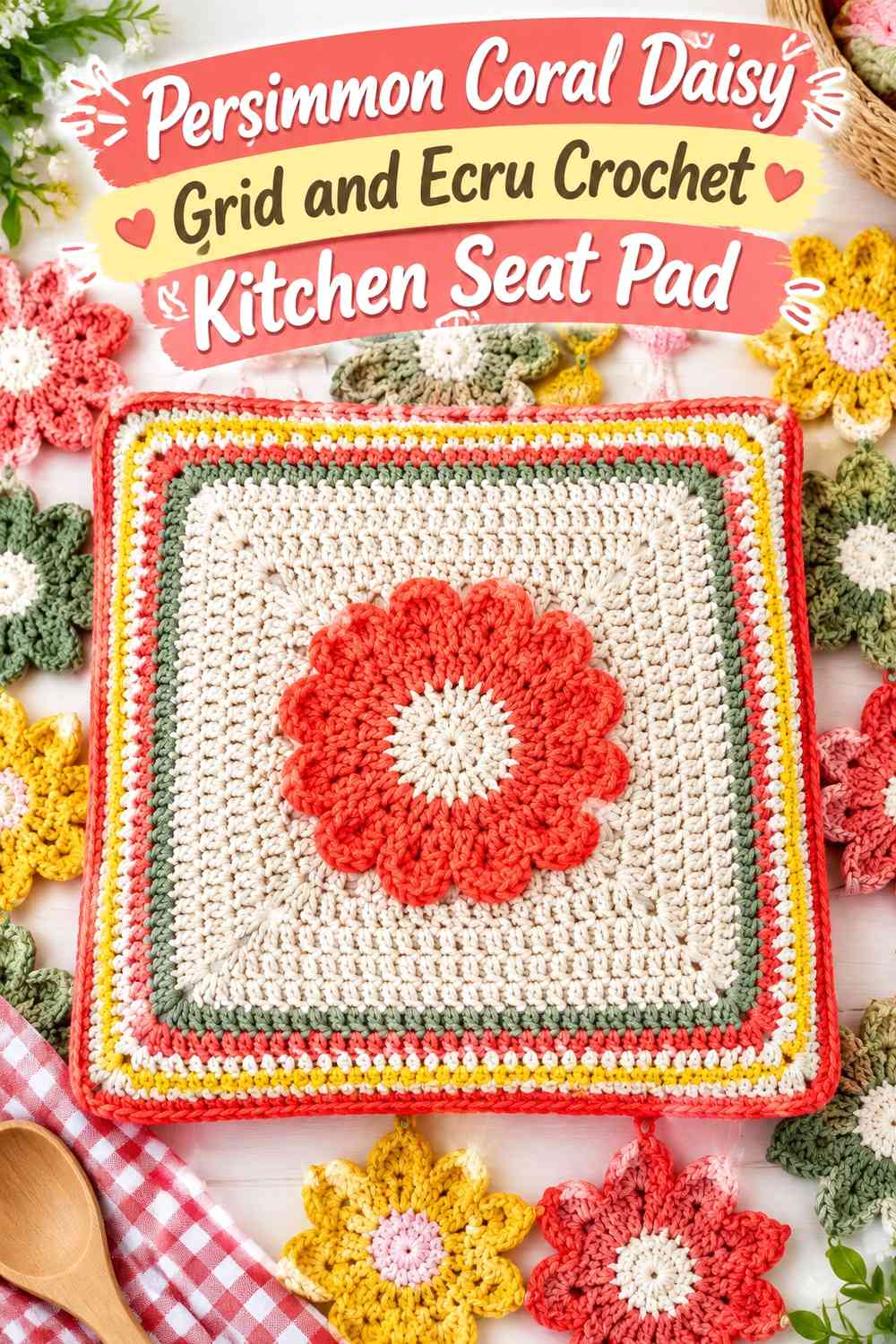
A grid of smaller daisies creates a different visual effect from one oversized flower. Persimmon coral repeats across the seat, while ecru provides enough negative space for every flower to stay distinct.
Repeat Persimmon Coral at the Same Point in Every Ecru Daisy
Use coral consistently for petals or centers rather than switching roles across the grid. Repetition is what makes a multi-square seat pad feel designed rather than randomly assembled.
Leave Ecru Between Persimmon Coral Flowers
Visible background space keeps the individual daisies clear and makes the seat pad lighter against dark or colorful chairs. If the grid becomes too dense, reduce motif size or repetition rather than adding another separator color.
Creator Credit: Daisy Girl Crochet — Tutorial
16. Persimmon Coral and Ochre Crochet Sunflower Seat Pad
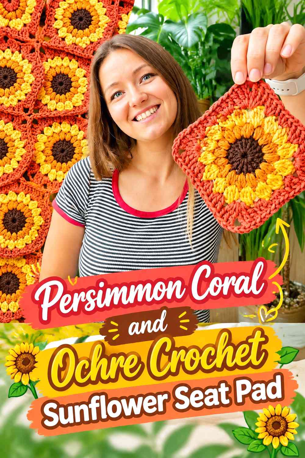
Ochre and persimmon coral create a concentrated retro warm palette, but ochre is slightly earthier than bright yellow. A darker central shade can keep the two neighboring colors from visually flattening together.
Give Persimmon Coral More Area Than Ochre on the Sunflower
Use coral across the broad outer petals and keep ochre nearer the petal bases or center. This establishes a clear hierarchy while retaining the golden retro warmth.
Keep Persimmon Coral Defined Around the Ochre Center
If the colors begin merging, add a compact deep-brown center or a narrow dark transition. Avoid outlining every petal, since that can make the flower look busier than a seat pad needs.
Creator Credit: by Kristine — Tutorial
17. Persimmon Coral and Plum Crochet Retro Statement Flower Seat Pad
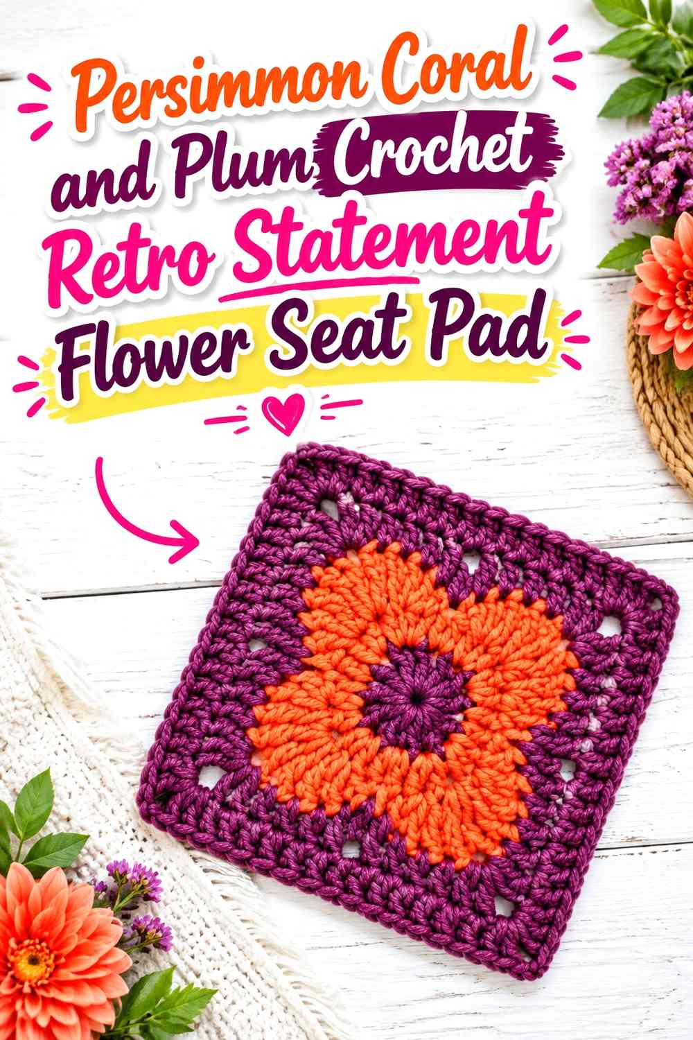
Plum creates an unexpected dark contrast that pushes persimmon coral away from an exclusively orange-brown retro palette. It works best as a small but substantial center or petal-base color.
Let Persimmon Coral Dominate the Plum Retro Flower
Keep coral on the majority of the flower so plum acts as an anchor rather than changing the main palette to purple. The contrast is strong enough that relatively little plum is needed.
Use Plum to Deepen the Persimmon Coral Flower Center
A plum center gives the warm coral petals a darker focal point without relying on standard brown. On a colorful kitchen chair, this can connect the seat pad to purple, berry, or dark painted accents elsewhere in the room.
Creator Credit: Adore Crea Crochet — Tutorial
Comparing the Persimmon Coral Retro Flower Seat Pad Directions
For the clearest oversized-flower look, ideas 1, 5, 6, 9, 10, 11, and 17 keep persimmon coral across broad petal surfaces. These make the main color easy to recognize even when the rear of the seat pad sits partly beneath a chair back.
Ideas 3, 4, 7, 12, and 16 lean most strongly into retro kitchen color. Avocado, mustard, olive, butter yellow, and ochre all reinforce the warm mid-century-inspired direction without requiring every chair pad to repeat the same palette.
Ideas 8, 13, and 15 use modular flower panels. They are useful for squarer chair seats or for readers who prefer repeated motifs over one oversized bloom. Cream and ecru create lighter backgrounds, while walnut gives the grid a darker vintage frame.
For cooler contrast, ideas 5, 10, and 14 pair coral with teal, sage, or dusty aqua. These can work particularly well when the kitchen already contains blue-green cabinetry or painted chairs.
Idea 2 provides the lightest overall arrangement because persimmon coral moves into the center rather than the outer petals, while idea 11 creates the softest tonal transition through burnt orange.
Conclusion
Persimmon coral works particularly well for retro crochet flower seat pads because it can move between orange, red, peach, and earthy brown supporting colors without losing its own warm identity. The key is deciding whether coral belongs on the large petals, flower center, repeated granny motifs, or surrounding seat-pad field.
Choose idea 1 for a simple coral-and-cocoa flower, ideas 3, 4, or 12 for a stronger retro kitchen palette, and ideas 5 or 14 when cool blue-green contrast suits the room better. Ideas 8, 13, and 15 provide modular alternatives for square seats, while ideas 6 and 17 give the flower a softer or more dramatic color relationship.
Before making a complete set for several chairs, test one motif or seat-pad front on the actual furniture. Check whether persimmon coral remains distinct from the chair color, whether the flower center is proportionate, and whether the outer petals stay visible from normal kitchen viewing angles.
Use each credited tutorial for its original flower cushion, floral motif, square, or related construction guidance, then adapt the persimmon coral color distribution and seat-pad dimensions independently.
Frequently Asked Questions
What Colors Work Best With Persimmon Coral on a Retro Crochet Seat Pad?
Cocoa, walnut, mustard, butter yellow, avocado, olive, teal, sage, dusty aqua, cream, and ecru can all create distinct retro directions. Choose the supporting color according to whether you want stronger contrast, a tonal warm palette, or a more botanical look.
Should Persimmon Coral Be Used on the Petals or the Flower Center?
Use persimmon coral on the petals when you want it to dominate the entire seat pad. Putting it in the center creates a lighter design when cream, ecru, or another pale shade occupies the petals.
How Can Persimmon Coral Stand Out on a Warm Wood Kitchen Chair?
Add stronger value contrast near the outer flower edge. Deep teal, cocoa, plum, cream, or another clearly different supporting color can create a boundary between persimmon coral and warm wood.
Can Flower Granny Squares Be Used for a Persimmon Coral Seat Pad?
Yes. Repeat persimmon coral in the same part of each motif and join the squares with one consistent supporting color. Measure the blocked motif layout against the chair seat before deciding how many squares to use.
How Can I Make Persimmon Coral Look More 1970s-Inspired?
Pair it with colors such as avocado, mustard, ochre, walnut brown, cocoa, or cream and use broad, clearly separated color areas. Retro flower designs usually benefit more from strong repeated shapes than from many tiny color changes.
How Do I Keep a Persimmon Coral Flower Seat Pad From Looking Too Busy in a Colorful Kitchen?
Limit the pad to two or three main colors and give persimmon coral a dominant role. Let the chair and kitchen provide some of the surrounding color rather than trying to repeat every room accent inside the crochet.
Should a Persimmon Coral Flower Seat Pad Have a Dark Center?
It does not have to, but cocoa, walnut, plum, or another darker center can give pale or midtone petals stronger definition. If the chair itself is very dark, a lighter butter-yellow or cream center may provide better separation instead.