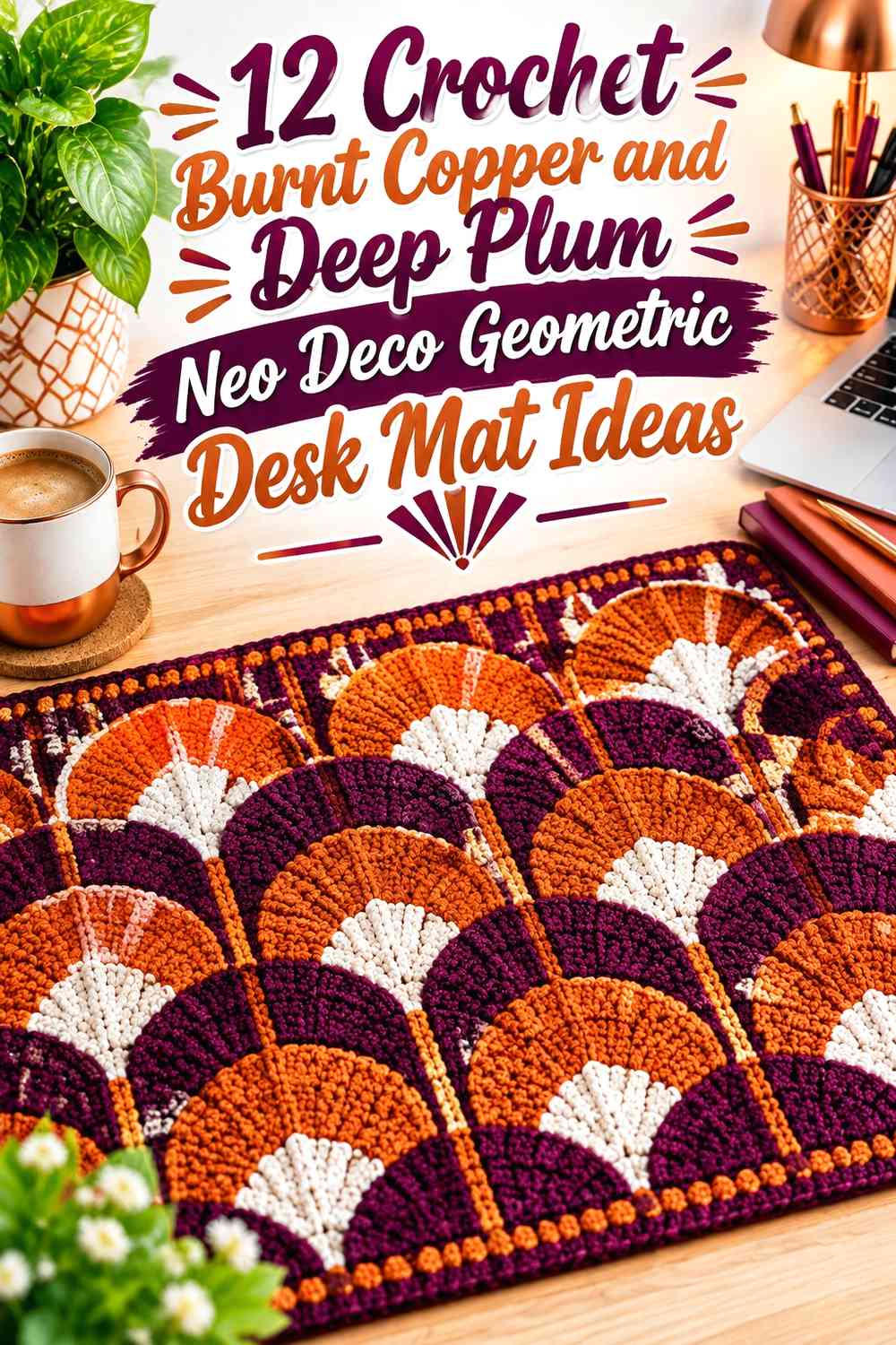

Burnt copper and deep plum give a crochet desk mat enough contrast to support strong geometric patterning without requiring a large palette. Burnt copper brings the warmer, brighter visual weight, while deep plum can act as a darker field, border, shadow line, or repeating anchor.
For a Neo Deco direction, the most useful color decisions happen around structure. Stepped borders, nested rectangles, diamonds, chevrons, offset blocks, and cube-like forms all become clearer when one color leads and the other is assigned a consistent geometric role. On a desk mat, placement also matters: highly active motifs can sit around the perimeter or decorative side, while the areas beneath a keyboard, notebook, or mouse can remain visually calmer.
The tutorials supporting these ideas cover geometric rugs, rectangular runners, placemats, and mug rugs that provide useful flat-crochet construction references. The burnt copper and deep plum arrangements below are independent color adaptations rather than claims about the colors used by the creators.
Quick List
- Burnt Copper and Deep Plum 3D Cube Crochet Desk Mat
- Deep Plum and Burnt Copper Chevron Crochet Desk Mat
- Burnt Copper and Deep Plum Long-Panel Crochet Desk Mat
- Deep Plum and Burnt Copper Double-Frame Crochet Desk Mat
- Burnt Copper and Deep Plum Minimal Grid Crochet Desk Mat
- Deep Plum and Burnt Copper Granny-Rectangle Crochet Desk Mat
- Burnt Copper Field and Deep Plum Corner-Block Crochet Desk Mat
- Deep Plum Field and Burnt Copper Side-Rail Crochet Desk Mat
- Burnt Copper, Deep Plum, and Cream Deco-Line Crochet Desk Mat
- Burnt Copper, Deep Plum, and Charcoal Asymmetric Crochet Desk Mat
Give Burnt Copper and Deep Plum Separate Geometric Roles
A two-color geometric desk mat becomes easier to read when burnt copper and deep plum do different jobs. One shade can cover the broad working surface while the other creates outlines, steps, diamonds, chevrons, or border repeats.
Avoid dividing every shape equally between the two colors unless a checkerboard effect is intentional. A clearer hierarchy usually makes the Neo Deco geometry more visible because the eye can identify a background and a repeating foreground pattern.
Keep Burnt Copper and Deep Plum Contrast Clear Around Small Motifs
Burnt copper and deep plum are different hues, but their actual light-and-dark contrast depends on the yarns you choose. Place the skeins beside each other before committing to small diamonds or narrow lines. A grayscale photo can also help show whether the geometric details will remain distinct.
If the values are closer than expected, use larger shapes or wider bands. Small burnt copper lines can disappear against deep plum more quickly than a broad copper diamond or stepped frame.
Plan Burnt Copper and Deep Plum Around the Working Desk Surface
The center of a desk mat often sits beneath equipment, so elaborate geometry does not need to cover every inch. A bold border can stay visible around a keyboard, while a side panel can remain exposed beside a notebook or other desk accessories.
Texture deserves similar planning. If you intend to place a mouse directly on the crochet surface, test a swatch with your actual mouse before committing to highly raised stitches in that area. A flatter colorwork zone can preserve the geometric look without making the working surface unnecessarily uneven.
1. Burnt Copper and Deep Plum 3D Cube Crochet Desk Mat
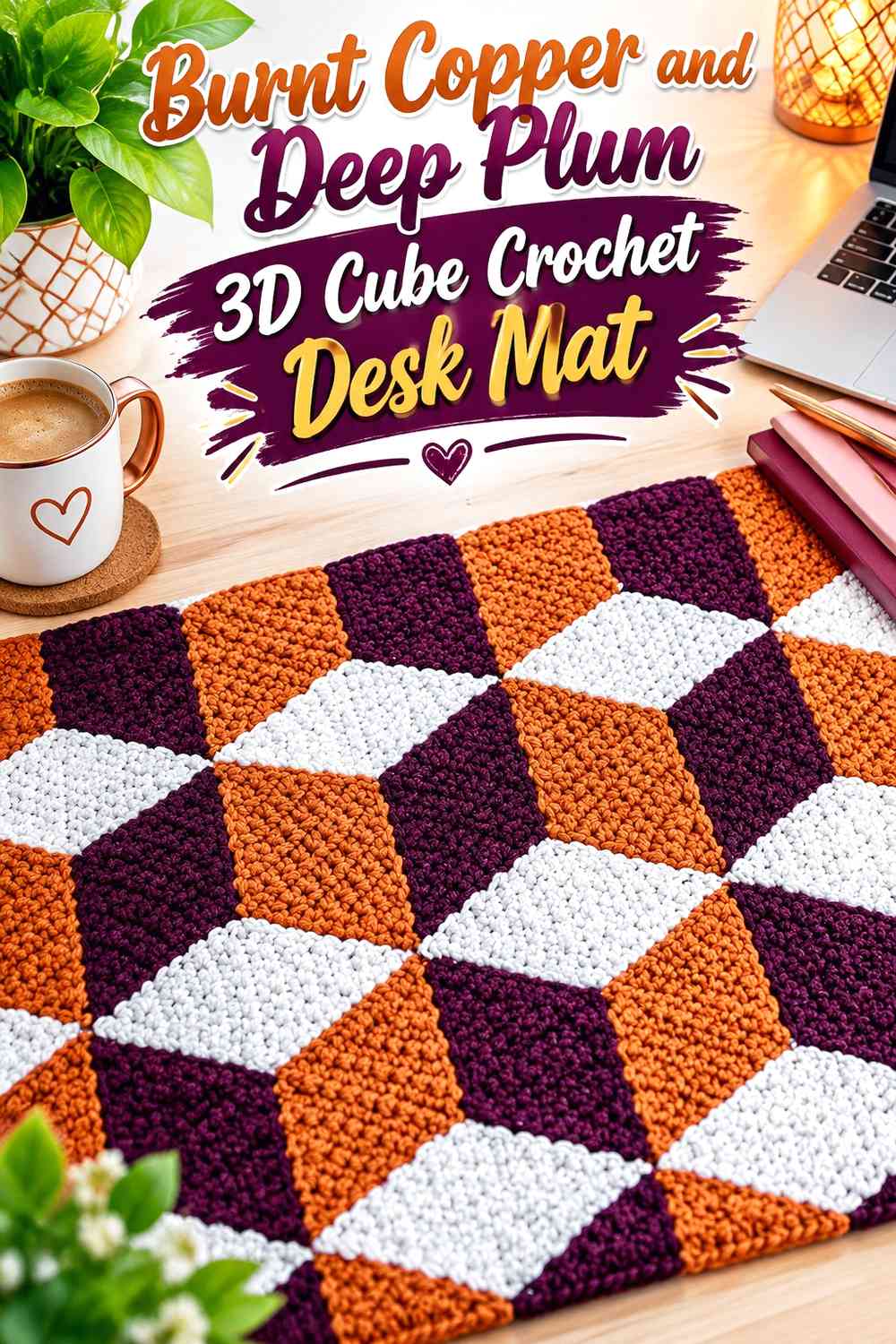
Cube-inspired geometry can give a desk mat a dimensional illusion without adding actual bulky decoration. Burnt copper can serve as the brighter face of each cube, while deep plum defines the darkest planes and separates repeated units.
Burnt Copper Should Stay on the Same Cube Face
Assign burnt copper to one consistent visual plane throughout the design. Switching its role from shape to shape can weaken the illusion because the viewer loses the repeating light-versus-dark logic.
This consistency matters more across a large desk mat than on a small sample because multiple cube units will be viewed together.
Deep Plum Can Create the Darkest Edge Around Burnt Copper Cubes
Use deep plum where you want the cube pattern to look most defined. A strong dark plane beside burnt copper creates clearer separation than using the two colors in random alternating sections.
If the design begins to feel too active, reserve the cube pattern for one side or the perimeter and leave a simpler central equipment zone.
Creator Credit: Artes da Kekel
2. Deep Plum and Burnt Copper Chevron Crochet Desk Mat
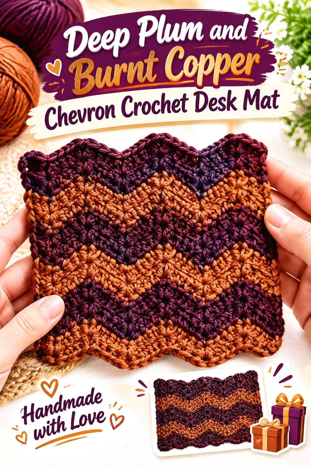
Chevrons give the two-color palette a clear horizontal rhythm. Deep plum can cover the larger background while burnt copper forms repeated angular peaks, or the balance can be reversed for a warmer overall mat.
Burnt Copper Chevrons Need Enough Width Against Deep Plum
Very narrow copper zigzags may lose definition once several are repeated. Broader burnt copper bands give the angles more presence and make the directional pattern visible from a normal seated position.
Keep the peaks aligned if you want a formal Deco effect. Intentionally offset them only when a more dynamic pattern is the goal.
Deep Plum Can Calm the Burnt Copper Chevron Center
If the full mat is covered in alternating chevrons, the surface can become visually busy beneath a keyboard. One option is to use broader deep plum sections through the central working area and concentrate copper chevrons toward the front or side edges.
That keeps the motif visible without forcing the busiest colorwork underneath every desk object.
Creator Credit: Treasures Made From Yarn
3. Burnt Copper and Deep Plum Long-Panel Crochet Desk Mat
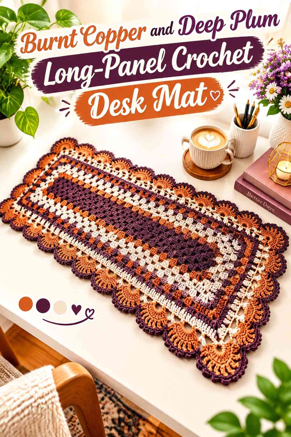
A long rectangular composition works naturally with the proportions of a desk. Burnt copper can form the main center panel, while deep plum runs along the long sides as parallel bands that visually stretch the mat from left to right.
Deep Plum Side Bands Can Contain the Burnt Copper Center
Use deep plum along both long edges when you want the mat to feel framed without adding complex patterning beneath the main equipment area.
The side bands can stay solid or carry a restrained stepped repeat. Keeping them similar in visual width gives the central copper panel a stable position.
Burnt Copper Can Keep the Long Desk Center Visually Unified
A broad burnt copper middle works well when several desk objects will cover the mat because the exposed sections still look connected.
If you add deep plum motifs to this center, repeat only a few large elements rather than filling every available space.
Creator Credit: Crochê da Alessandra
4. Deep Plum and Burnt Copper Double-Frame Crochet Desk Mat
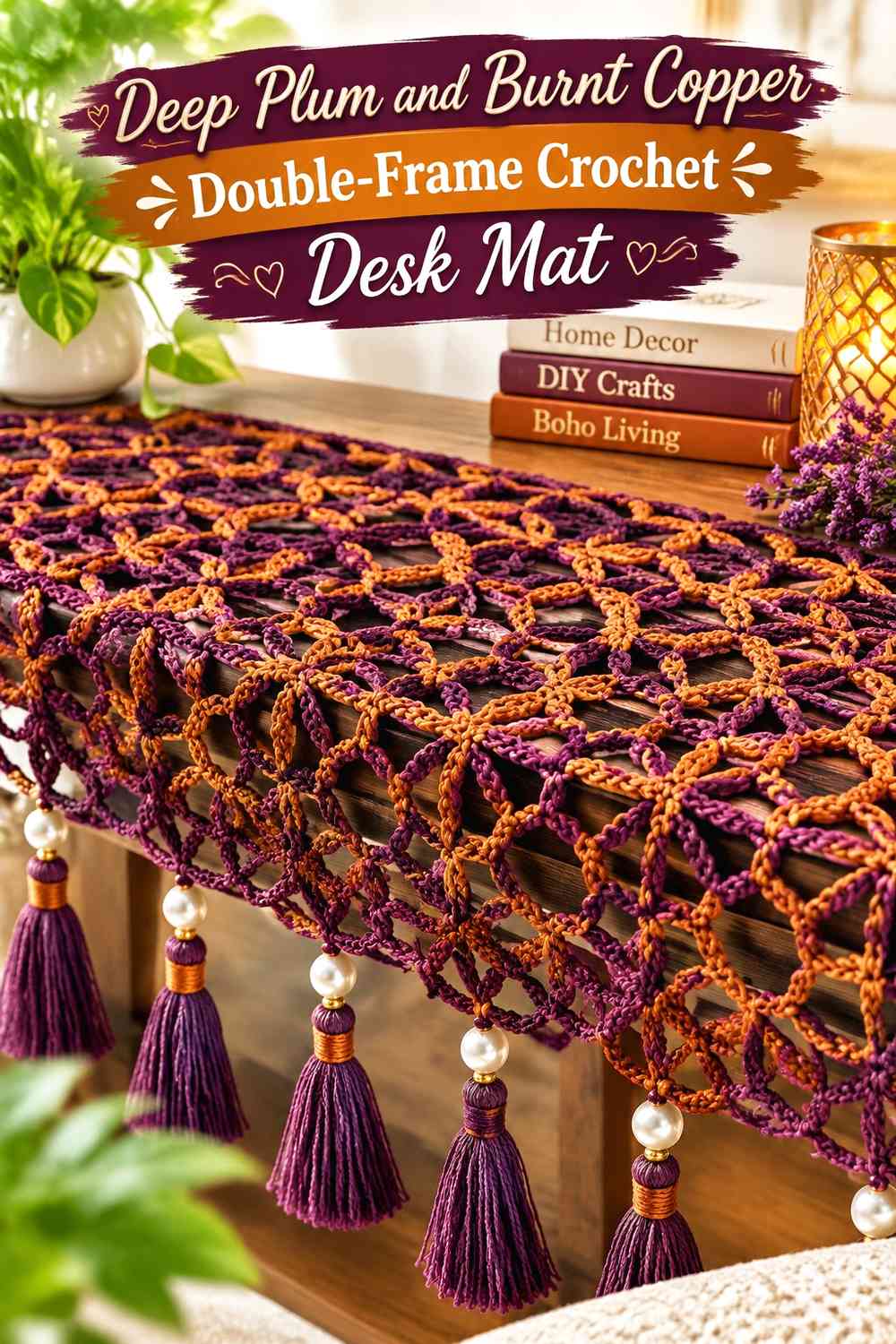
Nested rectangles give this idea a clear Deco-style structure. Start visually with a deep plum field, surround it with burnt copper, and bring deep plum back at the outer edge so the warmer frame is enclosed rather than floating.
Burnt Copper Can Form the Middle Frame Between Deep Plum Zones
The copper band should be wide enough to read as a distinct geometric layer. If it becomes only a thin line, the design will look more like ordinary edging than a nested-frame composition.
Keep the corners square and visually balanced so the rectangular repetition remains obvious.
Deep Plum Can Repeat at the Center and Outer Border
Using deep plum in both the central area and exterior frame ties opposite parts of the mat together. It also prevents burnt copper from becoming a single isolated band with no repetition elsewhere.
If the center will be mostly hidden beneath equipment, let a narrow plum continuation remain visible at the front edge.
Creator Credit: كروشية وتريكو كاريمان
5. Burnt Copper and Deep Plum Minimal Grid Crochet Desk Mat
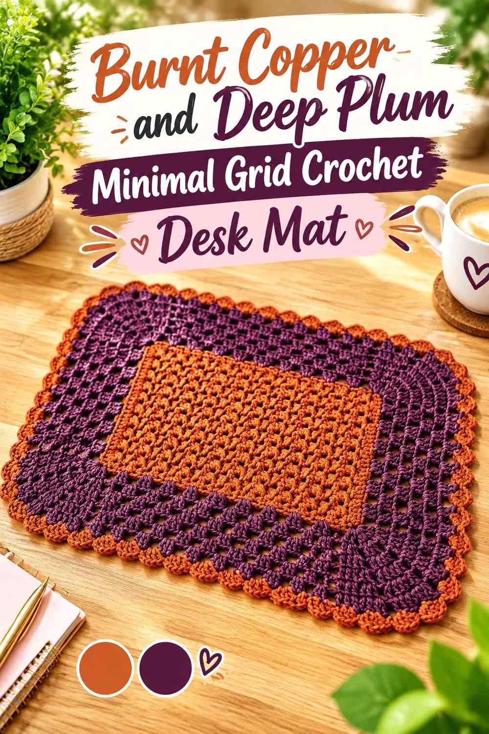
This version reduces the Neo Deco idea to straight intersections. Burnt copper can provide the field while deep plum forms a widely spaced grid, creating structure without the visual density of small checks.
Deep Plum Grid Lines Should Stay Wide Enough on Burnt Copper
A grid works only if its lines remain visible across the working surface. If your burnt copper and deep plum yarns are close in value, increase the visual width of the plum lines rather than adding extra colors immediately.
Larger grid cells also make more sense beneath desk equipment because fewer pattern intersections are hidden.
Burnt Copper Can Fill the Grid Without Competing With Deep Plum
Keep the copper interiors mostly solid. Adding another motif inside every grid cell would compete with the structural linework and make the surface harder to scan.
For a restrained Neo Deco result, let the grid itself provide the decoration.
Creator Credit: Mojina crochet and crafts
6. Deep Plum and Burnt Copper Granny-Rectangle Crochet Desk Mat
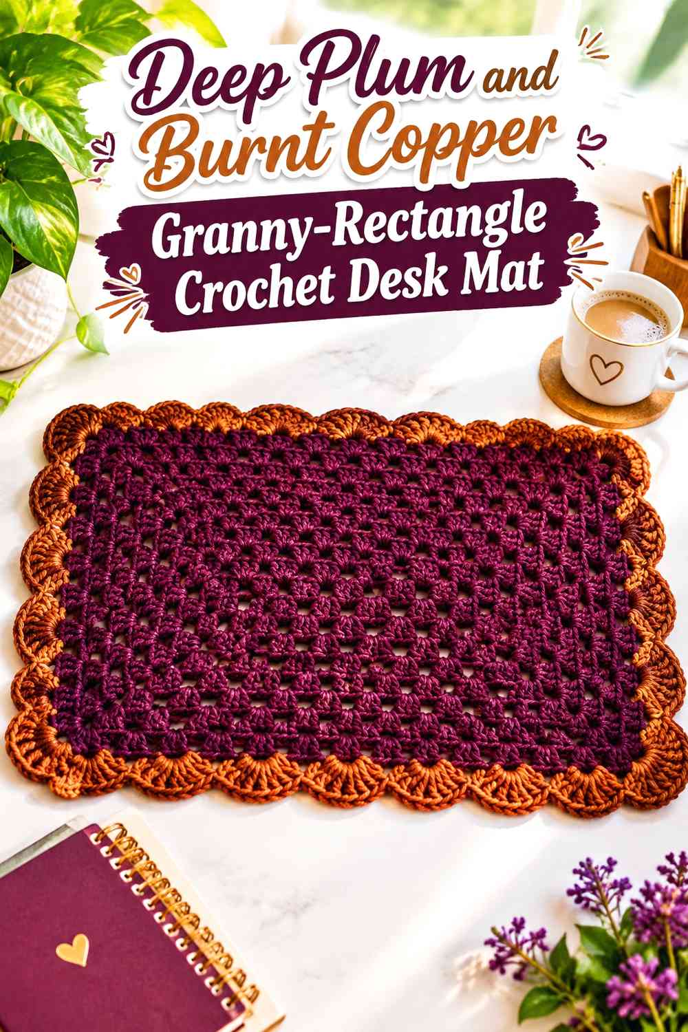
A granny-rectangle construction creates concentric color opportunities. Instead of changing colors constantly, use broad zones of deep plum and burnt copper so the expanding rectangular structure becomes part of the geometry.
Deep Plum Can Anchor the Granny-Rectangle Center
A deep plum center gives the mat a strong visual core. Allow that central section to remain large enough that it still reads beneath smaller desk accessories.
Burnt copper can then surround it in a broader rectangular band rather than appearing as many thin alternating rounds.
Burnt Copper Can Highlight the Expanding Deep Plum Rectangles
Repeat burnt copper at one or two strategic points as the rectangle grows. Wider warm bands make the shape of the construction easier to read and prevent the color scheme from becoming a sequence of narrow stripes.
A final deep plum edge can bring the darker color back to the perimeter.
Creator Credit: Nagu’s Handwork
7. Burnt Copper Field and Deep Plum Corner-Block Crochet Desk Mat
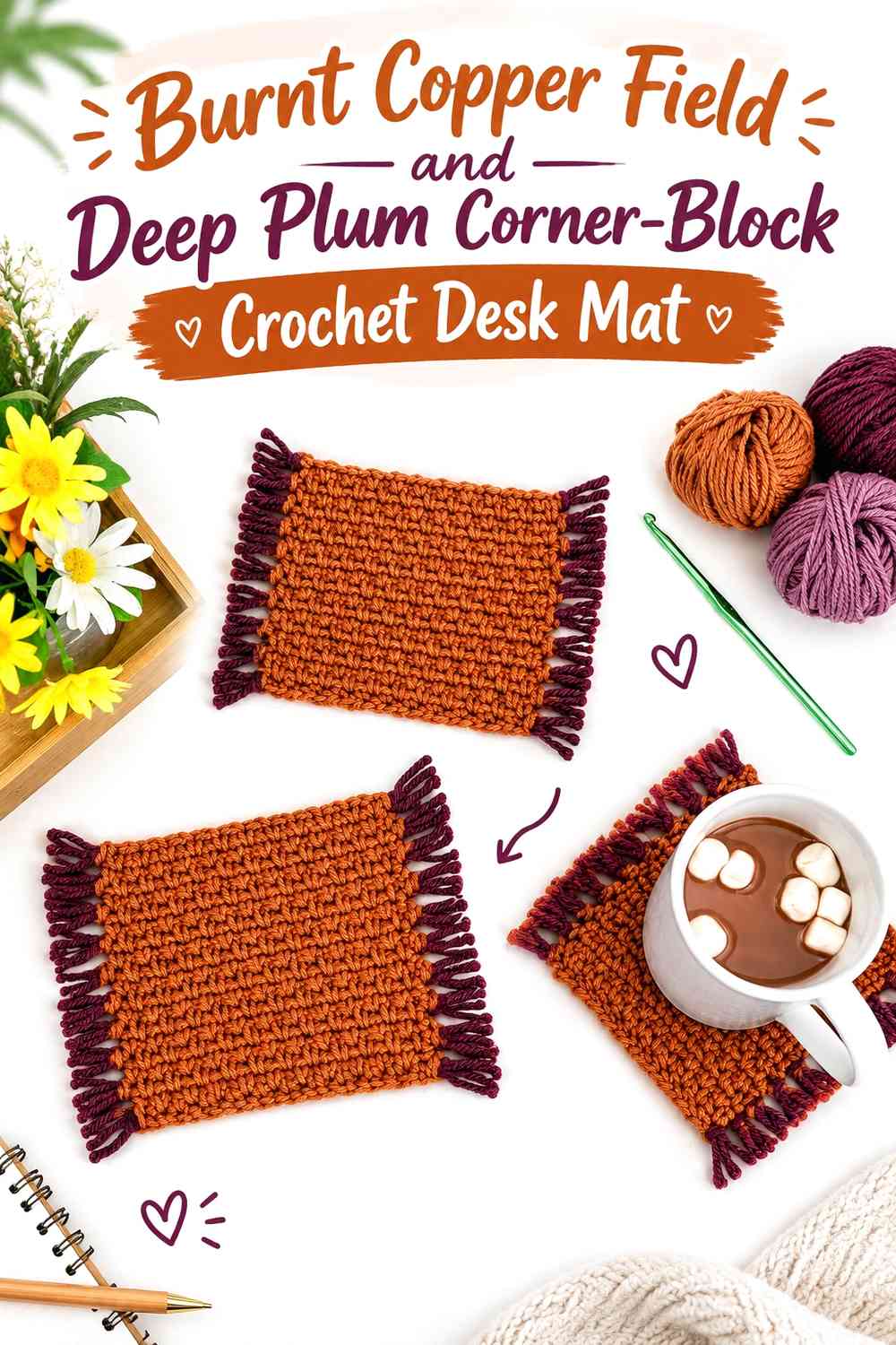
Corner blocks place the geometric detail where it is less likely to disappear beneath central desk equipment. Burnt copper fills most of the surface while deep plum appears as stepped squares or rectangles at the corners.
Deep Plum Corner Blocks Can Define a Burnt Copper Desk Mat
Repeat the same plum shape in each corner for a formal layout, or enlarge the two corners on one side if you want deliberate asymmetry.
Keep some burnt copper between the blocks and the edge so the dark shapes look inset rather than attached randomly to the border.
Burnt Copper Should Connect the Deep Plum Corners
The uninterrupted copper field is what makes four separate dark blocks feel like part of one composition. Avoid crossing the center with too many additional plum stripes.
This is particularly useful when you want a geometric mat that still feels relatively quiet underneath a keyboard and notebook.
Creator Credit: Jo to the World Creations
8. Deep Plum Field and Burnt Copper Side-Rail Crochet Desk Mat
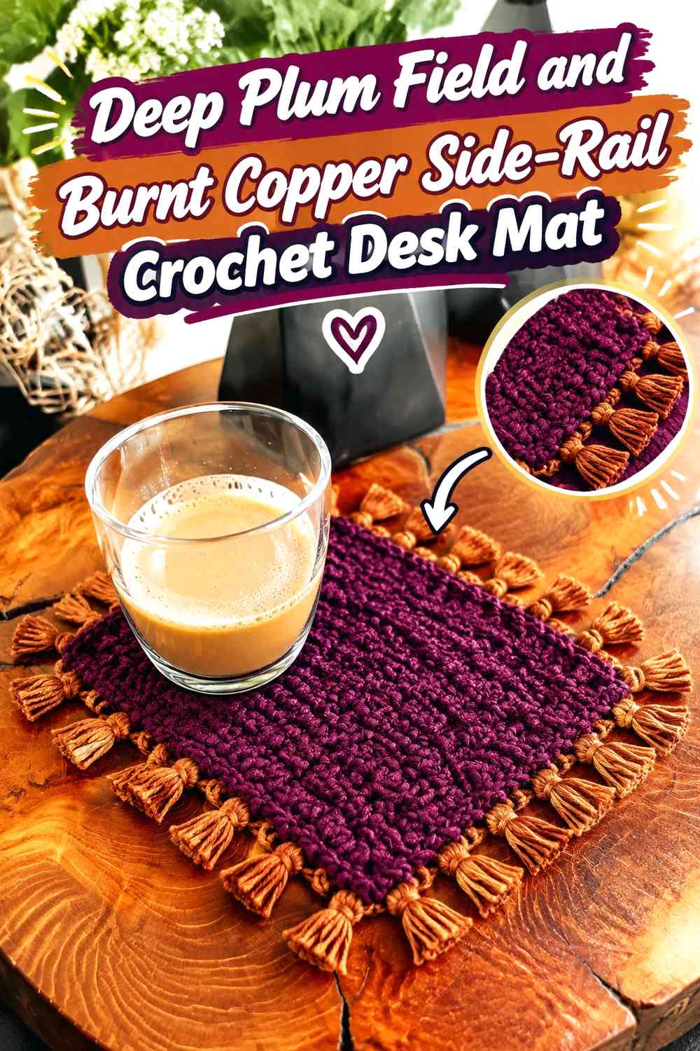
Here deep plum covers most of the rectangular surface, while burnt copper runs vertically or horizontally along the sides as narrow architectural rails. The arrangement is simpler than a full mosaic but still has a strong Deco-inspired linear quality.
Burnt Copper Side Rails Can Lengthen the Deep Plum Desk Mat
Place the copper bands parallel to the longest edge when you want the desk mat to appear visually wider. The eye follows the uninterrupted lines across the surface.
Keep the rails at a deliberate distance from the outer edge so they read as an inset design rather than ordinary border rows.
Deep Plum Gives Burnt Copper Rails a Strong Background
Because the plum field occupies most of the area, the copper rails can stay relatively restrained and still remain noticeable.
If you add small crossbars, repeat them consistently. Too many unrelated breaks will weaken the streamlined effect.
Creator Credit: CJ Design
9. Burnt Copper, Deep Plum, and Cream Deco-Line Crochet Desk Mat
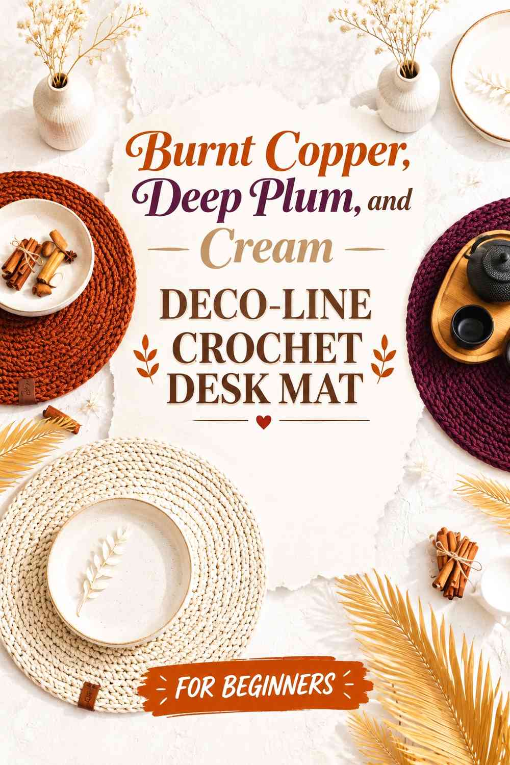
Cream can act as a narrow separator when burnt copper and deep plum need more value contrast. The third shade should not become an equal field; its purpose is to sharpen selected geometry.
Cream Can Separate Burnt Copper From Deep Plum Linework
Place a narrow cream line between major copper and plum sections, particularly around diamonds or nested rectangles. This can help both darker colors remain identifiable when they look closer in value than expected.
Do not outline every shape in cream. Selective use preserves the richer two-color identity.
Deep Plum Should Still Anchor Burnt Copper and Cream Geometry
Keep deep plum as the darkest recurring element around the perimeter or in key central shapes. If cream expands too far, the desk mat will shift toward a light neutral scheme rather than the requested copper-and-plum direction.
Burnt copper can then bridge the pale separator and darker anchor.
Creator Credit: Crochet Designer Simona
10. Burnt Copper, Deep Plum, and Charcoal Asymmetric Crochet Desk Mat
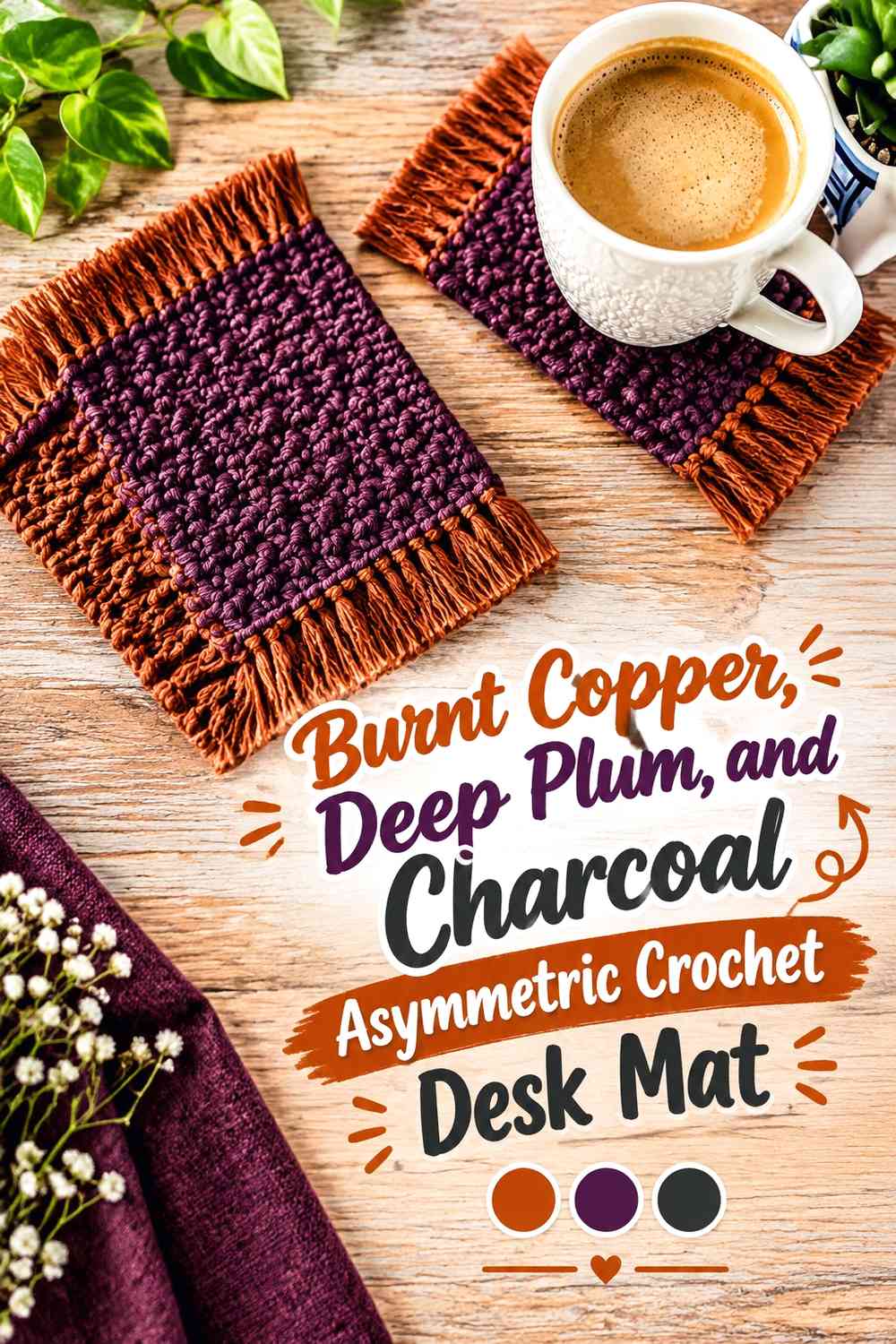
Charcoal gives the final idea an even darker outlining color. Use it sparingly around an asymmetric arrangement of burnt copper and deep plum blocks so the third shade defines geometry rather than competing for surface area.
Charcoal Can Outline Burnt Copper Without Replacing Deep Plum
Reserve charcoal for narrow lines along one corner, a stepped border, or selected block edges. Deep plum should still occupy enough area to remain one of the two principal colors.
If both dark shades receive large equal sections, the plum can lose its visual identity.
Burnt Copper Can Balance a Deep Plum Asymmetric Desk Layout
Place the largest burnt copper area opposite the strongest plum-and-charcoal grouping. That creates visual counterweight across the desk mat without forcing both sides to mirror each other.
Check the layout with your keyboard and other frequently used objects in place before deciding which geometric corner should carry the strongest contrast.
Creator Credit: MJ Carlos
Comparing the Burnt Copper and Deep Plum Neo Deco Directions
For the strongest geometric statement, the stepped mosaic, offset jacquard, 3D cube, and chevron ideas make the color relationship part of the main pattern. These work best when burnt copper and deep plum have enough value separation to keep repeated shapes distinct.
The long-panel, double-frame, side-rail, and corner-block ideas are calmer. They reserve stronger geometry for edges or selected zones, which can be useful when much of the desk mat will sit underneath equipment.
The cream-accented version is useful when the two main yarns need additional visual separation. Charcoal takes the opposite approach by adding an even darker outlining shade. In either case, keep the third color subordinate so burnt copper and deep plum still define the finished mat.
Conclusion
Burnt copper and deep plum can support several very different Neo Deco desk mat directions without changing the core palette. Let burnt copper dominate when you want a warmer surface with dark architectural detailing. Reverse the balance when you want deep plum to create a richer background for copper lines, blocks, or chevrons.
For busy geometry, concentrate on repeated diamonds, cubes, grids, or stepped motifs with a clear color hierarchy. For a calmer workspace, move the strongest contrast into borders, corners, or side rails and leave the central equipment zone simpler.
Before committing to a full-size mat, compare the yarns side by side and test any textured stitch area with the desk objects that will actually sit on it. Use the linked tutorials for their original crochet construction concepts and apply the burnt copper and deep plum arrangements independently.
Frequently Asked Questions
Should burnt copper or deep plum dominate a geometric crochet desk mat?
Either can lead. Burnt copper creates a warmer, lighter-looking field, while deep plum gives the mat a darker base and makes copper geometry more prominent. Choose the dominant color according to which parts of the mat you want to remain visually quiet.
How can I tell if burnt copper and deep plum have enough contrast for small shapes?
Place the yarns beside each other and view them from several feet away. A grayscale photo is another useful check. If the values look very similar, enlarge the geometric motifs, widen the contrasting lines, or introduce a narrow neutral separator.
Where should the busiest burnt copper and deep plum geometry go on a desk mat?
Borders, side panels, front edges, and exposed corners are useful locations because they remain visible around desk equipment. Keeping the center calmer can prevent a keyboard or notebook from hiding most of the motif.
Is a burnt copper and deep plum checkerboard too busy for a desk mat?
Not necessarily, but cell size matters. Larger blocks create a calmer pattern than many small checks. You can also limit the checkerboard to one panel and use a solid color through the main working area.
Can cream be added to a burnt copper and deep plum Neo Deco palette?
Yes. Cream works well as a narrow separator or highlight around important geometric lines. Keep it smaller than the two main shades so it improves contrast without becoming the new dominant color.
Can charcoal work with burnt copper and deep plum?
Yes, particularly for small outlines and strong edge definition. Because charcoal and deep plum are both visually dark, place some burnt copper beside them so their separate roles remain readable.
Should the mouse area use the same geometric texture as the rest of the crochet desk mat?
Not automatically. If your design uses raised or heavily textured stitches, make a small swatch and test it with your actual mouse. You can keep the same burnt copper and deep plum color scheme while using flatter colorwork in the active mouse area.