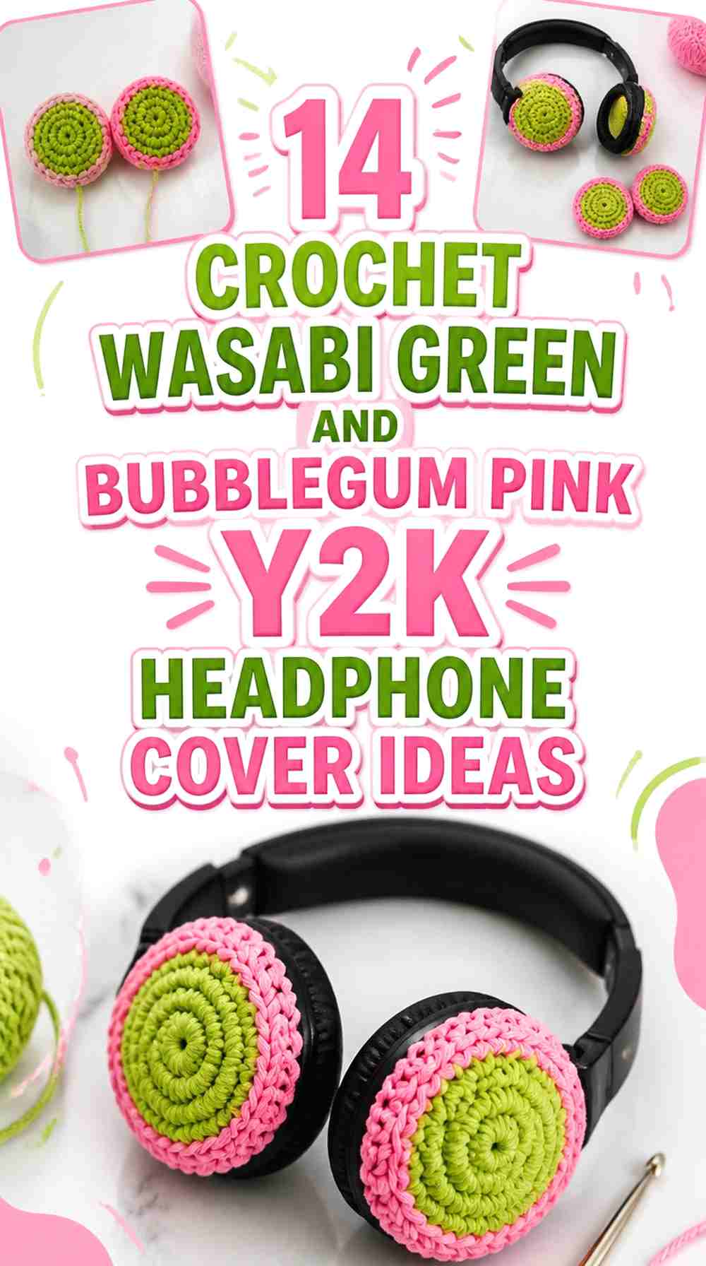

Wasabi Green and Bubblegum Pink create a deliberately playful color clash that suits Y2K-inspired crochet headphone covers especially well. The two shades are strong enough to share the spotlight, but the finished headphones will look more organized when each color has a clear job. Wasabi Green can dominate the ear-cup faces while Bubblegum Pink outlines the edges, or pink can take over the larger surfaces while green appears in checkerboards, flowers, bows, ears, or headband details.
Headphones also make color placement more complicated than a flat crochet accessory. Part of an ear-cup cover wraps around the side, some of the face may be hidden by hardware, and dimensional decorations can sit close to hinges or adjustment points. Plan the colors while the crochet is fitted to the actual headphones rather than judging the cover only while it lies flat.
The tutorials used with these ideas support different headphone-cover constructions and decorative concepts. The Wasabi Green and Bubblegum Pink palettes are independent adaptations, so the credited creators should not be assumed to have used these exact colors.
Quick List
- Wasabi Green Crochet Headphone Covers With Bubblegum Pink Rings
- Bubblegum Pink Crochet Headphone Covers With Wasabi Green Edges
- Wasabi Green and Bubblegum Pink Checkerboard Crochet Headphone Covers
- Bubblegum Pink and Wasabi Green Concentric-Ring Crochet Headphone Covers
- Wasabi Green and Bubblegum Pink Split-Color Crochet Headphone Covers
- Wasabi Green Crochet Headphone Covers With Bubblegum Pink Flowers
- Bubblegum Pink Crochet Headphone Covers With Wasabi Green Bows
- Wasabi Green Crochet Cat-Ear Headphone Cover With Bubblegum Pink Details
- Bubblegum Pink Crochet Bunny-Ear Headphone Cover With Wasabi Green Details
- Wasabi Green and Bubblegum Pink Cow-Spot Crochet Headphone Cover
- Bubblegum Pink Crochet Headband Cover With Wasabi Green Ear Cups
- Wasabi Green Crochet Headphone Covers With Bubblegum Pink Center Discs
- Bubblegum Pink Crochet Headphone Covers With Wasabi Green Side Walls
- Wasabi Green and Bubblegum Pink Opposite-Ear Crochet Headphone Covers
Decide Whether Wasabi Green or Bubblegum Pink Leads the Headphone Covers
Using equal amounts of both colors is not the only way to make the palette feel balanced. On headphones, one dominant ear-cup color plus a smaller contrasting edge can be clearer than constantly alternating shades.
For a greener result, let Wasabi Green occupy the broad visible cup faces and use Bubblegum Pink around borders, appliqués, or headband accents. For a more candy-colored direction, reverse that hierarchy. Because pink and green are already visually distinct, small accent areas can have plenty of impact without dividing every crochet section into two colors.
Keep Wasabi Green and Bubblegum Pink Away From Headphone Hardware
Color placement should follow the headphone shape rather than cover it indiscriminately. Before deciding where Bubblegum Pink edging or Wasabi Green motifs will sit, identify adjustment tracks, swiveling joints, buttons, microphones, cable connections, and openings on the actual device.
A decorative section that looks well positioned on a flat crochet piece may move closer to a hinge once stretched over the ear cup. Fit the first cover, operate the headphones normally, and then decide whether the second cover should repeat the color placement exactly.
1. Wasabi Green Crochet Headphone Covers With Bubblegum Pink Rings
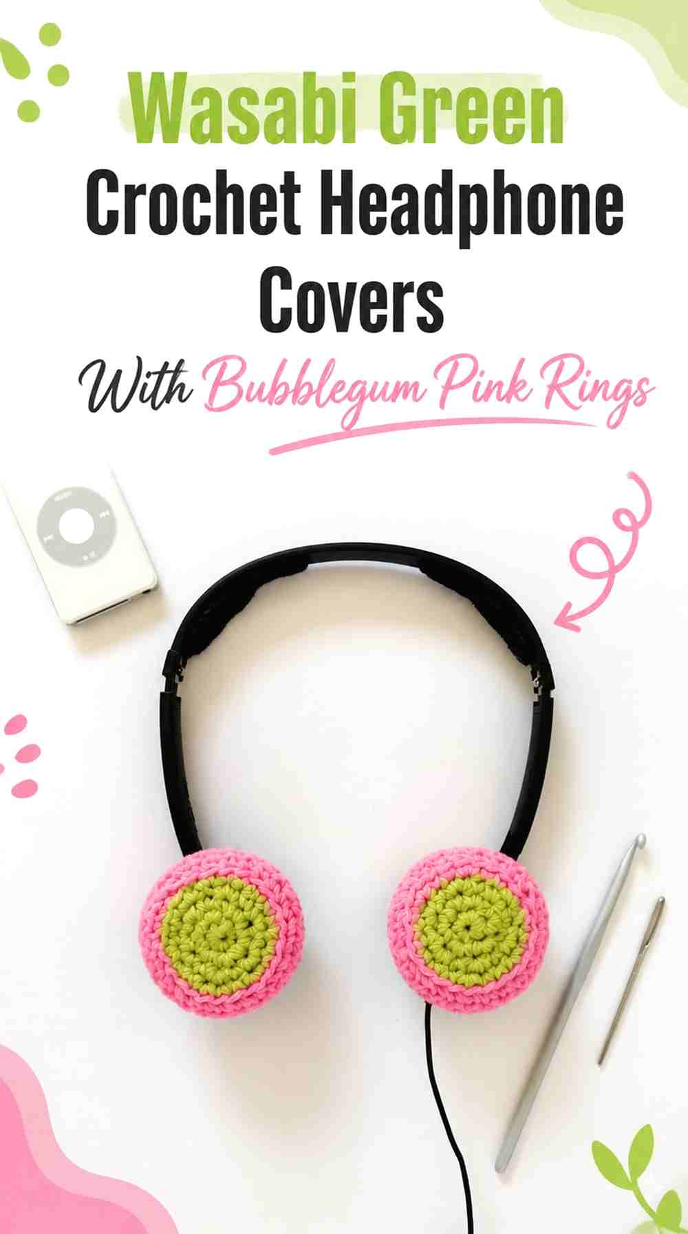
Make Wasabi Green the main visible ear-cup color and frame it with Bubblegum Pink around the perimeter. This layout gives the green the larger surface while pink functions almost like a graphic outline. Round headphone cups are especially suited to this treatment because the color boundary can follow their circular form.
Wasabi Green Should Fill the Main Headphone Cup Face
Keep the broad center Wasabi Green so there is enough uninterrupted crochet for the color to register clearly. If Bubblegum Pink begins too close to the middle, the design can become a multiring pattern rather than a green cover with a contrasting edge.
Compare both covers side by side before finishing the second one. Matching the approximate visible green area matters more than making the color change land at an arbitrary crochet point.
Bubblegum Pink Can Define the Wasabi Green Outer Edge
Move into Bubblegum Pink where the cover begins visually turning toward the side of the ear cup. This lets the pink emphasize the shape while keeping green dominant from the side view.
Check the fitted cover before expanding the pink section. A border that appears narrow when flat can look much wider after it wraps around the headphone housing.
Creator Credit: byGoldenberry
2. Bubblegum Pink Crochet Headphone Covers With Wasabi Green Edges

Reverse the first idea by filling the main ear-cup faces with Bubblegum Pink and using Wasabi Green only around the retaining edges. This is a useful option when you want the headphones to read as primarily pink while keeping the green highly visible from angled views.
Bubblegum Pink Needs Enough Uninterrupted Headphone Surface
Let Bubblegum Pink occupy most of each visible face rather than breaking it with frequent green bands. A broad pink center gives the pair a strong focal color and makes a relatively narrow Wasabi Green border more noticeable.
On oval headphones, follow the actual oval instead of forcing the green edge into a visually circular arrangement.
Wasabi Green Should Follow the Bubblegum Pink Ear-Cup Shape
Use Wasabi Green where the crochet begins curving around the perimeter. The color can help distinguish the front face from the portion that grips the sides.
Keep the green away from controls or connection points that need to remain exposed. Color symmetry is less important than maintaining usable hardware.
Creator Credit: theshadepcks
3. Wasabi Green and Bubblegum Pink Checkerboard Crochet Headphone Covers
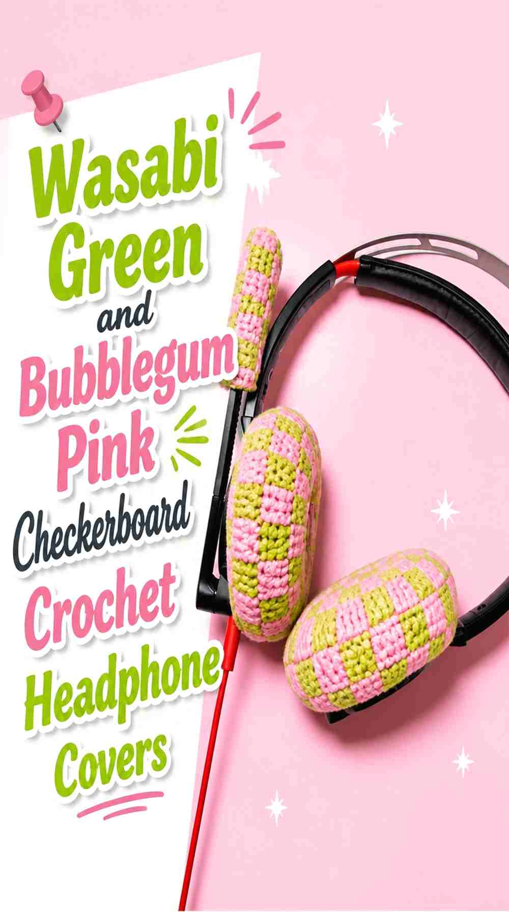
A checkerboard treatment pushes the palette further toward a graphic Y2K direction. Instead of letting either shade cover the whole ear cup, alternate larger Wasabi Green and Bubblegum Pink sections across the visible area. Keep the blocks large enough to remain recognizable on the relatively small crochet surface.
Wasabi Green and Bubblegum Pink Checks Need Enough Visual Space
Tiny checks can quickly become difficult to read once the cover stretches around the ear cup. Use fewer, clearer color areas instead of squeezing a dense checkerboard onto a compact headset.
Before repeating the design on the second side, fit the first cover. Stretch can change the apparent width of a color block.
Bubblegum Pink and Wasabi Green Should Align Intentionally Across the Pair
Decide whether the second cover should mirror the first or repeat the same checker placement. Mirroring can create a more symmetrical pair when the headphones are viewed from the front.
Whichever approach you choose, keep the color logic consistent rather than changing orientation accidentally between cups.
Creator Credit: Crafter Mai
4. Bubblegum Pink and Wasabi Green Concentric-Ring Crochet Headphone Covers
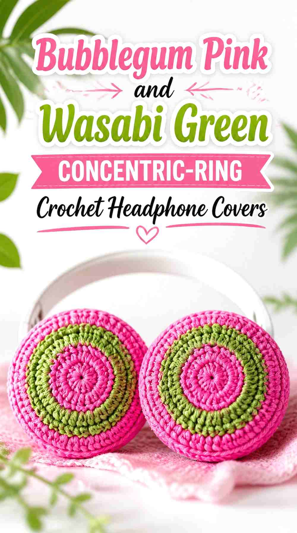
Use Bubblegum Pink in the center, surround it with Wasabi Green, and repeat the relationship only if the cup has enough visible space. Concentric color works best when the rings follow the headphone shape instead of becoming numerous narrow stripes.
Bubblegum Pink Makes a Clear Center Inside Wasabi Green Rings
Give the Bubblegum Pink center enough area to remain identifiable once the cover is installed. A center that is too small can disappear visually against the stronger surrounding green.
Check what portion of the center remains visible when the headphones are worn or displayed. Hardware and cushion shape may conceal more crochet than expected.
Wasabi Green Rings Should Not Crowd the Bubblegum Pink Center
Use green to create separation and framing rather than filling every remaining round with alternating color. Fewer, broader areas usually show the circular layout more clearly.
If the retaining section must stretch substantially, keeping it one solid color can also make the ring pattern look cleaner.
Creator Credit: AbbysCROCHET
5. Wasabi Green and Bubblegum Pink Split-Color Crochet Headphone Covers
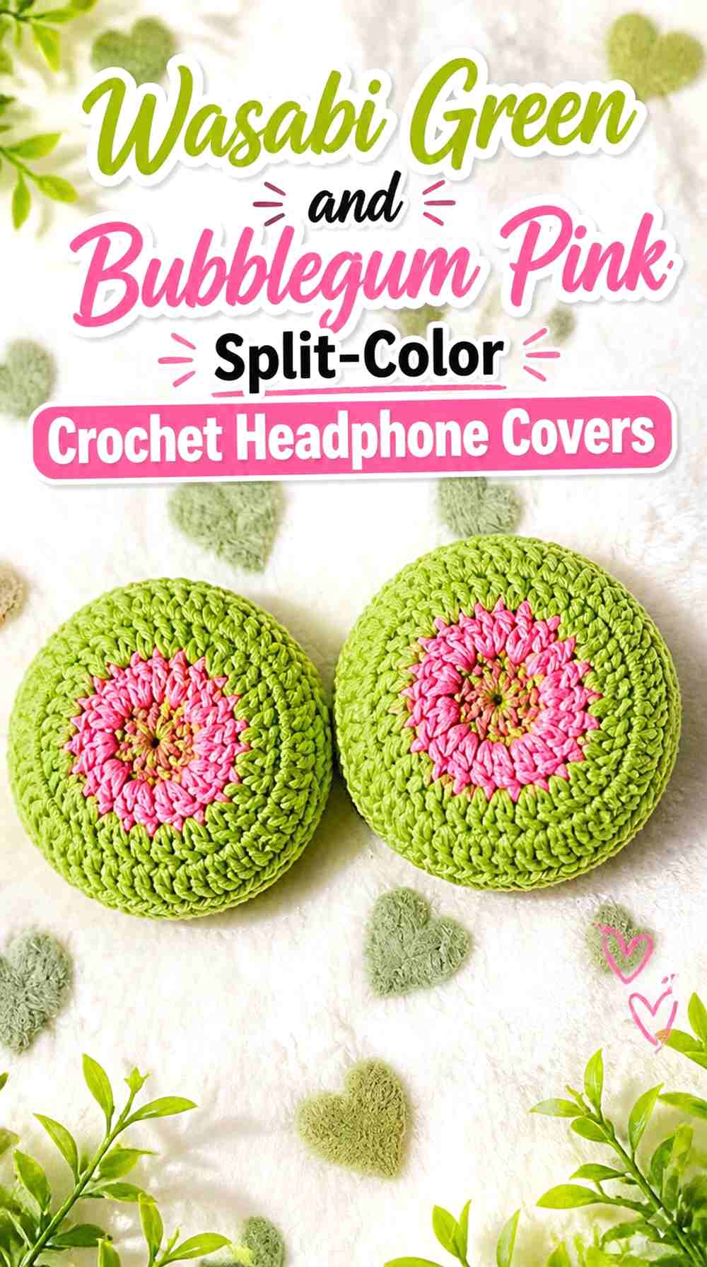
Divide each ear-cup cover into one Wasabi Green side and one Bubblegum Pink side. The large blocks let both colors carry equal visual importance without requiring a busy stitch-by-stitch alternation.
Wasabi Green and Bubblegum Pink Need a Clear Split Direction
Choose whether the division will run vertically, horizontally, or diagonally across the visible cup. A vertical split can emphasize the height of an oval cover, while another orientation changes which color is most visible from the front.
Plan the direction before completing the second cover so the pair does not look unintentionally mismatched.
Bubblegum Pink Can Mirror Wasabi Green Across Both Ear Cups
For a mirrored arrangement, place Bubblegum Pink toward the outer front edge on one cup and reverse it on the other. This creates a deliberate pair rather than two identical disks.
If your headphone controls make perfect mirroring impractical, preserve the visible color balance while adjusting the hidden edge around the hardware.
Creator Credit: Cassiekoy Crochet
6. Wasabi Green Crochet Headphone Covers With Bubblegum Pink Flowers
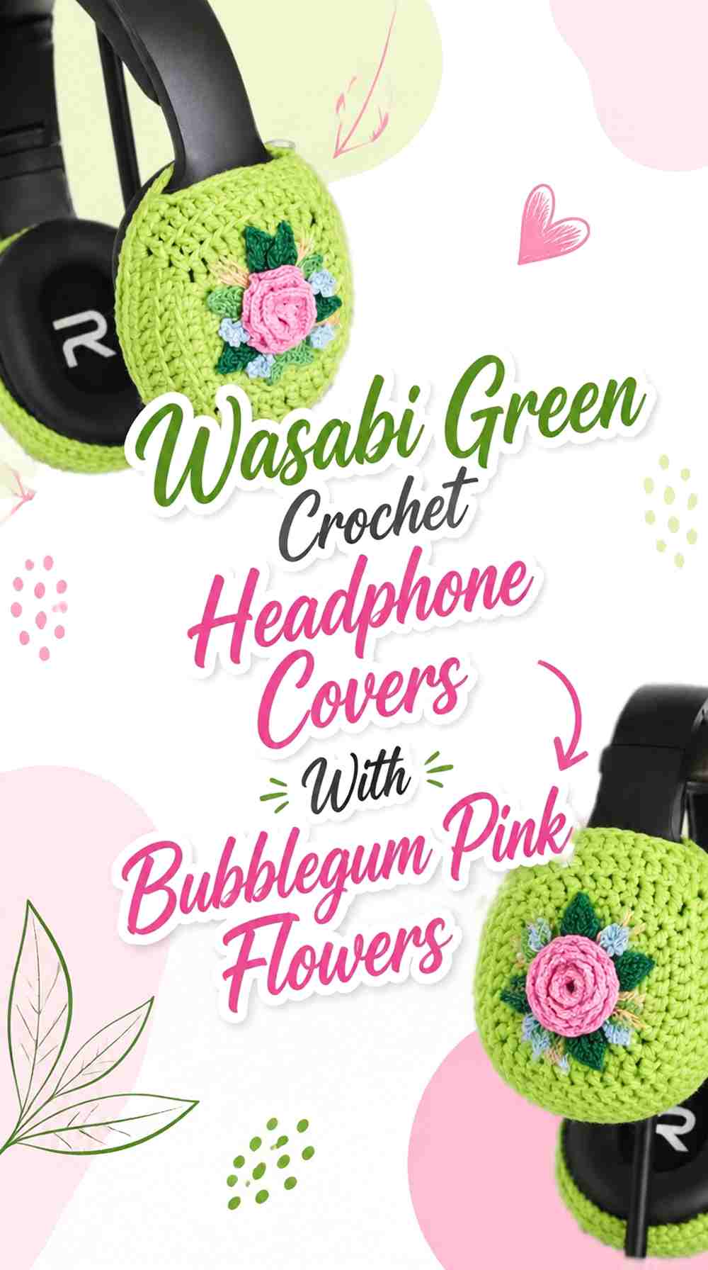
Use solid Wasabi Green as the base and add Bubblegum Pink flowers to selected visible areas. The strong background gives small pink motifs enough separation, while the floral details add Y2K decoration without requiring the complete cover to change color repeatedly.
Bubblegum Pink Flowers Need Clear Space on Wasabi Green
Place flowers where their full shapes can be seen rather than crowding them beside hinges or underneath the headband connection. One larger visible motif can be more effective than several small ones competing for limited cup space.
If the flower has a center detail, Wasabi Green can be repeated there to reconnect the appliqué with the base.
Wasabi Green Should Remain Visible Around Bubblegum Pink Motifs
Leave enough green around each flower to create a distinct background. Covering most of the surface with pink appliqués would reverse the intended hierarchy and make the underlying green harder to see.
Also check the motif profile from the side. Dimensional crochet should not interfere with swiveling or folding parts.
Creator Credit: Woodland Stitchcraft
7. Bubblegum Pink Crochet Headphone Covers With Wasabi Green Bows
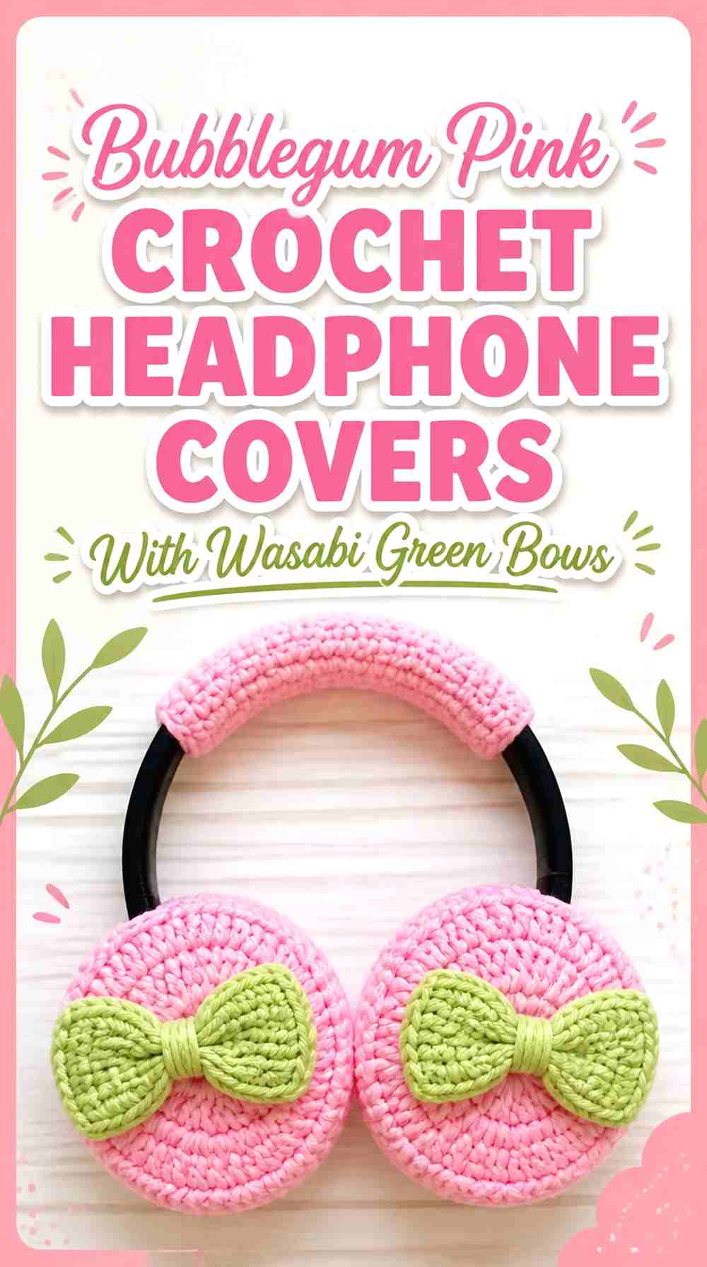
Make Bubblegum Pink the broad ear-cup color and use Wasabi Green for one controlled bow accent on each side or along the headband. This gives the green a clear decorative role without requiring multiple small color changes.
Wasabi Green Bows Need a Stable Bubblegum Pink Background
A solid Bubblegum Pink surface gives the bow enough contrast to remain readable. Avoid placing it over a busy checkerboard or striped section, where its outline could become less distinct.
Use similar bow placement on both sides if you want the headphones to look coordinated from either profile.
Bubblegum Pink Should Stay Visible Around Wasabi Green Bows
Do not scale the bows so large that they obscure most of the pink cover. The color relationship works because Bubblegum Pink remains the field and Wasabi Green acts as the accent.
Check the cup’s movement before settling on bow placement. A decorative element positioned too close to a swivel or hinge can become inconvenient even when its colors look balanced.
Creator Credit: The Highland Stitch
8. Wasabi Green Crochet Cat-Ear Headphone Cover With Bubblegum Pink Details

A cat-ear cover gives the color scheme more vertical space because the crochet extends above the standard headphone band. Use Wasabi Green for the main band and outer ears, then bring Bubblegum Pink into the inner ears or a small bow.
Bubblegum Pink Inner Ears Break Up the Wasabi Green Cat-Ear Shape
Reserve pink for the inner sections so each ear has a clear two-color structure. Keeping the outer ear Wasabi Green connects it with the band cover and prevents the decoration from looking detached.
If you add another Bubblegum Pink detail, keep it smaller than the ear interiors so the color hierarchy remains easy to understand.
Wasabi Green Should Connect the Cat Ears to the Headphone Band
Continue Wasabi Green through the band area rather than using the color only on the ears. That creates a visual base for the dimensional pieces and makes the pink look intentionally nested inside the larger green structure.
Make sure the crochet band still allows any adjustment mechanism your headphones require.
Creator Credit: My Rainbow Crochet
9. Bubblegum Pink Crochet Bunny-Ear Headphone Cover With Wasabi Green Details

Make Bubblegum Pink the dominant color across the headphone band and bunny ears, then use Wasabi Green for inner-ear sections, small ties, or other controlled details. The large pink ears provide enough surface for green accents to remain distinct.
Wasabi Green Inner Ears Give Bubblegum Pink Better Separation
Use green inside each pink ear rather than scattering several unrelated green spots over the band. The repeated inner-ear placement creates a clear pair and keeps the strongest contrast above the headphones.
If the ears are long, evaluate the green insert in proportion to the complete ear rather than judging it before assembly.
Bubblegum Pink Should Remain the Main Bunny-Ear Color
Keep most of the outer ear and the connecting cover Bubblegum Pink if you want the accessory to read primarily as pink. Too much green in the center can make the ear look evenly divided rather than pink with a contrasting inset.
Repeating a small amount of green at the ear cups can connect the upper decoration with the lower headphones.
Creator Credit: Yarnific
10. Wasabi Green and Bubblegum Pink Cow-Spot Crochet Headphone Cover

Use Wasabi Green as the main headset-cover color and replace a conventional neutral spot treatment with Bubblegum Pink. The irregular shapes offer a different way to mix the palette because the pink areas do not need to follow rings, stripes, or straight divisions.
Bubblegum Pink Spots Need Uneven but Controlled Wasabi Green Placement
Vary the Bubblegum Pink spot shapes while leaving enough Wasabi Green between them for the base color to remain dominant. Several spots touching one another can turn into an accidental large pink block.
Compare the two sides rather than copying every spot exactly. Similar overall color coverage can coordinate the pair without requiring identical placement.
Wasabi Green Should Anchor the Bubblegum Pink Animal Details
Use green consistently through the larger cover or band sections. That stable background gives the irregular pink shapes a clear visual role.
If additional dimensional animal features are included, decide whether they belong to the green base or pink accent family before attaching them rather than introducing random color changes.
Creator Credit: NhuHugsU Crochets
11. Bubblegum Pink Crochet Headband Cover With Wasabi Green Ear Cups

Move Bubblegum Pink away from the ear cups and place it mainly across the upper headphone band. Make the cup covers Wasabi Green so the palette forms a clear top-versus-side division.
Bubblegum Pink Can Make the Headband a Separate Wasabi Green Accent Zone
Keeping the headband solid pink creates a distinct horizontal bridge between the two Wasabi Green cups. This works especially well if you want the hardware silhouette to guide the color layout.
Avoid extending pink far down the sides unless the transition follows a clear structural point on the headphones.
Wasabi Green Ear Cups Need a Small Bubblegum Pink Connection
If the green cups feel disconnected from the pink band, repeat Bubblegum Pink as a narrow cup edge or tiny central detail. The repeat can be small because the headband already carries a substantial amount of pink.
Keep any added edge away from sliders, hinges, and exposed controls.
Creator Credit: Patronarte
12. Wasabi Green Crochet Headphone Covers With Bubblegum Pink Center Discs
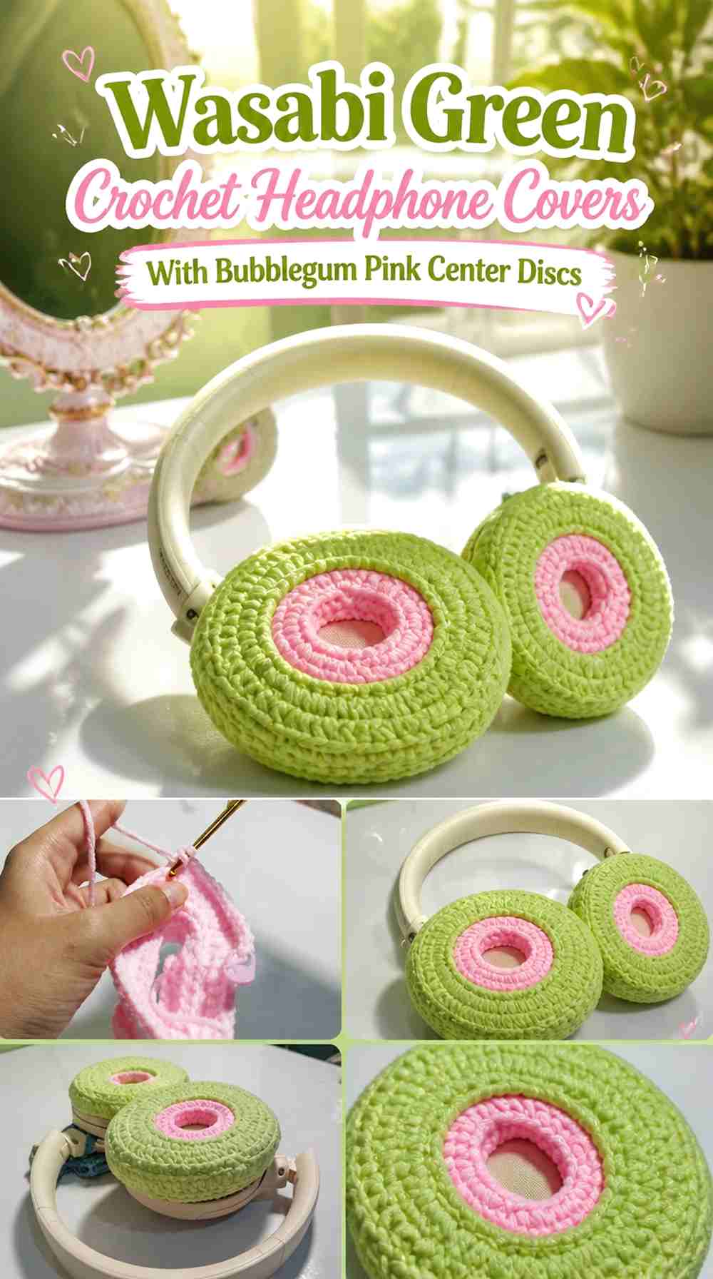
Place a Bubblegum Pink disk in the middle of each Wasabi Green cover, creating a graphic target-like contrast without building multiple rings. This layout is particularly useful when you want the pair to remain mostly green but still show a clear pink element from the side.
Bubblegum Pink Center Discs Need Matching Wasabi Green Margins
Keep a visible green area around each center so the pink does not expand into a nearly full-face cover. The surrounding Wasabi Green should function as a real frame rather than a thin outline.
Fit the first cover before choosing the final apparent size of the pink center, since stretching can make the disk appear larger.
Wasabi Green Can Continue Around the Bubblegum Pink Side Wall
Carry green from the outer face around the cup perimeter. This creates a clear distinction between the pink center feature and the functional section that holds the cover in place.
It also keeps the strongest color change away from complicated edge shaping.
Creator Credit: Butterflovint
13. Bubblegum Pink Crochet Headphone Covers With Wasabi Green Side Walls

Use Bubblegum Pink only on the visible front of the ear cup and change to Wasabi Green as the cover turns around the sides. This color placement follows the three-dimensional shape of the headphones instead of dividing the flat face into a pattern.
Bubblegum Pink Should Stay on the Most Visible Headphone Face
Keep the main front pink so both cups look strongly coordinated when viewed from the sides. A clean face also gives you a useful reference for matching the second cover.
Avoid letting the green transition creep irregularly across the front unless an opening or control makes an adjustment necessary.
Wasabi Green Can Visually Separate the Bubblegum Pink Face From the Hardware
Moving the darker or stronger contrasting green onto the sides can make the pink center appear more contained. Check the transition while the cover is installed, because only part of the side wall may be visible.
If Wasabi Green disappears completely behind the cup, move the color boundary slightly forward rather than making the entire edge larger.
Creator Credit: 9amStudio
14. Wasabi Green and Bubblegum Pink Opposite-Ear Crochet Headphone Covers

Instead of dividing each individual cover, make one ear cup predominantly Wasabi Green and the other predominantly Bubblegum Pink. This is the boldest asymmetrical option because both colors receive a full surface rather than sharing every small section.
Wasabi Green and Bubblegum Pink Need One Repeated Detail Across Both Sides
Give the Wasabi Green cup a small Bubblegum Pink edge or motif, then reverse those colors on the pink cup. That repeated relationship keeps the mismatched pair from looking like two unrelated covers.
A border, small center mark, or simple appliqué can provide enough connection without reducing the asymmetrical effect.
Bubblegum Pink and Wasabi Green Should Keep Matching Cover Shapes
When the colors are intentionally different, consistent shape becomes more important. Check that both fitted covers sit at a similar depth and expose comparable areas of the headphone hardware.
If one side needs a different opening for controls, adjust the hidden functional area while preserving similar visible proportions.
Creator Credit: caroleena’s closet
Comparing the Wasabi Green and Bubblegum Pink Y2K Headphone Cover Ideas
For a clean two-color look, Ideas 1, 2, 12, and 13 use broad color fields with controlled contrasting edges or centers. They keep the headphone shape easy to read while still making both colors visible.
For stronger graphic styling, Ideas 3, 4, 5, and 14 use checkerboards, rings, split blocks, or deliberately mismatched ear cups. These layouts make the Wasabi Green and Bubblegum Pink relationship the main visual feature.
Ideas 6 through 10 lean further into decorative Y2K styling through flowers, bows, cat ears, bunny ears, and irregular spots. In these versions, keeping one color dominant behind the dimensional details can prevent the small headphone surface from becoming visually crowded.
Idea 11 shifts attention away from the cups by making the headband itself a major Bubblegum Pink color zone, which is useful when you want the entire headphone silhouette involved in the palette.
Conclusion
Wasabi Green and Bubblegum Pink can take a Y2K crochet headphone cover in several distinct directions without adding more colors. For a cleaner graphic result, choose a solid ear-cup face with a contrasting edge or center. Checkerboards, rings, split colors, and opposite-color cups make the palette more prominent, while flowers, bows, cat ears, bunny ears, and spots bring the playful details forward.
The most useful choice depends on the shape of your headphones as much as the palette. Round, oval, compact, and adjustable headphones give the crochet different amounts of visible space. Decide where the main color should appear after checking the fitted cover, then use the original tutorial for its exact construction while treating the Wasabi Green and Bubblegum Pink distribution as your own color adaptation.
Frequently Asked Questions
Should Wasabi Green or Bubblegum Pink dominate Y2K crochet headphone covers?
Either can dominate. Wasabi Green creates a sharper green-led base for pink details, while Bubblegum Pink creates a brighter pink field where smaller green accents become easy to notice.
Choose the dominant shade for the largest visible area, then use the second color in borders, motifs, rings, ears, bows, or headband details.
How can I make Wasabi Green and Bubblegum Pink headphone covers look less busy?
Reduce the number of color changes. A solid Wasabi Green cup with one Bubblegum Pink edge can look much more organized than alternating the colors repeatedly across every section.
You can also concentrate the contrast in one feature, such as the center disk, outer edge, flower, bow, or headband.
Do Wasabi Green and Bubblegum Pink checkerboards work on small headphones?
They can, but larger color blocks are easier to read on a small crochet surface. Very tiny checks may become harder to distinguish after the fabric stretches around the ear cup.
Make a small color sample and compare its scale with the visible portion of the actual headphone cover before committing to the pair.
Should Bubblegum Pink and Wasabi Green cover the headphone controls?
No. Treat buttons, ports, adjustment tracks, microphones, swivels, and hinges as functional areas that may need to stay clear.
Fit the crochet to the specific headphones and adjust decorative color placement around the hardware rather than forcing perfect symmetry.
How can I use Bubblegum Pink flowers on Wasabi Green headphone covers without overcrowding them?
Give each flower enough surrounding green to remain identifiable. One or two clearly placed Bubblegum Pink motifs can create more useful contrast than filling every available space with small flowers.
Keep dimensional motifs away from moving headphone parts.
Can one headphone cover be Wasabi Green and the other Bubblegum Pink?
Yes. An opposite-ear scheme can make the pair deliberately asymmetrical. Repeat a small reversed detail—pink on the green side and green on the pink side—to connect the two covers visually.
What should I preserve if I substitute another Wasabi Green or Bubblegum Pink shade?
Preserve the contrast relationship and color role. If Wasabi Green is meant to be the stronger green base, choose another green that remains clearly distinct from the pink. If Bubblegum Pink is the bright focal accent, choose a pink that does not become so muted or similar in value that the small motifs disappear against the green.
Compare the substitute yarns side by side and, when possible, in a small crochet sample before making both covers.