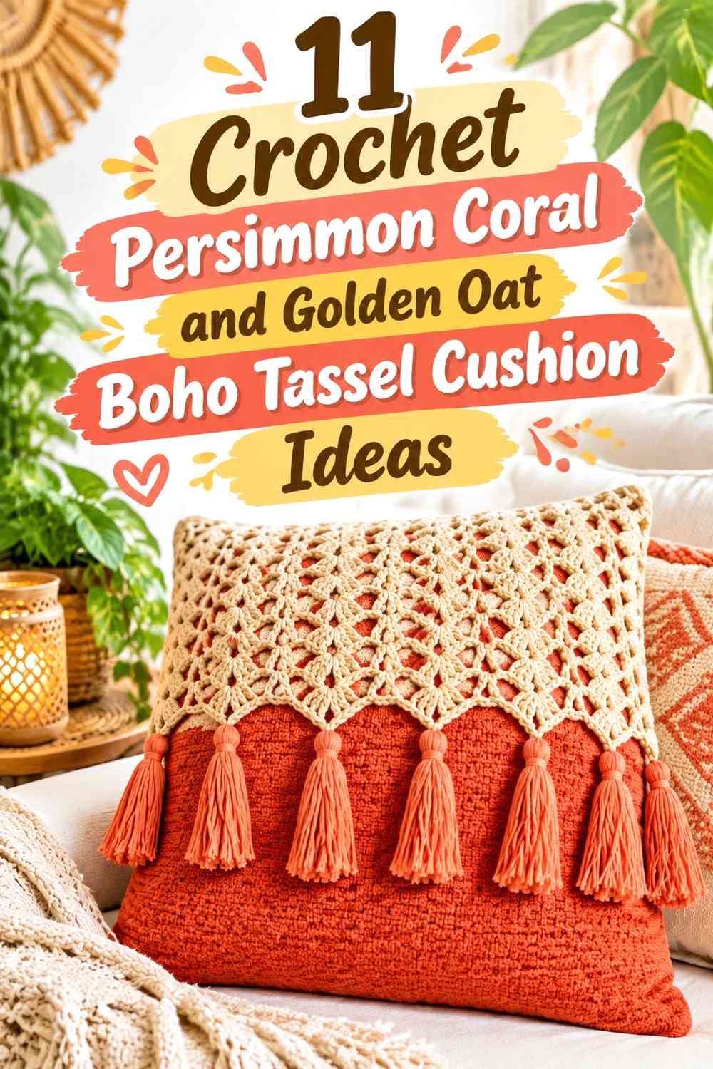

Persimmon coral and golden oat give a crochet tassel cushion a warm boho palette without relying on a long list of earthy colors. Persimmon coral can supply the stronger focal areas through stripes, motifs, bobbles, or tassels, while golden oat creates enough quieter surface for crochet texture to remain visible.
Tassels matter to the color balance because they sit outside the main cushion face. Four persimmon-coral corner tassels can make an otherwise golden-oat cushion feel much warmer, while golden-oat tassels can soften a coral-heavy front. Planning the cushion face and tassels as one composition produces a more deliberate result than choosing the tassel color at the end.
The tutorials supporting these ideas include complete boho tassel cushions, textured pillow covers, granny-square cushions, mosaic pillows, and other cushion constructions that can carry this palette. The persimmon-coral-and-golden-oat color schemes below are independent editorial adaptations unless a creator specifically demonstrates them.
Quick List
- Golden Oat Crochet Cushion With Persimmon Coral Boho Tassels
- Persimmon Coral Crochet Cushion With Golden Oat Boho Tassels
- Persimmon Coral and Golden Oat Striped Crochet Boho Tassel Cushion
- Golden Oat Bobble Crochet Cushion With Persimmon Coral Diamond Details
- Persimmon Coral Basket-Weave Crochet Cushion With Golden Oat Tassels
- Persimmon Coral and Golden Oat Granny Square Crochet Tassel Cushion
- Golden Oat and Persimmon Coral Mosaic Crochet Boho Tassel Cushion
- Persimmon Coral Openwork Crochet Cushion With Golden Oat Tassel Fringe
- Persimmon Coral Mandala Crochet Cushion With a Golden Oat Frame
- Golden Oat Textured Crochet Cushion With a Persimmon Coral Center Band
- Two-Color Persimmon Coral and Golden Oat Crochet Boho Tassel Cushion
Decide Whether Persimmon Coral or Golden Oat Should Dominate the Cushion
Persimmon coral has more visual intensity, so it does not need to cover half the cushion to feel important. On a golden-oat background, coral stripes, bobbles, tassels, or a central motif can become the strongest feature even when oat occupies most of the front.
A persimmon-coral-dominant cushion creates a warmer, deeper result. Golden oat can then function as a light break around texture, along edges, or at the corners. This works especially well when the crochet surface is raised or heavily patterned because the lighter shade can stop the stronger coral from flattening every detail into one color block.
Use Persimmon Coral and Golden Oat Tassels as Part of the Palette
Corner tassels can repeat the accent color without requiring more colorwork across the cushion face. If the front is mostly golden oat, persimmon-coral tassels can visually pull the warm accent toward all four corners. If the face already contains a lot of coral, golden-oat tassels give the perimeter a lighter finish.
Mixed tassels are another option, but keep the color order deliberate. A tassel containing both shades can connect a striped or mosaic front to the corners, while single-color tassels usually work better when the face already contains complicated color changes.
Check Persimmon Coral and Golden Oat Against Crochet Texture
Different hues can still be close in lightness. If your golden oat is deep and your persimmon coral is softened, some bobbles or geometric motifs may not separate as strongly as expected.
Make a small textured sample or compare the yarns in grayscale before committing to the complete front. When contrast is low, place the colors in larger blocks or reserve one shade for tassels and borders rather than relying on tiny alternating details.
1. Golden Oat Crochet Cushion With Persimmon Coral Boho Tassels
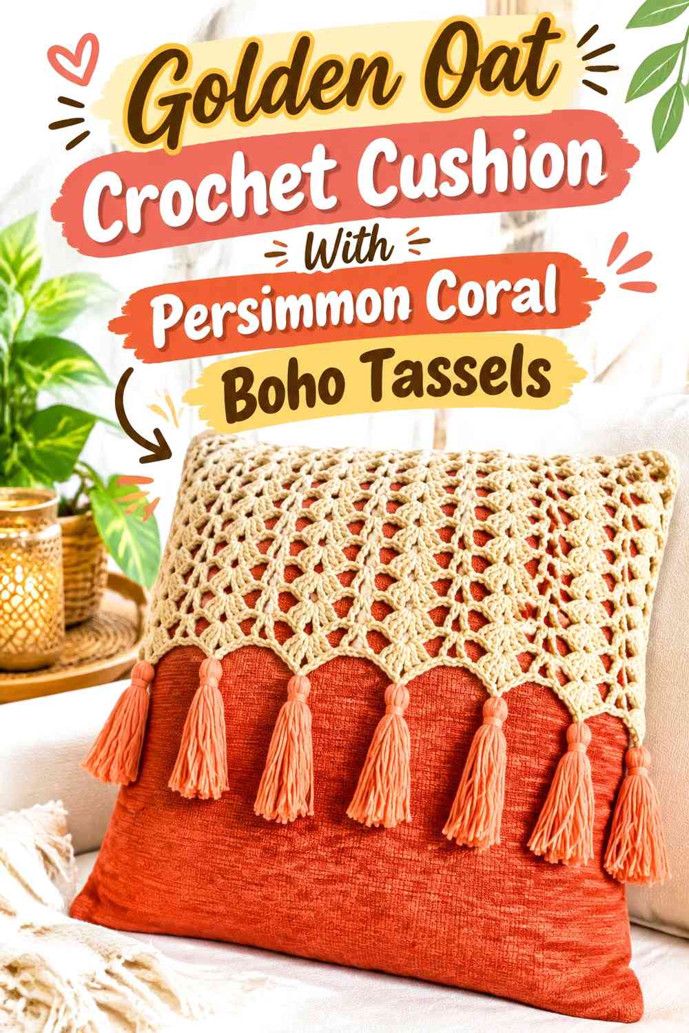
Use golden oat across most of the cushion face and reserve persimmon coral for the corner tassels and one restrained front detail. This gives the crochet texture plenty of uninterrupted light space while making the tassels an intentional part of the palette rather than an afterthought.
Golden Oat Should Carry the Main Cushion Surface
Keep the oat field broad if the front uses openwork, raised stitches, or another noticeable texture. Repeated coral changes across every row can distract from that stitch definition.
A mostly golden-oat face also gives each persimmon-coral corner tassel a clear background when the cushion is viewed from across the room.
Persimmon Coral Tassels Can Frame Golden Oat From All Four Corners
Using coral consistently at each corner creates a visual frame without requiring a dark border around the cushion. Keep the tassels similar in apparent fullness so one corner does not attract more attention than the others.
If you repeat coral on the face, use one controlled stripe or small central detail rather than several competing accents.
Creator Credit: Mitsu
2. Persimmon Coral Crochet Cushion With Golden Oat Boho Tassels
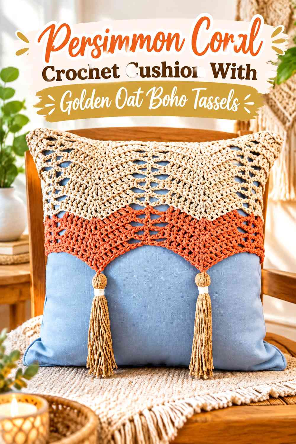
Reverse the first arrangement by using persimmon coral as the main surface and golden oat at the corners. The cushion becomes more color-forward, while the lighter tassels keep the edge from feeling as visually heavy as the center.
Persimmon Coral Works Best as One Broad Cushion Field
Allow the stronger color to cover enough uninterrupted surface for the cushion shape to remain clear. If the fabric contains pronounced crochet texture, coral can create natural light-and-shadow variation without requiring several additional color changes.
Use golden oat where separation is needed rather than breaking the coral field into many small bands.
Golden Oat Tassels Lighten a Persimmon Coral Cushion Edge
Pale tassels introduce contrast exactly where the cushion meets the surrounding sofa, chair, or bedding. They can soften the darker coral perimeter while keeping the front simple.
A narrow golden-oat edge can connect the tassels to the cushion if four pale corners otherwise feel disconnected.
Creator Credit: Secret Crochet Corner
3. Persimmon Coral and Golden Oat Striped Crochet Boho Tassel Cushion
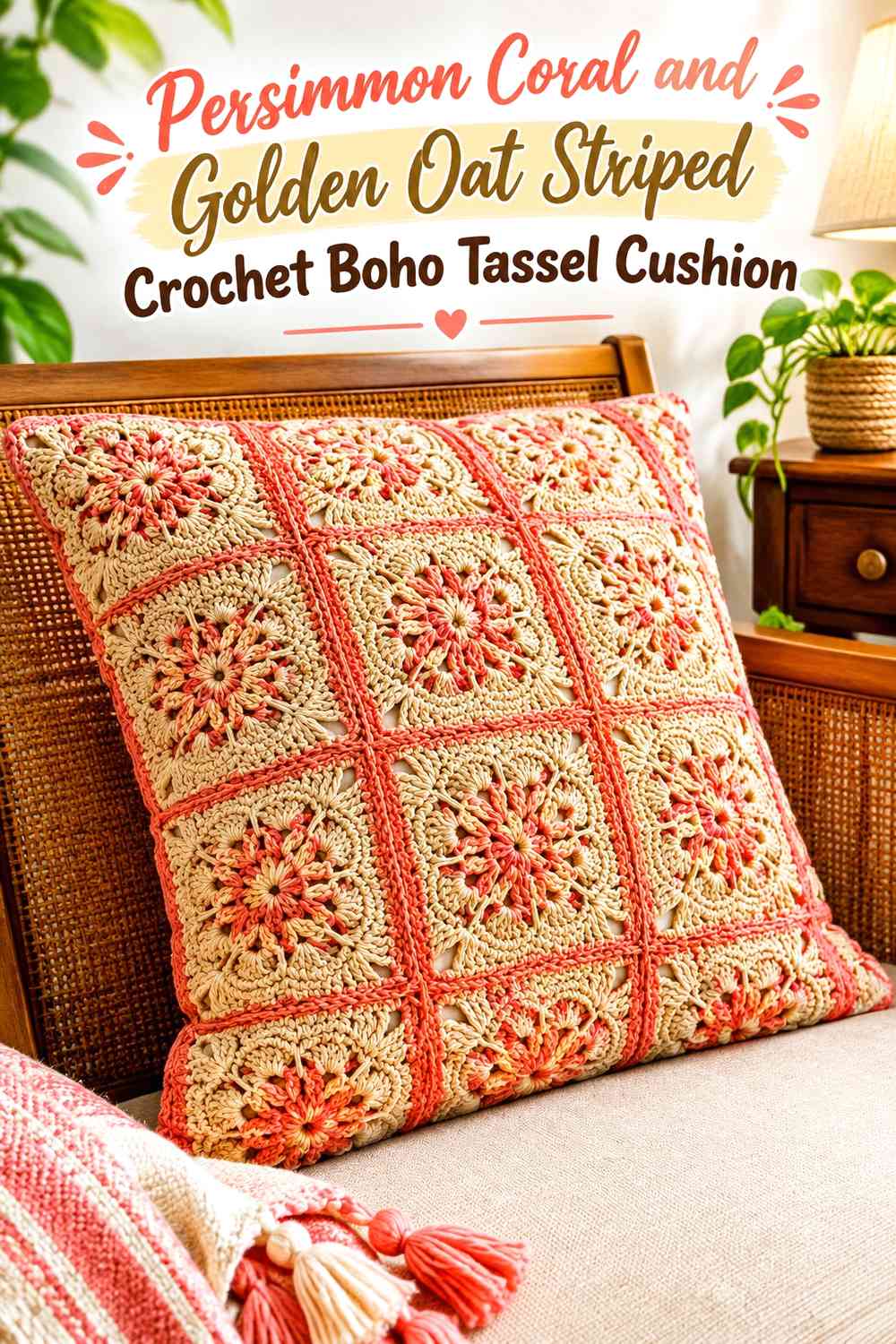
Use broad stripes rather than many narrow alternating rows. Golden oat can create calmer sections between stronger persimmon-coral bands, while mixed or single-color tassels repeat the stripe palette at the corners.
Persimmon Coral Stripes Need Enough Golden Oat Between Them
Spacing the coral bands apart prevents the front from becoming predominantly coral despite an apparently equal stripe count. Golden oat works as visual breathing room and gives textured stitches more opportunity to show.
Judge the complete front from a distance before deciding whether another coral stripe is necessary.
Golden Oat and Persimmon Coral Tassels Should Echo the Stripe Balance
If the front is oat-dominant, use coral tassels. If coral already occupies the larger share, oat tassels may produce a better balance.
For a genuinely split palette, create tassels containing both shades rather than adding another color at the corners.
Creator Credit: Tres Agujas Artesanas
4. Golden Oat Bobble Crochet Cushion With Persimmon Coral Diamond Details
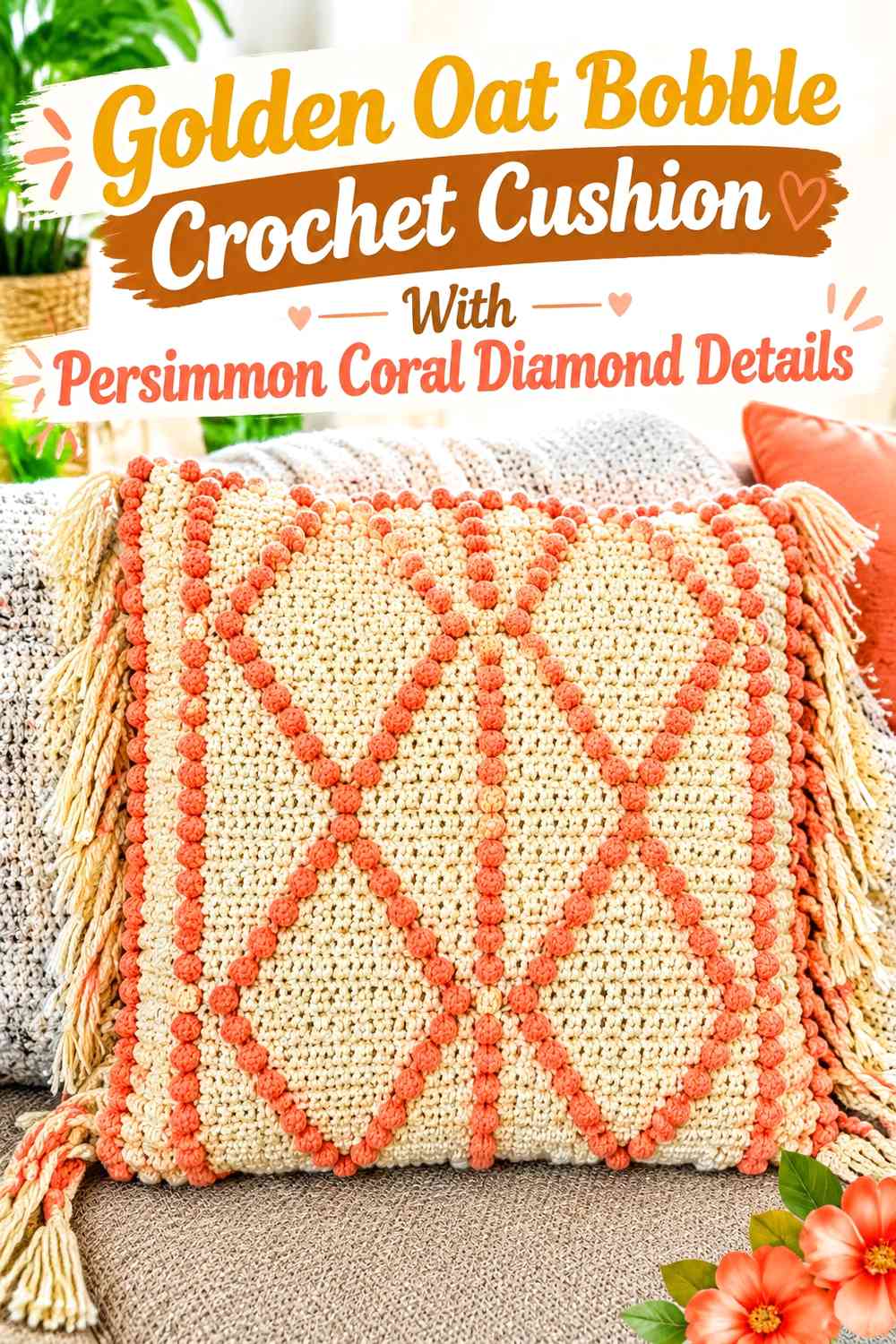
Let golden oat form the textured background and use persimmon coral only where a diamond, chevron, or other geometric motif needs to stand out. The contrast between a quiet field and a concentrated warm motif gives the cushion a more graphic boho direction.
Persimmon Coral Bobbles Need a Clear Golden Oat Background
Keep oat visible around every coral motif rather than allowing neighboring diamonds or bobbles to touch. The negative space is what makes the geometric pattern readable.
If your two yarns are close in value, increase the size of the coral motif instead of adding many tiny coral details.
Golden Oat Protects Persimmon Coral Texture From Looking Busy
A broad oat ground allows raised coral areas to create both color and dimension. Adding another decorative color is unnecessary because the bobbles already provide substantial surface variation.
Keep the tassels oat or coral according to which color needs repetition at the perimeter.
Creator Credit: Crazy Cool Crochet
5. Persimmon Coral Basket-Weave Crochet Cushion With Golden Oat Tassels
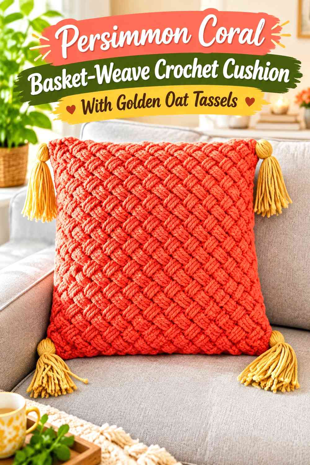
Use persimmon coral across a strongly textured basket-weave-style front and let golden oat appear mainly in the tassels and perhaps a narrow edge. This is useful when you want stitch texture, rather than colorwork, to provide most of the visual detail.
Persimmon Coral Basket-Weave Texture Needs Fewer Color Changes
The crossing and raised stitch structure already creates noticeable shadow. Keeping that area coral allows the texture to remain continuous instead of dividing it into unrelated color blocks.
If more golden oat is needed, add it at the outer edge instead of inside every textured repeat.
Golden Oat Tassels Give Persimmon Coral Texture a Lighter Finish
The oat corners create a clear change after the dense coral surface ends. This can help the tassels look decorative rather than simply like extensions of the main fabric.
Repeat a small amount of golden oat on the cushion face only if the tassels seem visually isolated.
Creator Credit: Crochet With Julie
6. Persimmon Coral and Golden Oat Granny Square Crochet Tassel Cushion
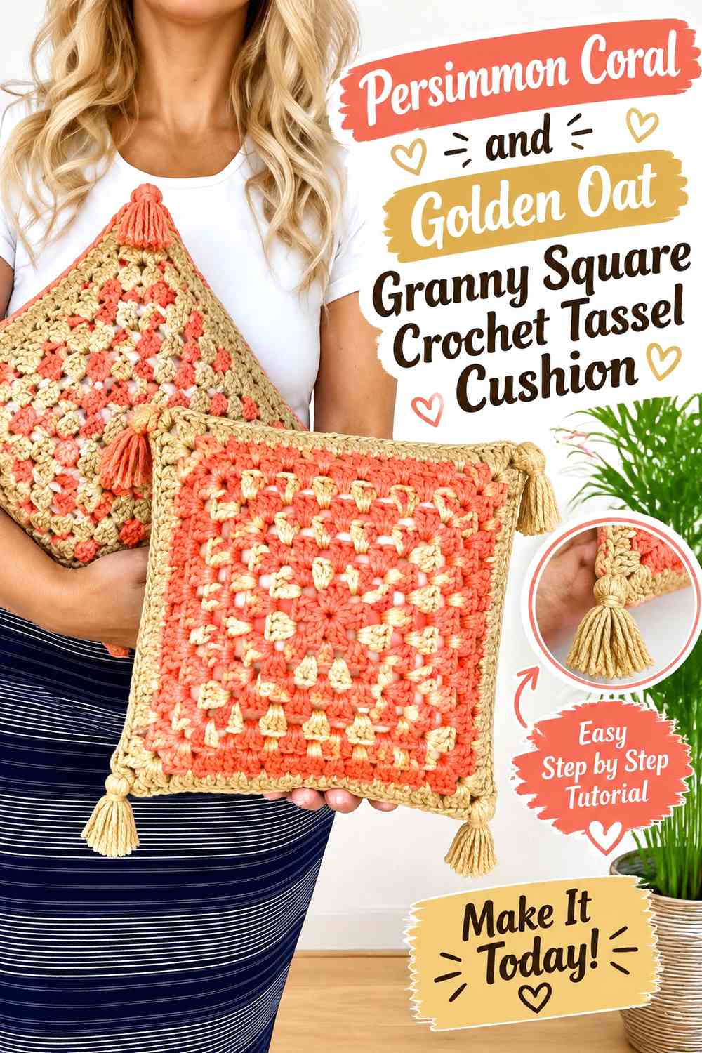
Use granny-square color placement to alternate the two hues through the cushion front. Golden oat can frame persimmon-coral centers, or coral can form selected outer rounds while oat keeps the joined motifs from becoming too intense.
Persimmon Coral Granny Centers Can Anchor Golden Oat Squares
Place coral near the center of repeated motifs when you want each square to have one clear focal point. Golden oat around the outside then creates more continuity once the motifs are joined.
Keeping the color order similar across several squares produces a calmer boho layout than changing every motif randomly.
Golden Oat Joins Can Separate Persimmon Coral Granny Motifs
A lighter joining color makes the square construction easier to see and prevents coral areas from merging across seams.
If the joins are golden oat, coral tassels can reconnect the strongest motif color with the outer corners.
Creator Credit: Jennifer Noelle
7. Golden Oat and Persimmon Coral Mosaic Crochet Boho Tassel Cushion
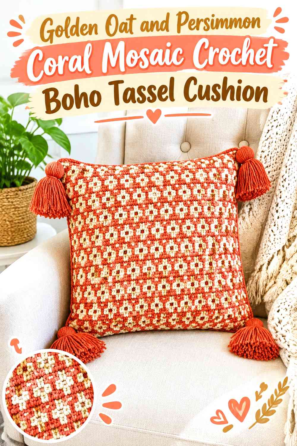
Use golden oat as the principal mosaic background and persimmon coral as the pattern color. This gives the cushion more structured geometry than loose stripes while keeping the two-color boho palette warm and controlled.
Persimmon Coral Mosaic Lines Need Golden Oat Negative Space
Do not reduce the oat background until the coral pattern becomes one large solid block. The lighter areas between geometric sections help the pattern remain understandable from normal decor-viewing distance.
This matters especially on a cushion, where tassels add another layer of visual activity around the edge.
Golden Oat Can Connect the Persimmon Coral Mosaic to the Tassels
Golden-oat tassels create continuity with the lighter background and leave coral concentrated in the geometric front pattern. Alternatively, coral tassels can reinforce the motif color if the front feels too oat-heavy.
Choose one strategy rather than making each corner different.
Creator Credit: MJ’s Off The Hook Designs
8. Persimmon Coral Openwork Crochet Cushion With Golden Oat Tassel Fringe
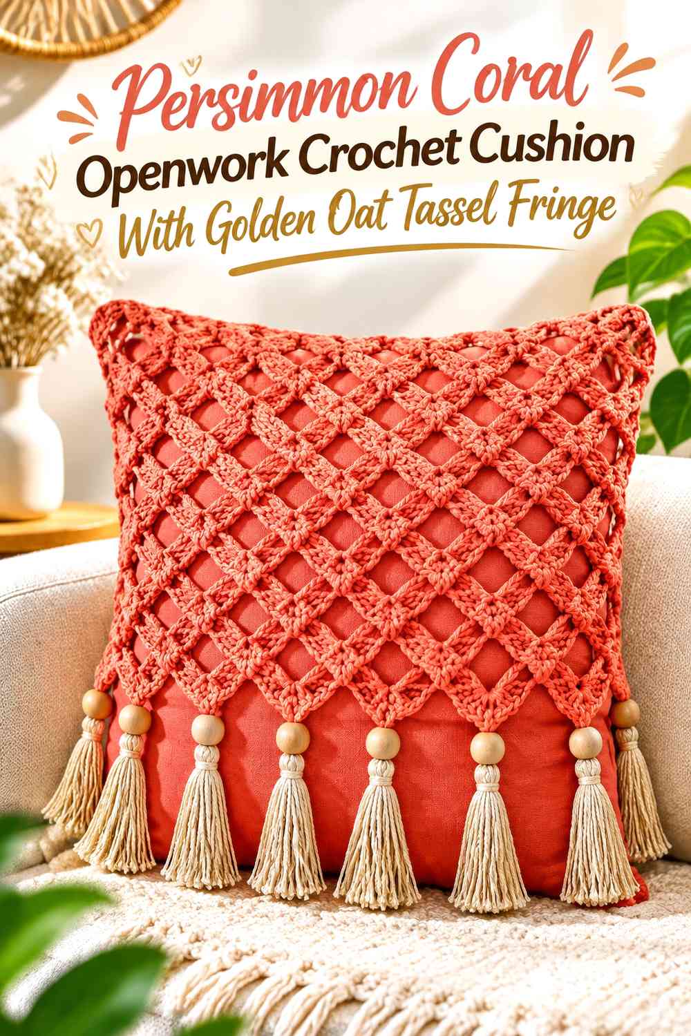
Give persimmon coral the openwork or lattice front and place golden oat along a tassel fringe or selected corner tassels. Because open crochet allows the backing or insert color to influence the appearance, avoid adding too many extra color changes inside the lattice.
Persimmon Coral Openwork Should Remain Visually Continuous
Let the coral structure run across a broad area so the repeating openings become the main design. Frequent golden-oat interruptions may make the openwork look fragmented.
If the cushion insert is visible through the fabric, check how its color affects the coral before finalizing the palette.
Golden Oat Tassel Fringe Should Stay Secondary to Persimmon Coral
Use oat below or at the corners as a lighter finishing detail. A very dense fringe can become the most noticeable feature, especially against a coral face.
Keep enough space between tassels for the cushion outline to remain easy to see.
Creator Credit: Fatma hobby
9. Persimmon Coral Mandala Crochet Cushion With a Golden Oat Frame
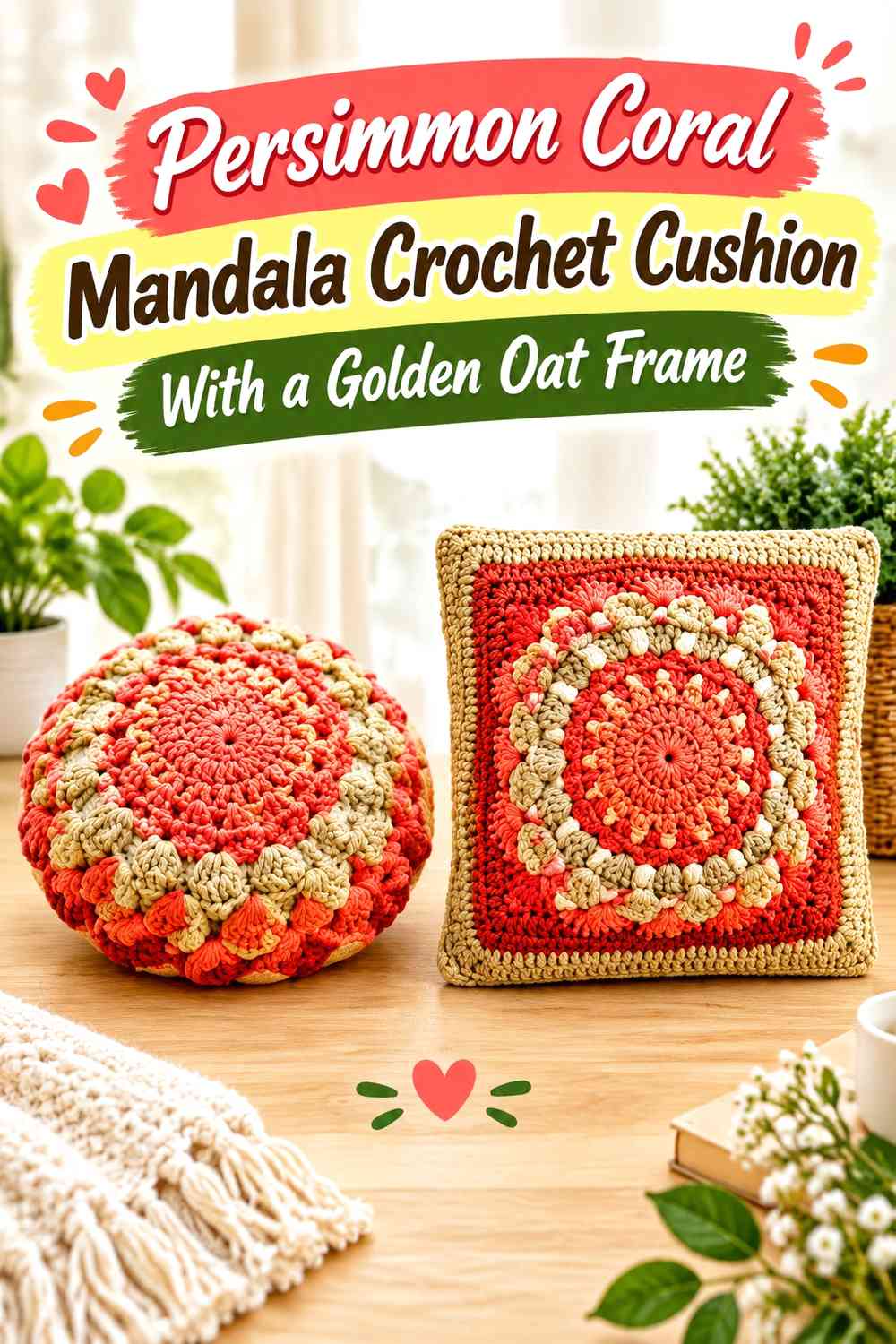
Start with a circular or radiating persimmon-coral center and transition into golden oat toward the square outer area. The center-to-edge change makes the palette part of the cushion’s geometry and creates a natural place for tassels to repeat either color.
Persimmon Coral Should Control the Mandala Focal Point
Keep coral near the center where the radial stitch pattern draws the eye. Too many alternating colors inside a detailed mandala can make the individual rounds harder to distinguish.
A concentrated coral center gives the cushion a clear warm focal area.
Golden Oat Frames Persimmon Coral Without Competing With the Mandala
Use oat through the outer square or border area to give the more intricate center breathing room. This lighter frame can also separate a coral-heavy cushion from darker surrounding decor.
Persimmon-coral tassels work well here because they bring the central color back to the corners.
Creator Credit: Hectanooga1
10. Golden Oat Textured Crochet Cushion With a Persimmon Coral Center Band
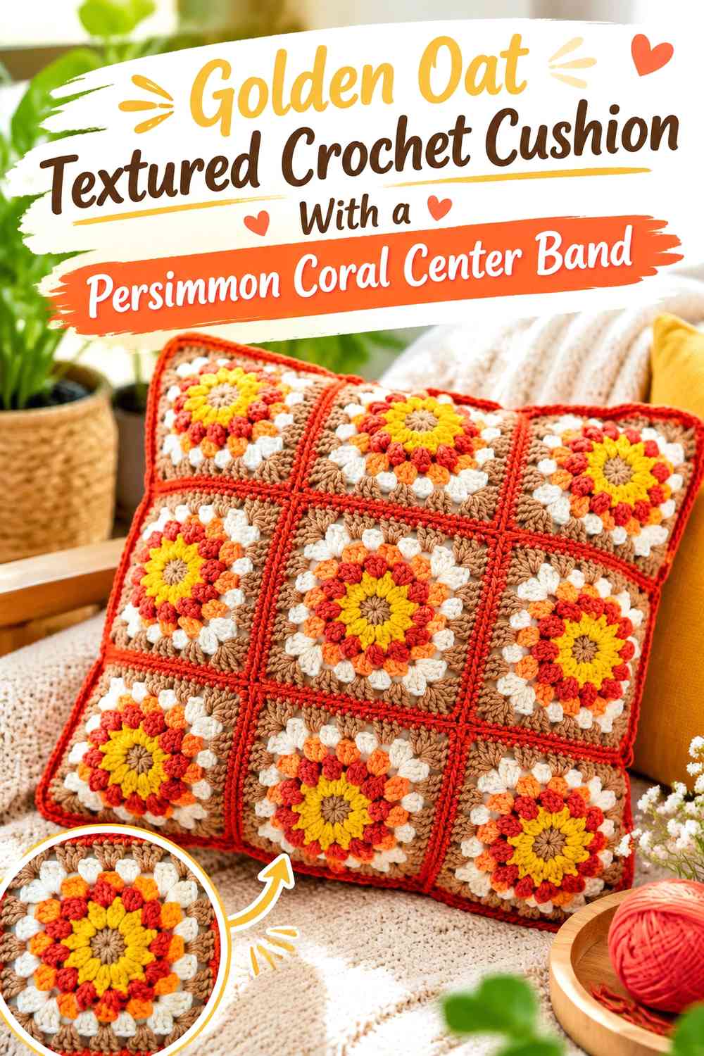
Keep most of the cushion golden oat and introduce one broad persimmon-coral band across the middle. The band can organize the front without turning it into a fully striped design, while matching coral tassels create a second controlled repetition of the stronger color.
Persimmon Coral Center Bands Need Golden Oat Above and Below
Leave substantial oat sections on both sides of the coral band so it reads as a focal stripe rather than half of a two-color cushion.
If the front has noticeable raised texture, the band can remain simple because the stitches already provide detail.
Golden Oat Texture Should Continue Around Persimmon Coral
Maintaining similar texture through both colors helps the cushion feel cohesive even though the center changes shade. The design difference then comes primarily from color placement rather than an unrelated stitch change.
Use golden-oat tassels for a quieter perimeter or coral tassels for stronger repetition.
Creator Credit: Sirin’s Crochet
11. Two-Color Persimmon Coral and Golden Oat Crochet Boho Tassel Cushion
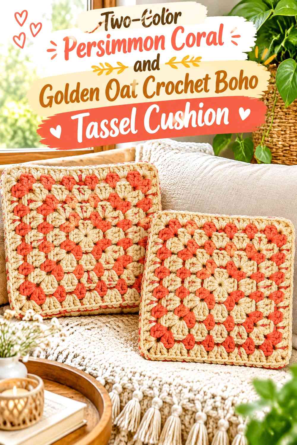
Keep the entire cushion strictly within the two requested shades. Persimmon coral can cover one major area and selected tassels, while golden oat forms the contrasting field, joins, or opposite corners. Without a third neutral, the hierarchy between the two colors needs to remain especially clear.
Persimmon Coral Should Have One Clear Role Against Golden Oat
Decide whether coral is the main field, central motif, stripe color, or tassel accent before distributing it elsewhere. Giving the same strong color every possible job can make the cushion feel much more coral-heavy than intended.
Let golden oat occupy the quieter areas that separate those focal sections.
Golden Oat Should Preserve Texture Around Persimmon Coral
Use the lighter shade where stitch definition or motif separation matters most. It can frame coral granny sections, divide stripes, or create an outer border around a warmer center.
A continuous oat area is generally more useful than many tiny pale interruptions.
Persimmon Coral and Golden Oat Tassels Can Complete the Two-Color Balance
Choose tassels according to the surface distribution. If golden oat dominates the front, coral corners strengthen the accent. If coral dominates, oat tassels provide a lighter finish.
Mixed tassels make sense when the face itself uses both colors in similarly strong proportions.
Creator Credit: CrochetBits
Which Persimmon Coral and Golden Oat Boho Tassel Cushion Should You Choose?
For a softer, lighter cushion, start with the golden-oat field with coral tassels, golden-oat bobble cushion, or golden-oat center-band design. These leave plenty of pale surface visible and use persimmon coral in deliberate focal areas.
For a warmer statement, the persimmon-coral basket-weave, openwork coral cushion, or coral-centered mandala puts more of the stronger color across the main face.
If you want color placement to create the pattern, the striped, granny-square, and mosaic versions provide the most obvious two-color structure. The final strict two-color cushion is useful when you want the boho character to come from tassels, texture, and contrast rather than additional accent shades.
Conclusion
Persimmon coral and golden oat can produce very different boho tassel cushions depending on which color covers the main surface and which is reserved for finishing details. Golden oat gives bobbles, openwork, granny motifs, and other crochet texture a quieter ground, while persimmon coral supplies warmth and stronger focal points.
Tassels are one of the easiest ways to adjust the balance without redesigning the cushion face. Coral tassels can make an oat cushion feel warmer, while oat tassels can soften a coral-heavy front. Mixed tassels work best when both shades already have similar importance across the cushion.
Before finishing the corners, place the completed front around or beside the intended cushion insert and hold several tassel samples at the edges. Judge the face, border, and tassels together. That final color relationship matters more than how the individual yarn balls look side by side.
Frequently Asked Questions
Should Persimmon Coral or Golden Oat Dominate a Boho Tassel Cushion?
Use golden oat as the dominant color when you want a lighter cushion that emphasizes crochet texture. Make persimmon coral dominant when you want a warmer, stronger accent piece. The other shade can then be concentrated in tassels, borders, or motifs.
What Color Tassels Work Best on a Golden Oat Crochet Cushion?
Persimmon-coral tassels create the strongest two-color contrast and repeat the warmer shade around all four corners. Golden-oat tassels produce a more tonal effect if coral already appears prominently across the cushion face.
Can I Use Persimmon Coral and Golden Oat Without Adding Another Neutral?
Yes. The pair can work as a complete two-color palette. Use one shade for the main surface and the other for motifs, stripes, edging, or tassels so each color has a clear role.
How Can I Keep Persimmon Coral Bobbles Visible on Golden Oat?
Compare the two yarns for light-dark contrast before making the full cushion. If they are similar in value, use larger coral motif areas or more golden-oat space around each bobble rather than relying on many tiny color changes.
Should All Four Tassels Be the Same Persimmon Coral or Golden Oat Color?
They can be, and matching tassels usually give the cleanest frame. You can also use two coral and two oat tassels or combine both colors within every tassel when that arrangement deliberately repeats the color pattern on the cushion face.
Does Golden Oat Work Better as a Border Around Persimmon Coral?
Golden oat can be especially effective around a coral-heavy center because the lighter edge separates the stronger color from surrounding furniture. The reverse also works when a pale cushion needs a more defined coral perimeter.
How Should I Choose Between a Striped, Granny Square, and Mosaic Persimmon Coral Cushion?
Choose stripes when you want broad, simple color blocks; granny squares when repeated motifs should define the boho look; and mosaic-style color placement when you want stronger geometry. In all three cases, plan the tassel colors after assessing which shade already dominates the front.