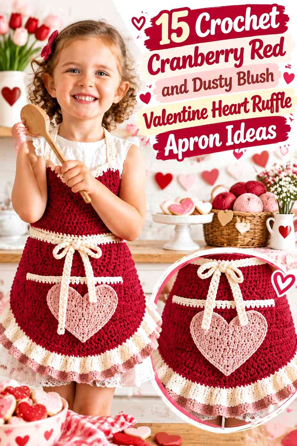

Cranberry red and dusty blush give a crochet Valentine apron enough contrast to make hearts and ruffles readable without relying on bright white or several shades of pink. Cranberry red can anchor the apron body, waistband, ties, or heart outlines, while dusty blush can soften ruffled hems, pockets, bib borders, and smaller romantic details.
Ruffles need to be planned as part of the color scheme rather than added at the end. A dusty-blush ruffle around a cranberry-red skirt can become one of the largest visible pale areas once it spreads, while a narrow cranberry edge on a blush ruffle can make the curves more distinct without overwhelming them.
The tutorials supporting these ideas include a complete ruffled crochet apron plus heart appliqués, heart granny motifs, heart garlands, and other Valentine components. When a source teaches only a heart rather than an apron, use it for that decorative element and establish the apron body, pocket function, ties, and ruffle construction separately.
Quick List
- Cranberry Red Crochet Apron With a Dusty Blush Heart Pocket and Ruffle
- Dusty Blush Crochet Apron With a Cranberry Red Heart Pocket and Ruffle
- Cranberry Red Crochet Bib Apron With Dusty Blush Double Hearts
- Dusty Blush Crochet Waist Apron With a Cranberry Red Heart Ruffle
- Cranberry Red Crochet Apron With a Dusty Blush Heart-Granny Pocket
- Dusty Blush Crochet Ruffle Apron With Cranberry Red Mini Hearts
- Cranberry Red Crochet Apron With a Dusty Blush Layered Heart Pocket
- Dusty Blush Crochet Apron With a Cranberry Red Scalloped Heart Border
- Cranberry Red Colorblock Crochet Apron With a Dusty Blush Heart Panel
- Dusty Blush Bib Crochet Apron With a Cranberry Red Heart Center
- Cranberry Red Side-Pocket Crochet Apron With a Dusty Blush Ruffle
- Dusty Blush Crochet Apron With a Cranberry Red Heart Appliqué Row
- Cranberry Red Crochet Ruffle Apron With a Dusty Blush Heart Outline
- Dusty Blush Granny-Heart Crochet Apron With Cranberry Red Trim
- Two-Color Cranberry Red and Dusty Blush Crochet Heart Ruffle Apron
Decide Whether Cranberry Red or Dusty Blush Should Lead the Apron
Cranberry red works well as the dominant shade when you want the apron to feel richer and more defined. Dusty blush can then appear in the heart pocket, ruffle, or bib edge without needing to cover half of the garment.
A dusty-blush-dominant apron creates a softer Valentine look. Cranberry red becomes especially effective around the waistband, heart outline, ties, or lower ruffle edge because a small amount of the deeper shade can carry substantial visual weight.
Keep Cranberry Red and Dusty Blush Hearts Clear Above the Ruffles
A heart pocket and a ruffled hem are both strong decorative elements. If they sit too close together in the same accent color, they can merge visually into one large area.
Leave some plain apron fabric between the heart and ruffle whenever possible. That separation helps the heart curves remain recognizable while giving the ruffle enough room to create its own movement.
Plan Cranberry Red and Dusty Blush Around the Waistband and Ties
The waistband is a useful place to repeat the heart or ruffle color, but keep it secondary if the heart pocket should remain the focal point. A broad cranberry waistband, large cranberry heart, and cranberry ties on a blush apron can collectively make the darker shade dominant even if the main skirt is pale.
Check the full apron in its worn orientation before finishing the ties. The skirt wraps around the body, so a heart that appears centered while flat may shift visually when the apron is tied.
1. Cranberry Red Crochet Apron With a Dusty Blush Heart Pocket and Ruffle
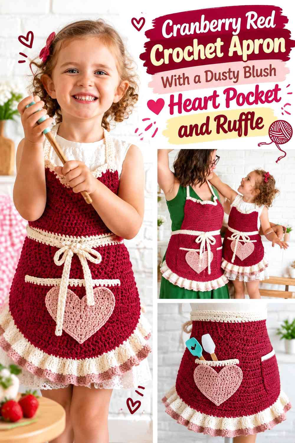
Use cranberry red across the apron body and reserve dusty blush for one heart pocket and the lower ruffle. The repeated pale shade connects the Valentine focal point with the hem while the deeper red remains the structural background.
Dusty Blush Heart Pockets Need Cranberry Red Space Around Them
Keep a visible cranberry margin around the heart so its top dip and rounded sides remain easy to identify. Avoid placing the blush ruffle immediately beneath the pocket if that makes the two pale areas appear connected.
A strip of plain red between them gives both details clearer roles.
Dusty Blush Ruffles Should Stay Secondary to Cranberry Red
Let the ruffle finish the apron rather than rise too far into the skirt panel. Because ruffles spread visually, a relatively narrow blush section can already have considerable impact.
Creator Credit: Winding Road Crochet
2. Dusty Blush Crochet Apron With a Cranberry Red Heart Pocket and Ruffle
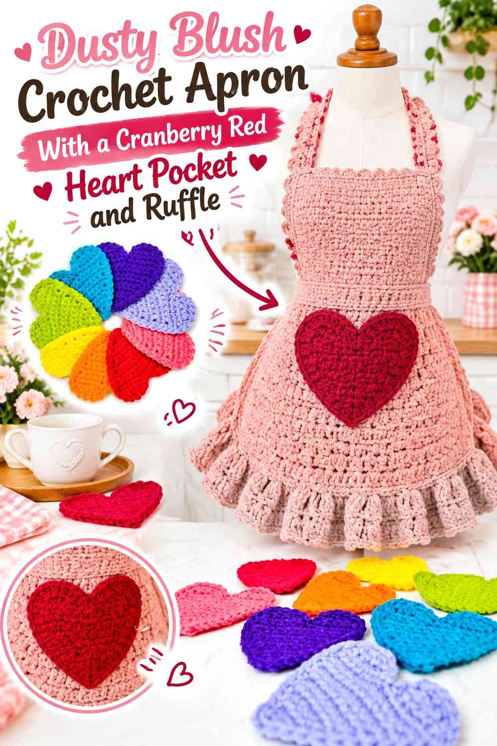
Reverse the palette with dusty blush across the body and cranberry red on the heart pocket and lower ruffle. The deeper shade creates a stronger Valentine outline against the pale apron.
Cranberry Red Heart Pockets Need a Calm Dusty Blush Background
Keep the area immediately around the heart mostly blush. Extra cranberry stripes behind it can weaken the pocket silhouette and make the center front look crowded.
A single strong heart usually provides enough dark contrast.
Cranberry Red Ruffles Should Not Overpower Dusty Blush
Use the darker ruffle as a finishing band rather than allowing it to become half of the skirt. If the hem already has substantial cranberry red, keep the ties or bib trim mostly blush.
Creator Credit: Heather Corinne Crochets
3. Cranberry Red Crochet Bib Apron With Dusty Blush Double Hearts
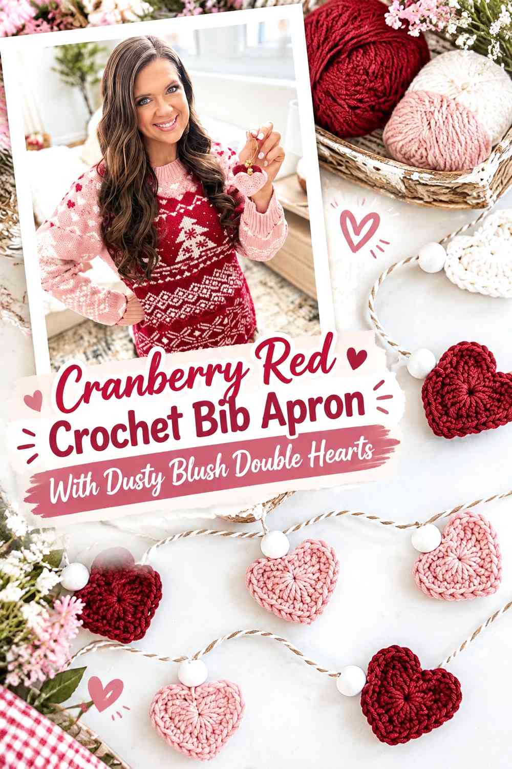
Use cranberry red across the bib and lower apron, then place two dusty-blush hearts on the front. The repeated hearts create a stronger Valentine effect than a single motif without adding another shade.
Dusty Blush Double Hearts Need Cranberry Red Between Them
Leave enough red between the two shapes for each heart to remain independent. If their outer curves touch, the pair can begin looking like one irregular blush panel.
Keep their general height related for a coordinated look.
Cranberry Red Should Stay Visible Above Dusty Blush Hearts
Do not fill the entire area between the pockets and waistband with additional blush trim. Plain cranberry red gives the front enough visual rest and keeps the bib connected to the skirt.
Creator Credit: MJ’s Off The Hook Designs
4. Dusty Blush Crochet Waist Apron With a Cranberry Red Heart Ruffle
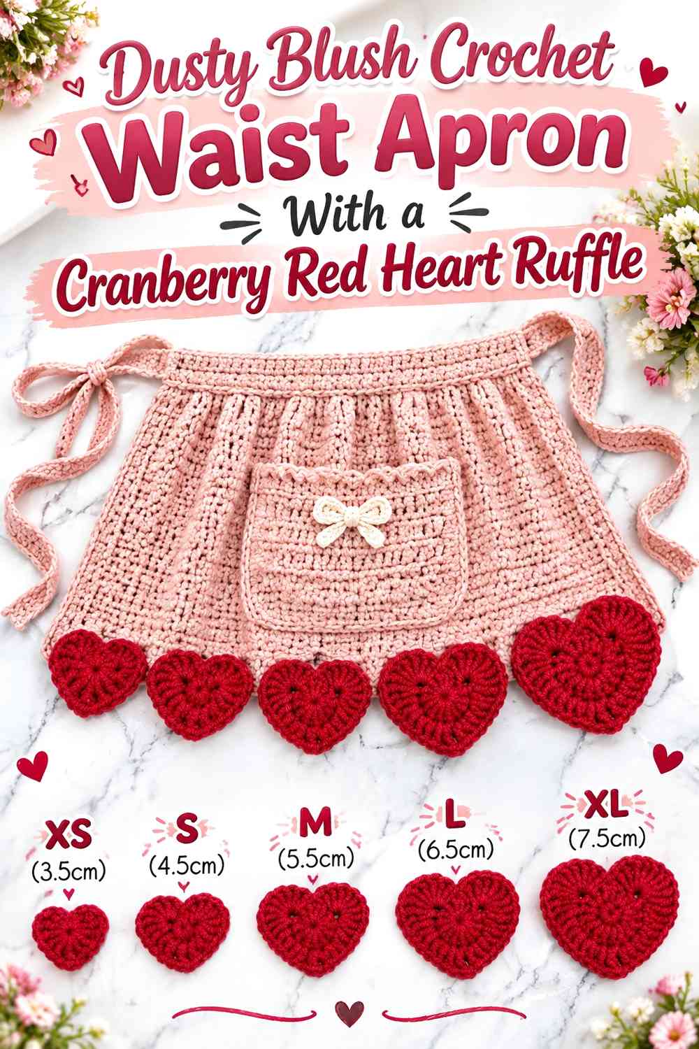
Use dusty blush for the skirt and make cranberry red the stronger waist and ruffle color. Add one heart near the center so the darker shade repeats in both a motif and an edge treatment.
Cranberry Red Hearts Should Sit Clearly on Dusty Blush
Place the heart where the apron faces forward after tying. A perfectly centered flat panel can shift once the apron wraps around the waist.
Keep enough blush visible on all sides of the heart.
Cranberry Red Ruffles Need Dusty Blush Above Them
Leave a substantial pale field between waistband and ruffle. This prevents the apron from becoming visually dominated by red at both the top and bottom.
Creator Credit: Creggy’s Crochet
5. Cranberry Red Crochet Apron With a Dusty Blush Heart-Granny Pocket
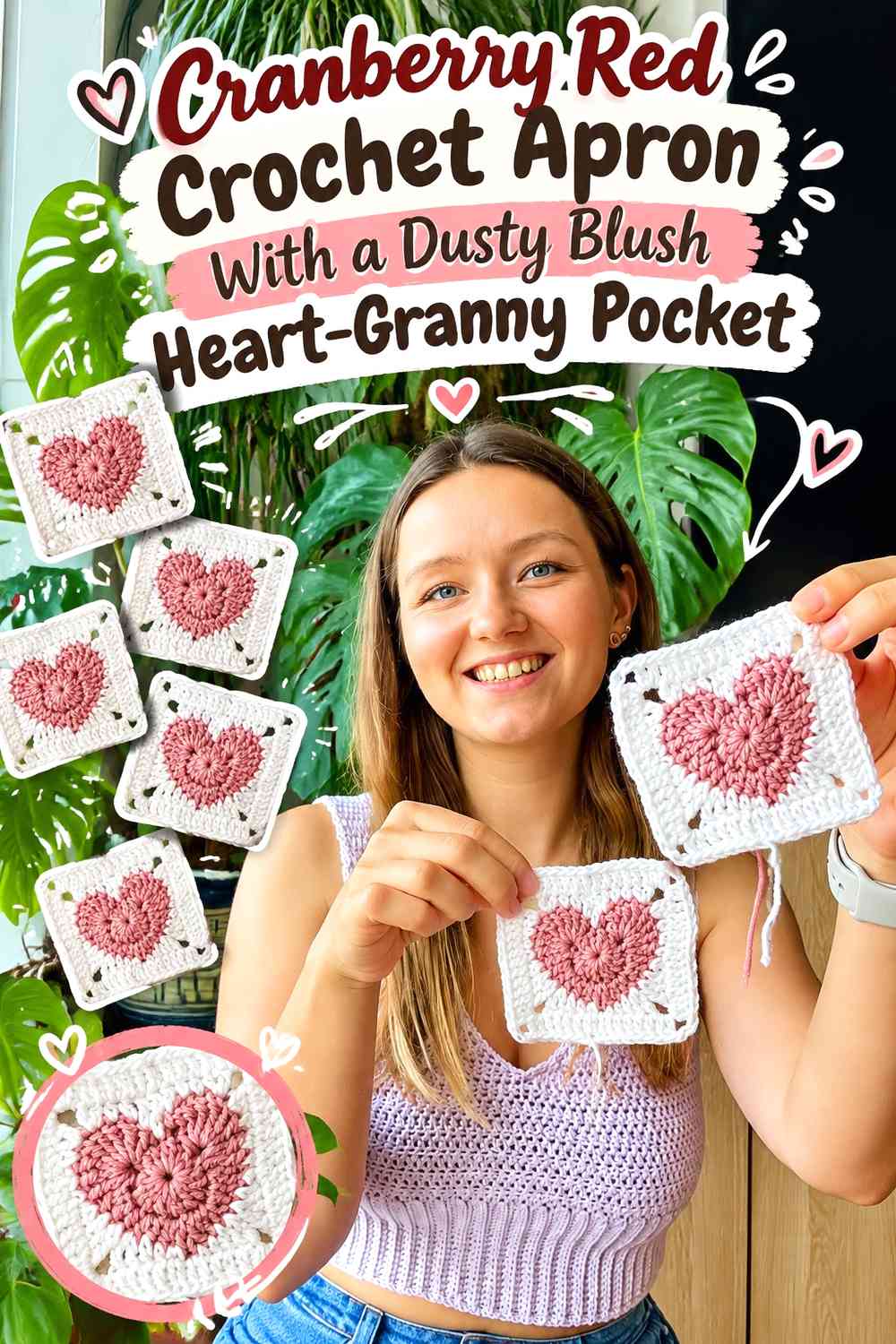
Turn a heart-centered granny square into the visual basis for the pocket, using dusty blush for the heart and cranberry red around the square. The geometric outer edge gives the pocket a different look from a freestanding heart.
Dusty Blush Hearts Should Stay Clear Inside Cranberry Red Granny Frames
Keep the central heart distinct from the surrounding square. If dusty blush spreads too heavily through the outer rounds, the heart can lose its concentration.
Use cranberry red to connect the granny pocket back to the apron body.
Cranberry Red Granny Borders Can Separate Dusty Blush From the Ruffle
A red outer square creates a useful boundary if the apron also includes a blush hem. The darker frame stops the heart pocket from visually merging into the lower ruffle.
Creator Credit: by Kristine
6. Dusty Blush Crochet Ruffle Apron With Cranberry Red Mini Hearts
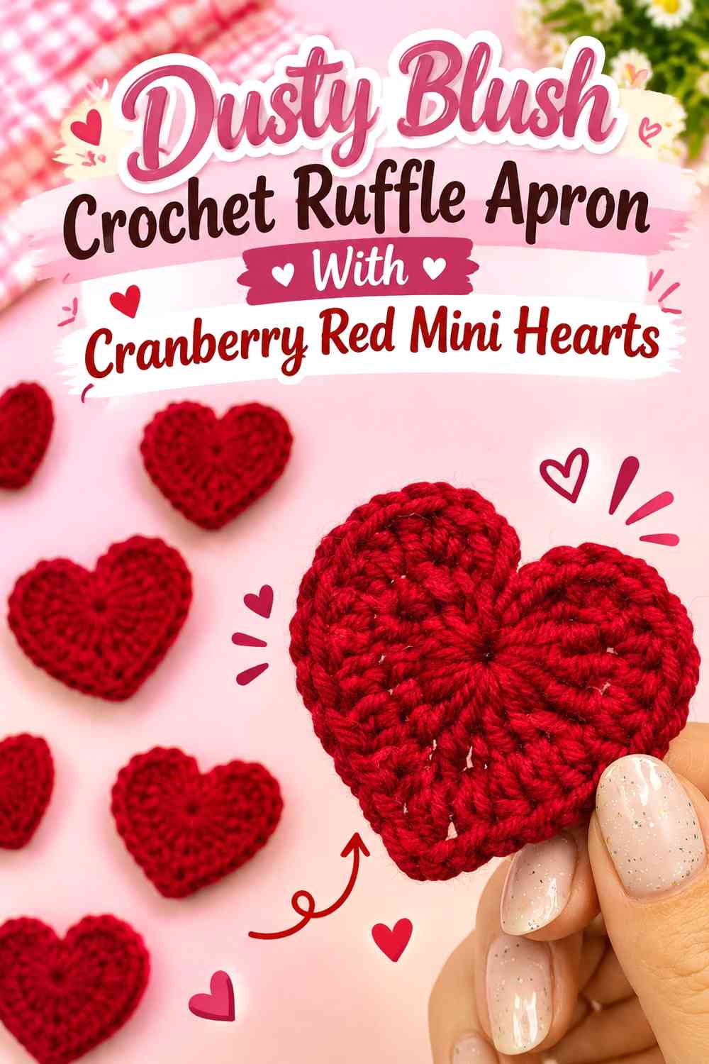
Make dusty blush the main apron and ruffle color, then use several small cranberry-red hearts as controlled accents across the bib, waistband, or lower panel.
Cranberry Red Mini Hearts Need Dusty Blush Space Between Them
Avoid covering the apron with closely packed hearts. Visible blush between motifs makes every shape easier to recognize and keeps the design from turning into an all-over red pattern.
A short row of hearts can be enough.
Dusty Blush Ruffles Should Remain Plain Around Cranberry Red Motifs
Keep the ruffle largely blush if the apron body already contains several red hearts. This lets texture, rather than another color repeat, provide the detail at the lower edge.
Creator Credit: Hooked by Robin
7. Cranberry Red Crochet Apron With a Dusty Blush Layered Heart Pocket

Use cranberry red for the apron body and build a layered heart effect with dusty blush as the main pocket color. A smaller cranberry or blush heart can sit inside the larger shape if the outline remains clear.
Dusty Blush Layered Hearts Need Cranberry Red Negative Space
Leave the outer edge of the heart clearly separated from other pink details. The layered construction already has internal complexity, so the surrounding apron should remain comparatively simple.
Avoid placing several mini hearts immediately beside it.
Cranberry Red Should Frame Dusty Blush Without Hiding the Heart
If you add a darker outline, keep it narrow enough for the blush surface to remain dominant. The border should clarify the shape rather than convert the pocket into a mostly red motif.
Creator Credit: VivCrochets
8. Dusty Blush Crochet Apron With a Cranberry Red Scalloped Heart Border
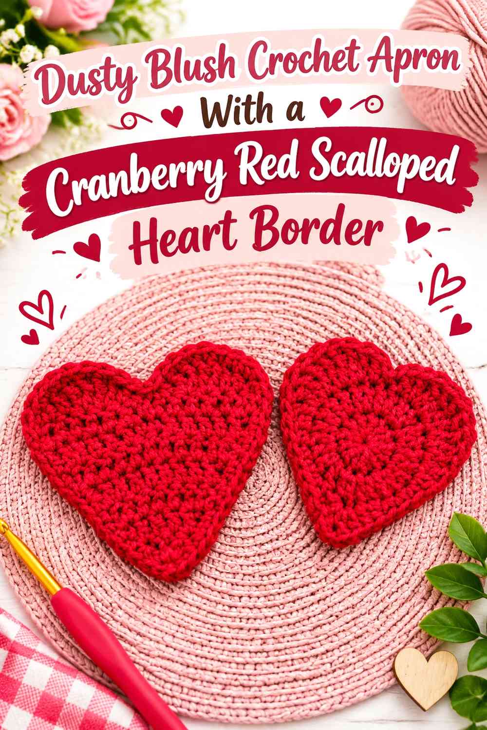
Use dusty blush through the main apron and heart pocket, then place cranberry red around the heart edge in a scalloped or decorative treatment. The darker outline separates two blush surfaces that would otherwise blend.
Cranberry Red Scallops Should Follow the Dusty Blush Heart Clearly
Keep the border consistent around the curved edges so it reinforces the heart rather than disguising it. Near the top opening, avoid overly deep scallops that make the pocket difficult to identify.
The opening should remain visibly functional.
Dusty Blush Should Stay Broad Inside Cranberry Red
Give the heart enough pale interior for the scalloped edge to remain a frame. A heavy red border around a very small blush center can reverse the intended color balance.
Creator Credit: Tangle with Yarn
9. Cranberry Red Colorblock Crochet Apron With a Dusty Blush Heart Panel
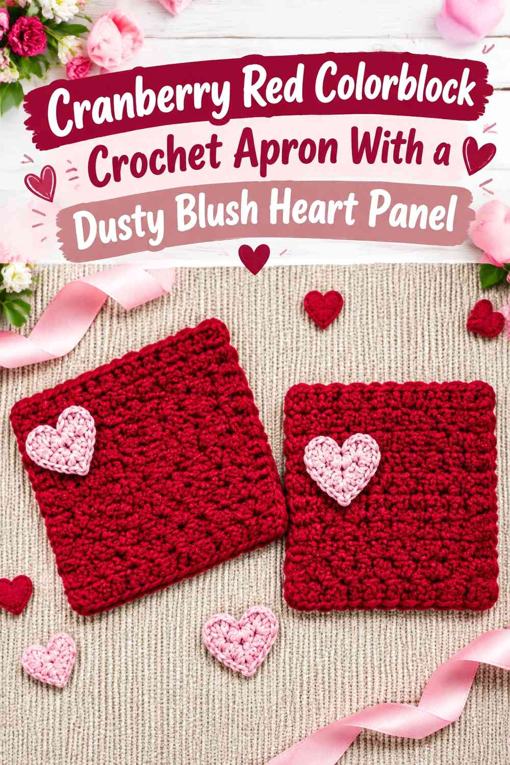
Use larger cranberry-red and dusty-blush areas instead of narrow stripes. Place the heart inside one blush panel so the colorblock structure and Valentine motif remain easy to distinguish.
Dusty Blush Heart Panels Need Clear Cranberry Red Boundaries
Keep the pale panel large enough to look intentional but separate from the ruffle and waistband. A clear cranberry border around it can turn the heart zone into a planned focal section.
Avoid placing another equally large blush block directly beside it.
Cranberry Red Should Connect the Dusty Blush Blocks
Use red through the ties, waistband, or side sections so the apron remains visually unified despite its larger pale zones.
Creator Credit: Raji’s Craft Hobby
10. Dusty Blush Bib Crochet Apron With a Cranberry Red Heart Center

Keep the bib and skirt dusty blush and place one cranberry-red heart prominently at the center front. This is a simple arrangement that gives the Valentine motif maximum contrast.
Cranberry Red Centers Need Enough Dusty Blush Around Them
Do not place the heart immediately against a cranberry waistband or neckline. Pale space around all sides makes the shape stronger.
A centered heart can provide enough dark color on its own.
Dusty Blush Ruffles Should Stay Softer Than the Cranberry Red Heart
Keep the lower ruffle blush so it adds texture without becoming another major dark focal area. If cranberry needs repeating, use a narrow edge rather than making the entire ruffle red.
Creator Credit: Crochet Guru
11. Cranberry Red Side-Pocket Crochet Apron With a Dusty Blush Ruffle
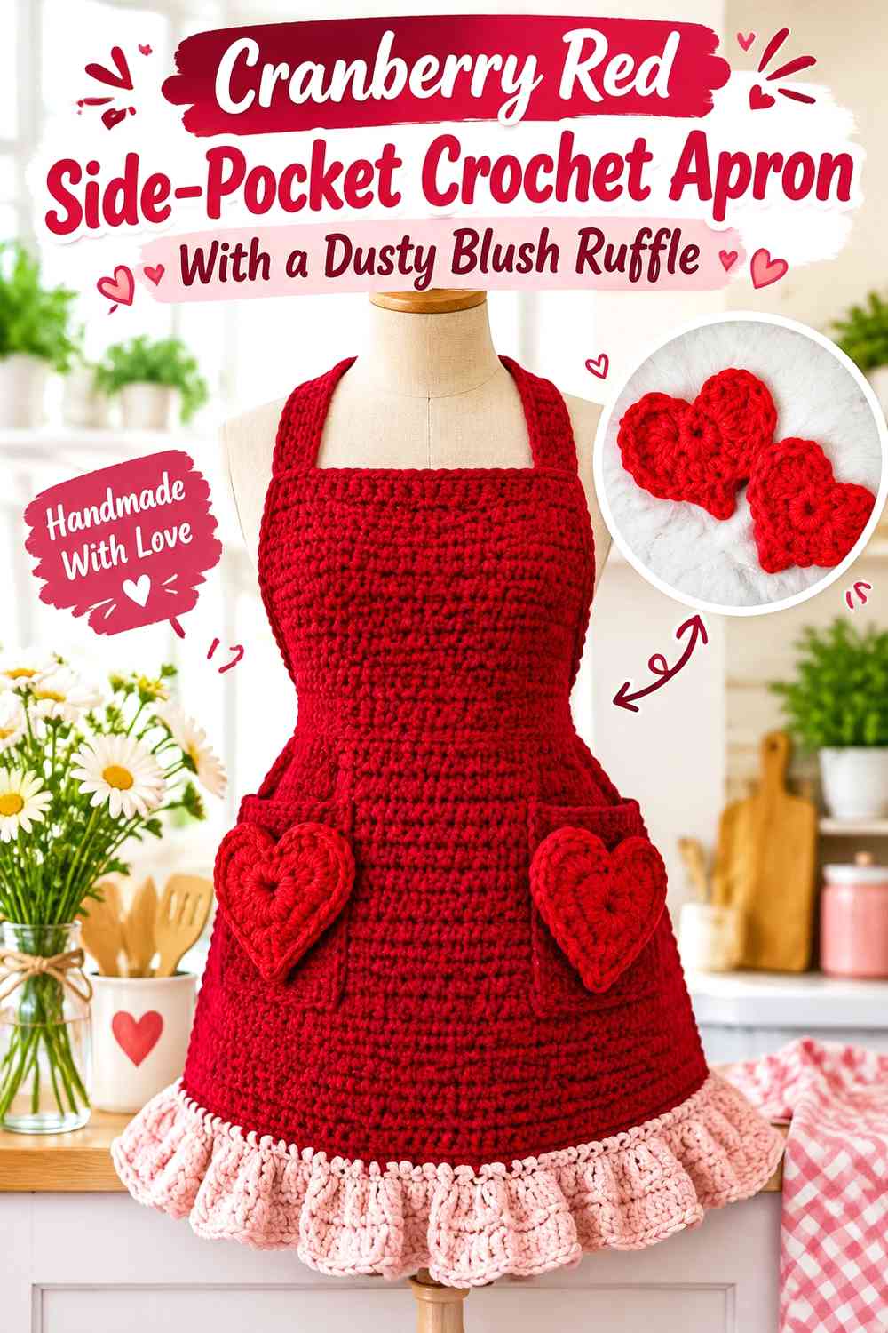
Use cranberry red across the apron and position one dusty-blush heart pocket slightly to the side. A matching blush ruffle brings the pale shade across the full hem without requiring another large pocket.
Dusty Blush Side Hearts Need Cranberry Red Near the Apron Edge
Do not push the pocket so far outward that one curve disappears around the wearer’s side. Check its position while the apron is tied.
Enough red should remain between the pocket and outer edge to preserve the heart outline.
Dusty Blush Ruffles Can Balance an Asymmetrical Cranberry Red Pocket Layout
Because the heart sits off-center, the full-width blush ruffle gives the lower apron a stable horizontal element. Keep the rest of the front comparatively quiet so the asymmetry remains deliberate.
Creator Credit: Hectanooga1
12. Dusty Blush Crochet Apron With a Cranberry Red Heart Appliqué Row
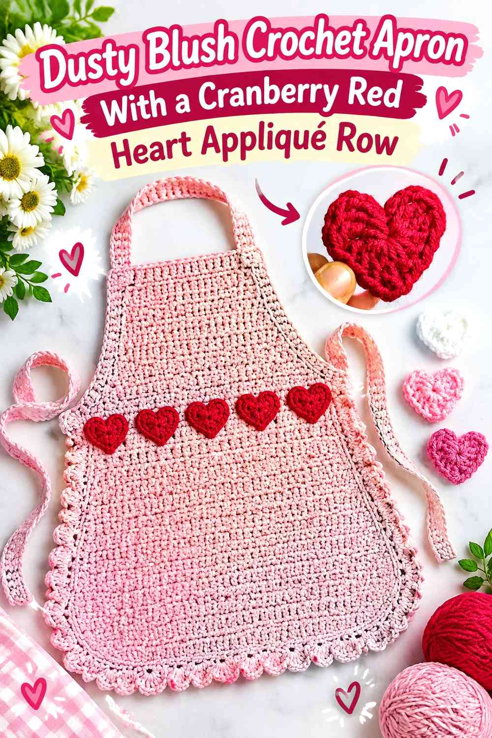
Use dusty blush as the main field and create a short row of cranberry-red heart appliqués near the bib edge or above the ruffle. The repeated motif becomes a decorative band without replacing the main apron construction.
Cranberry Red Heart Rows Need Dusty Blush Between Motifs
Leave visible blush gaps so each heart stays distinct. A row of touching red hearts can become one irregular stripe from normal viewing distance.
Keep the spacing consistent across the visible front.
Dusty Blush Should Stay Plain Above and Below Cranberry Red Hearts
Avoid adding another strong motif band immediately beside the heart row. A quiet blush area lets the repeated hearts do the decorative work.
Creator Credit: Divine Crochets
13. Cranberry Red Crochet Ruffle Apron With a Dusty Blush Heart Outline
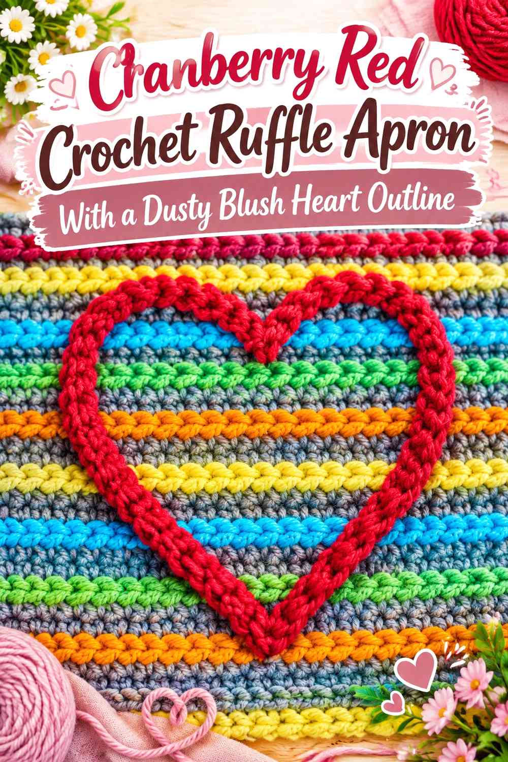
Make cranberry red the dominant apron and ruffle color, then use dusty blush only as a heart outline or surface detail. This creates one of the darkest options in the collection.
Dusty Blush Heart Outlines Need a Solid Cranberry Red Background
Place the pale outline on an uninterrupted red area so its shape remains easy to follow. Avoid crossing the outline over seams, ruffles, or several stitch textures.
The simpler the background, the clearer the heart.
Cranberry Red Ruffles Should Stay Solid Around Dusty Blush
Because blush is used sparingly here, keep the ruffle red rather than adding another large pale zone. This preserves the stronger cranberry hierarchy.
Creator Credit: Naztazia
14. Dusty Blush Granny-Heart Crochet Apron With Cranberry Red Trim
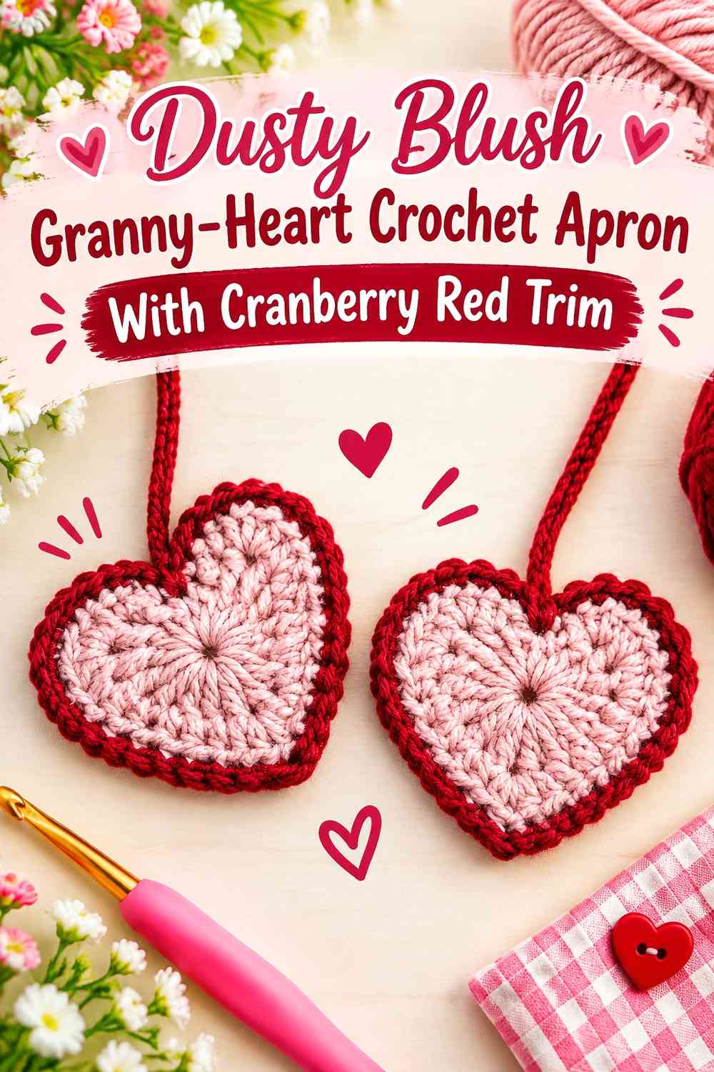
Use dusty blush across heart granny motifs or a heart-granny pocket and let cranberry red define the waistband, joins, and ruffled lower edge. The deeper trim gives a modular pale design more structure.
Cranberry Red Joins Should Separate Dusty Blush Heart Motifs
Keep enough red visible between granny sections for each heart to retain its individual outline. If the joins become too subtle, neighboring blush motifs may blend together.
Repeat the red at the waistband for continuity.
Dusty Blush Hearts Need a Controlled Cranberry Red Ruffle
Because the joins and waistband already contain substantial cranberry, keep the lower ruffle proportionate. A very deep red hem can overpower the softer granny-heart area above.
Creator Credit: Bella Coco
15. Two-Color Cranberry Red and Dusty Blush Crochet Heart Ruffle Apron
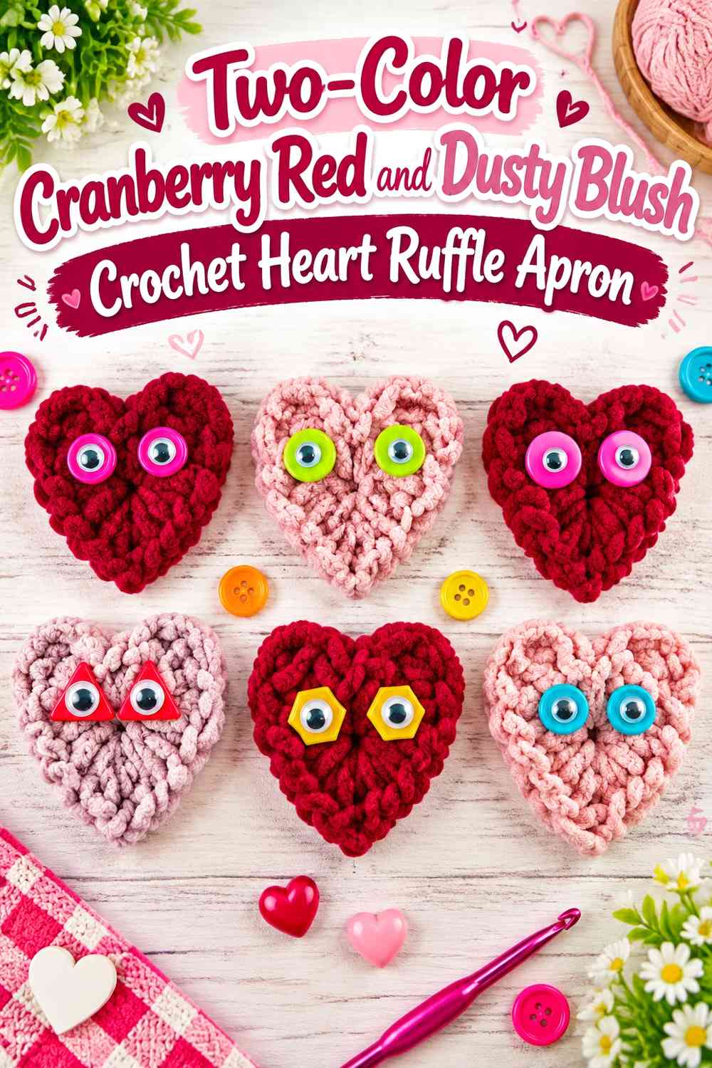
Use only cranberry red and dusty blush across the body, heart details, waistband, ties, and ruffle. The restricted palette works best when one shade controls the main apron field and the other takes clearly defined accent roles.
Cranberry Red Should Have a Clear Role Beside Dusty Blush
Decide whether cranberry controls the body, heart, or structural trim before completing the whole apron. Giving it every possible accent role can make dusty blush feel incidental.
Use the darker shade where it provides the most useful contrast.
Dusty Blush Should Separate Cranberry Red Heart and Ruffle Details
Leave larger pale sections between strong red areas. If the waistband, heart, and ruffle are all cranberry, visible blush between them prevents those elements from merging into one dark frame.
Cranberry Red and Dusty Blush Need a Worn-Apron Check
Tie the apron in its intended position before finalizing the pocket, ruffle, and tie-end colors. Confirm that the heart faces forward, the ruffle sits evenly, and one side has not accumulated more cranberry red than the other.
The credited Valentine-heart tutorial supports the heart motif; the complete apron and ruffle construction should come from an appropriate apron base.
Creator Credit: Fiber Flux
Which Cranberry Red and Dusty Blush Valentine Apron Should You Choose?
For the clearest romantic contrast, choose the cranberry-red apron with a dusty-blush heart pocket, dusty-blush apron with a cranberry heart, or center-heart bib apron. These give the Valentine motif a broad, uncluttered background.
For more decorative texture, the heart-granny, scalloped-heart, layered-heart, and mini-heart ruffle versions put more detail into the focal area while keeping the palette limited.
If you want a stronger fashion-apron look, the colorblock, side-pocket, and double-heart versions vary placement rather than adding more colors. The final strict two-color design is the most flexible option when you want every ruffle, heart, waistband, and tie to stay within cranberry red and dusty blush.
Conclusion
Cranberry red and dusty blush work especially well for a Valentine heart ruffle apron because the two shades can divide structure and decoration clearly. Cranberry red can anchor the body, waistband, ties, or heart outlines, while dusty blush can soften ruffles, pockets, bib edges, and layered motifs.
The strongest designs keep the heart and ruffle from competing. Give each one enough plain background to remain distinct, and repeat the accent color only where it helps connect the apron from bib to hem.
Use the full apron tutorial for the garment construction it demonstrates and the credited heart tutorials for the motifs they actually teach. Once the apron body is established, test the heart placement and ruffle depth in the worn position before completing the final color distribution.
Frequently Asked Questions
Should Cranberry Red or Dusty Blush Dominate a Valentine Heart Ruffle Apron?
Use cranberry red as the dominant shade when you want a richer, more defined apron with soft blush details. Use dusty blush as the main color when you want a lighter romantic apron with cranberry red providing stronger heart, waistband, or edging contrast.
Where Should Dusty Blush Go on a Cranberry Red Crochet Apron?
Dusty blush works particularly well on the heart pocket, ruffled hem, bib edge, tie ends, or small appliqués. Choose one or two major locations so the pale shade remains intentional rather than scattered.
How Can I Keep a Cranberry Red Heart Visible on Dusty Blush?
Leave enough uninterrupted blush around the heart and avoid placing broad cranberry stripes immediately beside it. A clear background is usually more useful than adding another outline color.
Should the Ruffle Match the Heart Pocket?
It can. Matching the ruffle and heart creates a strong repeated accent, but leave some main-body color between them so the two details remain visually separate.
Can I Use a Heart Appliqué Tutorial for a Functional Apron Pocket?
A heart appliqué tutorial teaches the heart shape, not necessarily a usable pocket. If you want storage, plan the pocket backing, opening, and attachment independently rather than assuming a flat appliqué will function as a pocket.
Can I Use a Heart Granny Square as a Crochet Apron Pocket?
Yes, if the finished square suits your apron proportions. Use the granny-square tutorial for the motif itself, then determine the pocket backing, opening, and placement separately.
How Can I Keep a Cranberry Red and Dusty Blush Apron From Looking Too Busy?
Limit the number of large Valentine details. One heart pocket plus one ruffle is often enough. If you add mini hearts, granny motifs, or scallops, reduce the number of other color changes around them.
Should Cranberry Red Be Repeated in the Waistband and Ties?
It can be useful when cranberry already appears in a heart or border. Keep those repetitions secondary if you want the heart to remain the main focal point.
What Should I Check Before Finishing the Valentine Ruffle Apron?
Try the apron in its worn position and check heart placement, waistband balance, ruffle depth, tie color, and how much of each shade remains visible from the front. Adjust larger color areas before adding more small accents.