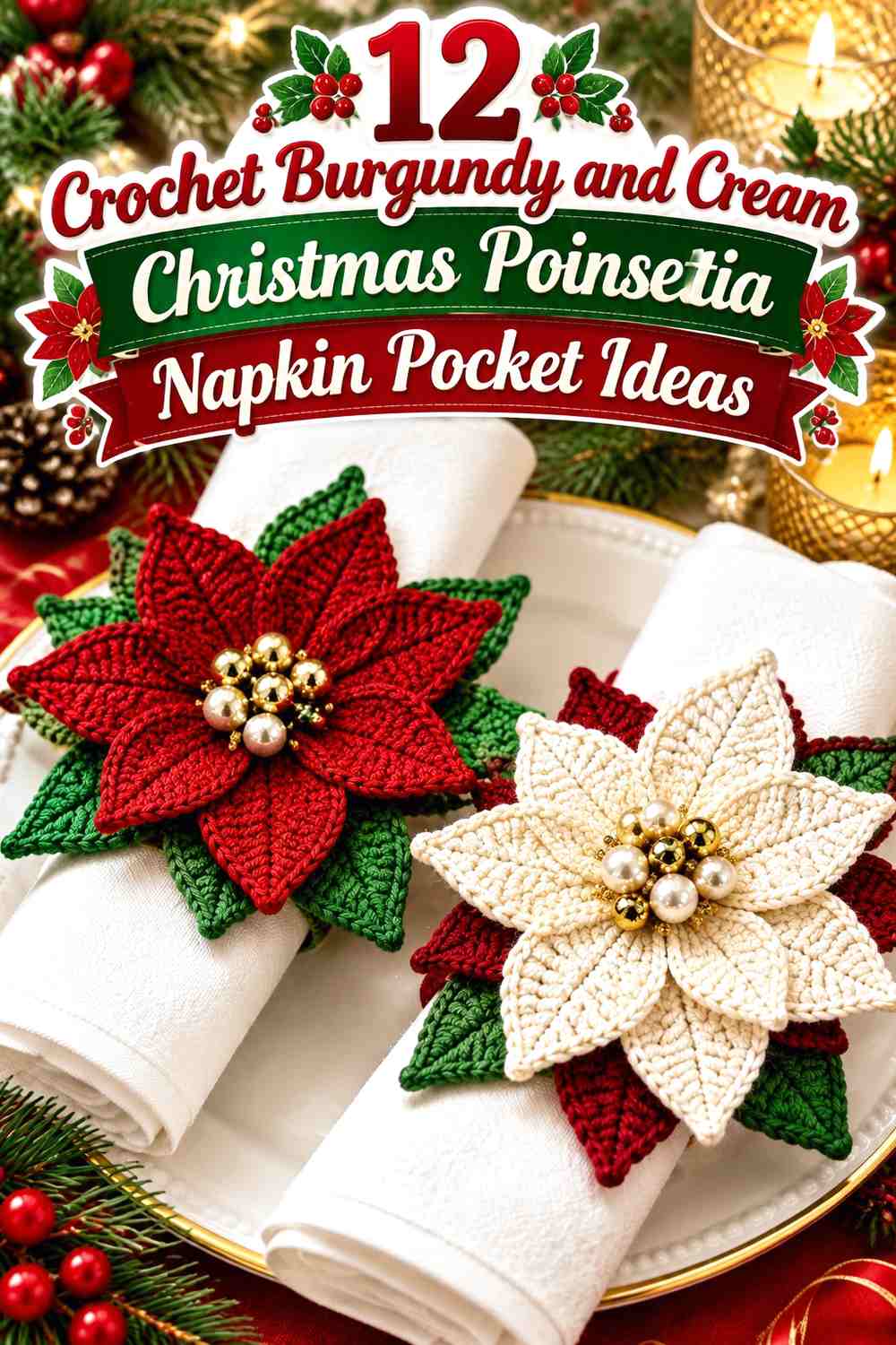

Burgundy and cream give a crochet Christmas poinsettia napkin pocket a softer alternative to bright red and white while still keeping the flower clearly connected to holiday table decor. Burgundy can carry the poinsettia petals, the pocket body, or both, while cream provides the light contrast needed to separate layered flowers, borders, and pocket openings.
Because a napkin pocket is small, color proportion matters. A large burgundy flower can dominate a cream sleeve quickly, while a narrow cream edge may be enough to define a burgundy pocket. The napkin itself also becomes part of the palette, so check the finished colors against the linens, plates, and placemats you plan to use.
The tutorials linked below support either napkin/cutlery-holder construction or poinsettia construction. Some sources demonstrate the pocket shape, while others focus on the flower that can be adapted as an embellishment. The burgundy-and-cream palettes are independent color plans rather than claims that the creators used these exact colors.
Quick List
- Burgundy Poinsettia and Cream Crochet Christmas Napkin Pocket
- Cream Poinsettia and Burgundy Crochet Christmas Napkin Pocket
- Burgundy Layered Poinsettia Crochet Napkin Pocket With a Cream Center
- Cream Textured Crochet Napkin Pocket With a Burgundy Poinsettia Cuff
- Burgundy Crochet Napkin Pocket With Cream Edging and a Poinsettia Accent
- Cream Crochet Christmas Napkin Pocket With a Burgundy Poinsettia Closure
- Burgundy and Cream Striped Crochet Poinsettia Napkin Pocket
- Cream Crochet Napkin Pocket With a Burgundy Poinsettia at the Opening
- Burgundy Crochet Napkin Pocket With a Cream Poinsettia
- Cream Crochet Poinsettia Napkin Pocket With Burgundy Petal Layers
- Burgundy and Cream Color-Block Crochet Poinsettia Napkin Pocket
- Cream Crochet Christmas Napkin Pocket With Burgundy Poinsettia and Leaf Details
Decide Whether Burgundy or Cream Should Lead the Napkin Pocket
A burgundy-dominant pocket creates the deepest color block beside the plate, so cream is most useful around the opening, flower center, or edging. This arrangement works especially well when the folded napkin itself is pale because the napkin creates an additional light break above the dark pocket.
A cream-dominant pocket gives the poinsettia more visual importance. Burgundy petals stand out clearly against a light body without requiring additional colors. If you are making a full set of place settings, this approach can also keep a row of handmade pockets from creating one continuous dark band across the table.
Use Burgundy and Cream Contrast to Keep the Poinsettia Visible
The poinsettia needs enough separation from the pocket body to remain recognizable. A burgundy flower on an almost equally dark background can lose its petal outline, even when the flower is dimensional. Cream behind or around the flower provides a simple solution without introducing another major color.
If you want burgundy on both the pocket and flower, create separation through cream placement. A cream cuff, narrow border, flower center, or small background panel can prevent the burgundy layers from visually merging.
You can also photograph the yarns and view the image in grayscale. If burgundy and cream remain clearly different in value, small details are more likely to stay readable from across the table.
Plan Burgundy and Cream Around the Napkin Pocket Opening
The pocket opening is functional, so decoration should not make it difficult to insert or remove the napkin. Large poinsettias generally make more sense slightly below the opening, toward one upper corner, or centered on a stable front section rather than directly across the space where the napkin slides in.
Color can help define that opening. A cream rim on a burgundy pocket makes the top boundary easy to distinguish, while a burgundy rim gives a cream sleeve more structure. Before repeating the design for an entire table, test one finished pocket with the actual folded napkin you intend to use.
1. Burgundy Poinsettia and Cream Crochet Christmas Napkin Pocket
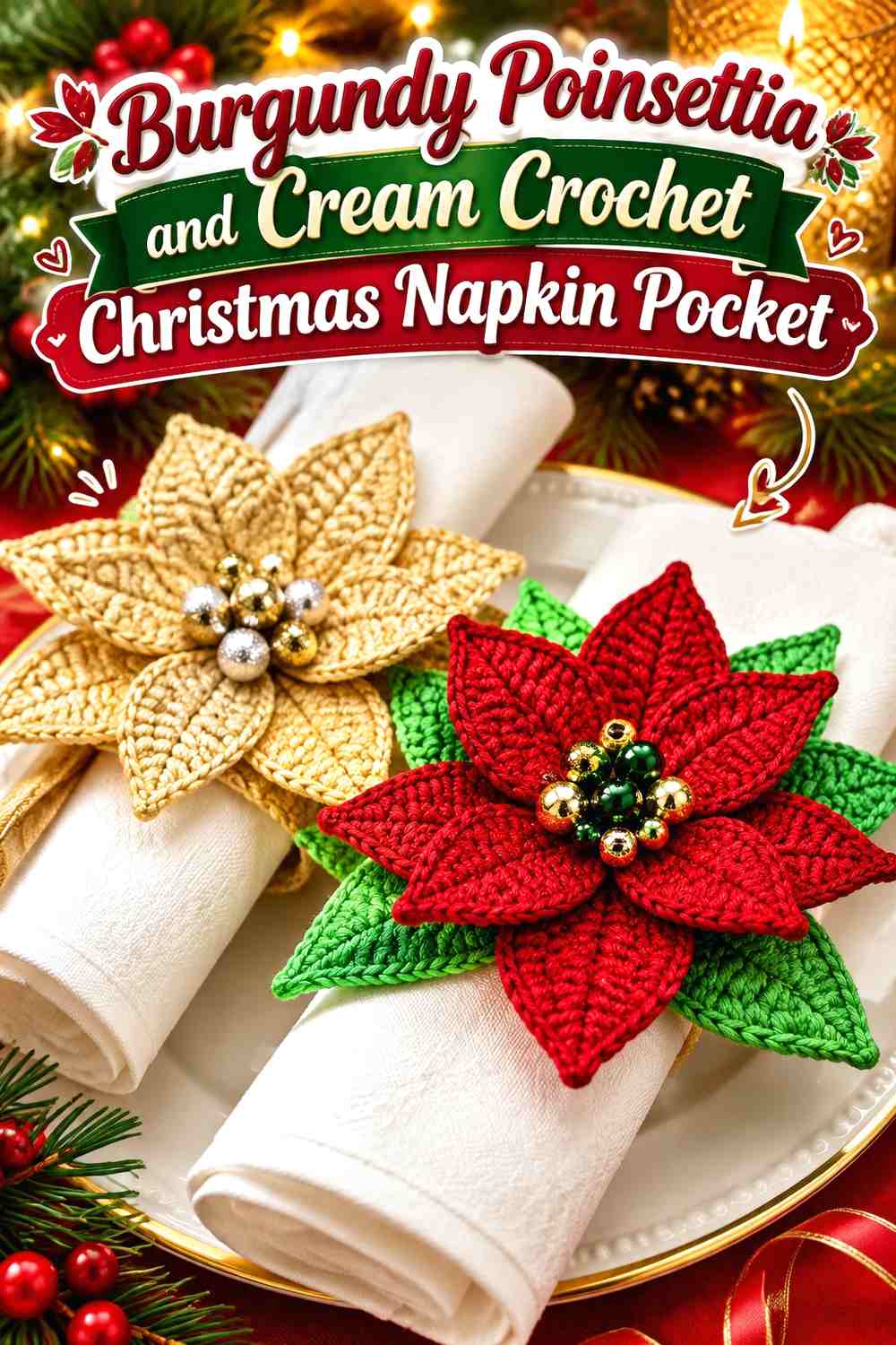
This arrangement gives cream the largest visual area and places a burgundy poinsettia across the front as the main seasonal feature. The contrast is strong enough that the flower does not need several additional colors to be recognizable. Keeping the pocket body quiet also lets the pointed petal silhouette provide most of the decoration.
Let Burgundy Poinsettia Petals Lead Against the Cream Pocket
Use burgundy for the flower rather than scattering it equally through the pocket body. A concentrated floral accent establishes a clear focal point and prevents the small holder from becoming unnecessarily busy.
Leave visible cream around the outer petals. If the burgundy flower fills almost the entire front, the pocket can start to look like a flower-shaped holder rather than a cream pocket decorated with a poinsettia.
Keep Cream Visible Around the Burgundy Poinsettia Opening
Cream near the top creates useful space between the flower and the folded napkin. This matters when your napkin is also burgundy or another dark holiday shade because the lighter pocket edge stops the two dark elements from running together.
Use a Small Cream Center to Break Up Burgundy Petals
A cream center can tie the flower back to the pocket without adding gold or yellow. Keep it visually smaller than the burgundy petal area so the poinsettia remains burgundy-led.
Creator Credit: Natagor Finlayson
2. Cream Poinsettia and Burgundy Crochet Christmas Napkin Pocket
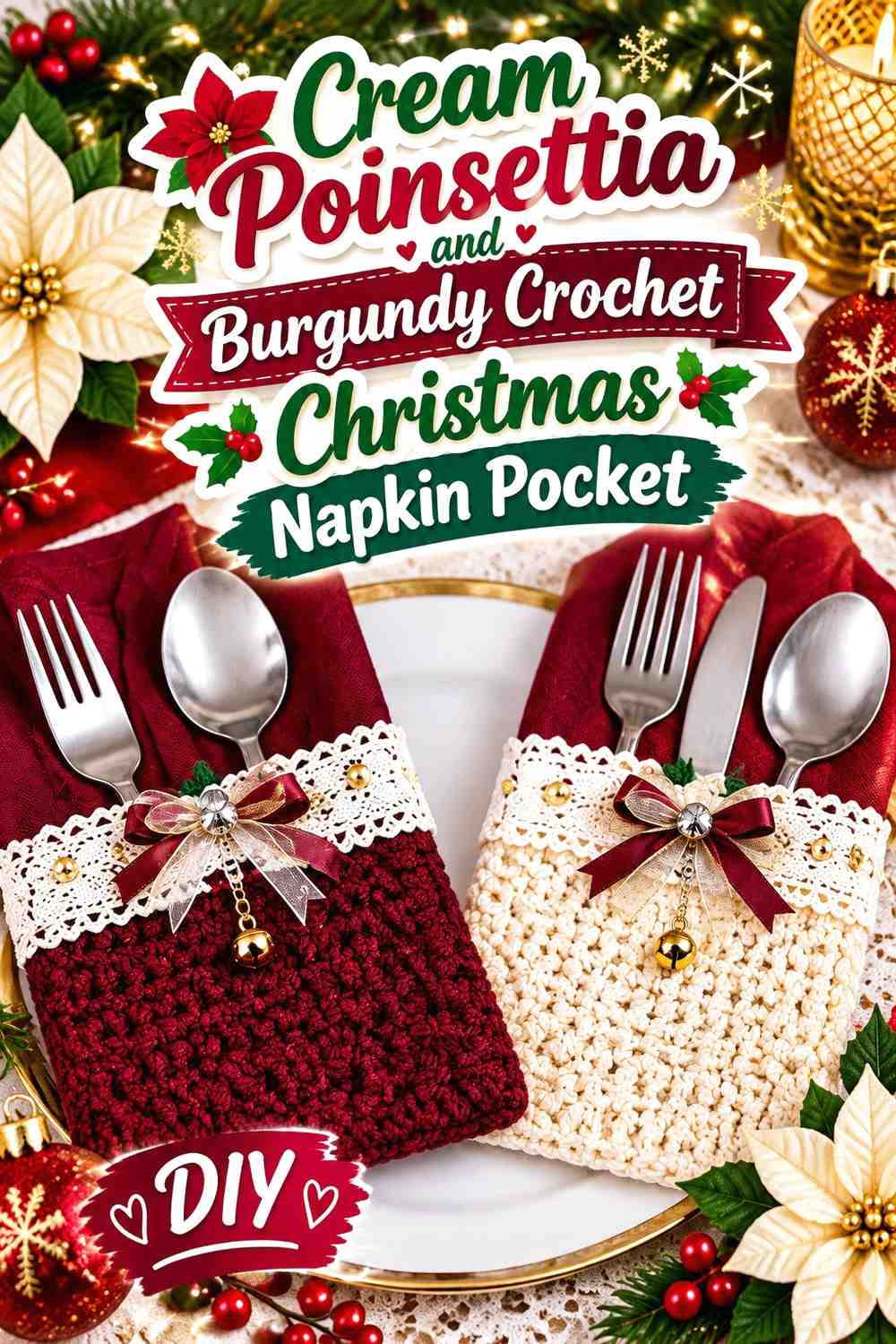
Reverse the first idea by covering the pocket in burgundy and placing a cream poinsettia on the front. The lighter flower becomes highly visible against the dark body, giving the project a winter-white floral direction while retaining burgundy as the strongest table color.
Let Burgundy Cover the Main Crochet Napkin Pocket
Keeping the front and back visually burgundy establishes a strong background before any decoration is added. This is useful when you want the holder to coordinate with burgundy table linens without making the poinsettia the same color as its base.
Give the Cream Poinsettia Enough Space on Burgundy
Cream petals can disappear against a white or cream napkin if the flower sits too close to the opening. Place the motif lower on the burgundy body so the darker background remains visible around its full outline.
That darker margin helps the cream poinsettia stay distinct even when pale napkins extend above it.
Repeat Cream Along the Burgundy Pocket Edge
A restrained cream edge can connect the flower with the pocket structure. Avoid making the border as visually dominant as the flower; the poinsettia should remain the main cream feature.
Creator Credit: Rosa Angélica
3. Burgundy Layered Poinsettia Crochet Napkin Pocket With a Cream Center
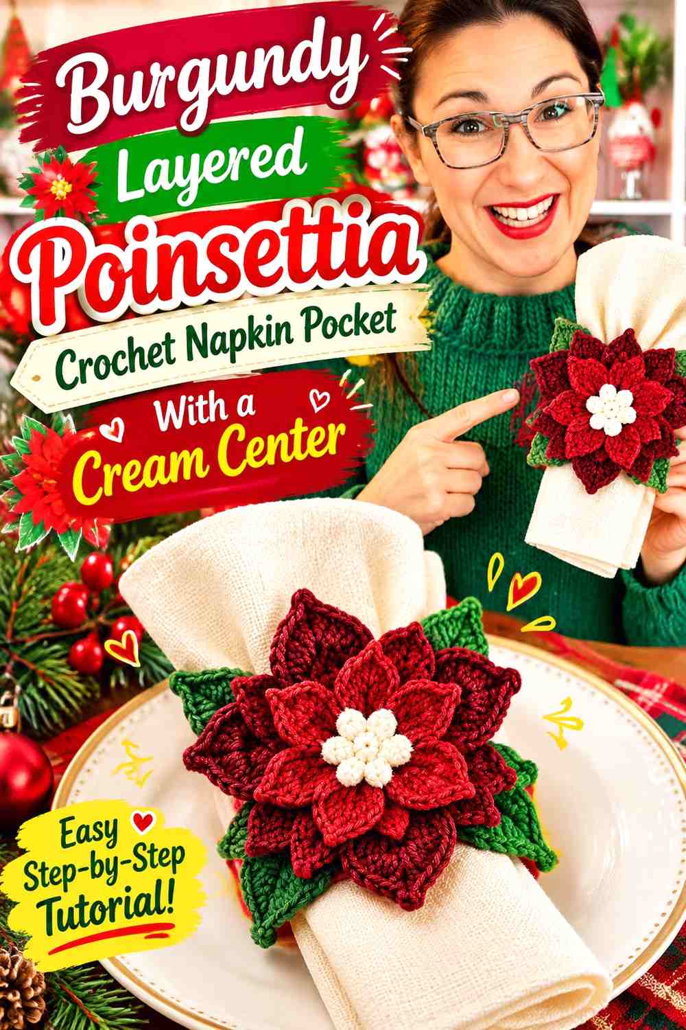
A layered burgundy flower creates more dimensional emphasis than a flat accent, so the surrounding pocket can remain comparatively simple. Cream works well at the flower center and around the upper pocket edge, where it separates multiple burgundy petal layers from the holder beneath.
Use Burgundy Layers Without Covering the Entire Cream Pocket
Dimensional petals already create considerable visual weight. Keep enough cream pocket surface visible around the flower so the layers can be distinguished individually rather than forming one dense burgundy mass.
This is particularly important on a narrow pocket, where even a medium-size flower can occupy much of the front.
Put Cream at the Center of the Burgundy Poinsettia
A cream center creates a light focal point inside darker petals and repeats the pocket color at a smaller scale. It is a useful option when you want to maintain a strict two-color palette instead of adding a third center shade.
Keep Cream Near the Burgundy Flower Clear of the Pocket Opening
If the flower is thick or strongly layered, position it where the petals do not fold over the opening. The cream top section should remain visually and physically clear enough to show where the napkin belongs.
Creator Credit: Hobbii Germany
4. Cream Textured Crochet Napkin Pocket With a Burgundy Poinsettia Cuff
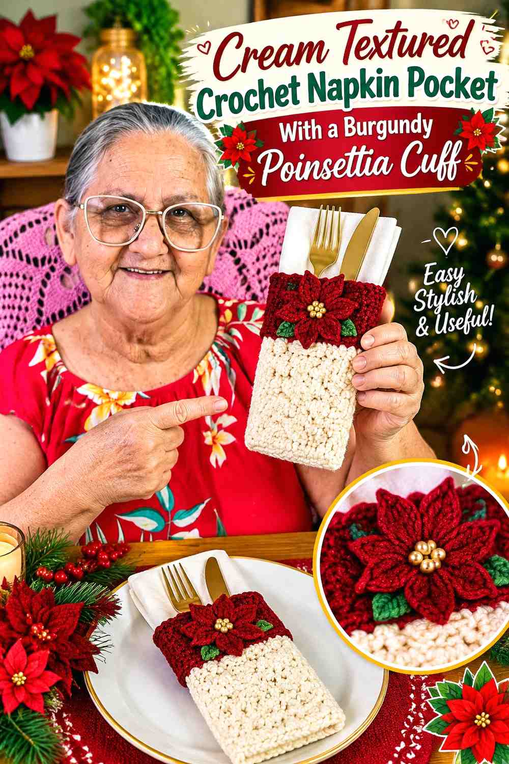
This design uses cream texture across the main pocket and moves burgundy upward to the cuff and flower. It suits a place setting where you want crochet texture to remain visible rather than dividing the whole surface with several stripes.
Let Cream Texture Carry the Main Napkin Pocket
Keeping textured stitches in one light color allows their shadows and raised areas to remain visible. Burgundy color changes through every textured section could compete with that surface detail.
If the pocket has pronounced texture, reserve burgundy for the areas where you deliberately want the eye to stop.
Use Burgundy Across the Cream Pocket Cuff
A burgundy cuff gives the opening a clear boundary and introduces the flower color before the poinsettia itself appears. It also helps distinguish a cream pocket from a cream or ivory napkin.
Position the Burgundy Poinsettia Near the Cream-to-Burgundy Transition
Placing the flower close to the cuff connects the decorative motif with the structural color change. Keep enough of the cream body visible beneath it so the flower does not merge completely into the burgundy band.
Creator Credit: Irene Art’s crochê
5. Burgundy Crochet Napkin Pocket With Cream Edging and a Poinsettia Accent
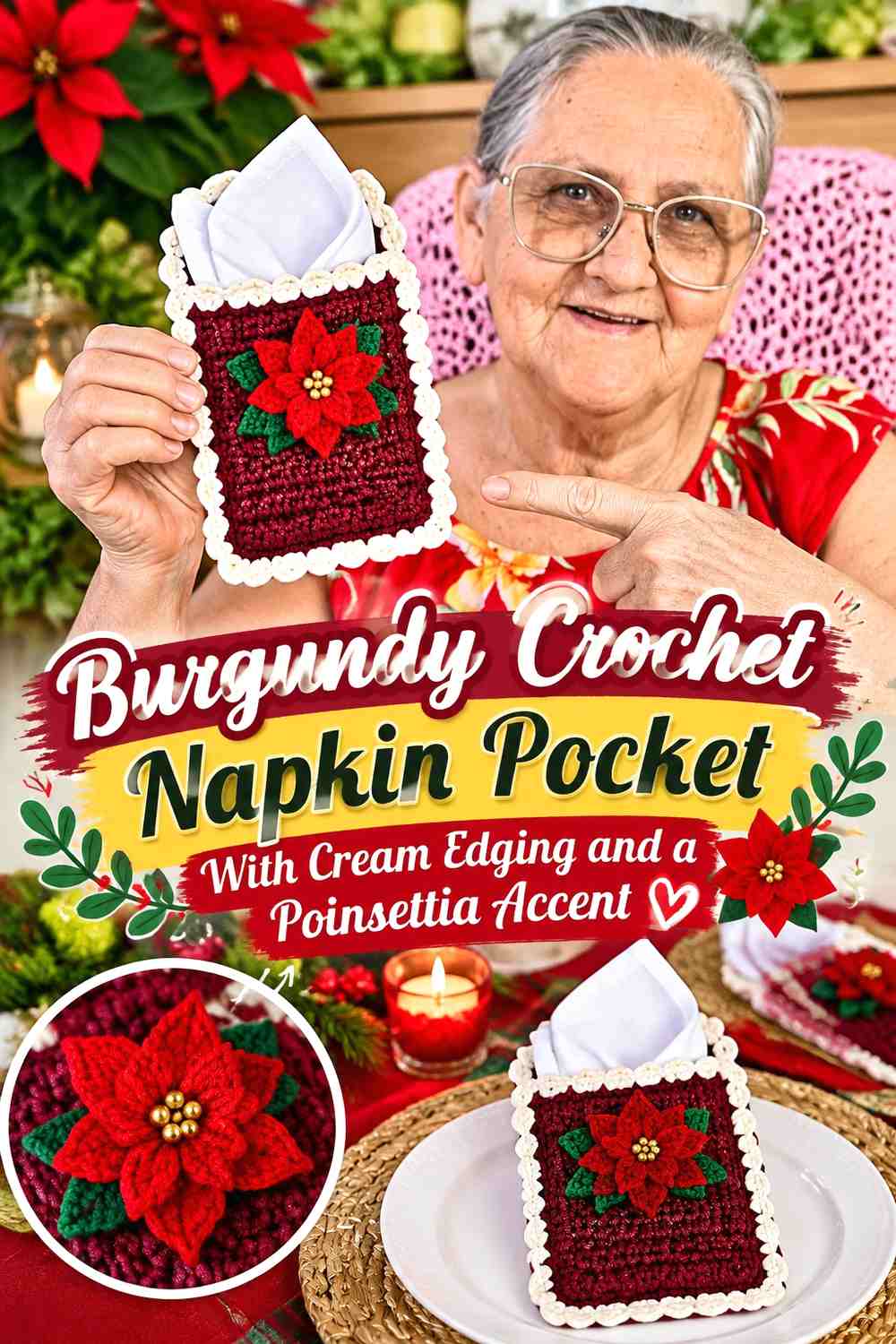
This version is predominantly burgundy but uses cream to trace the pocket outline. A smaller burgundy poinsettia can then sit against a cream patch, cream band, or sufficiently contrasting part of the front so its petals do not disappear into the body.
Let Cream Define the Burgundy Napkin Pocket Shape
Cream edging can make the side seams and opening easier to read against a dark body. A continuous border usually looks more deliberate than several unrelated cream details scattered around the pocket.
Keep the edge narrow if you want burgundy to remain clearly dominant.
Separate the Burgundy Poinsettia From the Burgundy Pocket With Cream
When flower and background share the same color, introduce cream immediately around or behind the motif. Even a small cream area can prevent the petal edges from becoming lost.
This is more effective than relying only on texture to separate two burgundy surfaces from across the table.
Keep Cream Away From Excessive Burgundy Decoration
Once the edge and flower separation are established, additional cream stripes may not be necessary. Too many competing divisions can make a small pocket appear fragmented.
Creator Credit: Jane Vallim Croché
6. Cream Crochet Christmas Napkin Pocket With a Burgundy Poinsettia Closure
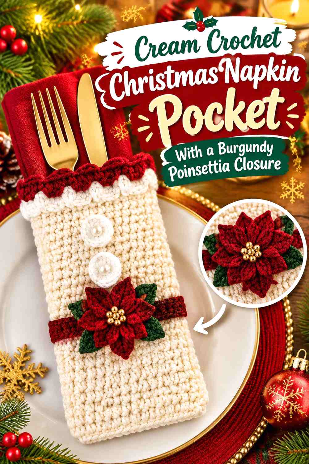
A poinsettia positioned near a fold, flap, tie, or closure area turns the burgundy flower into the visual endpoint of the pocket. Cream should dominate the surrounding structure so guests can still see how the napkin is inserted or removed.
Keep the Cream Pocket Opening Clear Around Burgundy
The burgundy flower should decorate the closure area without hiding it. If the petals extend across the opening, check that they do not make the napkin look trapped beneath the motif.
Move the flower slightly lower or to one side when necessary.
Use Burgundy as the Main Closure Accent on Cream
Because the closure occupies a small area, burgundy does not need to appear in many other places to be noticeable. A strong flower near the top can carry most of the Christmas color by itself.
Repeat Burgundy Once Along the Cream Pocket
If the flower feels isolated, repeat burgundy with a narrow lower edge or small finishing detail. One restrained repeat is usually enough to make the palette feel connected.
Creator Credit: MisAmigurumis
7. Burgundy and Cream Striped Crochet Poinsettia Napkin Pocket
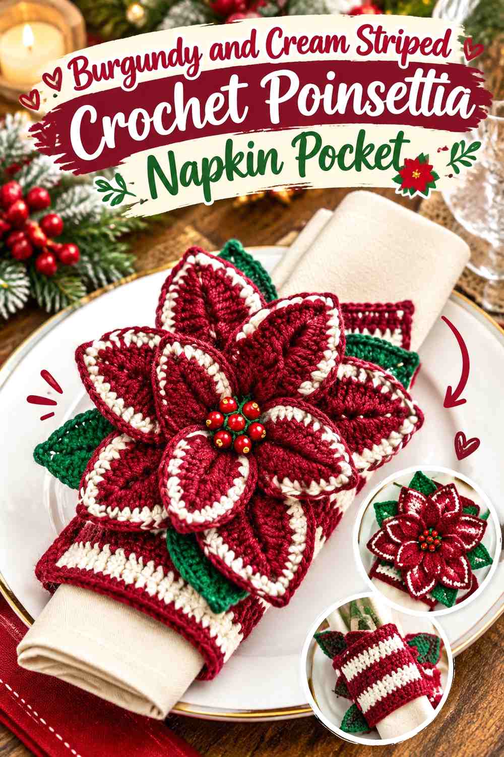
Stripes introduce more movement than a solid pocket, so the flower should be simpler in color. A solid burgundy poinsettia works well over broader cream sections, while the body can alternate the two shades in controlled bands.
Make Burgundy and Cream Stripes Broad Enough for the Small Pocket
Numerous narrow stripes can overwhelm a napkin sleeve because there is little surface area to display them. Broader sections make each color easier to identify and leave room for the flower to remain the focal point.
Place the Burgundy Poinsettia Over a Cream Stripe
A burgundy flower needs a light area beneath most of its petal outline. If it crosses several burgundy stripes, parts of the motif can disappear.
Plan the stripe placement with the flower position in mind rather than treating them as independent design decisions.
Finish Burgundy and Cream Stripes With a Quiet Cream Opening
A solid cream section at the top can give the striped body a visual stopping point and reduce competition around the napkin. It also provides a clean transition if your napkin is burgundy.
Creator Credit: MaryJ Handmade
8. Cream Crochet Napkin Pocket With a Burgundy Poinsettia at the Opening
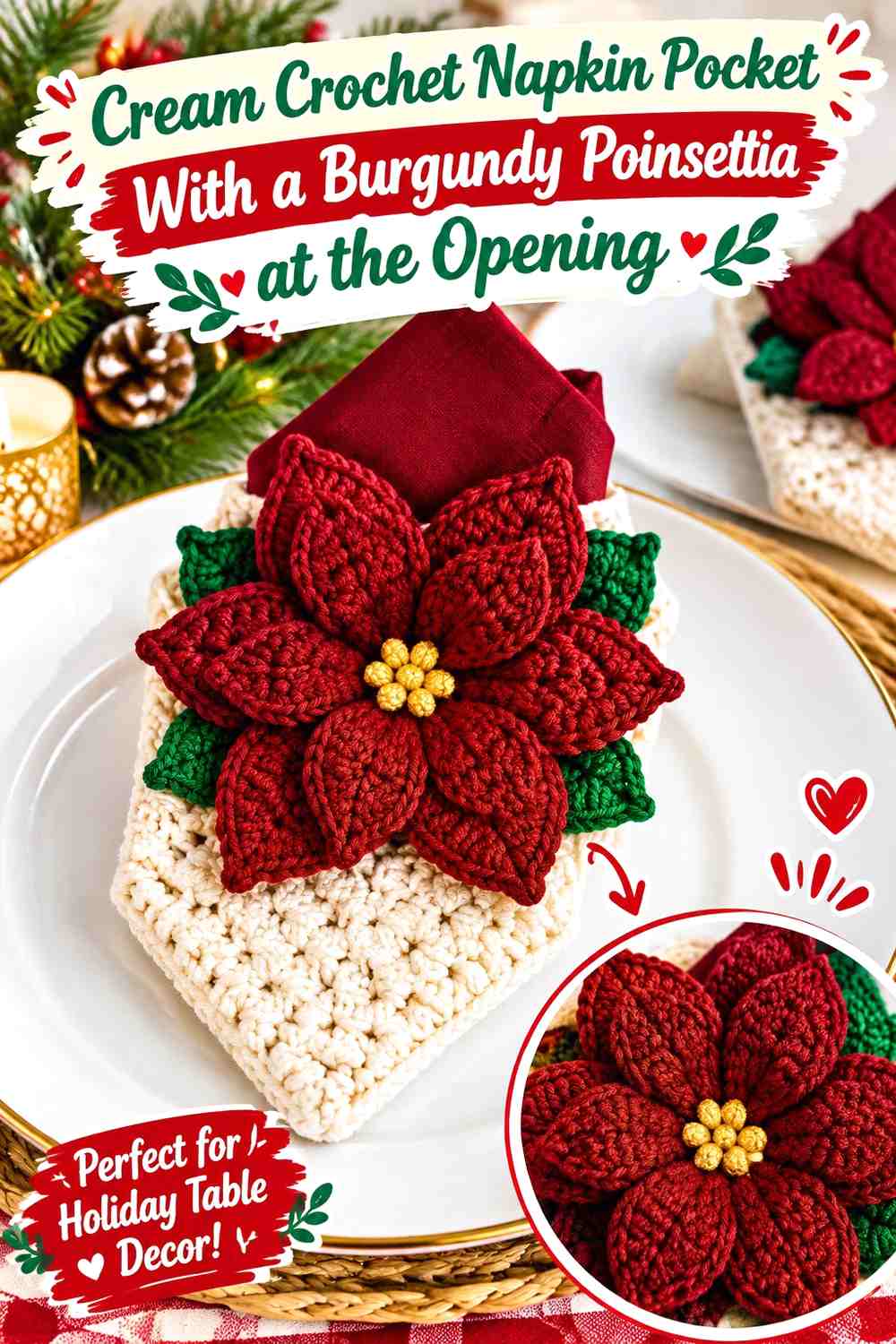
Placing the poinsettia near the upper front keeps it visible even when the pocket sits close to a plate or placemat. Cream dominates the lower body, preventing the upper burgundy flower from making the whole project visually heavy.
Keep Burgundy Petals Below the Cream Pocket Opening
The flower can sit near the top without covering the actual insertion point. Leave enough cream visible above or behind the petals to show the opening clearly.
This is especially important if you plan to tuck both a napkin and flatware into the pocket.
Let Cream Provide Negative Space Around Burgundy Petals
A pointed poinsettia shape is easier to identify when each petal has visible background around it. Avoid filling every gap with additional burgundy leaves or trim.
Use Burgundy Sparingly Along the Cream Lower Edge
If you want to repeat the flower color, a narrow burgundy finish at the bottom can balance the upper accent. Keep the middle cream-dominant so the flower still has adequate visual separation.
Creator Credit: Brunaticality
9. Burgundy Crochet Napkin Pocket With a Cream Poinsettia
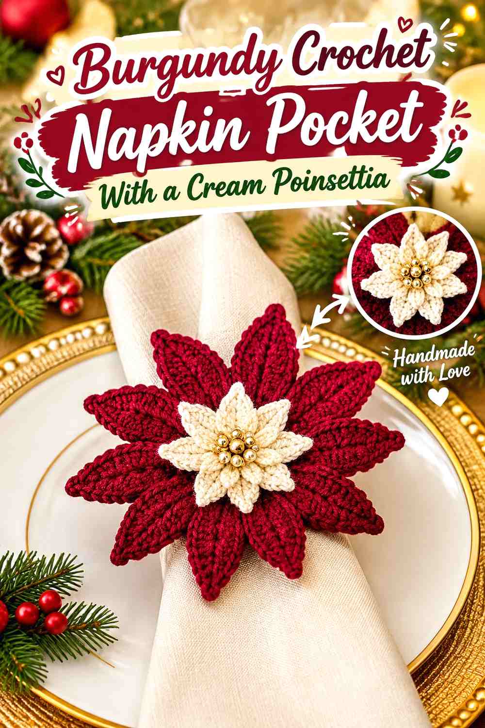
A cream flower over a burgundy pocket creates one of the strongest light-and-dark relationships in the collection. It also changes the usual poinsettia expectation, making the flower lighter while the pocket carries the traditional deep holiday color.
Use Cream Poinsettia Petals as the Main Contrast on Burgundy
Let the cream flower be the largest light detail. Adding a wide cream border, cream stripes, and a cream cuff at the same time can reduce its impact because the flower no longer has a unique role.
Keep Burgundy Visible Between Cream Petals and the Napkin
Position the flower so a strip of burgundy remains visible around the top and sides. This darker outline protects the cream poinsettia from blending into pale table linens.
Add a Burgundy Center to Reconnect the Cream Poinsettia
A burgundy center repeats the body color inside the flower and helps the two parts look intentionally related. It also keeps the palette limited to the requested two shades.
Creator Credit: Emi Harrington
10. Cream Crochet Poinsettia Napkin Pocket With Burgundy Petal Layers
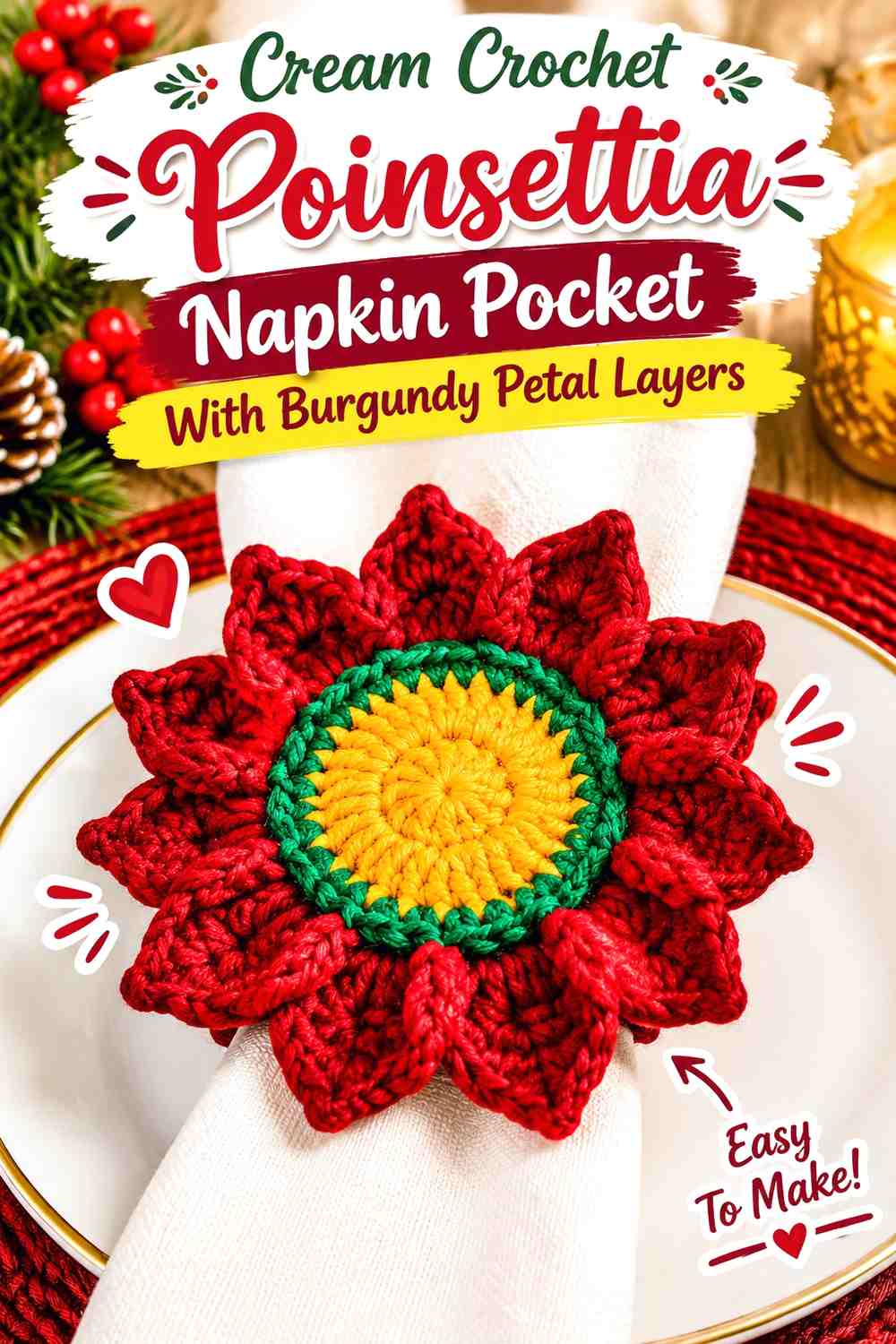
Here, cream covers both the pocket and part of the flower, while burgundy is used selectively across an outer or inner petal layer. The result is more tonal than a completely burgundy flower and gives each petal layer a distinct role.
Alternate Cream and Burgundy Across Poinsettia Layers Carefully
Avoid making every flower layer equal in color coverage. Let either burgundy or cream clearly lead so the layered shape remains easy to understand.
A burgundy outer layer with a smaller cream inner section gives a darker floral outline, while reversing those roles creates a lighter flower edged by the pocket color.
Keep the Cream Pocket Simpler Than the Burgundy Poinsettia
Because the flower already contains two-color layering, the pocket body does not need complex striping. A mostly solid cream front gives the floral construction enough room to be appreciated.
Use Burgundy at the Cream Pocket Edge Only as a Small Repeat
A narrow border can echo the petals, but keep it secondary. If the border becomes too wide, burgundy starts competing with the flower for the main accent role.
Creator Credit: The Secret Yarnery
11. Burgundy and Cream Color-Block Crochet Poinsettia Napkin Pocket
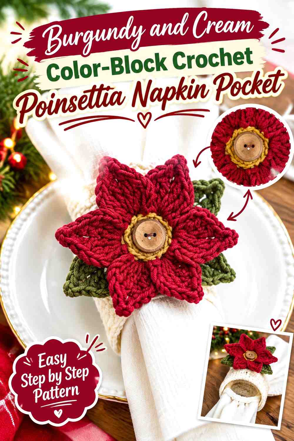
Large color blocks create a cleaner alternative to stripes. One section of the pocket can be burgundy and another cream, with the poinsettia positioned where its own colors maintain strong contrast against the background.
Give Burgundy and Cream Blocks Unequal Visual Roles
Rather than splitting the pocket exactly in half, decide which shade should lead. A larger cream lower panel with a burgundy top creates a different result from a burgundy body with only a cream front band.
Unequal sections can also make the poinsettia placement feel more deliberate.
Place Burgundy Poinsettia Petals Mainly Against Cream
If your flower is burgundy, keep most of it within the cream block. Crossing one or two petals into burgundy can be visually interesting, but moving most of the flower over the dark section reduces its outline.
Keep Cream Boundaries Clean Against Burgundy
Color blocking depends on a readable division. Avoid inserting several additional stripes directly at the transition, because that weakens the large-block effect.
Creator Credit: Simply Made by Erin
12. Cream Crochet Christmas Napkin Pocket With Burgundy Poinsettia and Leaf Details
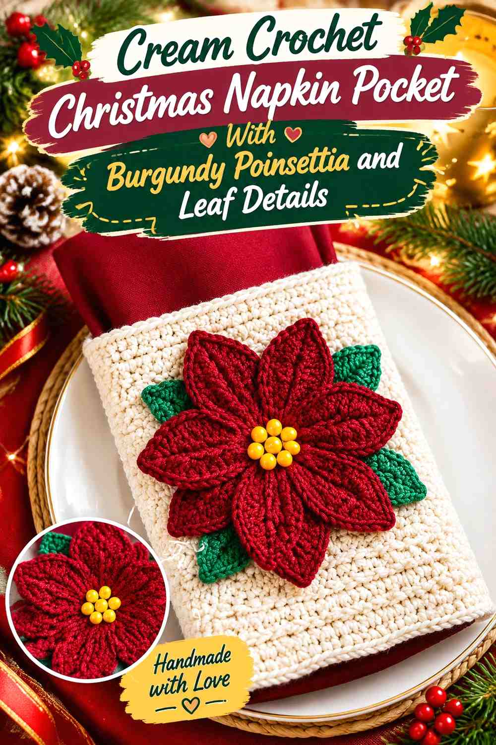
The final idea keeps the pocket largely cream, makes burgundy the poinsettia color, and extends the same burgundy into simplified leaf or pointed background details. Using one dark color for both flower and foliage creates a stylized two-color interpretation rather than introducing green.
Keep Burgundy Leaves Secondary to the Burgundy Poinsettia
When petals and leaves share the same shade, shape and placement must separate them. Keep the leaf area smaller or position it behind the flower so the poinsettia remains the main motif.
Cream showing between the flower and leaf edges can make those shapes easier to distinguish.
Let Cream Surround the Burgundy Flower-and-Leaf Cluster
A generous cream field prevents the expanded motif from consuming the whole pocket front. This is particularly useful when the leaf details extend horizontally beyond the petals.
Repeat Burgundy at One Cream Pocket Boundary
A narrow burgundy upper or lower edge can connect the larger floral cluster with the pocket shape. One boundary is usually enough; using burgundy around every side may make the cream center feel boxed in.
Creator Credit: Naztazia
Which Burgundy and Cream Poinsettia Napkin Pocket Color Direction Should You Choose?
For the clearest classic contrast, choose a cream pocket with a burgundy poinsettia, as in Ideas 1 or 8. The large neutral field makes the flower easy to recognize and keeps burgundy concentrated in the seasonal motif.
Ideas 2 and 9 reverse that relationship with a burgundy pocket and cream flower. These options create a darker place-setting accent while allowing the pale poinsettia to become the strongest contrast.
Choose Ideas 3, 4, or 10 when crochet texture and layered petals matter more than complicated pocket colorwork. Ideas 5 and 6 put greater emphasis on edging and the opening, while Ideas 7 and 11 are stronger choices when you want stripes or color blocking to participate in the design.
Idea 12 is useful when you want foliage-like detail but prefer to preserve a strict burgundy-and-cream palette instead of introducing traditional green.
Conclusion
Burgundy and cream can create far more than one version of a crochet Christmas poinsettia napkin pocket. The main decision is where the dark color carries the visual weight. Burgundy petals on a cream pocket create immediate flower definition, while a burgundy body with a cream poinsettia gives the entire place setting a richer, darker base.
For more subtle variation, use cream to separate burgundy petal layers, define a pocket opening, outline an edge, or break up a textured surface. On such a small table accessory, a narrow contrasting detail can be more effective than adding another major block of color.
Before making a complete set, test one pocket with the actual napkin and tableware. Check that the poinsettia remains visible, that the opening is unobstructed, and that the burgundy-to-cream balance still works when the pocket is viewed as part of the whole place setting. Use the linked original tutorials for the creators’ demonstrated construction details and adapt the color placement separately.
Frequently Asked Questions
Should Burgundy or Cream Be the Main Color in a Poinsettia Napkin Pocket?
Use cream as the dominant pocket color when you want a burgundy poinsettia to be the strongest visual feature. Use burgundy across the pocket when you prefer a deeper table accent and want cream to provide the floral or edging contrast.
Does a Burgundy Poinsettia Show Clearly on a Burgundy Crochet Pocket?
It can, but two burgundy areas may visually merge. Place cream behind the flower, around its center, along the nearby cuff, or between important petal edges when stronger separation is needed.
Can I Make the Poinsettia Cream Instead of Burgundy?
Yes. A cream poinsettia can stand out strongly against a burgundy pocket. Keep enough burgundy visible around the flower if the napkin and table linens are also pale so the cream petals retain a clear outline.
Where Should a Burgundy Poinsettia Sit on a Cream Napkin Pocket?
The upper front or an upper corner can keep the flower visible, but leave the actual pocket opening usable. A flower positioned slightly below the opening often provides better access than petals placed directly across the top.
How Can I Tell Whether Burgundy and Cream Have Enough Contrast?
Place the yarns together in the lighting where the table will be used. You can also view a photograph in grayscale. Clear light-and-dark separation is particularly helpful for small petals, narrow borders, and detailed colorwork.
Can I Add Green or Gold to a Burgundy and Cream Poinsettia Pocket?
You can, but use the third color sparingly if you want burgundy and cream to remain the defining palette. A small flower center or limited leaf detail will change the overall balance less than adding a wide third-color stripe to the pocket.
Should the Cream Border Be Wide on a Burgundy Napkin Pocket?
It depends on its role. A narrow cream border can simply define the opening or outline, while a wider cream band becomes a major color block. If the poinsettia is already cream, keeping the border narrower usually preserves the flower as the principal light feature.