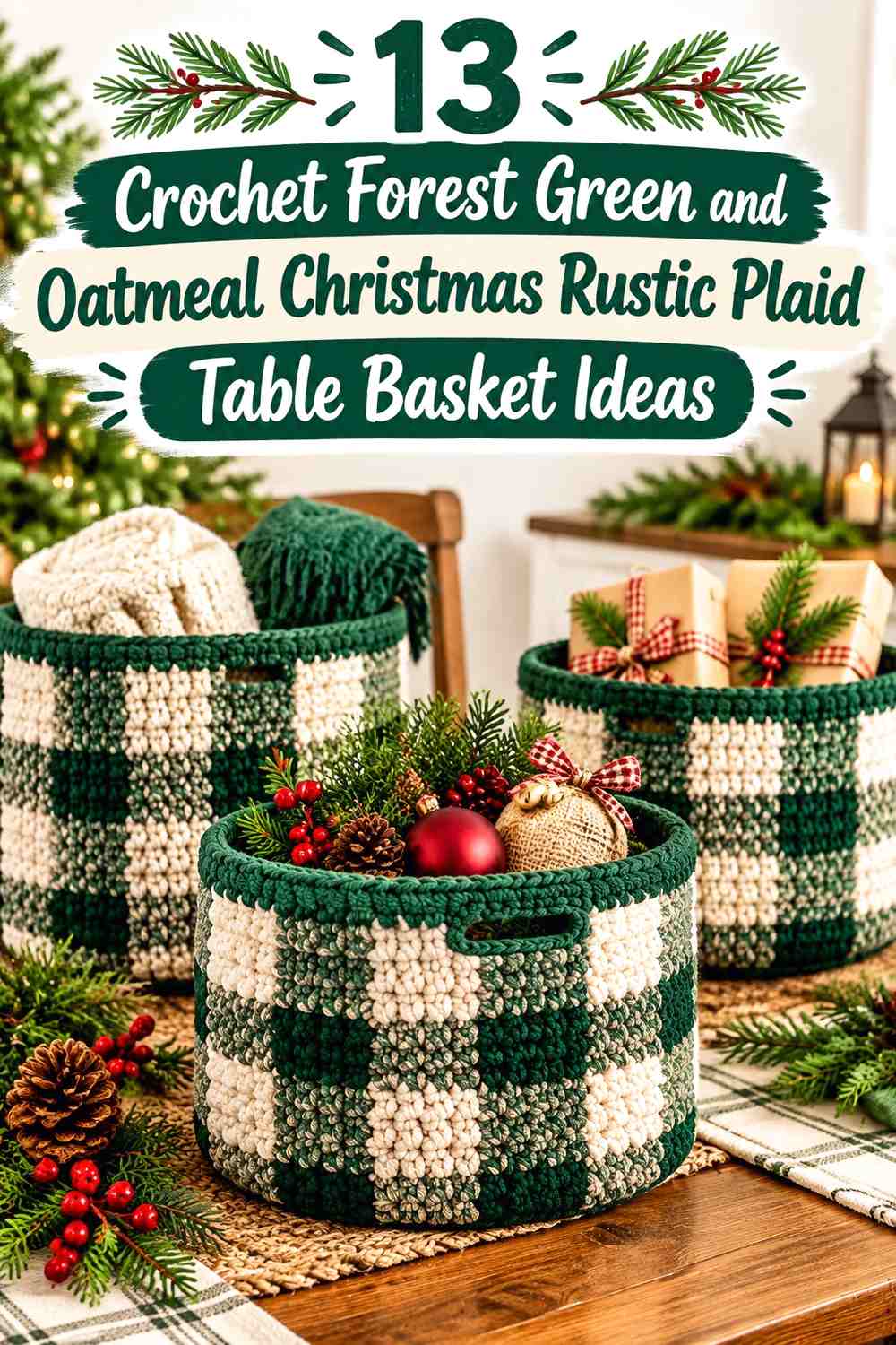

Forest green and oatmeal make a strong starting pair for a rustic Christmas crochet table basket. Forest green supplies the dark woodland color, while oatmeal gives plaid blocks, crossing lines, textured stitches, and borders enough light contrast to remain visible. The combination can stay strictly two-color or expand into cranberry, burgundy, camel, charcoal, sage, rust, and other restrained accents.
The key is deciding which color leads before starting the basket walls. A tabletop basket has limited surface area, so too many equal-strength colors can make the plaid difficult to read. The ideas below use different color proportions, grid styles, borders, and accent strategies while keeping forest green and oatmeal central.
The linked tutorials teach different crochet basket constructions. Use them for the basket concept and construction guidance; the forest green, oatmeal, plaid layouts, and supporting colors described here are independent palette adaptations rather than claims about the colors used by each creator.
Quick List
- Forest Green and Oatmeal Classic Buffalo Plaid Crochet Table Basket
- Oatmeal-Led Forest Green Windowpane Plaid Crochet Table Basket
- Forest Green, Oatmeal, and Cranberry Christmas Plaid Crochet Table Basket
- Forest Green, Oatmeal, and Charcoal Rustic Plaid Crochet Table Basket
- Forest Green, Oatmeal, and Camel Cabin Plaid Crochet Table Basket
- Forest Green, Oatmeal, and Burgundy Christmas Plaid Crochet Table Basket
- Forest Green, Oatmeal, and Muted Gold Holiday Plaid Crochet Table Basket
- Forest Green, Oatmeal, and Sage Woodland Plaid Crochet Table Basket
- Forest Green, Oatmeal, and Espresso Framed Plaid Crochet Table Basket
- Forest Green, Oatmeal, and Rust Cabin Plaid Crochet Table Basket
- Forest Green, Oatmeal, and Taupe Soft Rustic Plaid Crochet Table Basket
- Forest Green, Oatmeal, and Ivory Layered Plaid Crochet Table Basket
- Forest Green, Oatmeal, Cranberry, and Espresso Heritage Plaid Crochet Table Basket
How to Keep Forest Green and Oatmeal Plaid Clear on a Crochet Table Basket
Plaid becomes harder to read when the basket wall is short or heavily textured. Before committing to a complicated grid, decide which areas will act as broad blocks and which will work as thinner crossing lines. Forest green can handle larger areas because its darkness visually anchors the basket, while oatmeal is useful around smaller plaid details that need separation.
Also compare the yarn colors by light and dark value, not just by hue. Two different greens or two warm neutrals can still merge when viewed from a distance. A quick grayscale photo can help reveal whether forest green, oatmeal, and any third color have enough separation for the plaid layout you want.
Balance Forest Green and Oatmeal Around the Basket Rim and Base
A table basket benefits from a deliberate visual frame. If the walls carry a busy plaid, a solid forest green base or rim can give the pattern a stopping point. If the plaid is dark and green-heavy, an oatmeal rim can lighten the top edge and make the opening easier to distinguish.
Keep the base in mind even when it is partly hidden on the table. Repeating a wall color at the bottom creates continuity, while introducing a completely unrelated base color can make the basket look disconnected from the plaid above it.
Add Christmas Accents Without Losing Forest Green and Oatmeal
Cranberry, burgundy, muted gold, brown, or rust can make the palette more specifically seasonal, but none needs to occupy as much space as forest green or oatmeal. On a small basket, a third color often works better as a narrow crossing line, repeated check, rim detail, or small band.
If the added shade starts competing with both main colors, reduce its visual area instead of adding a fourth strong color. Forest green and oatmeal should still be easy to identify as the main relationship.
1. Forest Green and Oatmeal Classic Buffalo Plaid Crochet Table Basket
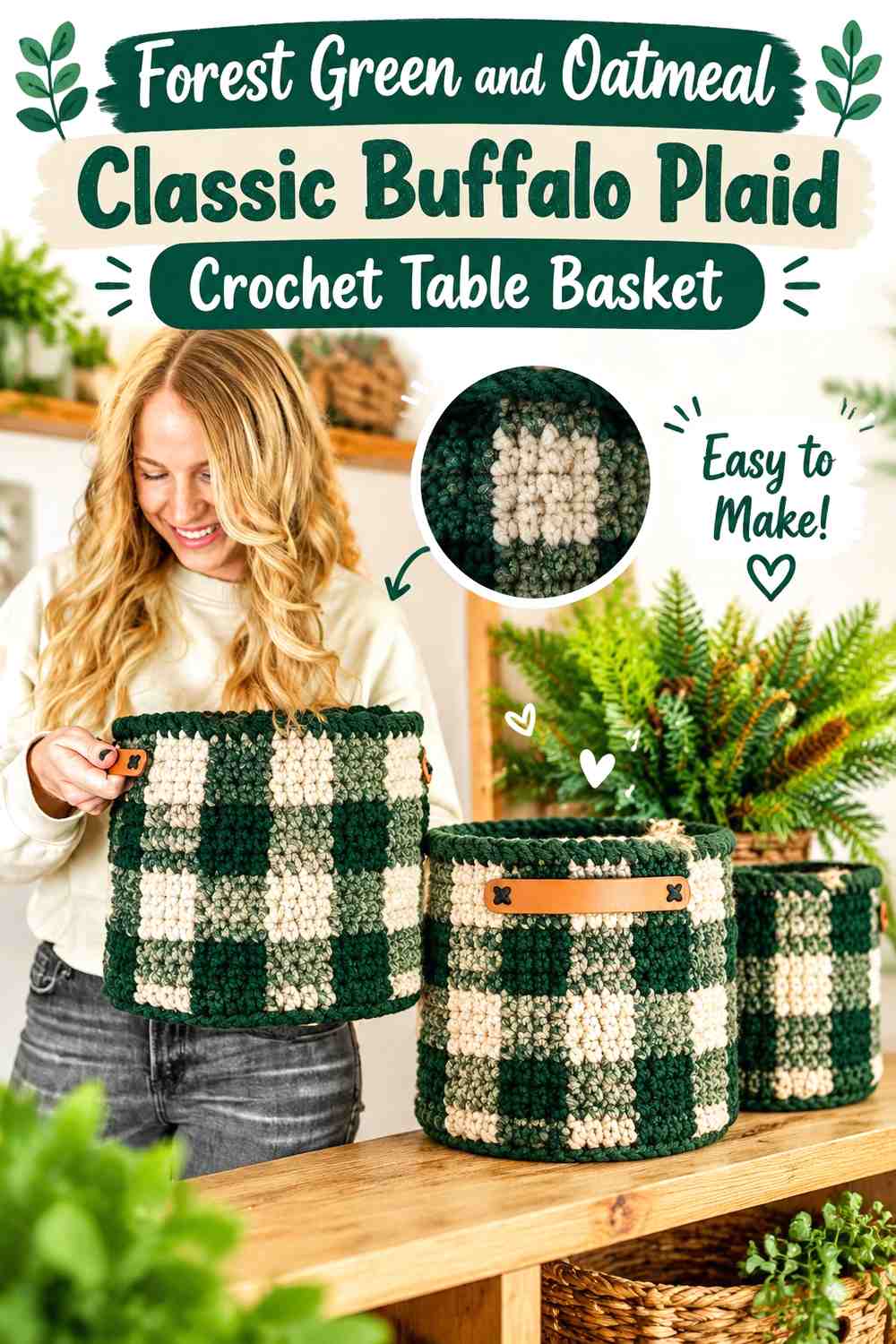
This version keeps the palette to two colors and relies on proportion rather than extra accents. Let forest green cover most of the basket wall, then use oatmeal to create lighter checks and intersections. The limited palette suits a compact tabletop basket because the plaid remains readable even when the surface area is modest.
A solid forest green base can visually support the darker checks above it, while an oatmeal rim provides a clean stopping point if the upper plaid would otherwise disappear into the basket opening.
Let Forest Green Carry the Large Plaid Blocks
Give forest green the larger uninterrupted areas so the basket retains the deep woodland character suggested by the title. Large green sections also provide enough visual rest between lighter oatmeal checks.
If every small block alternates equally between forest green and oatmeal, the basket can become visually busy. Broader green areas with strategically repeated oatmeal sections create a clearer hierarchy.
Use Oatmeal to Separate the Forest Green Checks
Place oatmeal where two dark areas would otherwise meet or where you want the plaid intersections to remain obvious. On a textured basket wall, these light breaks can prevent the forest green pattern from reading as one continuous dark band.
An oatmeal upper edge can repeat that separation without introducing another color.
Creator Credit: The Turtle Trunk
2. Oatmeal-Led Forest Green Windowpane Plaid Crochet Table Basket
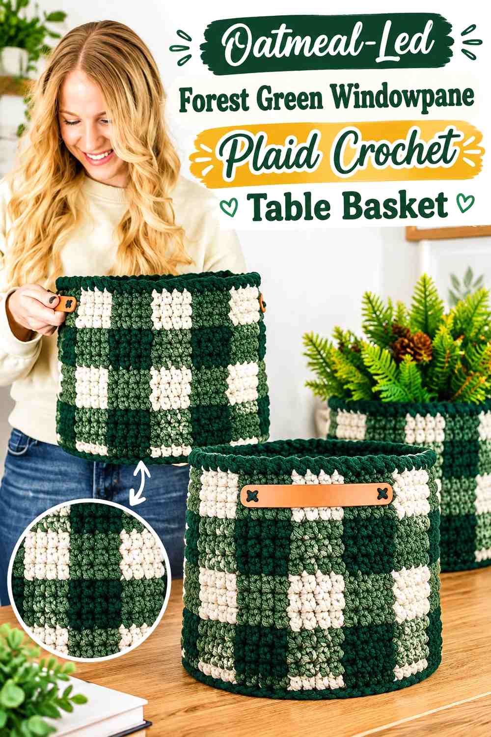
Reverse the balance for a lighter farmhouse-style basket. Oatmeal can occupy most of the wall, while forest green forms narrow vertical and horizontal lines that suggest a windowpane plaid rather than broad buffalo checks.
Because the green occupies less space, each line becomes more noticeable. Keep the repetitions consistent around the basket so the grid looks intentional instead of appearing as isolated green stripes.
Oatmeal Makes the Forest Green Table Basket Feel Lighter
Using oatmeal across the main wall reduces the visual weight of the basket without removing the traditional Christmas green. It is especially useful when the finished basket will sit on a darker wood table or beside other deep holiday colors.
Consider repeating forest green at the base or rim so the narrow plaid lines have another dark element to connect with.
Keep Forest Green Windowpane Lines Narrow and Repeated
Forest green should act as the drawing line of this palette. Rather than increasing its width in random places, repeat similarly weighted lines around the basket.
If the grid starts looking heavier than intended, increase the oatmeal areas between green lines instead of adding a third neutral.
Creator Credit: Jo to the World Creations
3. Forest Green, Oatmeal, and Cranberry Christmas Plaid Crochet Table Basket
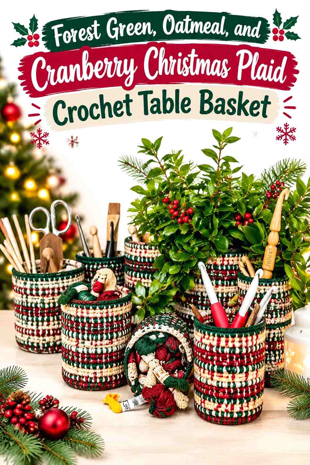
Cranberry introduces a recognizable holiday accent without requiring a bright red-and-green treatment. Keep forest green dominant, let oatmeal provide the lightest contrast, and use cranberry in a smaller repeated role.
On a table basket, cranberry can work particularly well as a narrow crossing stripe or occasional check because even a small amount will stand apart from the green-neutral foundation.
Forest Green Should Remain the Base Behind Cranberry
Use forest green across more of the basket than cranberry so the red accent does not turn the project into an equal red-and-green checkerboard. A green-heavy base keeps the palette woodland-oriented and gives cranberry a more intentional seasonal role.
If using cranberry near the rim, repeat a small cranberry detail lower on the basket so the accent does not look detached from the plaid.
Oatmeal Keeps Cranberry From Competing With Forest Green
Place oatmeal between some forest green and cranberry sections when the two darker colors begin to visually crowd each other. The neutral creates breathing room and makes the crossing structure easier to see.
This is especially helpful on stitch textures that cast shadows, where cranberry and forest green may appear closer in value than they do as loose yarn.
Creator Credit: Tinna Thorudottir Thorvaldar
4. Forest Green, Oatmeal, and Charcoal Rustic Plaid Crochet Table Basket
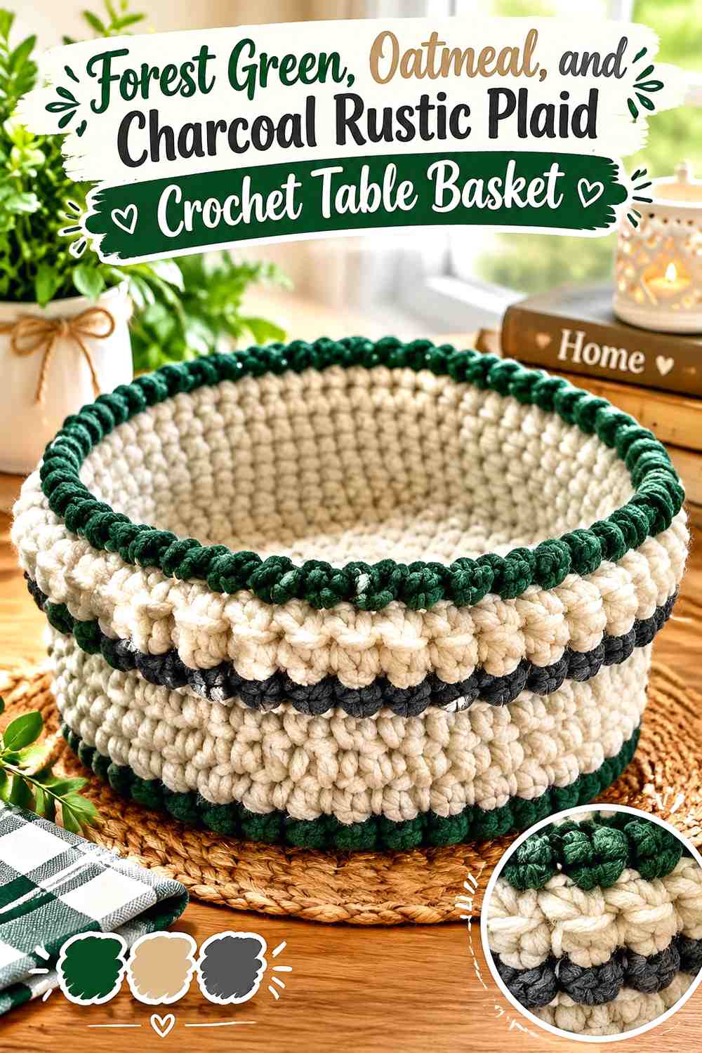
Charcoal pushes the palette toward a darker lodge-style plaid. Use it for definition rather than allowing it to cover the same area as forest green. Forest green should remain the recognizable main color, oatmeal the light neutral, and charcoal the deepest outlining shade.
A charcoal base or thin outer edge can also make the basket feel grounded on the table without requiring black.
Charcoal Sharpens Forest Green and Oatmeal Plaid
Use charcoal where the plaid needs its darkest visual line, such as selected crossings or a narrow lower band. The extra value difference can make oatmeal blocks appear cleaner and give forest green more definition.
Avoid filling every dark plaid position with charcoal. Too much can reduce forest green to an accent rather than the main seasonal color.
Keep Oatmeal Near the Rim to Soften Charcoal
When charcoal appears in the walls or lower edge, oatmeal at the rim gives the basket a lighter upper boundary. This can help separate the opening from the dark plaid beneath it.
You can also repeat small oatmeal checks near the charcoal lines so the deepest shade never forms one heavy uninterrupted area.
Creator Credit: L’angolo di Criss
5. Forest Green, Oatmeal, and Camel Cabin Plaid Crochet Table Basket
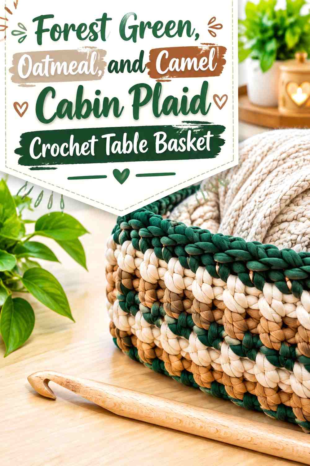
Camel shifts the scheme toward warm rustic decor. It sits closer to oatmeal than a dark brown would, so the most important decision is maintaining enough difference between those two neutrals.
Let forest green remain the main dark shade. Use oatmeal for the lightest checks and camel as an occasional warm stripe, border, or secondary block.
Camel Warms the Oatmeal Without Replacing Forest Green
Keep camel adjacent to both main colors instead of grouping it into one large band. Against oatmeal, it creates a softer neutral transition; against forest green, it reads as a distinct warm accent.
Check the two neutral yarns side by side before beginning. If camel and oatmeal are too close in value, use camel in larger simple sections rather than tiny plaid details.
Forest Green Needs the Largest Share in a Camel Plaid
Because oatmeal and camel are both quiet neutrals, forest green should occupy enough of the basket to keep the pattern from becoming beige-dominant.
A green base, broad green checks, or green rim can all reinforce that hierarchy without increasing the number of colors.
Creator Credit: Bella Coco
6. Forest Green, Oatmeal, and Burgundy Christmas Plaid Crochet Table Basket
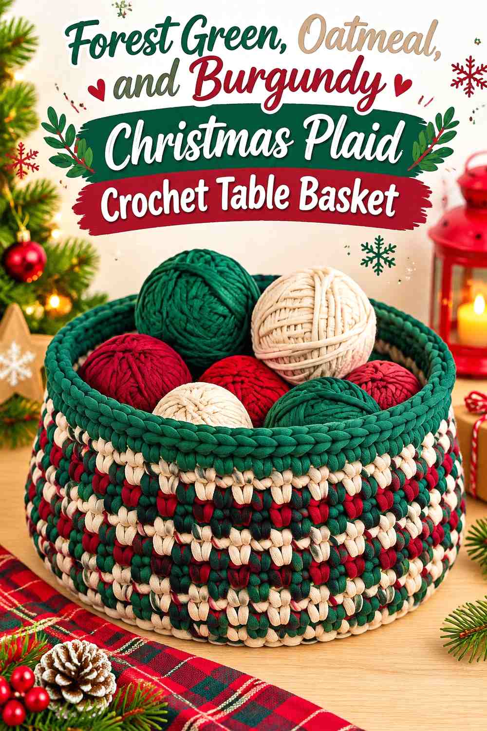
Burgundy gives the basket a deeper, more muted red accent than cranberry. Because burgundy and forest green can both be visually dark, oatmeal becomes especially important in this three-color scheme.
Use oatmeal around intersections or between blocks where the two darker colors would otherwise lose their individual shapes.
Burgundy Adds Christmas Depth Beside Forest Green
Reserve burgundy for selected plaid lines or repeated secondary blocks instead of splitting the basket equally between red and green. This maintains a quieter rustic direction while still adding a clear Christmas reference.
Burgundy can also appear in a narrow rim detail if the wall already contains enough forest green to anchor it.
Oatmeal Prevents Burgundy and Forest Green From Merging
Position oatmeal next to smaller burgundy sections when possible. The light neutral outlines the accent and prevents dark red from disappearing into adjacent green.
If a grayscale check shows little difference between the forest green and burgundy yarns, make the oatmeal separations broader rather than relying on hue alone.
Creator Credit: naztazia
7. Forest Green, Oatmeal, and Muted Gold Holiday Plaid Crochet Table Basket
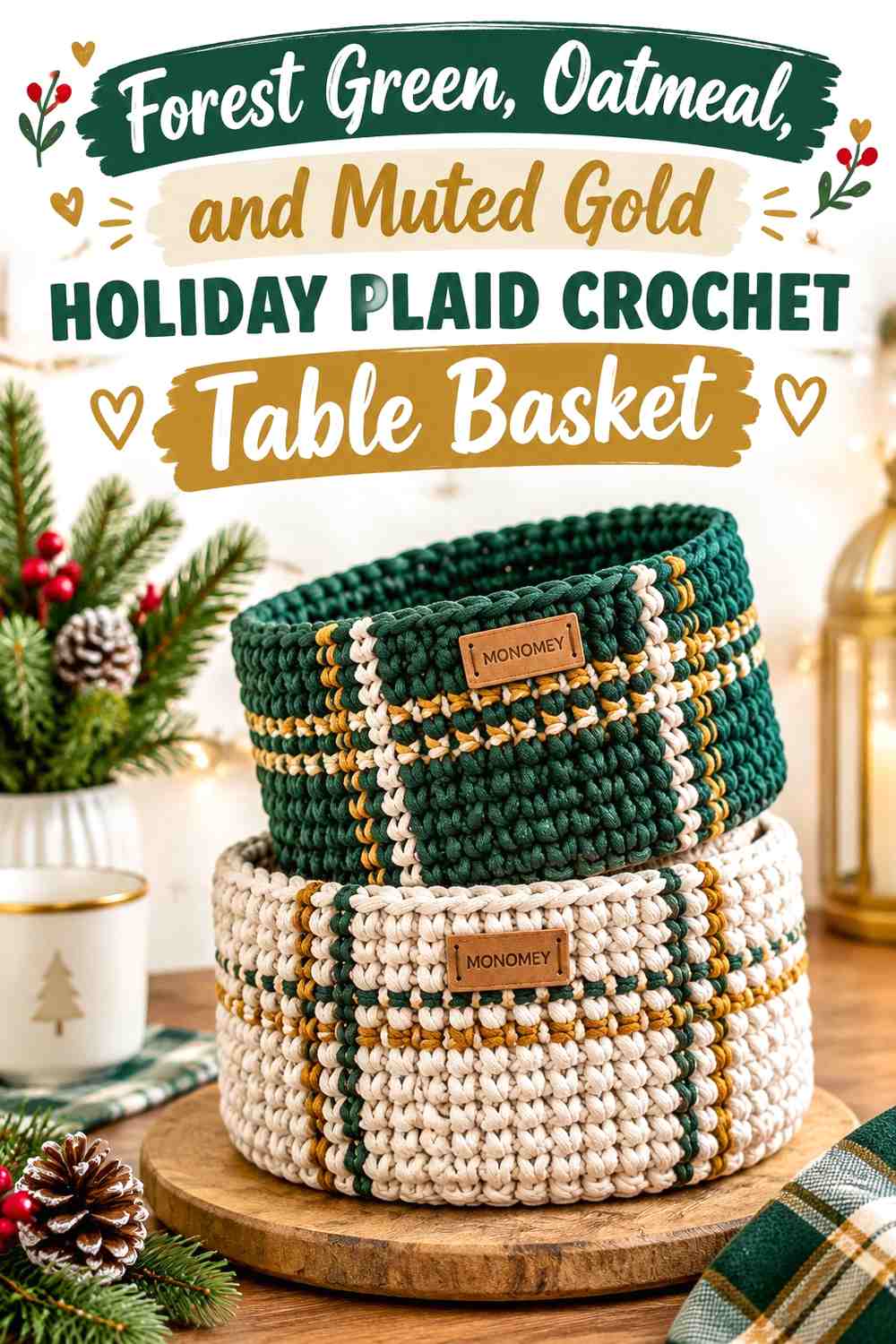
A restrained gold or mustard-toned accent gives forest green and oatmeal a warmer holiday direction without introducing red. This works particularly well when you want a Christmas table basket that can remain useful beyond strictly red-and-green decorating.
Keep the gold accent small because its warmth will draw attention even when it covers little surface area.
Muted Gold Works Best as a Small Accent With Forest Green
Use muted gold in narrow crossing lines or isolated checks rather than making it a full third of the plaid. Against deep forest green, a small amount is enough to remain visible.
Repeating the gold at measured intervals makes the accent feel integrated rather than randomly added.
Oatmeal Keeps Gold From Making the Forest Green Basket Too Busy
Oatmeal provides visual space between the strong warm accent and the dominant green. Keep some oatmeal sections uninterrupted instead of filling every neutral block with gold.
An oatmeal rim is another way to calm the upper edge if the wall already contains several gold intersections.
Creator Credit: Crochet Designer Simona
8. Forest Green, Oatmeal, and Sage Woodland Plaid Crochet Table Basket
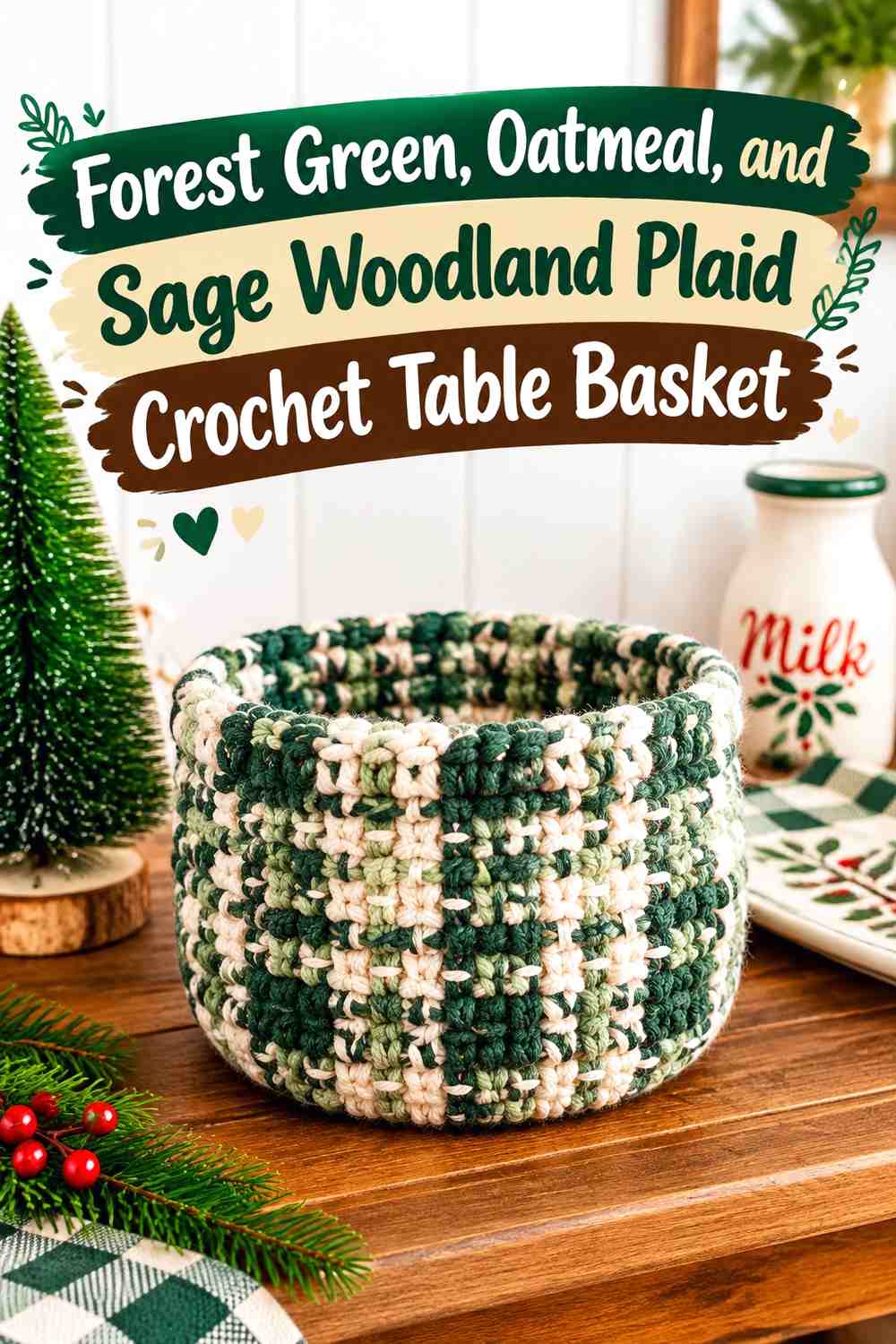
Sage creates the softest green-based variation in the collection. Instead of adding a contrasting holiday accent, this palette builds depth through two green values plus oatmeal.
Use forest green for the darkest anchor, sage for transitional blocks, and oatmeal for the lightest sections. The result can suggest plaid without relying on strong red or black lines.
Sage Builds a Softer Bridge Around Forest Green
Place sage beside forest green where you want a gradual transition rather than a hard contrast. This is useful across larger plaid blocks because the two greens can create depth without making the table basket look heavily striped.
Do not let sage replace every oatmeal section; the palette still needs a clearly light value.
Oatmeal Still Needs Enough Space to Define the Forest Green Tonal Plaid
Because sage and forest green belong to the same color family, oatmeal does much of the work of keeping the grid readable. Give it enough visible area to separate the darker and medium green sections.
If the finished plaid looks flat from a distance, increasing oatmeal is usually more effective than adding another green.
Creator Credit: Sigoni Macaroni
9. Forest Green, Oatmeal, and Espresso Framed Plaid Crochet Table Basket
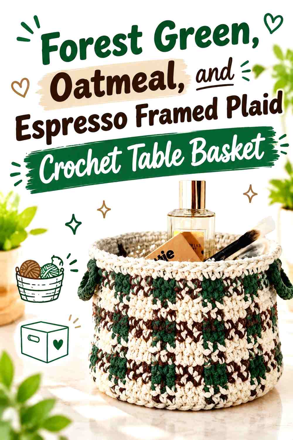
Espresso brown works particularly well as a framing color. Instead of weaving it throughout every plaid repeat, concentrate it around the base, rim, or selected outer lines and keep the main checks forest green and oatmeal.
This creates a basket with a distinct dark frame while preserving the classic two-color plaid in the central wall.
Espresso Gives Forest Green a Rustic Outer Frame
A narrow espresso border can visually contain the forest green and oatmeal pattern and connect the basket with dark wood or other brown holiday decor.
Avoid using a very wide espresso band on a short table basket, since it may reduce the amount of wall available for the plaid itself.
Oatmeal Plaid Blocks Should Stay Inside the Espresso Border
Keep several clear oatmeal areas between the darkest brown frame and the green checks. The lighter neutral prevents the lower or upper edge from blending into the patterned wall.
If espresso also appears in the plaid, use it sparingly enough that the dedicated border still feels distinct.
Creator Credit: Lovable Loops by Melissa Hassler
10. Forest Green, Oatmeal, and Rust Cabin Plaid Crochet Table Basket
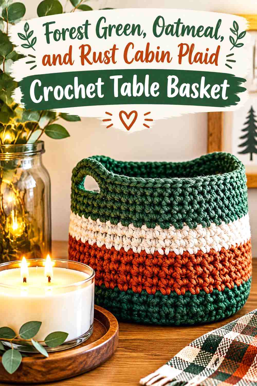
Rust brings a warmer cabin-inspired note to forest green without looking as conventionally Christmas-red as cranberry or burgundy. It can also connect the basket visually with natural wood, copper-colored decor, dried botanicals, or warm neutral table settings.
The strongest version keeps rust clearly secondary and gives oatmeal enough room to separate the warm and cool areas.
Rust Adds Cabin Warmth Without Overtaking Forest Green
Use rust in repeated narrow lines or a few controlled plaid blocks. Forest green should still determine the overall color of the basket when viewed from across the room.
If rust begins occupying the same area as forest green, the basket may move away from the green-led Christmas direction and toward an autumn palette.
Oatmeal Keeps Rust and Forest Green Distinct
Oatmeal can sit between the warm rust and cool forest green where a cleaner plaid structure is needed. This neutral buffer also gives the basket a lighter tabletop presence.
Consider an oatmeal rim when both forest green and rust already cover substantial areas of the wall.
Creator Credit: Twisted Fibers Designs
11. Forest Green, Oatmeal, and Taupe Soft Rustic Plaid Crochet Table Basket
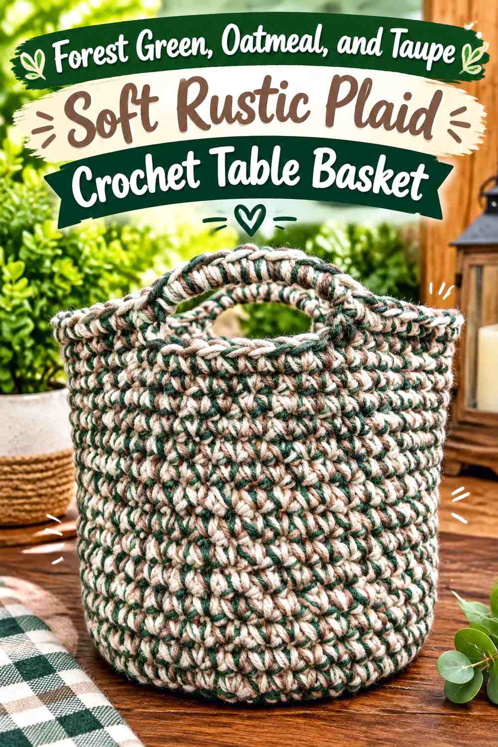
Taupe produces a quieter rustic palette than camel, charcoal, or brown. It works best when the desired plaid is subtle rather than graphic.
Because taupe and oatmeal can be similar, forest green should do most of the structural work. Think of green as the anchor, oatmeal as the light neutral, and taupe as a soft intermediate shade.
Taupe Creates a Low-Contrast Shift Next to Oatmeal
Use taupe in larger plaid blocks where its subtle difference from oatmeal has enough space to register. Very thin taupe lines may disappear if the two yarns are close in value.
Compare the yarns in natural and indoor light before committing to the whole basket, especially if the table display will be used in warm evening lighting.
Forest Green Should Anchor the Soft Taupe Plaid
A solid forest green base or repeated dark green verticals will keep a low-contrast neutral scheme from appearing washed out.
The darker green also gives the eye a reference point, making the more delicate oatmeal-to-taupe changes easier to notice.
Creator Credit: Crochet With Julie
12. Forest Green, Oatmeal, and Ivory Layered Plaid Crochet Table Basket
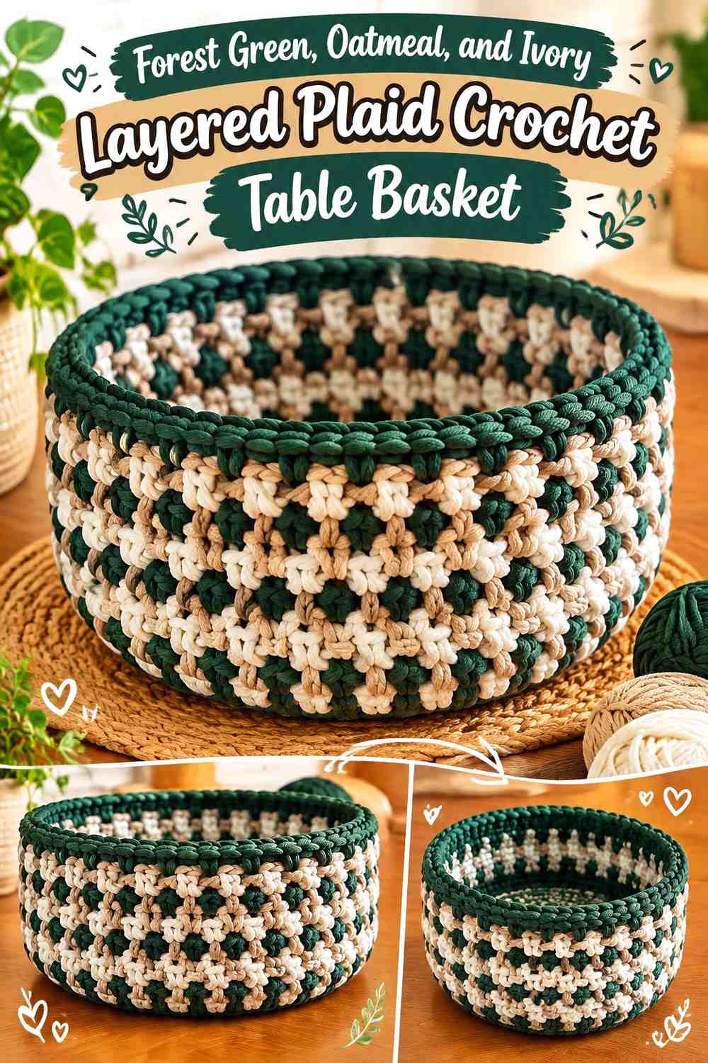
Ivory is close to oatmeal, but the pairing can work when the goal is a light, layered Christmas neutral rather than high contrast. Keep the two pale shades in different roles: oatmeal can form the main light blocks, while ivory appears as a thinner highlight or edging color.
Forest green then supplies the strong contrast necessary to make the plaid structure readable.
Ivory Can Highlight Oatmeal Without Flattening the Plaid
Use ivory where you want a brighter edge around oatmeal, such as a narrow rim, selected crossing line, or small repeated detail. Avoid alternating ivory and oatmeal in tiny equal blocks unless their value difference is clearly visible.
If they merge from a few feet away, simplify the arrangement and treat ivory as trim rather than another full plaid color.
Forest Green Needs Clear Edges Against Oatmeal and Ivory
Keep forest green beside at least one of the light neutrals throughout the basket. Those dark-to-light transitions define the plaid more effectively than relying on the subtle ivory-oatmeal difference alone.
A forest green base can further anchor the pale upper palette.
Creator Credit: Melanie Ham
13. Forest Green, Oatmeal, Cranberry, and Espresso Heritage Plaid Crochet Table Basket
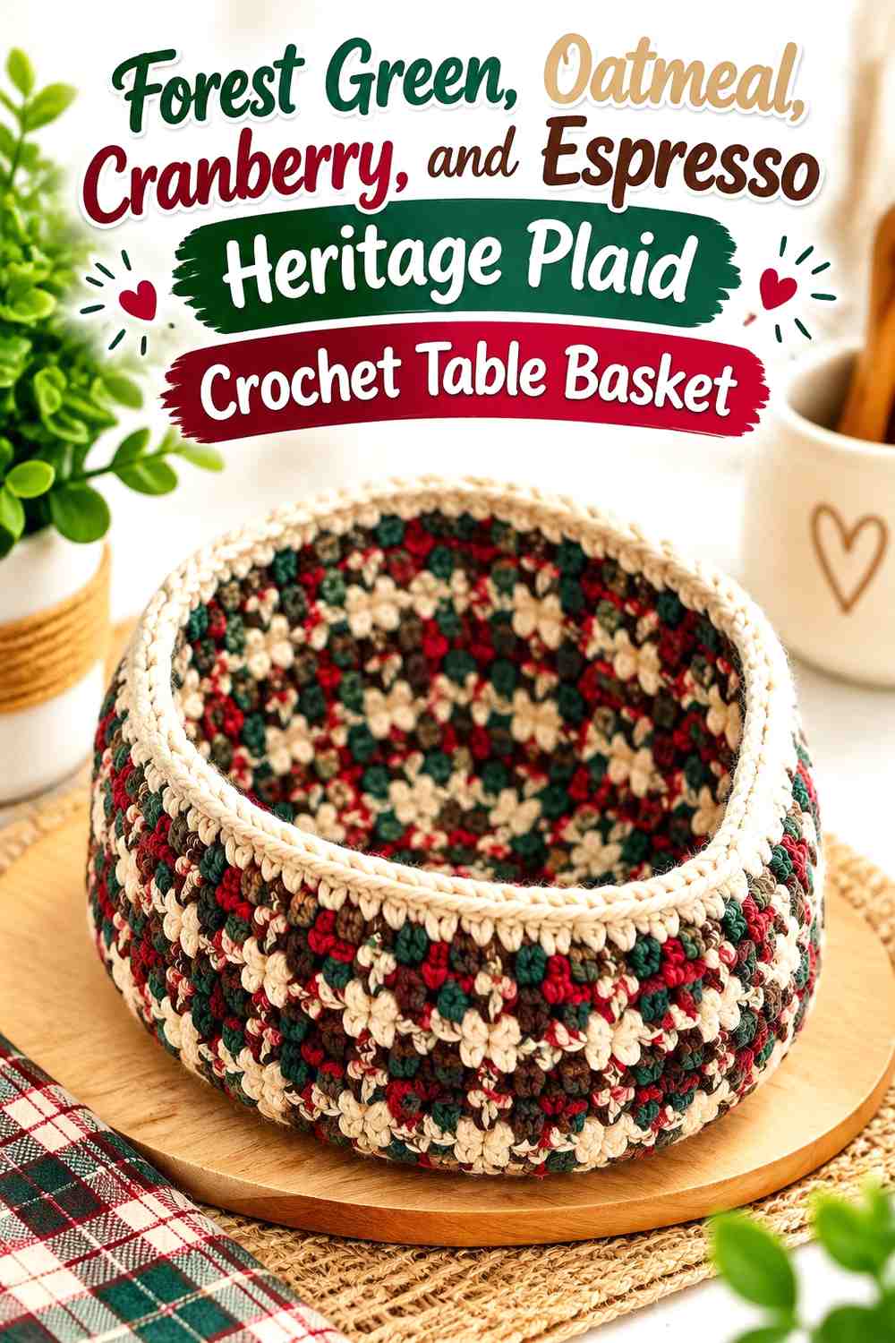
This is the most layered palette in the collection. Forest green and oatmeal remain the foundation, cranberry supplies the Christmas accent, and espresso provides dark definition.
Because four colors can crowd a small table basket quickly, assign each a specific role before beginning: forest green as dominant, oatmeal as light support, cranberry as the festive accent, and espresso as the smallest framing color.
Forest Green and Oatmeal Need a Clear Hierarchy in a Heritage Plaid
Do not divide all four shades equally. Let forest green cover the largest visual area and oatmeal the next largest so the original palette is still recognizable beneath the additional accents.
Use broader areas for those two colors and reserve thinner lines or occasional checks for cranberry and espresso.
Cranberry and Espresso Should Stay Secondary to Forest Green
Cranberry is strong enough to establish the Christmas direction with relatively little yarn visible. Espresso needs even less space when it is used for outlining, a base band, or a narrow rim.
If the finished surface feels crowded, remove or reduce espresso inside the main plaid before reducing oatmeal. The light neutral is more important for keeping the dark colors separated.
Creator Credit: Fuad Azmat / YARNutopia by Nadia
Which Forest Green and Oatmeal Christmas Plaid Basket Palette Should You Choose?
For the clearest traditional plaid, start with the two-color forest green and oatmeal buffalo check. The oatmeal-led windowpane version gives the same colors a lighter result, while the sage scheme is useful when you prefer a quieter woodland palette.
Choose cranberry or burgundy when you want the basket to read more immediately as Christmas decor. Muted gold offers a festive alternative without red, while camel, taupe, espresso, and rust push the basket toward a warmer rustic cabin style.
The four-color heritage version provides the most layered look, but it also requires the clearest hierarchy. On a small table basket, reducing an accent is usually more effective than trying to give every color equal space.
Conclusion
Forest green and oatmeal can support far more than one rustic Christmas plaid. Changing which color dominates, how wide the checks are, where the crossing lines appear, and how a third accent is repeated can produce noticeably different table baskets without abandoning the same core palette.
Choose the classic two-color or windowpane schemes when clear plaid definition is the priority. Add cranberry or burgundy for a stronger Christmas direction, camel or rust for cabin warmth, sage or taupe for a softer woodland look, or espresso when the basket needs a darker visual frame.
Whichever palette you choose, decide the color hierarchy before applying it to the basket. Use the linked creator tutorial for the construction details, then adapt the colors independently so forest green, oatmeal, and any supporting accents remain deliberate rather than crowded.
Frequently Asked Questions
How much forest green should I use in an oatmeal Christmas plaid crochet table basket?
There is no universal percentage, but forest green should occupy the larger share when you want a dark woodland look. If you prefer a lighter farmhouse result, reverse the hierarchy and let oatmeal dominate while forest green forms the plaid grid. The important point is that one color clearly leads rather than splitting every area equally by default.
How can I tell whether forest green and oatmeal have enough contrast for crochet plaid?
Place the yarns together and look at them from several feet away. A grayscale photo can also help show whether their light and dark values remain different. If the colors merge, choose a lighter oatmeal or darker green, or increase the size of the contrasting sections.
Should forest green or oatmeal be used around the crochet basket rim?
Either can work. Forest green creates a darker, more defined frame and suits oatmeal-heavy walls. Oatmeal can lighten the opening when forest green dominates the plaid. Choose the rim based on which color needs to be repeated or balanced in the wall below.
Can I add cranberry to a forest green and oatmeal Christmas basket?
Yes. Cranberry works especially well as a smaller accent in crossing lines, repeated checks, or a narrow detail. Keeping it secondary allows forest green and oatmeal to remain the defining palette instead of turning the basket into an equal red-green-neutral mix.
What should I do if oatmeal and another neutral look too similar in the plaid?
Increase the size of those sections, separate them with forest green, or reduce the second neutral to a trim color. Camel, taupe, and ivory can all sit close to oatmeal in value, so they may not work well as tiny alternating checks.
How can I keep a multicolor forest green crochet table basket from looking too busy?
Give each color a role. Let forest green dominate, use oatmeal as the light supporting shade, and limit stronger accents such as cranberry, gold, rust, or espresso to smaller repeated areas. A solid base or rim can also give a complicated plaid a visual stopping point.
Can a forest green and oatmeal crochet basket be used for Christmas table serving?
It can work well as decorative tabletop storage for napkins, wrapped treats, ornaments, gift tags, or similar items. If you want to use a crochet basket for bread or other food, consider a removable suitable liner rather than assuming the yarn or finished crochet surface is intended for direct food contact.