Burgundy and antique cream suit a vintage love-letter bookmark because the colors can imitate the visual relationship between dark sealing wax, aged paper, decorative borders, and handwritten accents without adding a large palette. Burgundy provides the strongest definition, while antique cream keeps small crochet hearts, envelope panels, lace openings, and narrow bookmark strips from becoming visually heavy.
The most useful approach is to decide which part represents the “letter.” An antique cream panel with a burgundy heart seal reads differently from a burgundy bookmark with a cream envelope motif. The same colors can also be distributed through lace edges, tassels, tiny flowers, heart-shaped ends, or envelope flaps to create distinct Valentine directions.
These 14 ideas vary the dominant shade, envelope treatment, heart placement, lace border, tassel, floral detail, and color blocking. The credited tutorials support compatible love-letter, bookmark, lace, heart, envelope, or decorative components; the burgundy-and-antique-cream vintage styling is an independent color adaptation.
Quick List
- Antique Cream and Burgundy Crochet Love Letter Envelope Bookmark
- Burgundy and Antique Cream Crochet Vintage Envelope Bookmark
- Antique Cream and Burgundy Crochet Vintage Lace Love Letter Bookmark
- Burgundy and Antique Cream Crochet Heart-Ended Love Letter Bookmark
- Antique Cream and Burgundy Crochet Lace Heart Bookmark
- Burgundy and Antique Cream Crochet Victorian Lace Bookmark
- Antique Cream and Burgundy Crochet Written-Love Bookmark
- Burgundy and Antique Cream Crochet Love Note Envelope Bookmark
- Antique Cream and Burgundy Crochet Flower Love Letter Bookmark
- Burgundy and Antique Cream Crochet Flower-Topped Love Letter Bookmark
- Antique Cream and Burgundy Crochet Scalloped Love Letter Bookmark
- Burgundy and Antique Cream Crochet Vintage Tassel Bookmark
- Antique Cream and Burgundy Crochet Heart-Seal Love Letter Bookmark
- Balanced Burgundy and Antique Cream Crochet Vintage Heart Bookmark
Let Antique Cream Suggest the Love Letter and Burgundy Define the Seal
When the bookmark is meant to resemble a folded note or envelope, antique cream works naturally across the broad paper-like area. Burgundy can then define the heart, seal, edge, or closure point. Concentrating the dark shade in those smaller locations makes the love-letter concept easier to understand than alternating both colors equally throughout the whole bookmark.
The reverse palette can work too. A burgundy letter strip feels richer and more decorative, while an antique cream flap or center panel prevents the small bookmark from becoming one uninterrupted dark shape.
Keep Burgundy and Antique Cream Details Flat Enough for a Bookmark
A bookmark sits between pages, so color placement should not depend on excessive three-dimensional decoration. A small heart, flat flower, lace edge, or slim envelope flap can add Valentine detail while allowing the main strip to remain relatively unobtrusive.
If you add a flower or heart at the end of the bookmark, let that ornament sit outside the closed pages whenever possible. The long portion that rests inside the book benefits from a flatter, simpler color treatment.
Use Burgundy and Antique Cream to Clarify Lace and Envelope Edges
Vintage-inspired crochet often relies on openwork, scallops, or narrow borders. Antique cream can make those details feel lighter, while burgundy can identify the outer edge or central motif.
Avoid switching colors inside every small lace opening. A continuous cream lace field with a burgundy border is usually easier to read than a heavily alternated two-color pattern, especially on a narrow bookmark.
1. Antique Cream and Burgundy Crochet Love Letter Envelope Bookmark
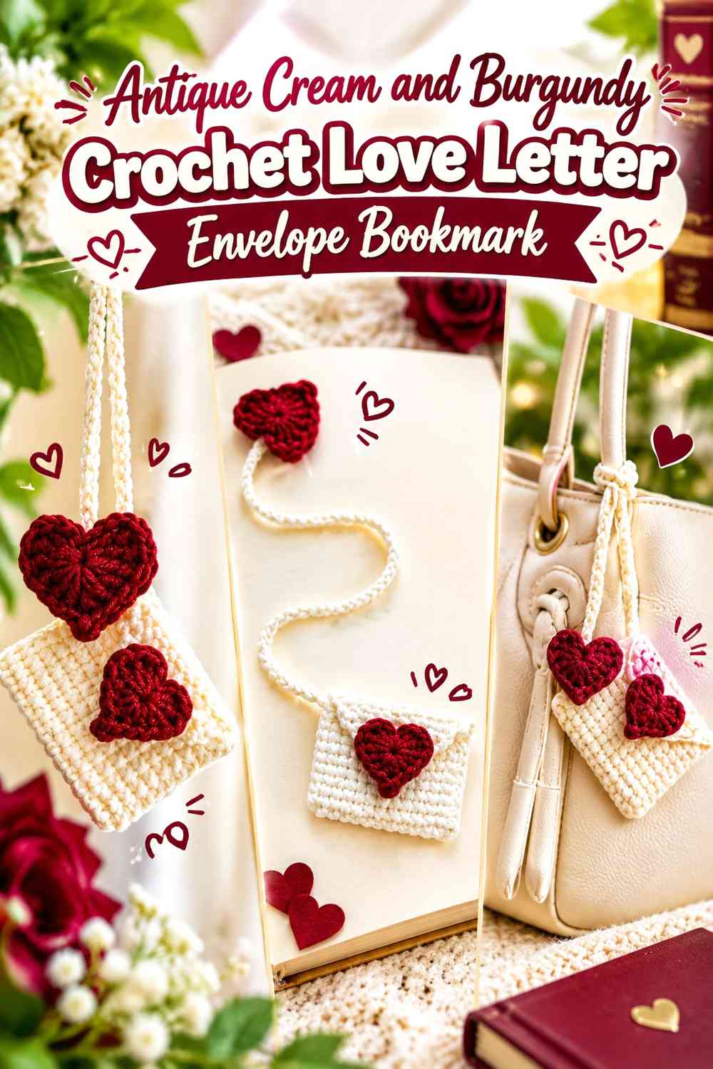
Let antique cream form the main envelope and letter area, with burgundy concentrated in a heart-shaped seal or closure detail. This gives the bookmark the clearest aged-letter direction: the lighter color behaves like the paper, while burgundy supplies one deliberate Valentine focal point.
Antique Cream Should Cover Most of the Burgundy-Sealed Letter
Keep the broad front and visible note area antique cream instead of introducing several burgundy stripes. A large light field makes the envelope shape easier to recognize and gives the heart seal stronger contrast.
Burgundy Works Best as the Antique Cream Envelope’s Focal Seal
Place burgundy where an envelope closure naturally attracts attention. If the heart is small, surrounding it with uninterrupted antique cream helps preserve its outline without requiring a larger motif.
Creator Credit: Danielle L Designs 🌻
2. Burgundy and Antique Cream Crochet Vintage Envelope Bookmark
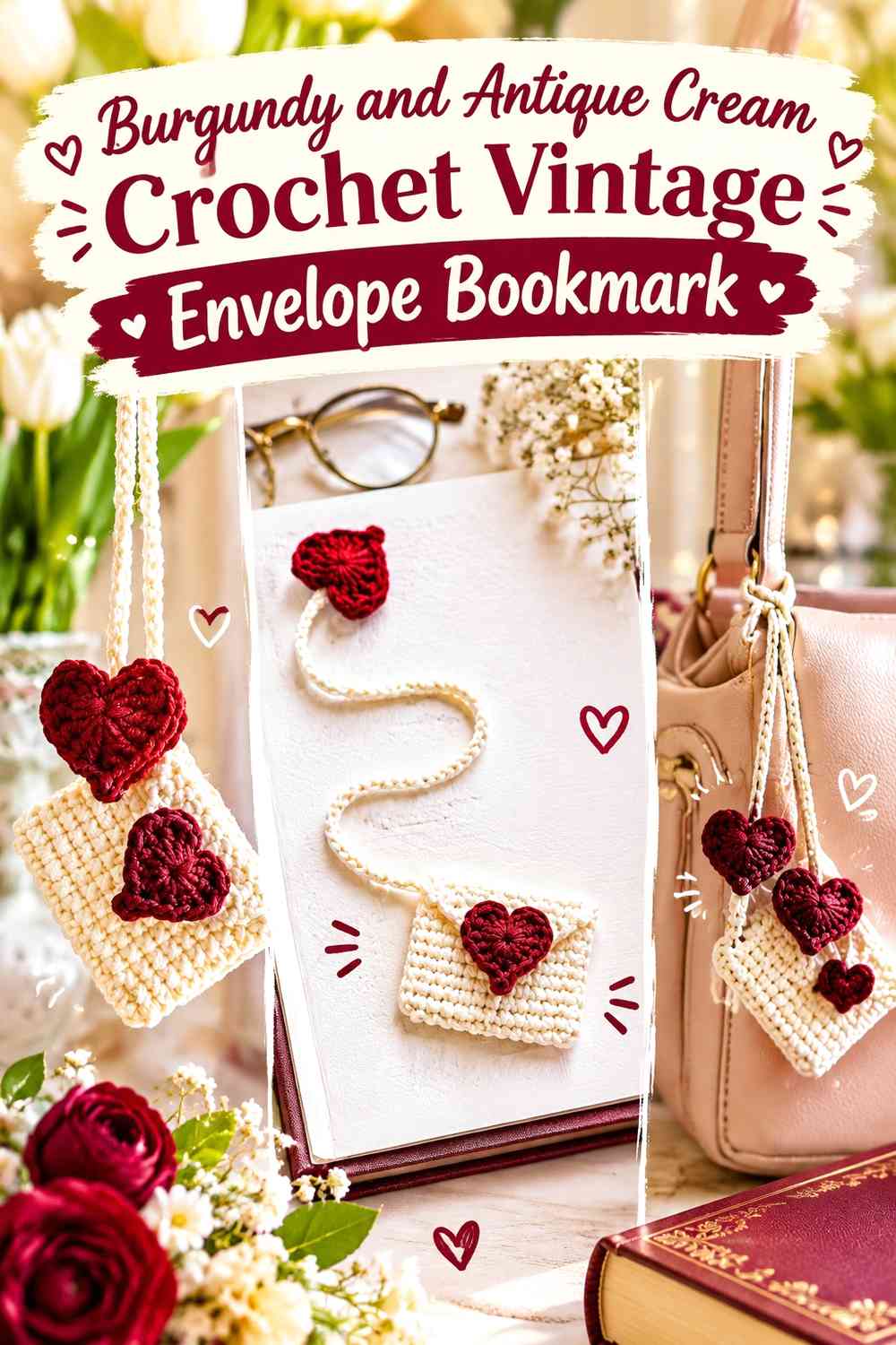
Reverse the color hierarchy with a burgundy envelope or main letter body and an antique cream flap or inner note. The darker background gives the bookmark a richer Valentine appearance, while the pale section explains the folded-letter structure.
Burgundy Should Remain Visible Around the Antique Cream Envelope Flap
Keep enough burgundy surrounding the lighter flap for both areas to stay distinct. If antique cream expands across most of the front, the bookmark loses its burgundy-led direction.
Antique Cream Can Lighten the Burgundy Love Letter Without Extra Colors
A single cream flap, insert, or narrow border can create enough visual separation. Avoid adding several unrelated cream motifs when the folded letter itself already provides the contrast.
Creator Credit: The Yarnling
3. Antique Cream and Burgundy Crochet Vintage Lace Love Letter Bookmark

Use antique cream for the main lace strip and reserve burgundy for one narrow edge, tassel detail, or small heart near the top. This keeps the bookmark light enough for the openwork to remain visible while introducing a darker Valentine accent.
Antique Cream Makes Burgundy Lace Accents Easier to Separate
Let the main openwork stay consistently cream. Burgundy placed only along a selected edge or focal section will read more clearly than alternating the colors through every lace repeat.
Burgundy Should Stay Secondary to the Antique Cream Vintage Lace
A dark accent can visually outweigh a pale lace strip even when it occupies less physical area. Keep burgundy concentrated so the bookmark still reads as antique cream first.
Creator Credit: Valeria Chérie
4. Burgundy and Antique Cream Crochet Heart-Ended Love Letter Bookmark

Let an antique cream bookmark strip run between the pages and finish it with a burgundy heart outside the book. This makes the darkest color visible when the book is closed without adding bulk along the full bookmark length.
Burgundy Gives the Antique Cream Bookmark a Strong Valentine Endpoint
Keep the heart predominantly burgundy so it remains clearly different from the long cream section. A tiny cream center can be added editorially if desired, but the burgundy outline should remain easy to recognize.
Antique Cream Keeps the Burgundy Heart From Making the Bookmark Too Dark
Using cream through the long strip balances the deeper ornament and keeps the page-marking section visually quiet. It also preserves a clear distinction between the functional length and decorative end.
Creator Credit: BeaCurious
5. Antique Cream and Burgundy Crochet Lace Heart Bookmark

Build the Valentine identity into the bookmark shape itself by using an antique cream lace heart with burgundy along a selected border or connecting section. This creates a softer alternative to a solid heart while keeping the two colors easy to distinguish.
Burgundy Should Outline Important Antique Cream Heart Curves
Use the darker shade where it helps the upper lobes or lower point remain visible. Avoid outlining every internal lace opening, which can make the small heart visually crowded.
Antique Cream Needs Enough Area Inside the Burgundy Heart Border
Keep the pale lace clearly visible within the darker definition. If the burgundy edging becomes too broad, the design can stop reading as an antique-cream heart and become a mostly dark motif.
Creator Credit: TheYarnBowl Crochet
6. Burgundy and Antique Cream Crochet Victorian Lace Bookmark
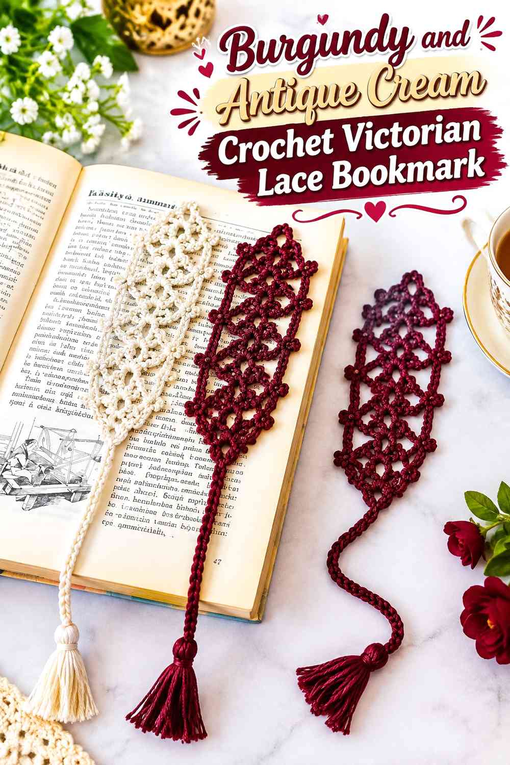
Use burgundy for the central bookmark strip and antique cream for lace-like borders on both sides. This reverses the familiar cream-lace arrangement and gives the middle a strong line that can suggest the dark ink or ribbon of an old love letter.
Antique Cream Borders Should Stay Visible Along the Burgundy Bookmark
Keep both pale edges consistent enough that they frame the dark center. If the cream appears only in tiny isolated spots, the vintage lace effect becomes less apparent.
Burgundy Should Remain the Narrow Visual Anchor Between Antique Cream Edges
The central dark section does not need to be wide to influence the entire bookmark. A controlled burgundy strip between two lighter borders can create a strong vertical focal line without making the bookmark visually heavy.
Creator Credit: Crochet with Tuula Maaria
7. Antique Cream and Burgundy Crochet Written-Love Bookmark
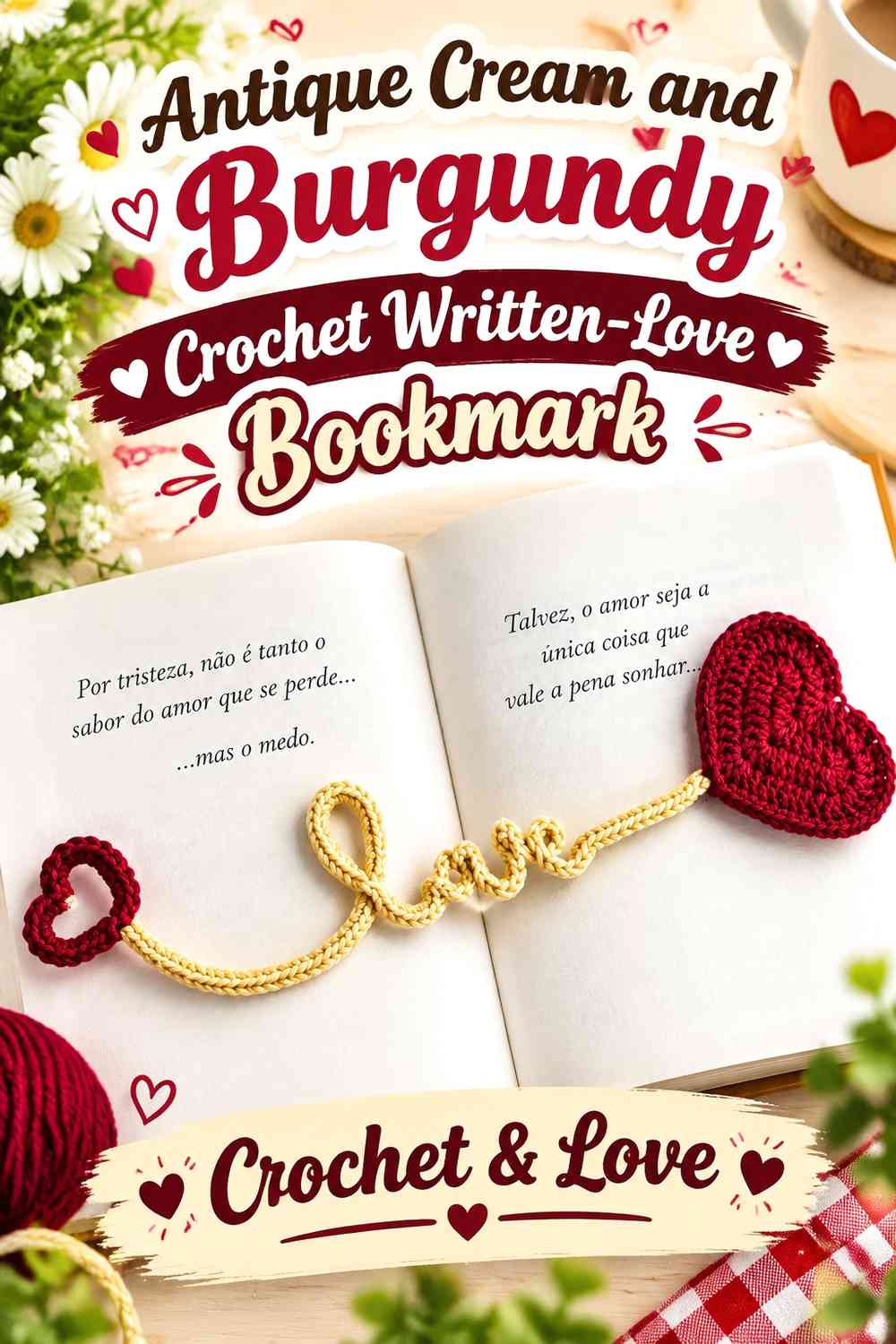
Use antique cream for the main bookmark and reserve burgundy for a heart or lettering-inspired decorative area. The pale field suggests vintage paper, while the darker crochet detail can evoke the idea of a written Valentine message without reproducing an actual letter.
Burgundy Details Need a Quiet Antique Cream Background
Keep the area around the decorative writing or heart mostly cream. Several dark borders close to the same motif can make small shapes harder to distinguish.
Antique Cream Should Carry the Full Length Beneath Burgundy Decoration
A continuous light bookmark strip helps the burgundy feature look intentionally placed rather than part of an allover two-color pattern.
Creator Credit: Francesca Uncinettando Crochet&Love
8. Burgundy and Antique Cream Crochet Love Note Envelope Bookmark
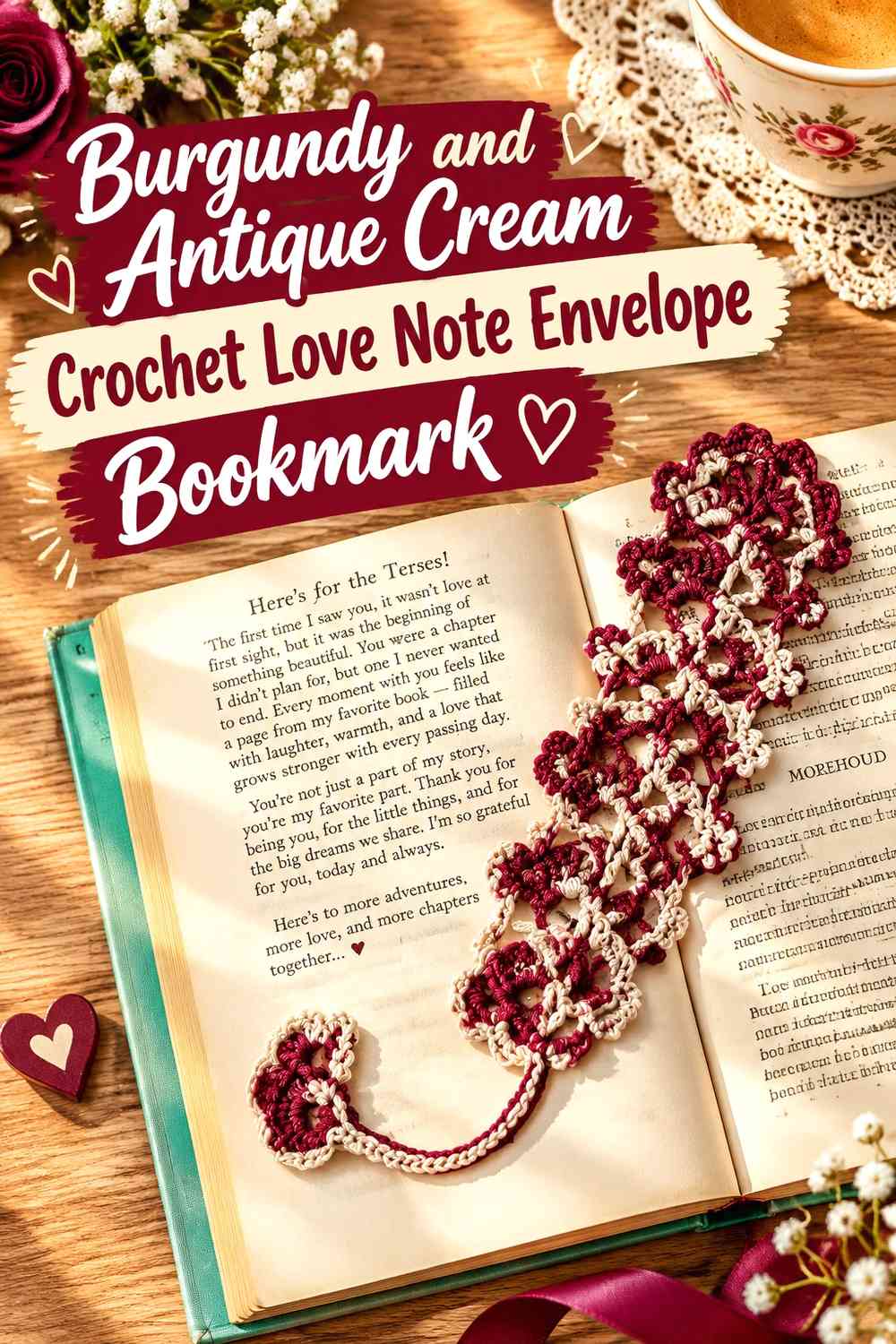
Make burgundy the outer envelope color but let an antique cream “note” remain visible inside or above it. This gives both colors substantial roles while keeping their purposes separate: burgundy forms the romantic wrapper and cream represents the letter.
Antique Cream Should Project Clearly From the Burgundy Envelope
Leave enough of the pale note visible for it to read as a separate component. A tiny cream sliver may look like ordinary edging rather than an inserted love letter.
Burgundy Should Frame the Antique Cream Note on More Than One Side
A visible dark border around the pale section strengthens the envelope effect. Keep the framing broad enough to distinguish the outer piece without covering most of the cream.
Creator Credit: HappyBerry Crochet
9. Antique Cream and Burgundy Crochet Flower Love Letter Bookmark
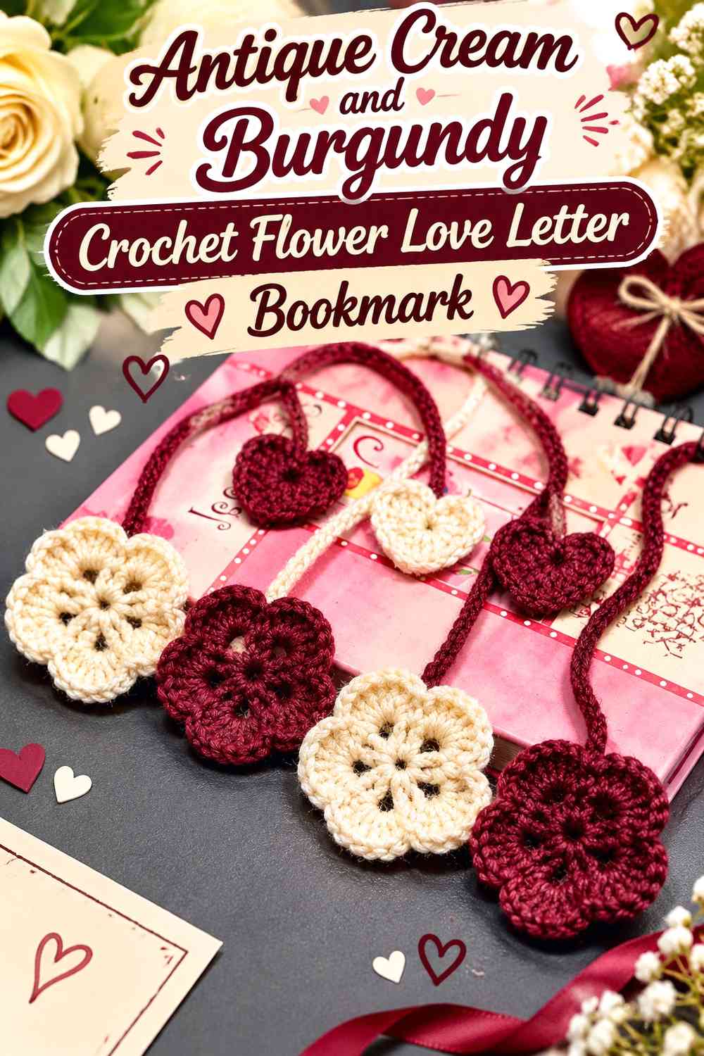
Use an antique cream bookmark strip with a flower at one end, then work burgundy into the flower center or a small adjacent heart. This introduces botanical romance without replacing the love-letter palette with several floral colors.
Burgundy Should Stay Concentrated Inside the Antique Cream Flower
A dark center provides enough definition for pale petals. Making every petal half burgundy and half cream can reduce the clean vintage effect and make the small flower visually busy.
Antique Cream Should Connect the Burgundy Flower to the Bookmark Strip
Repeat cream through both the flower and long bookmark section so they feel like one project. The burgundy center then functions as the deliberate Valentine accent.
Creator Credit: Crochet It
10. Burgundy and Antique Cream Crochet Flower-Topped Love Letter Bookmark

Reverse the floral arrangement with a burgundy flower and an antique cream strip. The darker flower becomes the visible end marker, while the cream section resting inside the book stays visually lighter.
Burgundy Flower Petals Need Antique Cream Space Around Them
Keep the flower outside the page edge when possible so its silhouette can be seen against the book rather than pressed between pages. The cream connecting strip should remain clearly separate from the darker bloom.
Antique Cream Should Stay Simple Beneath the Burgundy Flower
Avoid loading the long section with repeated burgundy motifs when the flower is already substantial. A calmer cream strip gives the bookmark a clearer focal hierarchy.
Creator Credit: ElyseCrochets 💌
11. Antique Cream and Burgundy Crochet Scalloped Love Letter Bookmark

Let antique cream form a narrow bookmark with scalloped sides and finish it with a burgundy tassel. The combination keeps the vintage detail along the functional strip while moving the darkest color to the exposed end.
Antique Cream Scallops Need a Clear Burgundy-Free Center
Allow the pale edging to remain the main decorative treatment instead of filling the center with additional dark stripes. This keeps the bookmark light and prevents the narrow surface from becoming overcrowded.
Burgundy Tassels Can Anchor the Antique Cream Bookmark End
A dark tassel provides a clear visual endpoint without interrupting the lace or scallops that sit inside the book. Keep its color concentrated rather than repeating large burgundy sections through the bookmark body.
Creator Credit: MODA NA BIO
12. Burgundy and Antique Cream Crochet Vintage Tassel Bookmark
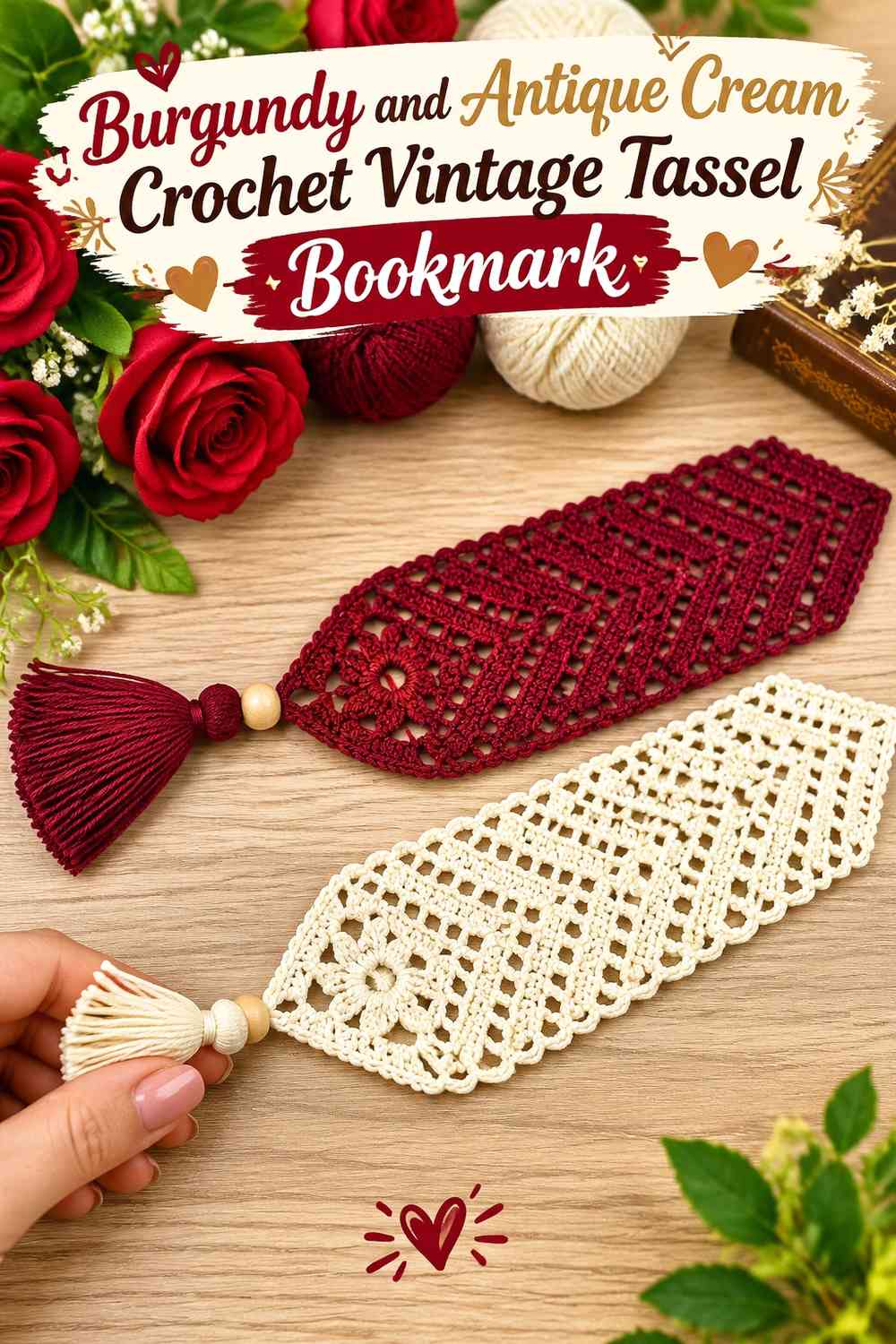
Use burgundy across the main bookmark strip and finish it with an antique cream tassel. This gives the long body the deepest color while using the lighter shade where movement and fringe can make individual strands more noticeable.
Burgundy Should Stay Continuous Above the Antique Cream Tassel
A solid dark strip gives the pale finishing detail a clear place to begin. Several cream bands immediately above the tassel can blur the transition and reduce its impact.
Antique Cream Can Soften the Burgundy Bookmark Without Changing Its Main Field
Because a tassel sits outside the pages, it can carry more visual contrast than the section lying between them. This makes it an efficient place to repeat the lighter color.
Creator Credit: Crochet Magic Studio
13. Antique Cream and Burgundy Crochet Heart-Seal Love Letter Bookmark

Use antique cream for a flat bookmark or envelope-inspired panel and attach one burgundy heart as the symbolic seal. This is a simplified love-letter direction for readers who want the concept without a more dimensional envelope construction.
Burgundy Hearts Should Remain Small Enough for the Antique Cream Bookmark
Keep the heart proportionate to the bookmark width. A motif that extends far beyond both edges can dominate the piece and create unnecessary bulk between pages.
Antique Cream Should Surround the Burgundy Heart on Every Side
A visible cream margin protects the heart silhouette and makes the “seal on paper” relationship clearer. If burgundy reaches the bookmark edges around the heart, that visual metaphor becomes weaker.
Creator Credit: MJ’s Off The Hook Designs
14. Balanced Burgundy and Antique Cream Crochet Vintage Heart Bookmark

For the most evenly shared palette, use substantial areas of both colors while keeping them in separate roles. An antique cream main strip can meet a burgundy heart at one end, with a narrow burgundy border echoed by a small cream detail inside the heart.
Burgundy Should Provide the Strongest Anchor Against Antique Cream
Use the dark shade on the heart, outer frame, or another major focal section rather than dividing it into many tiny accents. One strong burgundy area gives the bookmark a clear Valentine identity.
Antique Cream Should Separate Burgundy Details Instead of Filling Tiny Gaps
Give cream meaningful uninterrupted space along the bookmark. The lighter shade is most effective when it acts like the “paper” of the love-letter concept rather than functioning only as narrow filler between dark stitches.
Creator Credit: Bella Coco
Which Burgundy and Antique Cream Love Letter Bookmark Should You Choose?
For the clearest love-letter interpretation, choose an antique cream envelope or bookmark panel with a concentrated burgundy heart seal. The light field immediately suggests the letter portion, while the darker heart provides the Valentine focal point.
For a more decorative vintage direction, choose lace edges, scallops, flowers, or tassels. Those ideas allow antique cream to carry openwork and finishing texture while burgundy provides stronger definition.
If you want a richer bookmark, reverse the balance and make burgundy the central strip or envelope. Antique cream can then soften the flap, lace border, tassel, or inner note without weakening the deeper romantic color.
Conclusion
Burgundy and antique cream work particularly well for a crochet Valentine love-letter bookmark when each color represents a different visual layer. Antique cream can suggest the letter, envelope insert, lace, or aged-paper field, while burgundy can define the heart seal, border, flower center, or darker ribbon-like strip.
For the most straightforward design, use an antique cream body with one burgundy heart. Choose lace or scalloped variations when you want the vintage treatment to be more prominent, and move flowers, hearts, or tassels toward the bookmark ends when you want to keep the section between pages relatively flat.
Use the credited tutorials for the bookmark, heart, envelope, lace, or decorative component they demonstrate, then apply the burgundy-and-antique-cream placement that best supports your own vintage love-letter interpretation.
Frequently Asked Questions
Should burgundy or antique cream dominate a vintage love letter bookmark?
Antique cream is useful when you want the bookmark to resemble paper or an old letter, while burgundy works well as the seal, border, heart, or darker decorative strip. Reverse the balance when you want a richer bookmark with only selected light details.
How can I make a burgundy heart stand out on an antique cream bookmark?
Leave a clear antique cream margin around the entire heart. Avoid adding burgundy stripes or borders immediately beside it unless they are visually separated, because those dark areas can merge with the heart outline.
Is antique cream better than bright white with burgundy for a vintage bookmark?
Antique cream creates a softer light-dark transition and supports the aged-letter styling more naturally. Bright white would create a sharper contrast and a different visual direction. The better choice depends on whether you want softened vintage contrast or a crisper two-color effect.
Where should the burgundy heart go on an antique cream love letter bookmark?
A heart can sit on an envelope flap, near one exposed end of the bookmark, or on a flat cream panel. Keep larger or more dimensional hearts near an end so they do not add unnecessary bulk between pages.
Can burgundy and antique cream both be used in crochet lace?
Yes, but giving them separate roles usually keeps the lace easier to read. For example, use antique cream for the openwork field and burgundy for a narrow edge rather than alternating color through every small opening.
How can I keep a vintage love letter bookmark flat enough for a book?
Keep the section that sits between pages relatively simple and move dimensional flowers, tassels, or thicker heart details toward the exposed ends. If you add an envelope or appliqué, consider how much thickness it creates before deciding where it should sit.
How do I substitute another red or cream without losing the burgundy-and-antique-cream effect?
Preserve the contrast relationship and muted direction. Choose a deep wine-like red for the burgundy role and a softened off-white for antique cream. Compare them side by side so the heart, envelope flap, lace, and border remain visibly separate.