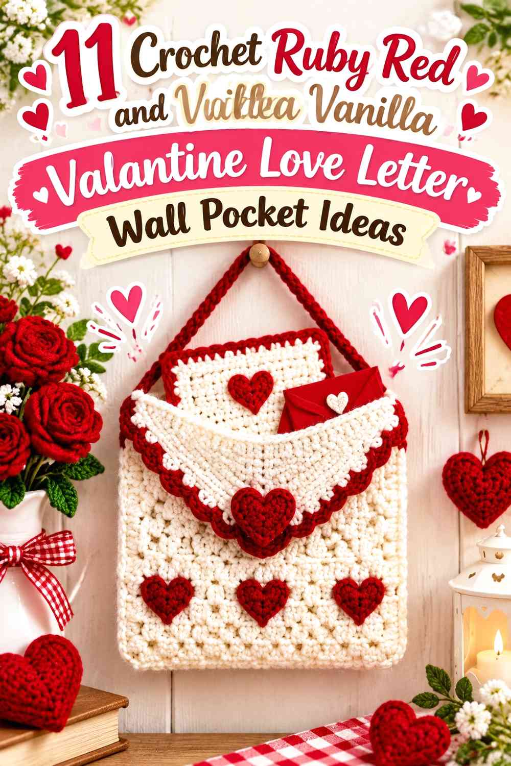

Ruby Red and Vanilla give a crochet Valentine love letter wall pocket a clear visual language before any extra decoration is added. Ruby Red can identify hearts, envelope seals, flap edges, or the pocket opening, while Vanilla can provide enough light background for those details to remain visible from across the room.
The color balance matters because this project combines two ideas at once: a decorative envelope and a functional hanging pocket. If Ruby Red appears on every surface, the triangular flap, heart appliqué, and pocket opening can begin to merge. If Vanilla dominates everything, the Valentine theme may depend too heavily on a few tiny accents. Giving each color a specific job makes the love-letter shape easier to read.
The credited tutorials below include crochet envelopes, Valentine pouches, love-letter pockets, envelope bags, and wall-pocket organizers. Some provide the envelope or pocket construction concept rather than an exact hanging love-letter design, so use the original tutorial for its demonstrated construction and treat the Ruby Red-and-Vanilla wall-pocket treatment as an independent color and display adaptation.
Quick List
- Vanilla and Ruby Red Crochet Valentine Love Letter Wall Pocket With a Heart Seal
- Ruby Red and Vanilla Crochet Valentine Love Letter Wall Pocket With a Light Flap
- Ruby Red and Vanilla Split-Panel Crochet Valentine Love Letter Wall Pocket
- Vanilla and Ruby Red Scalloped Crochet Valentine Love Letter Wall Pocket
- Vanilla Crochet Valentine Love Letter Wall Pocket With Ruby Red Pocket Framing
- Vanilla Crochet Valentine Love Letter Wall Pocket With Ruby Red Heart Appliqués
- Vanilla Crochet Wall Pocket With a Ruby Red Valentine Love Letter Insert
- Ruby Red Crochet Valentine Love Letter Wall Pocket With a Vanilla Hanging Panel
- Vanilla Crochet Valentine Envelope Wall Pocket With a Ruby Red Outer Frame
- Ruby Red Centered and Vanilla Framed Crochet Valentine Love Letter Wall Pocket
Give Ruby Red and Vanilla Separate Jobs on the Love Letter
Start by deciding whether the envelope or the Valentine detail should receive the strongest color. A Vanilla envelope with a Ruby Red heart seal makes the heart the obvious focal point. A Ruby Red envelope with a Vanilla flap creates a broader Valentine statement and shifts attention toward the envelope silhouette itself.
The flap is especially important because its triangular or pointed shape helps communicate “love letter.” If the flap and pocket front are the same color, use a contrasting border or heart so that division remains visible.
Use Ruby Red and Vanilla to Keep the Pocket Opening Visible
A wall pocket needs a readable opening even when the project is mostly decorative. Using Ruby Red around a Vanilla pocket opening creates a strong horizontal boundary, while a Vanilla edge on a red pocket produces a softer but still visible division.
Before finalizing the color placement, view the hanging from several feet away. The opening, flap, and heart should remain distinguishable as separate features rather than collapsing into one large color block.
Balance Ruby Red and Vanilla Around Hearts, Flaps, and Hanging Details
Ruby Red naturally attracts attention in this palette, so it does not need to cover half the project to have influence. A heart appliqué, flap border, or repeated corner detail may provide enough red to balance a larger Vanilla envelope.
Also consider the hanging area. If Ruby Red is concentrated at the bottom of the pocket, a small red loop, top border, or hanging detail can repeat the color higher on the piece and keep the composition from feeling visually bottom-heavy.
1. Vanilla and Ruby Red Crochet Valentine Love Letter Wall Pocket With a Heart Seal
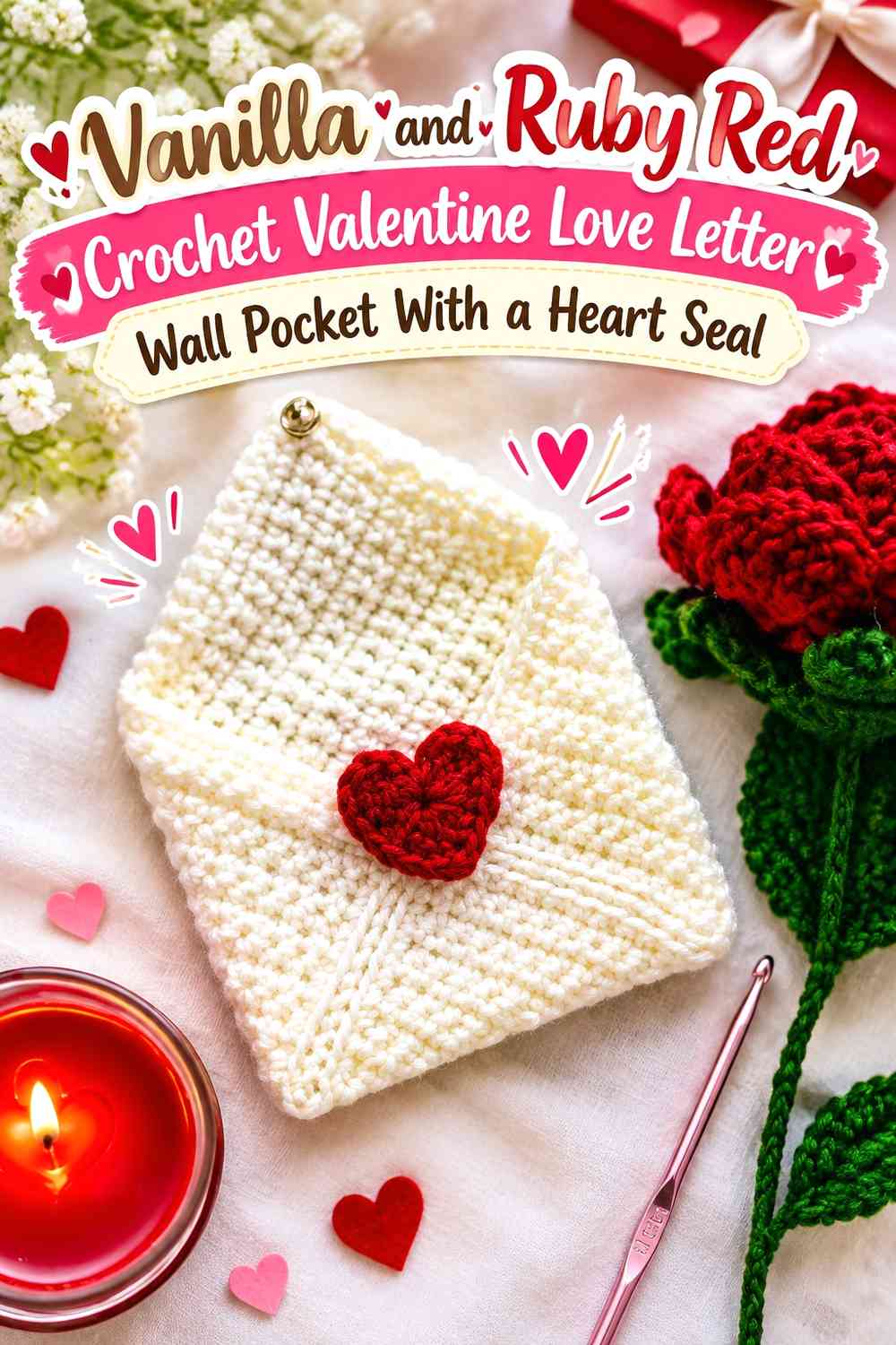
Use Vanilla across the main envelope body and reserve Ruby Red for the central heart seal and a narrow flap edge. This is one of the clearest love-letter color schemes because the pale envelope reads first as stationery, while the Ruby Red heart immediately identifies the Valentine theme. The darker accent can also be repeated around the pocket opening without competing with the envelope shape.
Let Vanilla Cover the Main Ruby Red Valentine Envelope Surface
Keep the largest front and flap areas Vanilla so the wall pocket retains a paper-envelope appearance. A continuous light field also gives textured crochet stitches room to show without competing with several red color changes.
Make Ruby Red the Focal Point on the Vanilla Heart Seal
Place Ruby Red at the flap point or immediately below it so the heart visually connects the two halves of the envelope. Repeating a narrow Ruby Red line around the opening can reinforce the accent without reducing Vanilla’s dominant role.
Creator Credit: The Yarnling
2. Ruby Red and Vanilla Crochet Valentine Love Letter Wall Pocket With a Light Flap
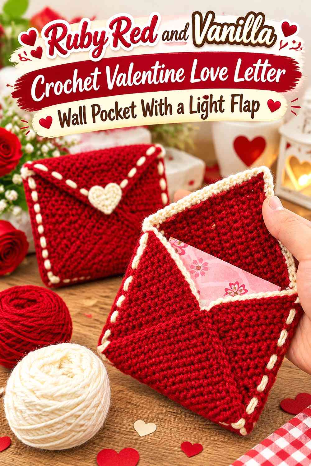
Make Ruby Red the main pocket color and use Vanilla on the triangular envelope flap. This reversal gives the wall hanging a much stronger red presence while preserving a clear letter-like structure. The light flap separates itself from the pocket front and creates a useful location for a smaller Ruby Red heart.
Keep Ruby Red Broad Below the Vanilla Envelope Flap
Let the rectangular or lower pocket section remain mostly Ruby Red rather than interrupting it with many small Vanilla stripes. The broad red field establishes the Valentine color while the contrasting flap handles most of the visual structure.
Use Vanilla to Separate the Ruby Red Flap Heart From the Pocket
A Vanilla flap provides a light background for a Ruby Red heart appliqué or closure detail. Keeping the heart smaller than the flap ensures the triangular envelope shape remains visible around it.
Creator Credit: Animal Crochet Academy
3. Ruby Red and Vanilla Split-Panel Crochet Valentine Love Letter Wall Pocket
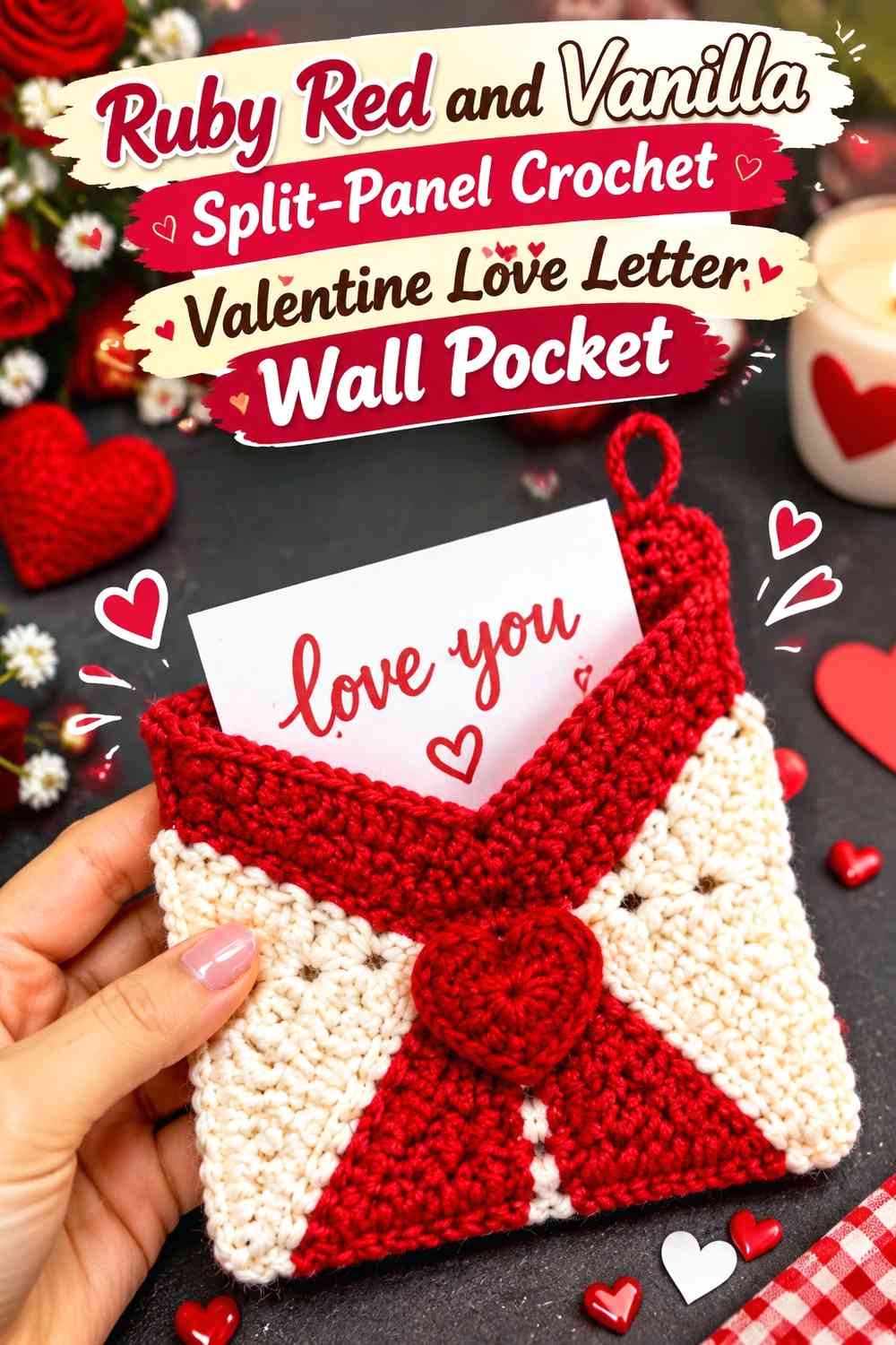
Divide the visible pocket into two substantial color areas rather than treating Vanilla only as trim. Ruby Red can occupy the lower pocket front while Vanilla covers the flap and upper section. The larger color blocks create a clear envelope division without requiring additional shades.
Keep Ruby Red and Vanilla Panels Large Enough to Define the Envelope
Avoid narrow alternating bands. A broad Ruby Red lower panel and substantial Vanilla upper panel make the pocket look deliberately color-blocked and preserve the visual difference between the letter body and flap.
Repeat Ruby Red on the Vanilla Flap to Connect Both Panels
A small Ruby Red heart or flap border prevents the Vanilla section from appearing detached from the lower pocket. One repeated accent is generally enough because the larger Ruby Red panel already supplies plenty of warm color.
Creator Credit: SOEL
4. Vanilla and Ruby Red Scalloped Crochet Valentine Love Letter Wall Pocket
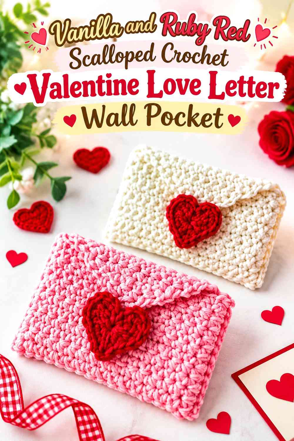
Use Vanilla for most of the pocket and place Ruby Red around a decorative scalloped flap or outer edge. The repeated red curves soften the straight envelope shape and create a Valentine border without filling the entire front with color.
Keep Vanilla Visible Inside the Ruby Red Scalloped Border
Make sure the light envelope body remains broad enough to contrast with the decorative edge. If the Ruby Red scallops become very deep or are paired with several additional red rows, the Vanilla center can become visually cramped.
Repeat Ruby Red Scallops Along a Useful Vanilla Pocket Edge
Choose one important edge—the flap, opening, or lower border—for the strongest scalloped treatment rather than decorating every boundary equally. Concentrated repetition creates a clearer hierarchy and keeps the envelope shape easy to recognize.
Creator Credit: Oolioo Craft
5. Vanilla Crochet Valentine Love Letter Wall Pocket With Ruby Red Pocket Framing
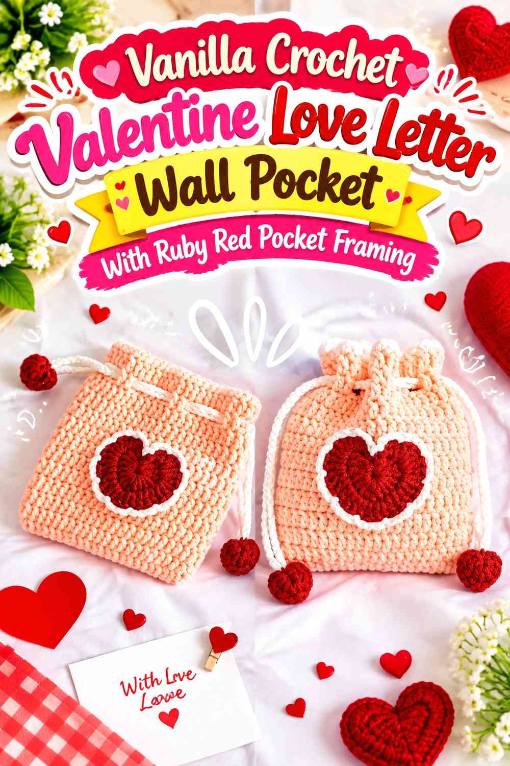
Keep the center Vanilla and use Ruby Red around the side seams, pocket opening, and selected outer edges. This creates the impression of a red frame holding a light love letter and is especially useful when the opening needs clearer definition.
Use Ruby Red to Define the Vanilla Pocket Opening
A narrow Ruby Red line across the opening shows where the functional pocket begins. That distinction matters if the Vanilla flap and Vanilla front would otherwise blend into one continuous light surface.
Keep Ruby Red Narrow Around the Vanilla Side Edges
Side framing works best when it defines rather than overwhelms. A controlled red perimeter lets Vanilla remain the dominant envelope color while giving the rectangular pocket a clear boundary against the wall.
Creator Credit: from littlespot
6. Vanilla Crochet Valentine Love Letter Wall Pocket With Ruby Red Heart Appliqués
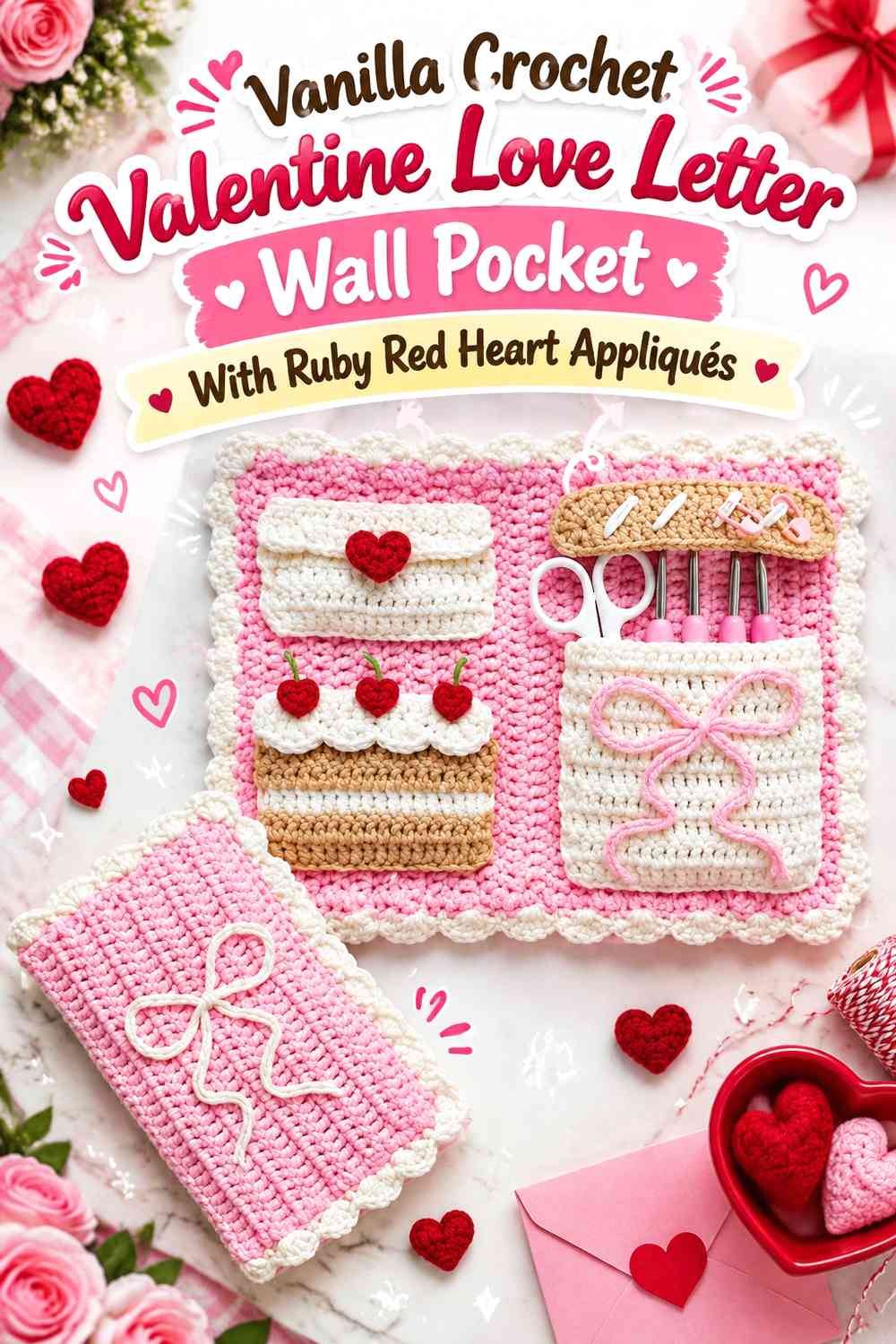
Use Vanilla across the envelope and introduce Ruby Red through a small family of repeated hearts. Instead of relying on one oversized heart, place the accents where they clarify the pocket: one on the flap and perhaps another near the lower corner or hanging area.
Keep Ruby Red Hearts Repeated but Controlled on Vanilla
Two or three intentional red accents can connect the design without turning the envelope into an all-over heart pattern. Leave enough Vanilla around each appliqué for the individual shapes to stay distinct.
Put the Largest Ruby Red Heart on the Vanilla Envelope Flap
The flap naturally acts as the visual center of a love letter. Give its Ruby Red heart the strongest presence, then make any secondary red hearts smaller so they support rather than compete with that focal point.
Creator Credit: ETM’s Studio
7. Vanilla Crochet Wall Pocket With a Ruby Red Valentine Love Letter Insert
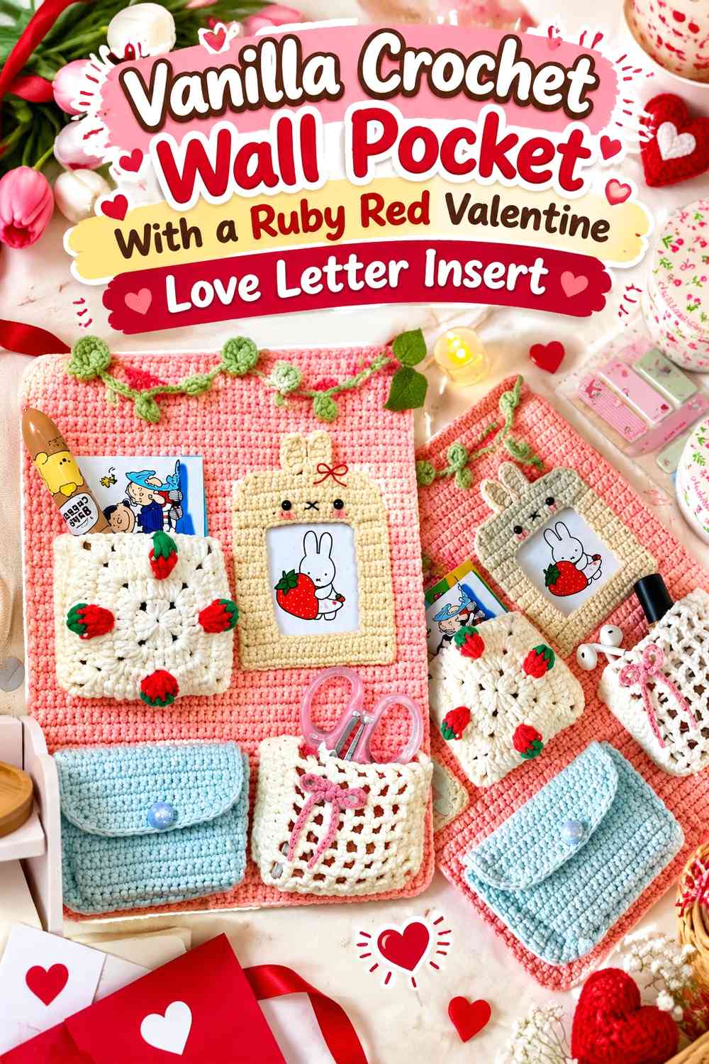
Let the wall-pocket backing remain Vanilla and treat Ruby Red as the visible “letter” or envelope section tucked into the front. This color placement emphasizes the functional pocket concept because the red insert appears separate from its lighter holder.
Use Vanilla as a Quiet Frame Around the Ruby Red Letter
Keep enough Vanilla visible above and beside the red section that it reads as a genuine backing panel. If Ruby Red fills almost the entire surface, the useful pocket-within-a-hanging distinction becomes less obvious.
Let Ruby Red Rise Above the Vanilla Pocket Opening
A visible strip or flap of Ruby Red above the opening creates the impression that a Valentine letter is tucked inside. Keep the color change broad and simple so the insert remains readable rather than looking like another decorative stripe.
Creator Credit: chubbiesbyash𐙚
8. Ruby Red Crochet Valentine Love Letter Wall Pocket With a Vanilla Hanging Panel
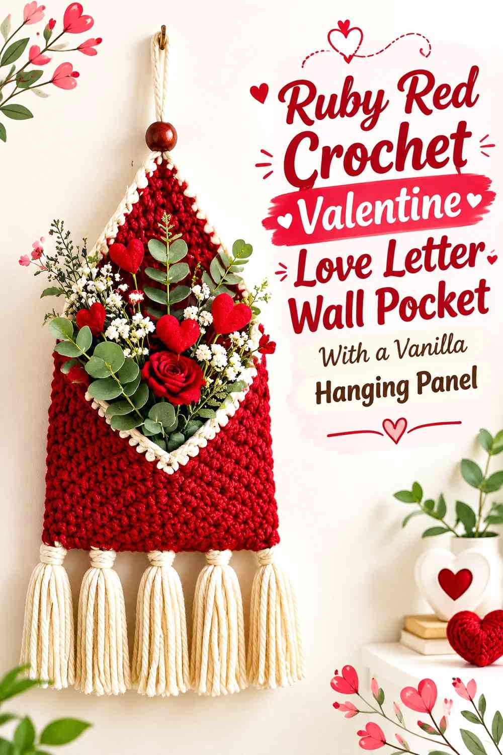
Use Vanilla across the larger wall-hanging panel and place a Ruby Red envelope-shaped pocket on its lower portion. This arrangement separates the display support from the love-letter motif and gives the Ruby Red pocket a clear background.
Give Ruby Red Enough Space on the Vanilla Hanging Panel
The pocket should occupy enough visual area to remain the focal feature. If it becomes too small relative to the Vanilla backing, the piece may read primarily as a wall organizer rather than Valentine envelope decor.
Keep Vanilla Visible Around the Ruby Red Pocket Edges
Leave a clear Vanilla margin around the red pocket so the envelope outline does not disappear into the outer panel. This background separation also gives you room for a hanging loop or upper decorative detail without crowding the letter.
Creator Credit: Day’s Crochet – Modern Crochet Patterns
9. Vanilla Crochet Valentine Envelope Wall Pocket With a Ruby Red Outer Frame
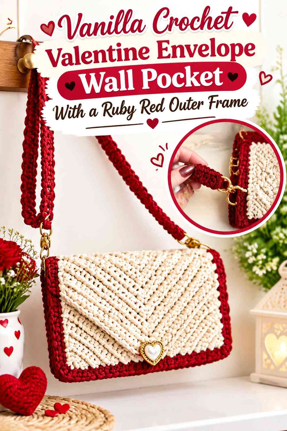
Use an envelope-style shape as the central Vanilla pocket and apply Ruby Red around the perimeter rather than only at the heart. This gives the project a stronger rectangular outline while leaving the light center available for a message-inspired or stationery-like appearance.
Keep Vanilla Broad Inside the Ruby Red Envelope Frame
The Vanilla center should remain the largest uninterrupted surface. This allows the wall pocket to retain the visual suggestion of a paper love letter even though the border is strongly colored.
Carry Ruby Red From the Vanilla Frame Into the Hanging Detail
Repeat Ruby Red at the top through a loop, narrow hanging band, or other small display detail. That repetition keeps the red perimeter connected vertically and prevents all of the stronger color from sitting only around the bottom pocket.
Creator Credit: AmaArte Ateliê
10. Ruby Red Centered and Vanilla Framed Crochet Valentine Love Letter Wall Pocket
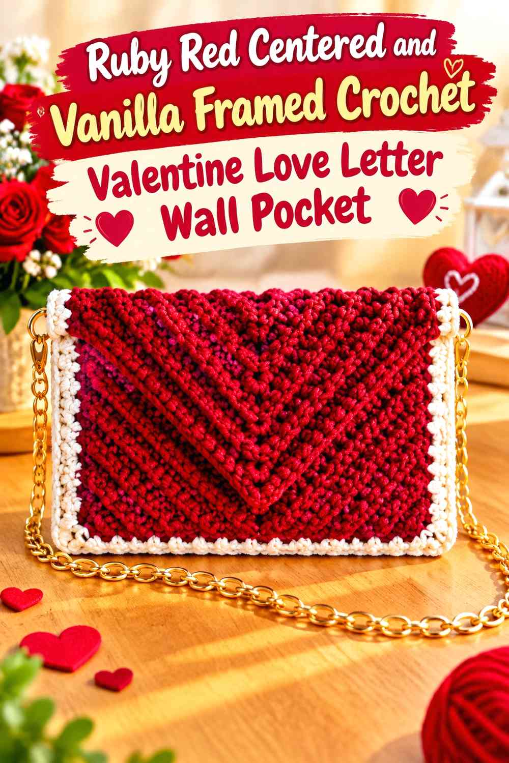
For the final scheme, place a large Ruby Red envelope panel in the center and surround it with Vanilla edging or a light backing. The result gives Ruby Red the strongest Valentine presence while using Vanilla to separate the hanging from the wall and clarify its outer silhouette.
Center Ruby Red Inside a Clearly Visible Vanilla Border
Keep the Vanilla perimeter reasonably consistent around the Ruby Red section. A recognizable light frame makes the central envelope look deliberately inset rather than simply edged on one side.
Use Vanilla to Separate Ruby Red Hearts From the Outer Wall Pocket Edge
If the center already includes Ruby Red texture or heart details, avoid carrying red uninterrupted all the way to the outside. Vanilla around the perimeter creates breathing room and makes the darker central Valentine motif easier to distinguish.
Creator Credit: Geovana Artes em Crochê
Comparing the Ruby Red and Vanilla Love Letter Wall Pocket Ideas
Ideas 1 and 2 provide the clearest envelope-style color reversals. Choose a Vanilla body with a Ruby Red heart when you want the project to resemble light stationery with a strong Valentine seal. Reverse the colors when you want Ruby Red to dominate the wall display.
Ideas 3, 4, and 6 use color boundaries to explain the pocket structure. Split panels, scalloped borders, and framed openings are useful when the flap and functional pocket need to remain visually separate.
Ideas 5 and 7 concentrate attention on heart motifs. The Vanilla-heart version makes the entire pocket feel richer and darker, while Ruby Red hearts on Vanilla create smaller, more controlled Valentine accents.
Ideas 8 and 9 treat the wall hanging as a layered composition. They are useful when you want the love letter to look like an object tucked into or attached to a larger backing rather than making the entire hanging one oversized envelope.
Ideas 10 and 11 rely on framing. Choose Ruby Red around Vanilla for a light-centered envelope, or Vanilla around Ruby Red for a stronger Valentine focal block.
Conclusion
Ruby Red and Vanilla work especially well for a crochet Valentine love letter wall pocket when one shade defines the envelope and the other clarifies its focal details. A Vanilla envelope with a Ruby Red heart creates the most obvious stationery-inspired direction, while a Ruby Red body with a Vanilla flap makes the whole hanging more saturated and Valentine-focused.
If the pocket will actually hold cards, notes, or small lightweight keepsakes, make sure the opening remains visually and physically clear instead of covering it with decorative hearts or edging. Color can help: a contrasting Ruby Red or Vanilla line around the opening immediately separates the functional space from the flap.
For a more decorative piece, concentrate Ruby Red around hearts, scallops, or the pointed flap. For a stronger wall statement, let Ruby Red cover the pocket and use Vanilla as the surrounding frame or backing.
Use the credited tutorials for their demonstrated envelope, pouch, pocket, or wall-hanging construction concepts, then apply the Ruby Red and Vanilla placement that gives your Valentine love letter the hierarchy you want.
Frequently Asked Questions
Should Ruby Red or Vanilla dominate a Valentine love letter wall pocket?
Choose Vanilla as the dominant color when you want the crochet piece to resemble a light paper envelope with Ruby Red Valentine details. Use Ruby Red as the dominant color when you want the wall hanging itself to make a stronger Valentine statement and Vanilla to clarify the flap, heart, or border.
Where should Ruby Red go on a Vanilla crochet love letter pocket?
The flap heart, pocket opening, scalloped edge, side border, or hanging detail are all useful locations. Pick a few connected placements rather than outlining every feature so the Ruby Red accents retain a clear hierarchy.
How do I keep a Ruby Red envelope flap visible on a Ruby Red pocket?
Introduce Vanilla around the flap edge, underneath the flap, or as a heart detail. Crochet texture alone may not create enough visual separation from normal viewing distance when the same color covers both areas.
Can the Vanilla section be used as the actual love letter inside a Ruby Red pocket?
Yes. A Vanilla panel peeking above a Ruby Red opening can visually suggest a letter tucked into the envelope. Keep enough of the light section exposed for the idea to remain recognizable when the hanging is viewed from across the room.
Should a Ruby Red heart be centered on a Vanilla flap?
Centering creates the clearest traditional envelope-seal effect, but it is not mandatory. If the rest of the pocket contains asymmetrical decoration, the heart can shift slightly as long as its relationship to the flap remains visually clear.
How can I keep Ruby Red and Vanilla from looking too flat?
Use color placement together with crochet texture. A Vanilla textured envelope can carry a smooth Ruby Red heart, or a Ruby Red pocket can use a contrasting Vanilla border to reveal the outer shape. Avoid adding texture everywhere at once, since the flap, opening, and appliqués already create several visual layers.
Can I adapt an envelope-bag tutorial into a Ruby Red and Vanilla wall pocket?
An envelope-bag tutorial can provide useful inspiration for the envelope shape, flap, and pocket concept, but its original construction is not automatically a wall-hanging design. Plan the backing or hanging method separately and avoid assuming bag hardware or proportions directly translate to wall display.