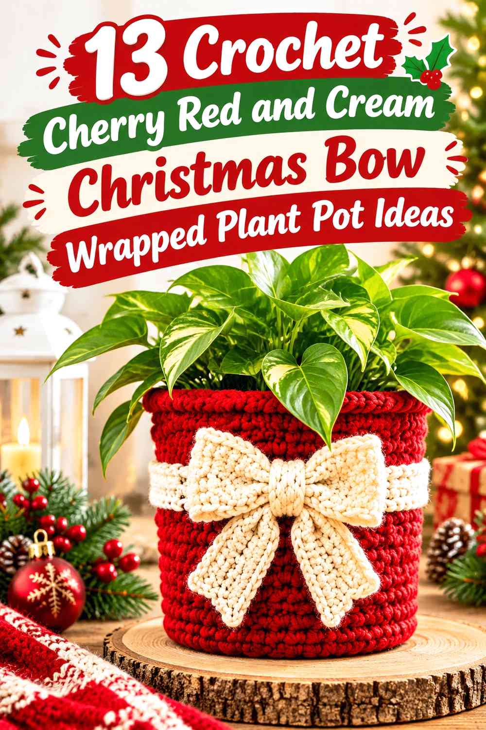

Cherry red and cream can turn a simple crochet plant pot cover into Christmas decor without relying on several competing holiday colors. The main decision is not whether the two shades work together, but how much space each one receives and where the contrast appears.
A cherry red pot with a cream bow feels very different from a cream pot wrapped with cherry red bands. Changing the rim, base, vertical wrap, bow, or textured sections can make the same two-color palette look graphic, soft, traditional, or more modern.
The ideas below focus on those placement decisions. The linked tutorials support the underlying crochet plant-pot cover, basket, or hanging-holder concept; the cherry red, cream, and Christmas bow arrangements are color adaptations you can apply to the finished project.
Quick List
- Cherry Red Crochet Plant Pot with a Cream Cross-Wrap Christmas Bow
- Cream Crochet Plant Pot with a Cherry Red Center-Wrap Bow
- Cherry Red Crochet Plant Pot with Cream Vertical Ribbon Panels
- Cream Crochet Plant Pot with a Cherry Red Cuff and Bow
- Cherry Red Crochet Plant Pot with a Cream Base Band and Bow
- Cherry Red and Cream Checkerboard Crochet Bow-Wrapped Plant Pot
- Cream Crochet Plant Pot with Cherry Red Double-Band Gift Wrap
- Cherry Red Crochet Plant Pot with an Offset Cream Side Bow
- Cream Crochet Plant Pot with a Cherry Red Front-Panel Bow
- Cherry Red Crochet Plant Pot with Cream Raised-Texture Details
- Cherry Red Crochet Hanging Plant Pot with Cream Straps and Bow
- Cream Crochet Hanging Plant Pot with a Cherry Red Rim and Bow
- Cherry Red Crochet Boho Plant Pot with Cream Wrapped Bands
How to Balance Cherry Red and Cream on a Bow-Wrapped Crochet Plant Pot
Decide which color should control the main pot surface before placing the bow. When cherry red covers most of the pot, cream works well as visual separation around the ribbon, rim, or bow. On a cream-dominant cover, cherry red becomes a stronger focal color, so a relatively small band or bow can still command attention.
Avoid automatically dividing both colors into equal areas. A clear dominant color usually makes the wrapped-gift idea easier to read because the contrasting shade can act like actual ribbon rather than becoming another background pattern.
Keep Cherry Red and Cream Details Readable Around Crochet Texture
Crochet texture can change how clearly a two-color arrangement reads. Raised or deeply textured sections create their own shadows, so a cherry red bow placed on an equally textured cherry red background may disappear even when the bow itself is dimensional.
Cream can provide a useful light-value break around small red details. Before committing to a layout, place the yarns together and view them from farther away. A grayscale photo can also help reveal whether the red and cream sections have enough light-dark separation for a bow, band, border, or motif to stay distinct.
Plan the Cherry Red or Cream Bow Around the Plant Pot Rim
Treat the plant, pot, and crochet cover as one display. A large bow positioned directly beneath spreading foliage may compete with the plant, while a low bow can disappear behind a shelf edge or saucer.
The front-center position gives the strongest wrapped-present effect, but an offset bow can work well when the plant itself is visually fuller on one side. Keep decorative crochet elements clear of areas that need to be moved or handled during watering, and consider making the cover removable if that suits the pot setup.
1. Cherry Red Crochet Plant Pot with a Cream Cross-Wrap Christmas Bow
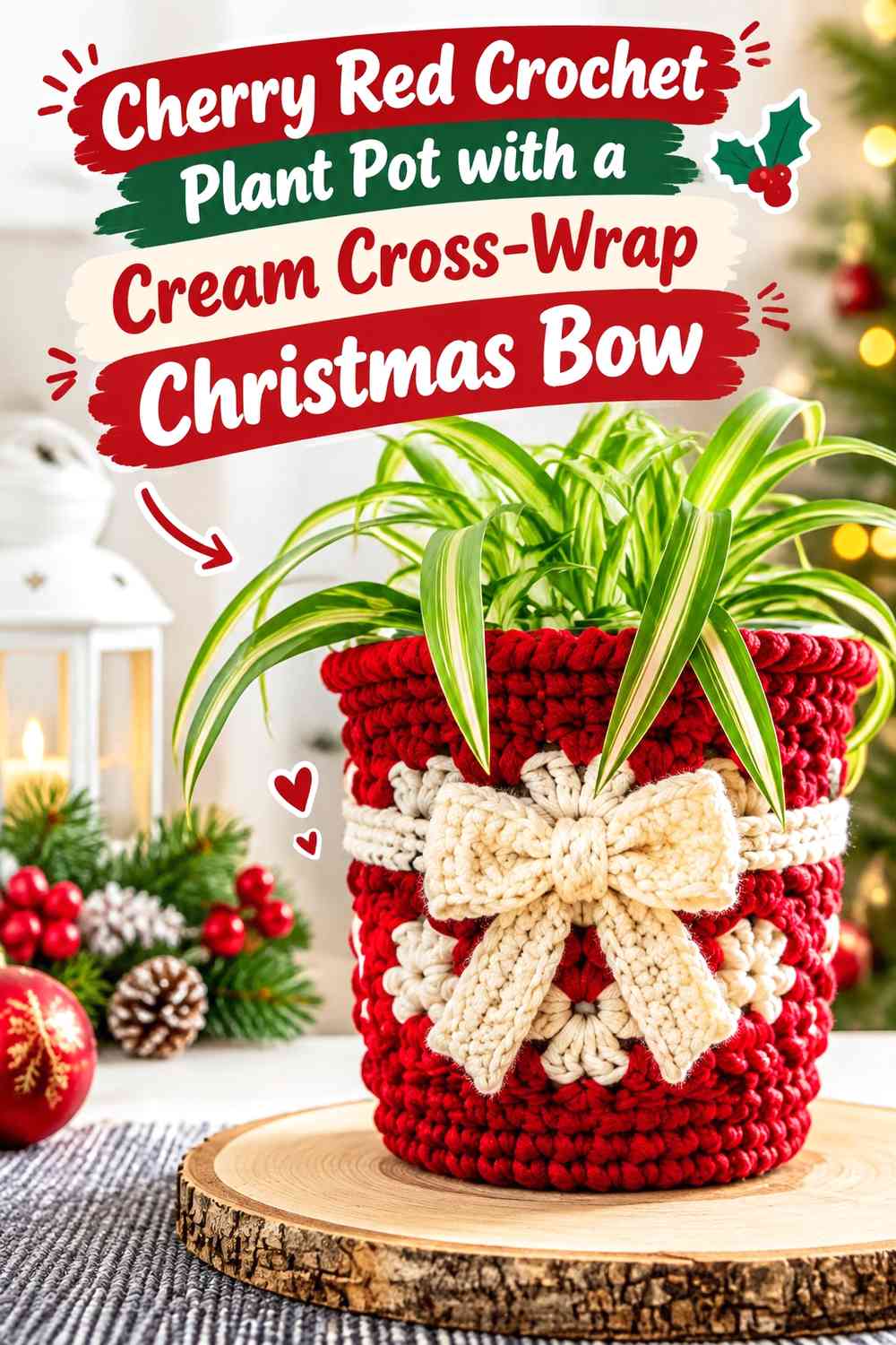
Let cherry red cover most of this crochet plant pot so it reads as the main Christmas color, then use cream like gift ribbon: one vertical route down the visible face and one horizontal band around the pot. The intersection gives the cream bow an obvious home without requiring additional colors.
This arrangement is strongest when the cream remains concentrated. If cream spreads across too many unrelated parts of the cover, the gift-wrap illusion becomes less clear and the red loses its dominant role.
Cream Cross-Wrap Gives Cherry Red a Clear Gift-Ribbon Structure
Place cream where a ribbon would naturally cross a wrapped package rather than scattering it through random stitches. The continuous cream lines visually divide the cherry red surface and lead directly toward the bow.
On a highly textured pot cover, make sure the cream ribbon area remains wide enough to read as a continuous feature rather than a series of disconnected highlights.
Keep the Cream Bow Separate From Cherry Red Raised Texture
A cream bow already has strong value contrast against cherry red, so it does not need a complicated background. If the pot body contains pronounced texture, consider keeping the section directly behind the bow visually quieter.
That gives the loops and tails more definition and prevents the bow from fighting with raised crochet details for attention.
Repeat Cream Sparingly Against the Cherry Red Rim
A narrow cream rim can connect the bow to the top of the plant pot, but it changes the balance quickly because it creates an uninterrupted light line around the entire piece. Use it when you want a more coordinated two-color finish.
If the cream cross-wrap already supplies enough contrast, leaving the rim cherry red can keep the design cleaner.
Creator Credit: B.Hooked Crochet
2. Cream Crochet Plant Pot with a Cherry Red Center-Wrap Bow
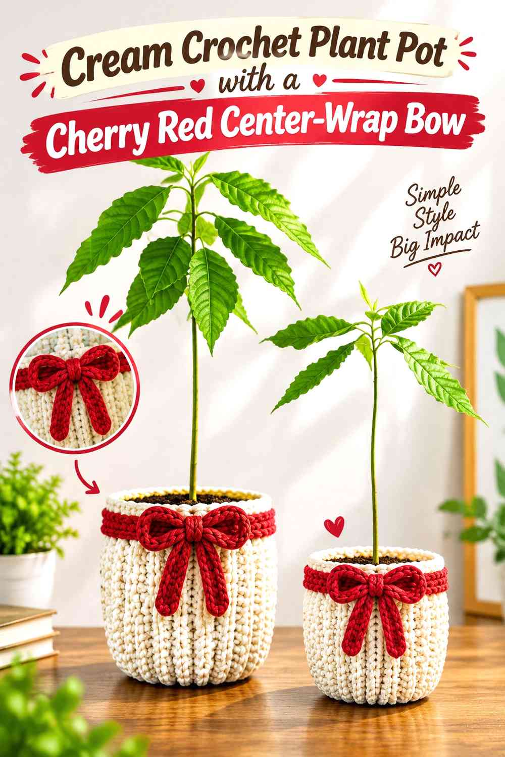
Reverse the color hierarchy for a lighter Christmas plant pot. Cream becomes the main field, while cherry red forms the horizontal gift band and front bow. Because the red occupies less surface area, it naturally becomes the focal point.
This arrangement works especially well when you want the greenery to remain the darkest visual element above the pot rather than surrounding it with a large red block.
Cherry Red Center Band Anchors the Cream Crochet Plant Pot
Keep the cherry red band concentrated around the middle or slightly above center. It breaks the cream surface into clear sections while giving the bow an intentional attachment point.
Avoid adding several unrelated cherry red stripes above and below it unless you want a busier result. One defined band makes the wrapped-present reference easier to recognize.
Let the Cherry Red Bow Carry More Weight Than the Cream Texture
If the cream pot has pronounced stitch texture, the cherry red bow should still remain the strongest foreground detail. Check the piece from a few feet away rather than judging only at close range.
If the bow visually disappears into texture, simplify the surrounding cream section or increase the uninterrupted red area around the bow attachment.
Creator Credit: Made by Lunda
3. Cherry Red Crochet Plant Pot with Cream Vertical Ribbon Panels
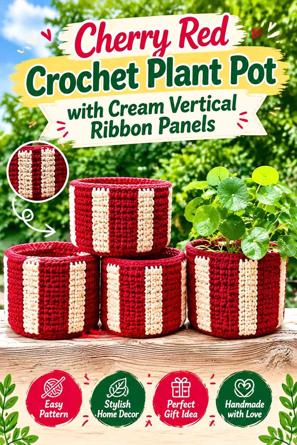
This version emphasizes height rather than wrapping the pot with a strong horizontal stripe. Use cherry red across most of the cover, then run cream vertically down the visible sides or front as narrow ribbon-like sections. A cherry red bow positioned over the cream gives the bow a contrasting backdrop while keeping red dominant overall.
The vertical placement can also visually organize a tall or tapered planter because the eye follows the lighter cream sections from rim toward base.
Cream Vertical Strips Break Up a Cherry Red Plant Pot Without Diluting It
Limit cream to deliberate vertical areas so the red still reads as one connected surface. Narrow cream panels can provide contrast without turning the whole pot into alternating stripes.
Before adding the bow, check that the cream sections appear balanced when the planter is viewed from its usual display angle.
Cherry Red Bow Repetition Keeps the Cream Ribbon Panels Connected
Placing a cherry red bow over cream creates a useful color reversal: the pot is red, the ribbon is cream, and the bow returns to red. That repeated red helps the bow feel connected to the body instead of looking like a separate decoration.
Leave enough cream visible around the bow for its silhouette to remain easy to see.
Creator Credit: WAVELENGTHS
4. Cream Crochet Plant Pot with a Cherry Red Cuff and Bow
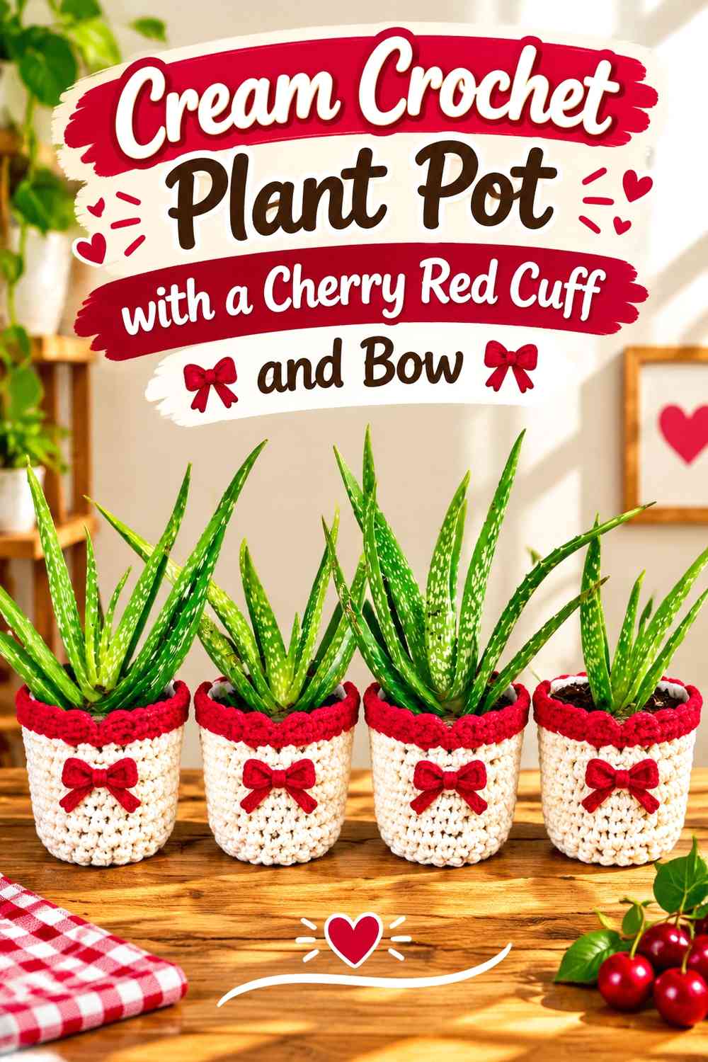
A cherry red upper cuff concentrates the Christmas color close to the plant while allowing cream to cover most of the pot. Position the bow just below or partly against that upper band so the red looks intentionally repeated rather than scattered.
This palette direction is useful when you want a predominantly light plant cover but still need a definite holiday focal point.
Cherry Red Cuff Gives the Cream Plant Pot a Strong Top Edge
The rim is visually important because it forms the transition between the crochet cover and the plant. A cherry red cuff creates a defined boundary above the cream body and can make the top edge feel more finished.
Keep the band proportionate to the pot. If it extends too far downward, the design shifts from cream-dominant to a roughly divided two-color block.
Keep the Cherry Red Bow Below the Cream Area Near the Foliage
If both the red cuff and bow sit tightly beneath the leaves, the upper part of the pot can become visually crowded. Moving the bow slightly lower leaves some cream between the foliage and the main decoration.
That light break makes it easier to distinguish plant, rim, bow, and body as separate elements.
Creator Credit: Fat Lady Crochet
5. Cherry Red Crochet Plant Pot with a Cream Base Band and Bow
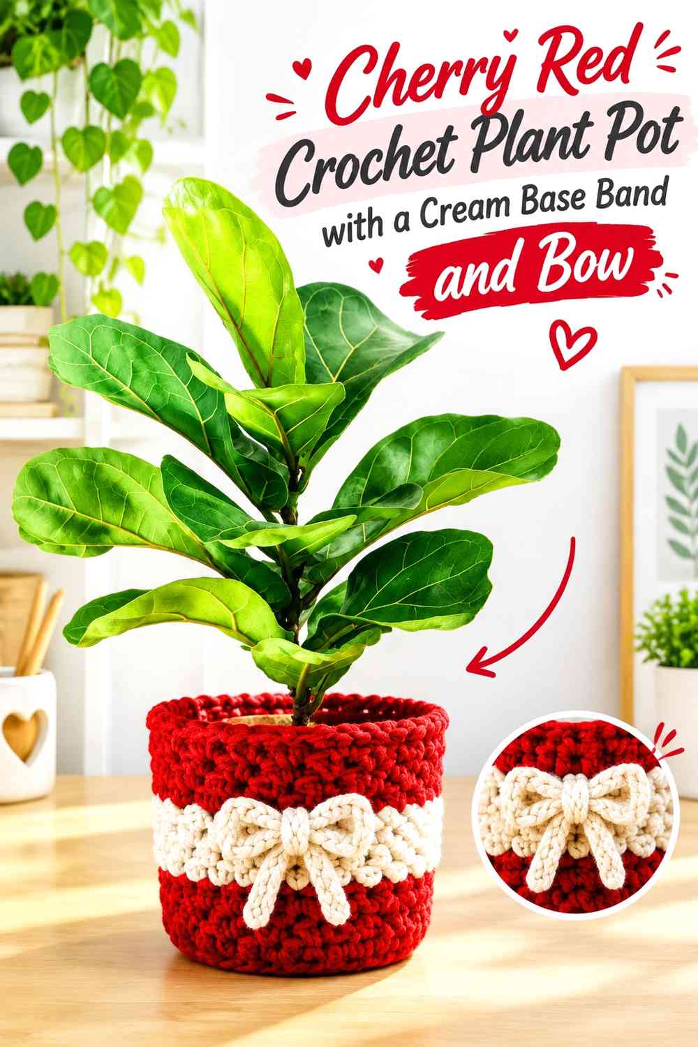
Move the light contrast toward the bottom for a less conventional gift-wrap layout. Let cherry red dominate from the rim downward, then introduce cream as a substantial lower band. A cream bow can sit above that band so the same supporting color appears in two clearly separated locations.
Because the darkest and strongest color remains around most of the plant pot, the piece still reads as cherry red first.
Cream Base Band Lightens a Cherry Red Plant Pot From the Bottom Up
A cream lower section visually lifts the bottom of a dark or saturated red cover. It can also create separation between the crochet pot and a darker tabletop or shelf.
Check the pot in its intended display location before deciding how much cream to use. A light shelf may reduce the definition of a cream base, while a darker surface can make it much more prominent.
Keep the Cream Bow Distinct From the Cream Base Band
Avoid placing the bow so low that its tails visually merge into the cream base. Leave a visible cherry red section between them when you want the bow to read as a separate feature.
If you prefer a more connected look, one bow tail can approach the band while the other remains surrounded by red.
Creator Credit: Sincerely Pam
6. Cherry Red and Cream Checkerboard Crochet Bow-Wrapped Plant Pot
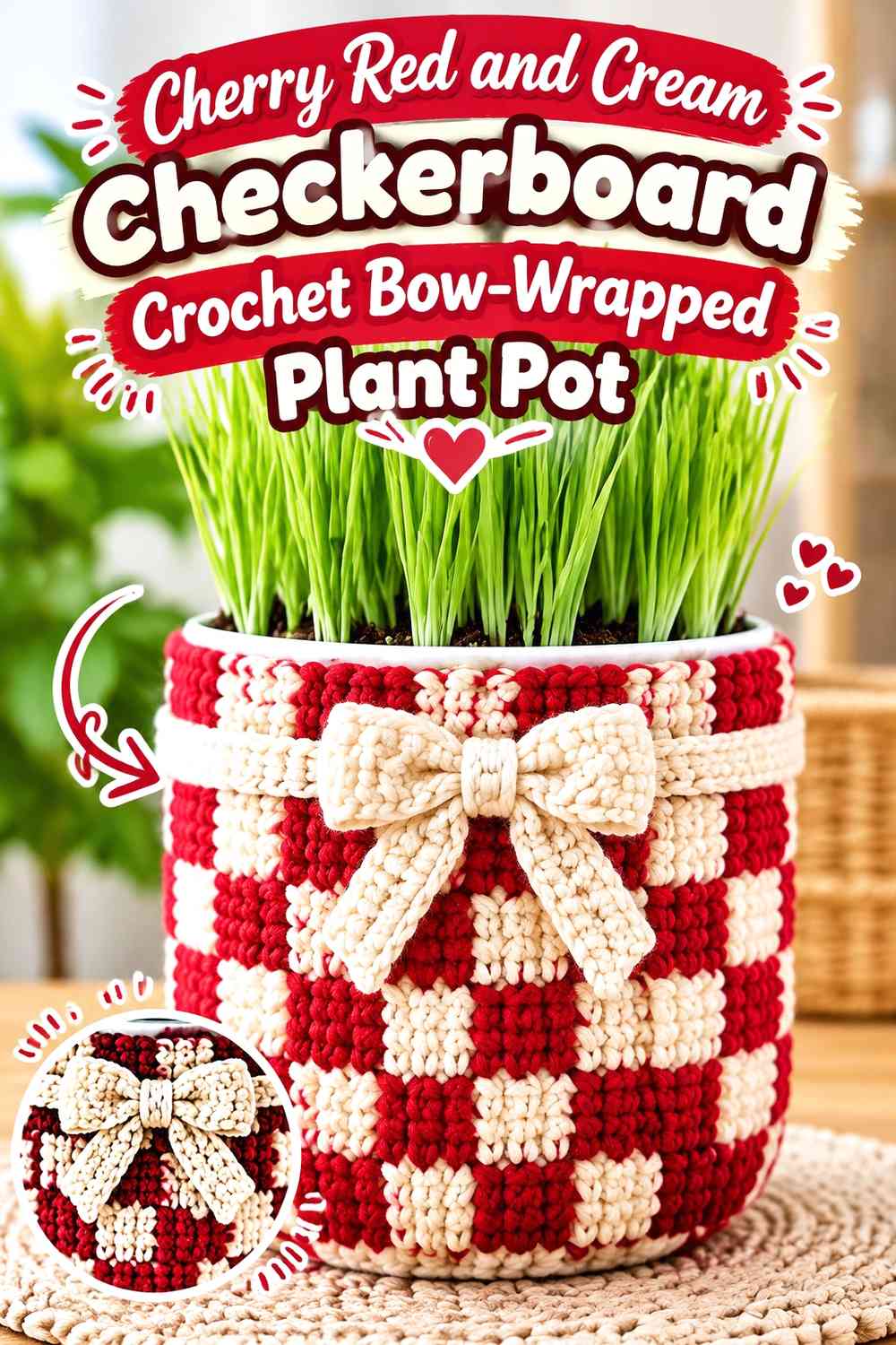
A checkerboard or block-based treatment gives the same two Christmas colors a more graphic direction. Instead of treating cream only as ribbon, distribute cherry red and cream across repeated sections, then use a solid-color bow to create a clear focal point.
Because the background already contains frequent color changes, this idea needs stronger hierarchy than the simpler red-body or cream-body options.
Cherry Red and Cream Checkerboard Needs One Color to Lead
Even with alternating blocks, one shade can occupy the larger visual areas. Let cherry red control more of the surface if you want a richer Christmas result, or increase cream when you want the cover to appear lighter.
The important point is to avoid making every section equally prominent unless a deliberately busy geometric result is the goal.
Use Cream Around the Cherry Red Bow to Protect Its Silhouette
A cherry red bow can disappear over red checkerboard blocks. Position it where cream sits immediately behind most of the loops and knot so the shape remains readable.
You do not need to redesign the entire checkerboard. Simply planning the bow position in relation to the color blocks can solve the visibility problem.
Keep Cherry Red and Cream Repetition Consistent Around the Pot
Repeated color blocks are easiest to read when they look intentional from more than one viewing angle. Before finishing the cover, rotate it around the actual planter and identify which section will become the front.
Place the bow only after deciding that front orientation so the strongest cream-red contrast is facing outward.
Creator Credit: First The Coffee Crochet
7. Cream Crochet Plant Pot with Cherry Red Double-Band Gift Wrap
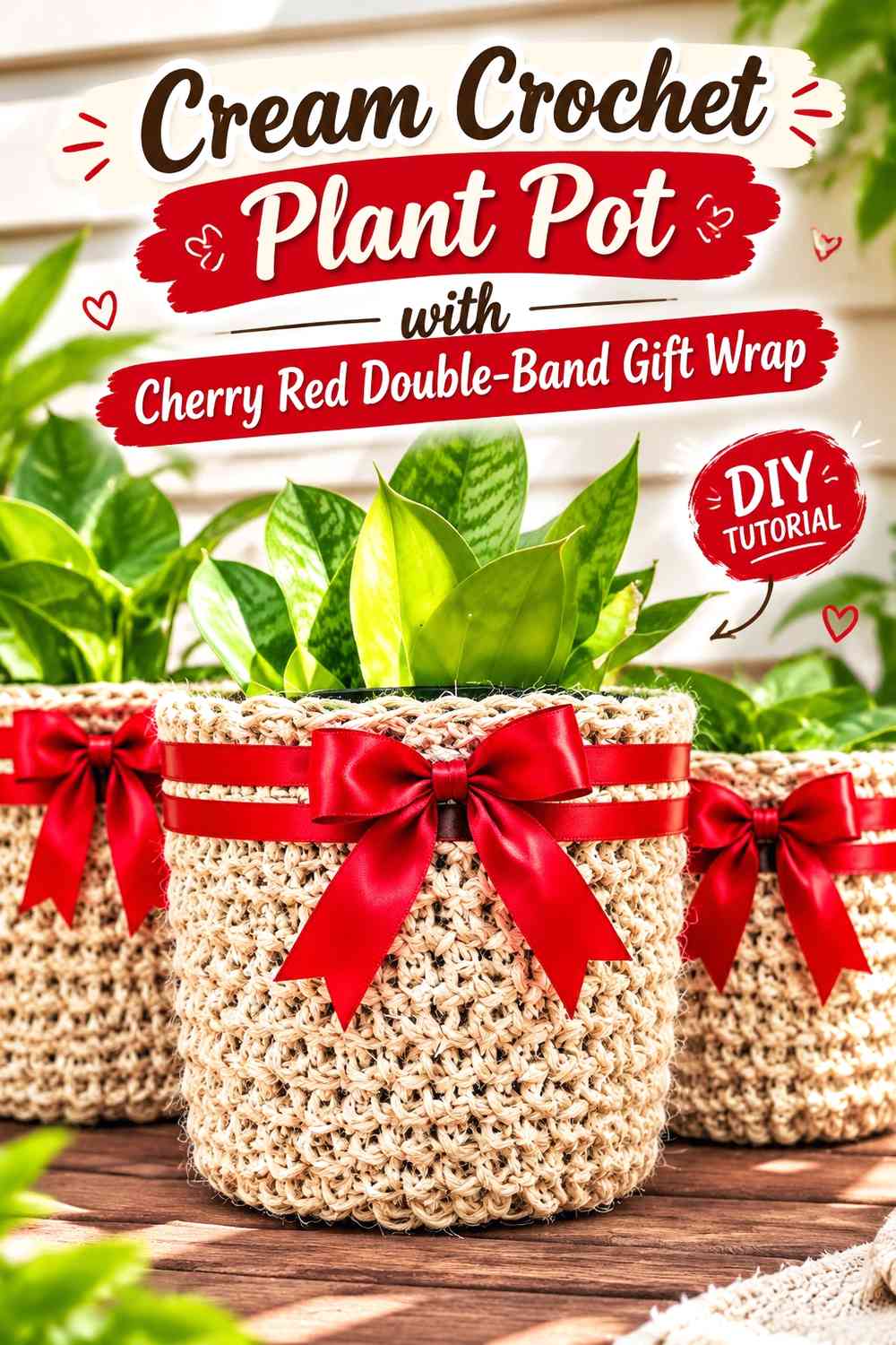
Two narrow cherry red bands can give a cream plant pot a structured Christmas wrapping effect without covering much of the lighter base. Use one band closer to the rim and another lower on the pot, then connect the concept with a cherry red bow at the front.
This design relies on repetition rather than large color blocks, so spacing becomes more important than adding additional shades.
Cherry Red Double Bands Give Cream a More Structured Wrapped Look
Keep the two cherry red lines visibly related. If one is extremely narrow and the other becomes a broad panel, they may no longer read as a coordinated ribbon treatment.
The cream between them should remain substantial enough to preserve the light, open appearance of the overall planter.
Cherry Red Bow Repetition Works Better When Cream Stays Quiet
Because the bow and two bands already repeat cherry red several times, avoid adding extra red details to every edge. Leaving the base and much of the rim cream gives the eye somewhere to rest.
This also makes the bow easier to identify as the primary decorative element.
Creator Credit: Rich Textures Crochet
8. Cherry Red Crochet Plant Pot with an Offset Cream Side Bow
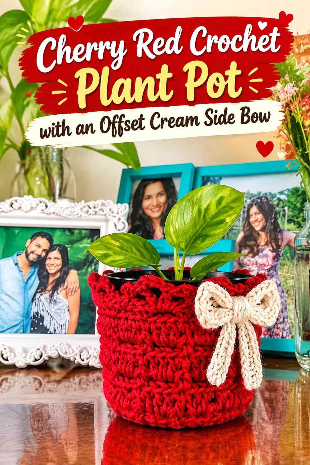
Not every Christmas bow needs to sit at the exact center. A cream bow shifted to one side can create an intentionally asymmetrical focal point on a cherry red plant pot, particularly when the plant’s foliage naturally leans or trails in the opposite direction.
Keep the rest of the color placement relatively restrained so the off-center choice looks deliberate rather than accidental.
Cream Side Bow Creates a Clear Break in the Cherry Red Surface
The broad cherry red field gives an offset cream bow strong visibility. Because the surrounding color is consistent, the eye can locate the bow immediately even when it is not centered.
Before attaching it, rotate the finished cover around the planter and decide which side will normally face the room.
Keep the Cream Bow Away From a Busy Cherry Red Rim
A cream-edged rim plus a cream side bow can make the top corner overly light. If the bow already sits high on the pot, consider keeping the nearby rim cherry red.
That preserves a stronger red background around the bow and prevents the upper edge from becoming the dominant feature.
Creator Credit: Vida de Artesã
9. Cream Crochet Plant Pot with a Cherry Red Front-Panel Bow
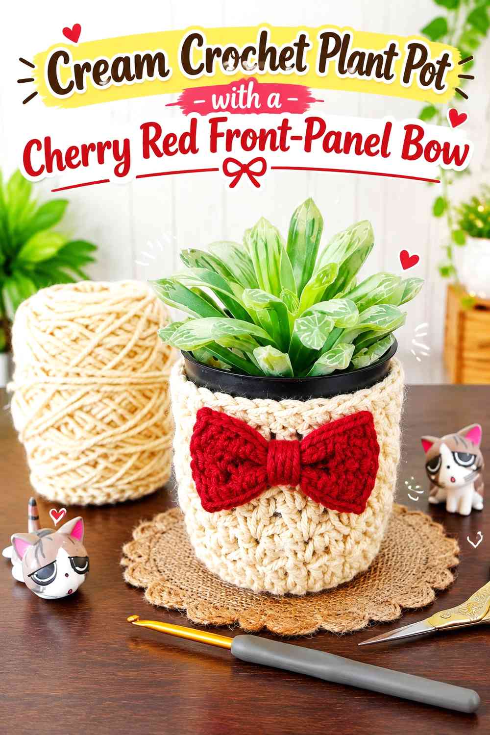
Instead of wrapping red completely around the planter, restrict it to a front-facing panel. The cream cover remains visible from the sides and back, while cherry red creates a concentrated display area for the Christmas bow.
This approach uses color directionally: it is designed for a pot that will usually be viewed from one main angle on a shelf, table, or mantel arrangement.
Cherry Red Front Panel Gives the Cream Plant Pot One Strong Focal Area
Make the red panel broad enough to look intentional but not so wide that the cream disappears when viewed from the front. The contrast between a red center and cream sides naturally frames the bow.
This is also a useful arrangement when you want to avoid carrying multiple color changes around the entire circumference for purely decorative reasons.
Cream Side Areas Keep the Cherry Red Bow From Feeling Too Heavy
A red panel plus a red bow concentrates substantial visual weight in one area. Cream sections on either side act as breathing room and keep the decoration from turning into one uninterrupted red block.
If the bow is especially dimensional, resist adding another red border directly beside it.
Creator Credit: Chompu Handicrafts
10. Cherry Red Crochet Plant Pot with Cream Raised-Texture Details
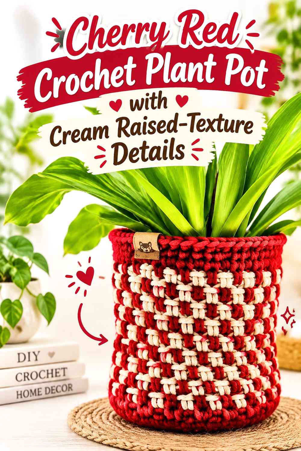
Use cherry red as the uninterrupted base color, then reserve cream for raised bands, ridges, or other prominent texture areas and the bow. This makes color and crochet texture reinforce each other rather than acting as separate design features.
The lighter cream can help textured sections remain visible from farther away, while red provides a solid Christmas background.
Cream Raised Texture Can Reveal Detail Against Cherry Red
Place cream on the texture you most want the eye to notice. A light contrasting yarn on raised sections can create clearer separation than working the same detail entirely in cherry red.
Avoid highlighting every textured area. Selective cream placement keeps the pot from looking segmented.
Cherry Red Should Frame the Cream Bow Instead of Competing With It
Give the cream bow a reasonably plain cherry red area behind it. When cream ridges, edging, and the bow all meet in the same small section, their outlines can merge.
A red buffer around the bow lets its loops and tails remain the main cream feature.
Creator Credit: Pretty Darn Adorable Crochet Tutorials
11. Cherry Red Crochet Hanging Plant Pot with Cream Straps and Bow
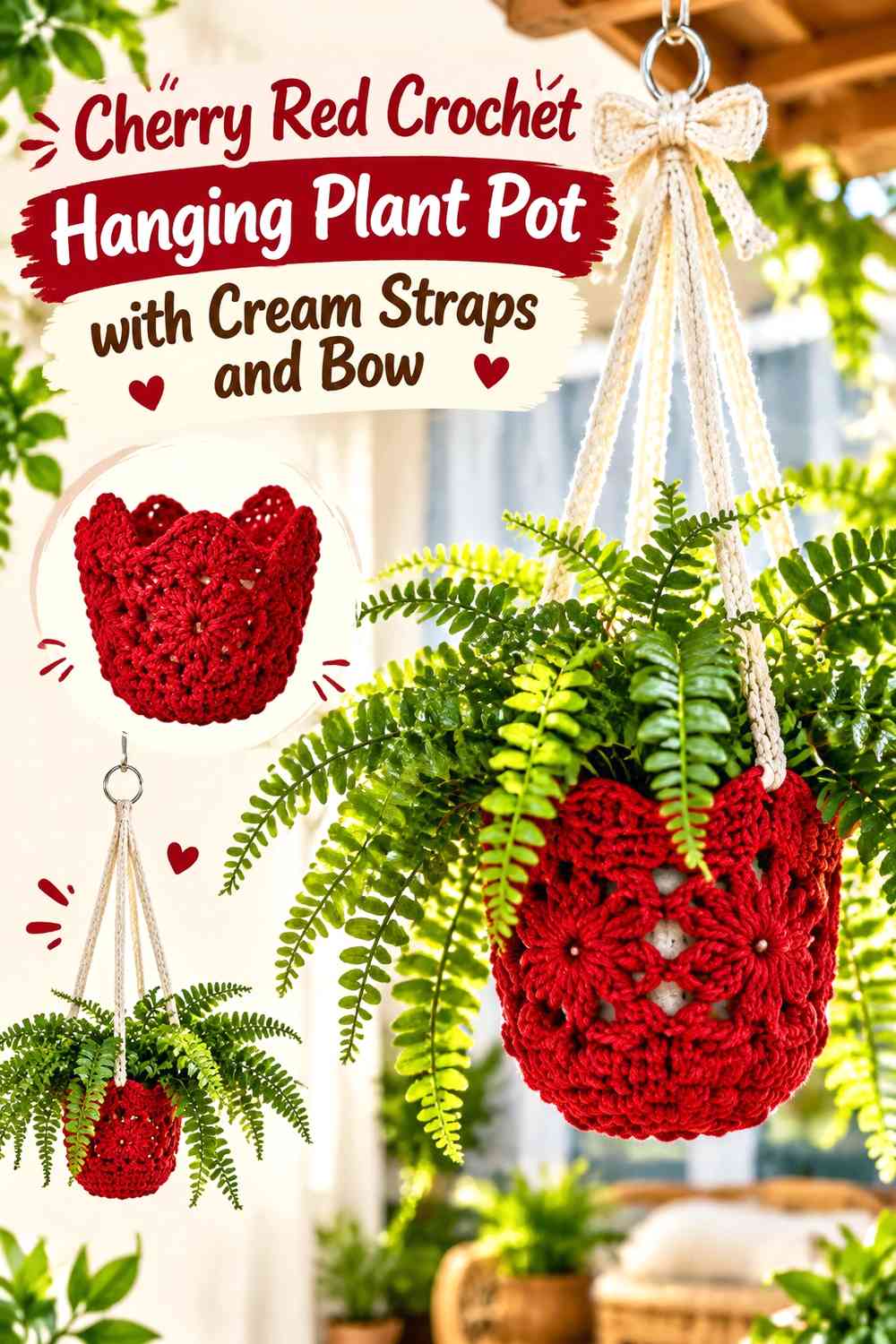
A hanging planter creates an extra place to repeat the palette above the pot. Keep the main holder cherry red, then carry cream into the hanging lines or upper joining area. A cream bow on the pot can visually connect those upper elements to the lower container.
The additional vertical space means color repetition should be controlled. Cream does not have to appear along every hanging section for the palette to feel coordinated.
Cream Straps Can Carry the Wrap Motif Above a Cherry Red Hanging Pot
Cream hanging lines extend the light color beyond the pot itself, which can make the whole display feel taller and more integrated. Keep the cherry red body visually solid so the planter still provides a clear base underneath the foliage.
If the actual pot shows through open crochet areas, consider its color as part of the composition before deciding how much cream to add.
Cherry Red Bow Placement Needs Space From the Cream Hanging Lines
When cream lines rise directly behind a cream bow, the bow’s upper loops can lose definition. Position the bow where cherry red remains visible around most of its outline.
Alternatively, use a cherry red bow over a cream wrap section if the hanging lines already provide plenty of cream elsewhere.
Keep Cream Repetition Secondary to the Cherry Red Plant Holder
A hanging project offers many tempting accent locations, including straps, joins, rims, and decorative ends. Using cream on all of them can quickly reverse the intended balance.
Choose two or three connected cream areas and let cherry red remain the visual anchor.
Creator Credit: Brunaticality
12. Cream Crochet Hanging Plant Pot with a Cherry Red Rim and Bow
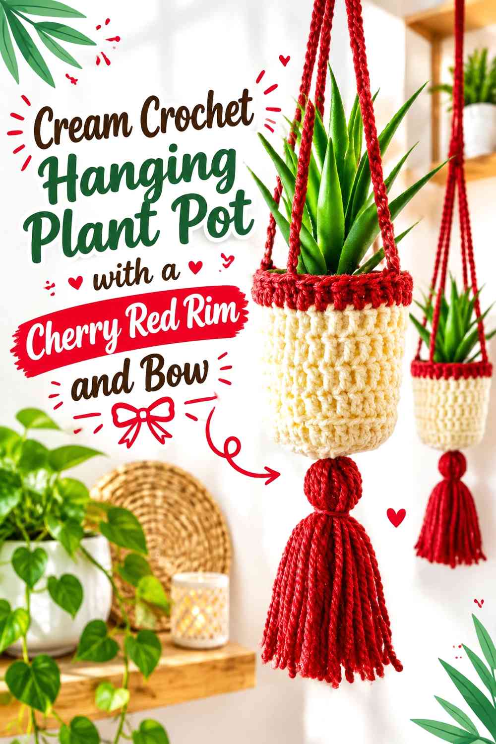
For a lighter hanging display, cover most of the pot area in cream and use cherry red around the rim and front bow. The concentrated red at the top gives the cream planter definition where it meets the foliage.
This approach can work especially well when the hanging structure itself is visually simple and you want the color emphasis to remain close to the plant pot.
Cherry Red Rim Gives the Cream Hanging Pot a Strong Top Edge
A cherry red rim separates cream crochet from the plant above it. It can also provide a visual starting point for red details carried into the bow or a small section of the hanging structure.
Keep the rim relatively controlled if cream is meant to remain the dominant color.
Cherry Red Bow Repetition Connects the Cream Pot to the Hanging Structure
Repeat cherry red once more above or around the planter only when it helps connect the design. The bow already provides a substantial red focal point, so additional red accents should support it rather than compete with it.
Viewing the hanger at its actual hanging height can help reveal whether the bow needs more or less contrast.
Creator Credit: Bella Coco
13. Cherry Red Crochet Boho Plant Pot with Cream Wrapped Bands
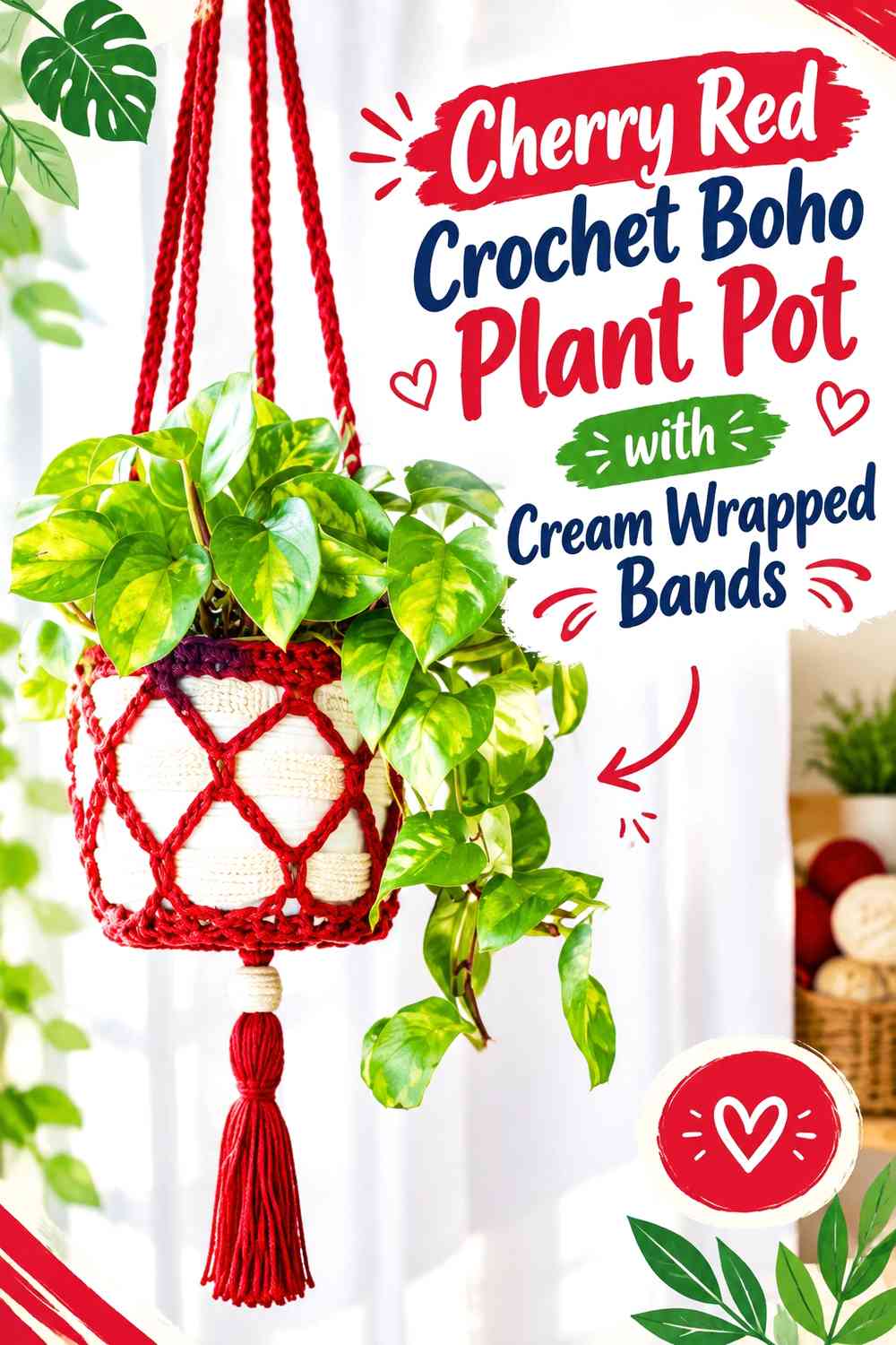
A more open or boho-style holder can still read as Christmas decor when the palette is disciplined. Let cherry red dominate the crocheted pot-support area and use cream in wrapped bands, joins, or a simple bow rather than covering every open section with alternating color.
The actual planter may remain visible through open crochet, so its color becomes an important part of the finished scheme.
Cream Wrapped Bands Soften a Cherry Red Boho Plant Pot
Cream can interrupt the red where hanging sections meet or where you want a gift-wrap reference. Keep those bands visually connected to the bow so they feel like one design language.
If the real planter underneath is already cream or white, reduce the cream crochet slightly so the red structure remains easy to see.
Keep the Cream Bow Simple When Cherry Red Openwork Adds Movement
Open crochet already creates many lines and negative spaces. A highly elaborate bow can introduce another competing shape.
A cleaner cream bow placed against a relatively solid cherry red section preserves the Christmas gift effect without obscuring the underlying holder design.
Creator Credit: You Should Craft
Which Cherry Red and Cream Plant Pot Layout Should You Choose?
For the strongest traditional Christmas impact, start with a cherry red-dominant option such as Ideas 1, 5, 8, or 10. These keep the saturated red over most of the plant-pot surface and use cream mainly for definition.
For a lighter display, Ideas 2, 4, 9, and 12 allow cream to control the background while cherry red becomes the focal accent. If the wrapped-present effect matters most, Ideas 1, 6, and 7 make the ribbon structure especially obvious.
Ideas 11 through 13 suit hanging displays, where the extra straps and open space give you additional places to repeat cherry red and cream without covering the entire pot.
Conclusion
Cherry red and cream give a Christmas crochet plant pot enough contrast to create several distinct designs without introducing a long list of colors. The main choice is where you want the red to carry visual weight and where cream should create separation.
Choose a red-dominant pot when you want a stronger holiday statement, a cream-dominant cover when you prefer a lighter display, or a structured ribbon arrangement when you want the plant pot to resemble a wrapped present most clearly.
Whichever direction you use, plan the bow only after the main color blocks are established. That makes it easier to give the bow enough contrast while keeping it visually connected to the rim, bands, or wrapped sections around the plant pot. Use the credited tutorials for the exact underlying crochet construction and adapt the color placement to your chosen Christmas scheme.
Frequently Asked Questions
Should Cherry Red or Cream Dominate a Crochet Christmas Plant Pot?
Either can lead. Cherry red dominance creates a stronger, more saturated holiday look, while a cream-dominant pot feels lighter and makes smaller cherry red accents appear more prominent.
Choose the dominant color before deciding on the bow. If the pot is mostly cherry red, cream can function like gift ribbon. If the pot is mostly cream, a cherry red bow and band can become the main focal point without needing much additional red.
How Can I Keep a Cream Bow Visible on a Cherry Red Crochet Plant Pot?
Give the cream bow a relatively uninterrupted cherry red background. Raised stitches, stripes, borders, and other cream details placed directly behind the bow can weaken its outline even though the two yarn colors contrast strongly.
Check the pot from normal viewing distance after temporarily positioning the bow. If the loops are difficult to distinguish, simplify the nearby texture or move the bow onto a larger solid-red area.
What If My Actual Plant Pot Is Already Cream?
Treat the visible pot as part of the palette. If cream ceramic or plastic shows through an open crochet holder, using too much additional cream yarn can reduce the definition of the crochet structure.
Increasing the visual share of cherry red around open areas can restore separation. On a dense crochet cover that completely hides the original pot, its color matters much less.
Can Cherry Red and Cream Work Without Green or Gold Accents?
Yes. The two colors can provide enough visual variety when their roles are clear. Use one as the dominant pot color and the other for the bow, ribbon, rim, base, or textured details.
Adding a third color is optional rather than necessary. Staying with cherry red and cream can actually make the wrapped-gift concept easier to recognize because the eye has fewer competing accents to process.
Where Should a Cherry Red or Cream Crochet Bow Sit on a Plant Pot?
Front center gives the clearest wrapped-present appearance, while an offset position can balance foliage that leans or trails to one side. The bow should also remain practical around the way the planter is handled.
Temporarily position it before securing it and view the pot at its normal shelf, tabletop, or hanging height. This helps you catch bows that sit too close to the foliage, rim, saucer, or surrounding decorations.
How Do I Substitute Another Red for Cherry Red?
Preserve the relationship with cream rather than trying to match an exact commercial yarn shade. Choose a clear red that remains noticeably darker and more saturated than the cream so the gift-wrap sections and bow retain strong separation.
Compare the substitute yarn directly beside your cream yarn before crocheting a large area. If the combination looks softer than you want, use the red across a larger continuous surface and keep cream concentrated in the smaller decorative details.