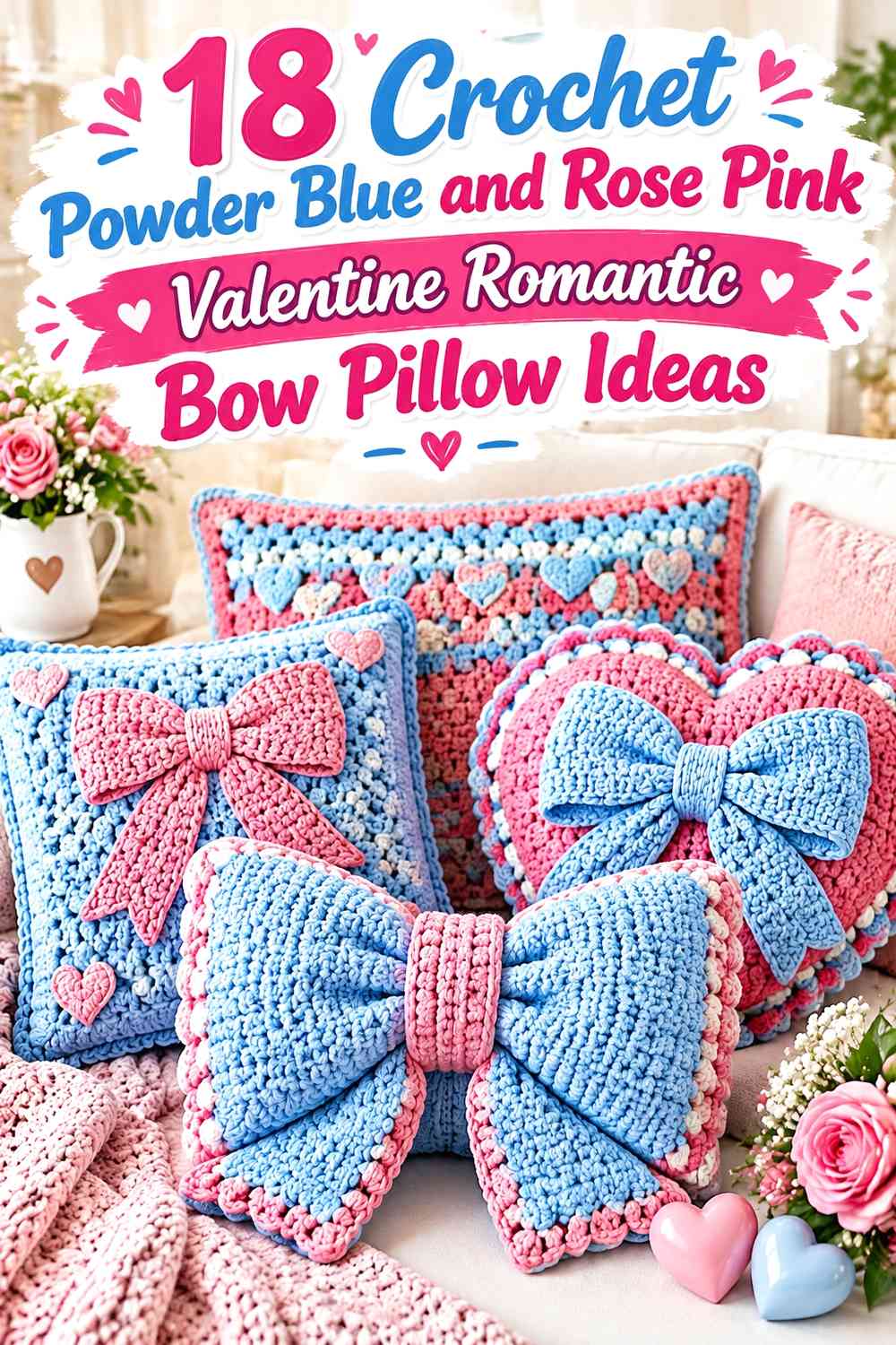

Powder blue and rose pink offer a softer alternative to the usual red-and-white Valentine palette. On a crochet bow pillow, powder blue can create a calm background that gives rose pink bows and hearts clear separation, while reversing the colors produces a warmer, more romantic pillow with cool blue details.
The amount of each color matters as much as the colors themselves. A large rose pink bow can become the focal point on an otherwise powder blue pillow, while several small bows need more surrounding quiet space. Heart shapes, flower-inspired surfaces, granny squares, bobbles, ruffles, and textured panels also change how strongly the two colors compete.
The tutorials linked with these ideas support the underlying pillow, cushion, or bow construction concepts. The powder blue and rose pink color arrangements are independent adaptations, so the creators are not being credited with palettes they did not necessarily use.
Quick List
- Powder Blue Crochet Granny Square Bow Pillow With a Rose Pink Center Bow
- Powder Blue Crochet Woven-Texture Pillow With a Rose Pink Ribbon Bow
- Rose Pink Crochet Heart Pillow With a Powder Blue Romantic Bow
- Powder Blue Crochet Pixel Heart Bow Pillow With Rose Pink Accents
- Powder Blue Crochet Surface-Heart Pillow With a Rose Pink Center Bow
- Rose Pink Crochet Flower Pillow With a Powder Blue Bow Center
- Powder Blue Crochet Petal Pillow With a Rose Pink Romantic Bow
- Rose Pink Crochet Flower Bow Pillow With Powder Blue Petal Details
- Powder Blue Crochet No-Sew Flower Pillow With a Rose Pink Center Bow
- Powder Blue Crochet Valentine Heart Pillow With Rose Pink Bow Corners
- Rose Pink Crochet Striped Heart Pillow With a Powder Blue Bow
- Powder Blue Crochet Flower Bow Pillow With Rose Pink Petal Accents
- Powder Blue Crochet Star Bow Pillow With a Rose Pink Valentine Bow
- Rose Pink Crochet Bobble Pillow With a Powder Blue Statement Bow
Let Powder Blue or Rose Pink Clearly Lead the Bow Pillow
Using powder blue and rose pink in exactly equal amounts can make a small decorative pillow feel divided rather than coordinated. Decide first which color should cover the largest visual area. A powder blue body with a rose pink bow gives the bow immediate emphasis, while a rose pink body with powder blue edging creates a warmer Valentine look with cooler definition around the perimeter.
The bow itself also affects the balance. A large central bow usually needs less additional rose pink elsewhere on a blue pillow. Smaller bows can be repeated, but they work better when the surrounding pillow face stays relatively simple.
Use Powder Blue and Rose Pink Contrast Around Hearts, Bows, and Texture
Powder blue and rose pink are different hues, but their light-dark values can still be fairly close depending on the yarns chosen. If a rose pink bow disappears into a similarly light powder blue background, deepen the pink, lighten the blue, or add a narrow cream separator rather than introducing several unrelated colors.
Texture matters too. Bobbles, petals, granny clusters, and raised stitches already create shadows and visual movement. On highly textured pillow faces, keeping one color dominant often makes the romantic bow easier to identify.
1. Powder Blue Crochet Granny Square Bow Pillow With a Rose Pink Center Bow
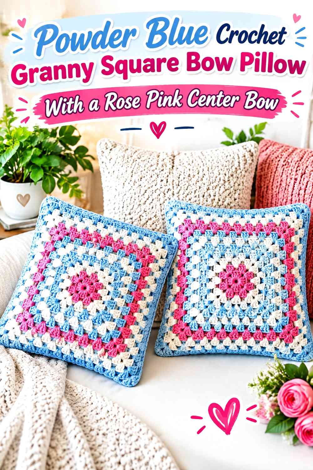
Granny-square construction gives powder blue and rose pink many possible placement points, so a clear hierarchy is important. Use powder blue through most of the repeated squares or outer rounds, then reserve rose pink for selected centers and one larger bow across the finished pillow face.
Repeat Powder Blue Across the Crochet Granny Squares
Using powder blue consistently in every motif creates a visual thread connecting the whole pillow. The repeated color can appear in outer rounds, backgrounds, or joins depending on the square layout.
This consistency matters because multiple granny motifs already create a patchwork effect without additional random color changes.
Concentrate Rose Pink in Granny Centers and the Crochet Bow
Small rose pink motif centers can echo the larger bow without taking over the pillow face. Keep the pink placement repetitive and predictable so the eye can follow it across the cushion.
If every granny round contains rose pink, the statement bow may lose its focal role.
Creator Credit: Bhūmi
2. Powder Blue Crochet Woven-Texture Pillow With a Rose Pink Ribbon Bow
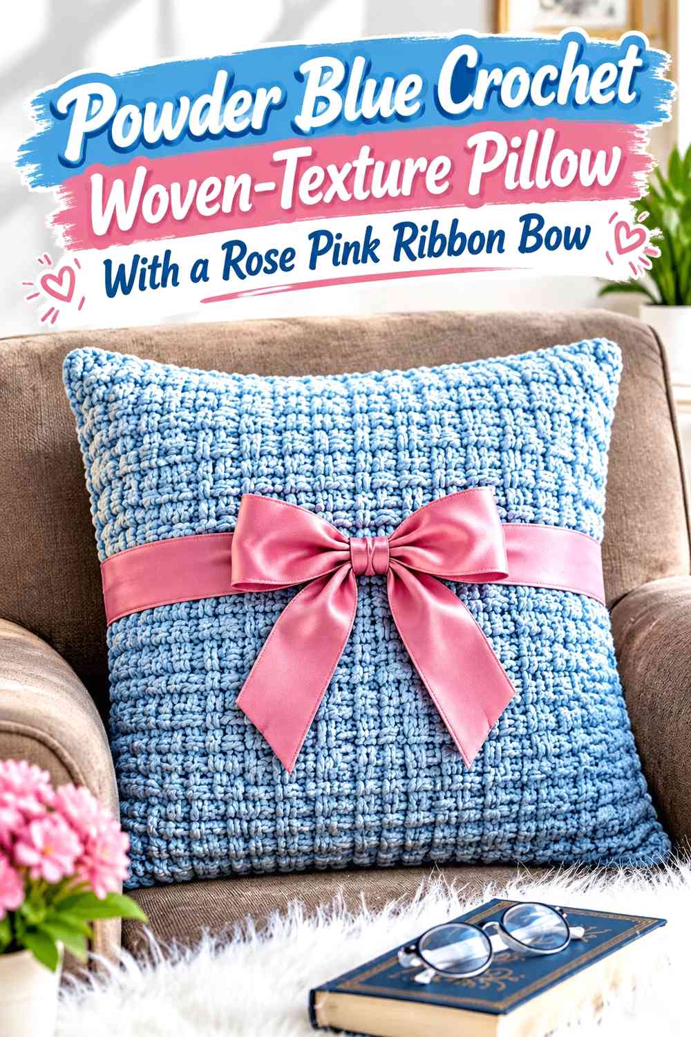
A woven-looking surface already supplies strong linear texture, so the color treatment can stay simple. Powder blue makes a useful main color for the textured body, while rose pink can form a smoother bow laid across or centered on that structured surface.
Powder Blue Lets the Crochet Woven Texture Stay Cohesive
Use powder blue across most of the woven-looking pillow face so the interlocking texture remains the primary surface feature. Changing colors too frequently through a highly structured stitch can make the pattern harder to read.
A single blue field also provides a clean backdrop for a contrasting bow.
Rose Pink Should Interrupt the Powder Blue Texture Deliberately
Position the rose pink bow where it crosses enough of the powder blue field to be visible but does not obscure every interesting textured section.
A horizontal bow can emphasize the pillow’s width, while a more compact central bow keeps more of the woven surface exposed.
Creator Credit: Yarnspirations
3. Rose Pink Crochet Heart Pillow With a Powder Blue Romantic Bow
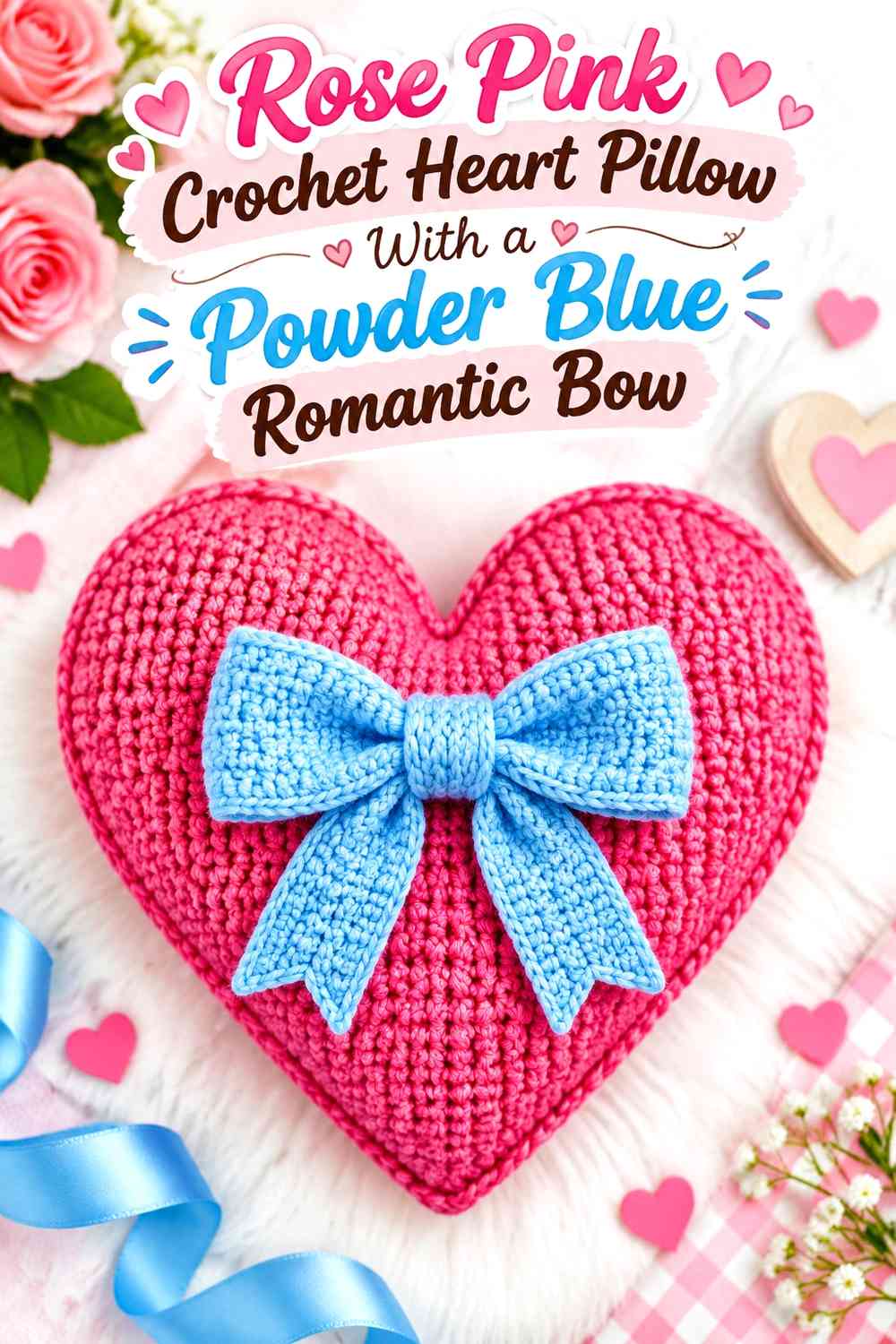
This version uses rose pink for a plush heart silhouette and powder blue for the main bow. It gives the cool color a stronger role than simple edging while keeping the Valentine identity centered on the pink heart.
Rose Pink Should Remain the Largest Crochet Color Area
Let the complete heart body stay rose pink so the pillow is recognized first by shape and dominant color. The powder blue bow can be substantial without needing blue stripes or additional panels behind it.
Keeping the color areas large and clear is especially helpful on a three-dimensional heart.
Make the Powder Blue Crochet Bow Broad Enough to Read on Rose Pink
A tiny pale blue bow can disappear against a soft rose background. Give the bow sufficient width or visual density that its loops and center remain distinct.
If both yarns are similar in value, compare them from a distance before committing to the final bow size.
Creator Credit: GratiaProject
4. Powder Blue Crochet Pixel Heart Bow Pillow With Rose Pink Accents
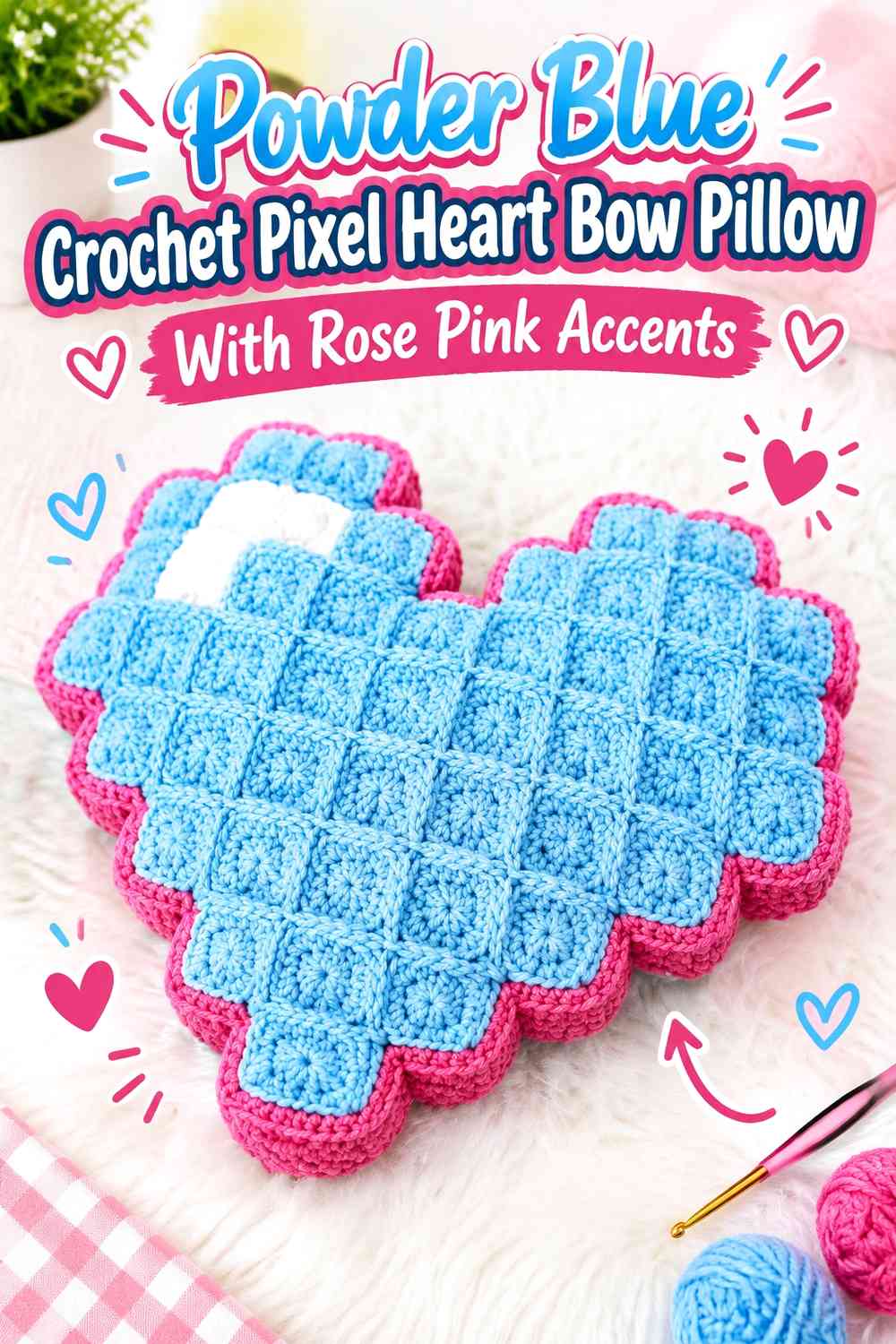
Pixel construction gives the Valentine theme a more graphic direction. Use powder blue for most of the block structure and build rose pink into the central heart or selected squares. A compact rose pink bow can sit at the top or center without competing with the geometric motif.
Powder Blue Can Organize the Crochet Pixel Grid
Use powder blue in the repeated background blocks so the grid stays visually consistent. A stable blue field helps the rose pink heart or bow read as a deliberate shape rather than another random group of squares.
Avoid alternating blue and pink equally in every block unless a checkerboard effect is intentional.
Keep Rose Pink Focused on the Pixel Heart and Crochet Bow
Let rose pink identify the romantic imagery. If the heart occupies a large area, keep the bow comparatively small. If the heart is subtle, the bow can become the larger pink feature.
The key is preventing two large rose pink focal points from competing on the same square pillow face.
Creator Credit: Hooked On Patterns
5. Powder Blue Crochet Surface-Heart Pillow With a Rose Pink Center Bow
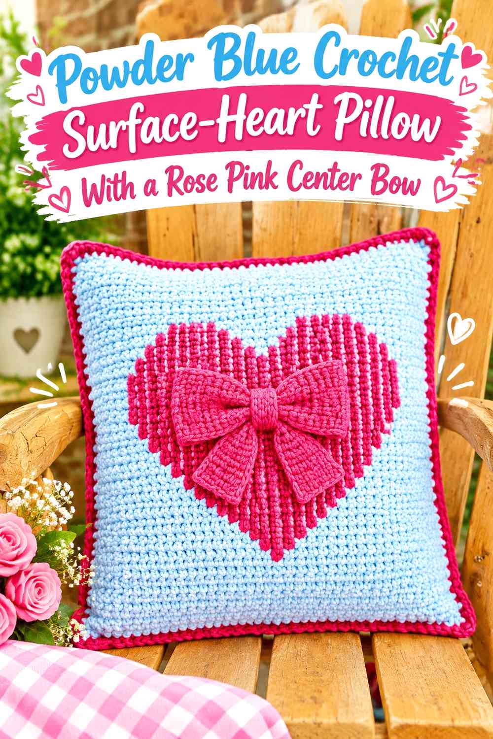
A square pillow with a heart worked across its surface provides room for both Valentine motifs without changing the basic pillow silhouette. Use powder blue as the background and rose pink for the heart, then repeat rose pink in a smaller central bow.
Powder Blue Gives the Rose Pink Surface Heart Clear Space
Keep the pillow panel predominantly powder blue so the heart remains visible from edge to edge. A calm background is especially important when the heart is created through surface detail rather than a separate appliqué.
Leave some plain blue between the heart and border to avoid crowding the design.
Scale the Rose Pink Crochet Bow Below the Heart Motif
The bow should support rather than hide the rose pink heart. Place a smaller bow near the center, upper edge, or one side where it can be read separately.
Using the same rose pink for both elements keeps the surface cohesive despite having two romantic motifs.
Creator Credit: Banana Moon Studio
6. Rose Pink Crochet Flower Pillow With a Powder Blue Bow Center
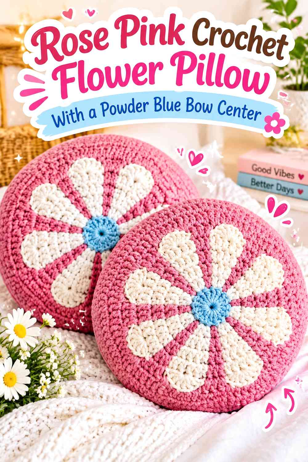
A flower-shaped pillow can become a romantic bow pillow by treating rose pink petals as the main field and using powder blue at the center with a bow detail. The curved petal outline gives this option a softer silhouette than a square cushion.
Let Rose Pink Cover Most Crochet Flower Petals
Using rose pink consistently across the petals keeps the flower readable as one complete shape. Alternating blue and pink on every petal would create a stronger multicolor effect and reduce the bow’s importance.
The pink petal field also gives the pillow a clear Valentine direction before the bow is added.
Use Powder Blue at the Rose Pink Flower Center and Crochet Bow
Connecting the flower center and bow with powder blue keeps the accent color from appearing isolated. The blue can act almost like the center of a ribbon arrangement surrounded by rose pink petals.
Keep the blue area smaller than the petal field so the flower does not become visually top-heavy.
Creator Credit: VivCrochets
7. Powder Blue Crochet Petal Pillow With a Rose Pink Romantic Bow
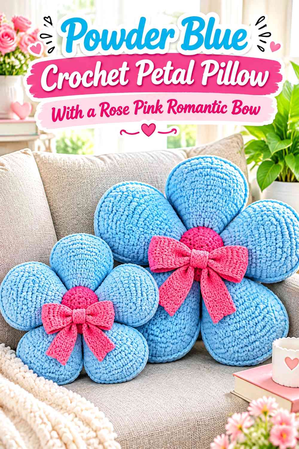
For a cooler floral Valentine look, reverse the previous arrangement. Powder blue petals create the main shape, while rose pink occupies the center and bow. This works well when you want the romantic color concentrated rather than spread across the entire pillow.
Powder Blue Can Carry the Large Crochet Petal Surface
Use one consistent powder blue across the petals so the flower shape remains unified. Because each petal creates its own outline, extra color changes are not necessary to create separation.
The continuous blue surface also makes rose pink feel more deliberate when it appears only at the center.
Rose Pink Can Turn the Powder Blue Flower Center Into a Bow Focal Point
Place the rose pink bow directly over or close to the center so the warm accent becomes the visual anchor. A central location works particularly well on a radial flower because the surrounding petals naturally direct attention inward.
Avoid adding another equally large rose pink border that would compete with this focal point.
Creator Credit: Maria’s Blue Crayon
8. Rose Pink Crochet Flower Bow Pillow With Powder Blue Petal Details
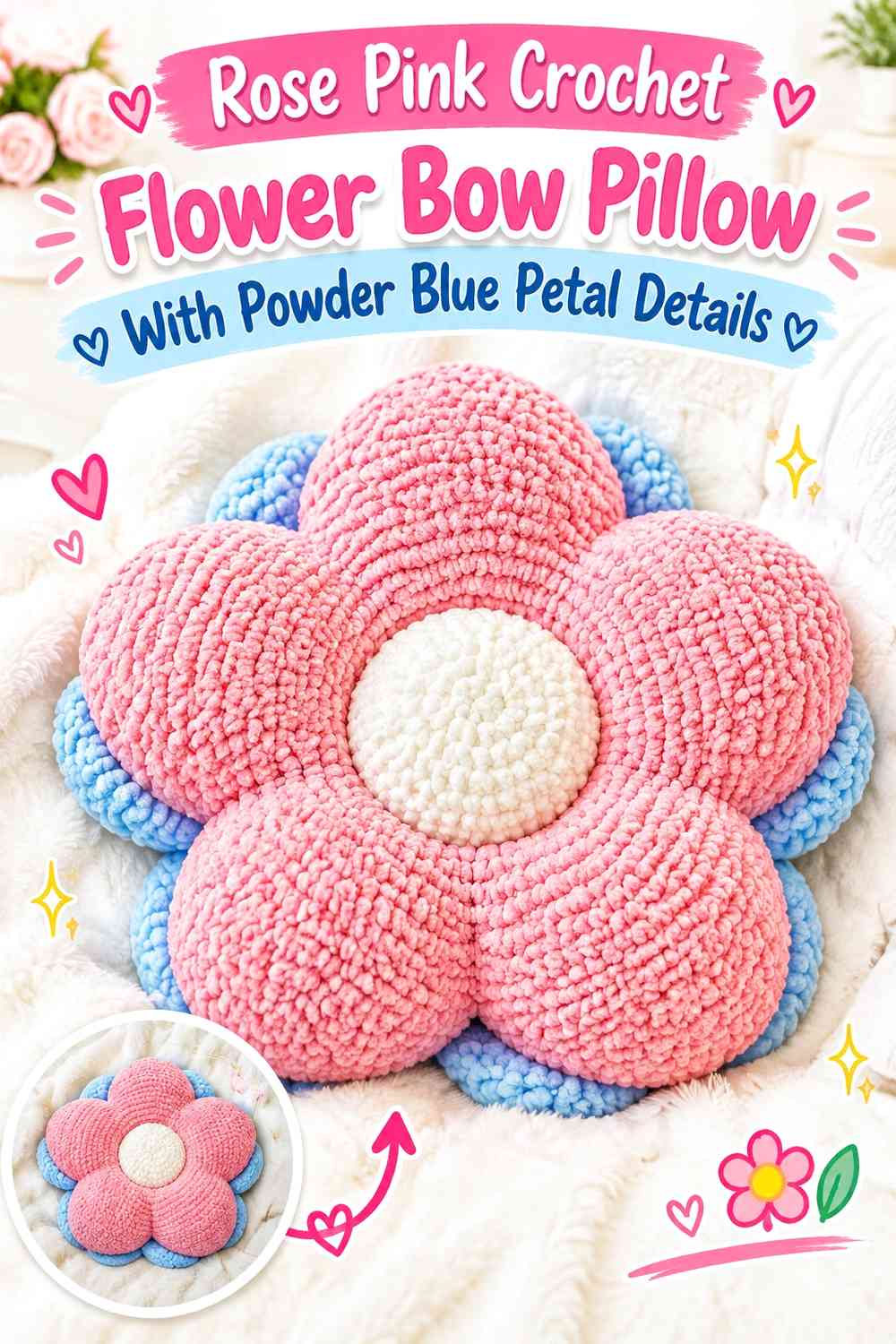
This palette keeps rose pink dominant but introduces powder blue selectively toward the ends or inner sections of the petals. The bow can remain rose pink so it blends into the romantic main color while its three-dimensional shape provides the necessary separation.
Rose Pink Can Unite the Crochet Flower and Bow
Using rose pink for both the main petal field and bow creates a more tonal romantic look. The bow should then rely on shape and placement rather than sharp color contrast to stand out.
This direction works especially well when you want the pillow to feel softer and less graphic than a contrasting blue-bow version.
Use Powder Blue to Break Up Large Rose Pink Crochet Petals
Place powder blue in small repeated areas rather than coloring only one isolated petal. Inner petal sections, tips, or a narrow surrounding accent can introduce the cool tone while keeping the flower predominantly pink.
Repeating the blue evenly helps the accent feel intentional.
Creator Credit: Let’s crochet
9. Powder Blue Crochet No-Sew Flower Pillow With a Rose Pink Center Bow
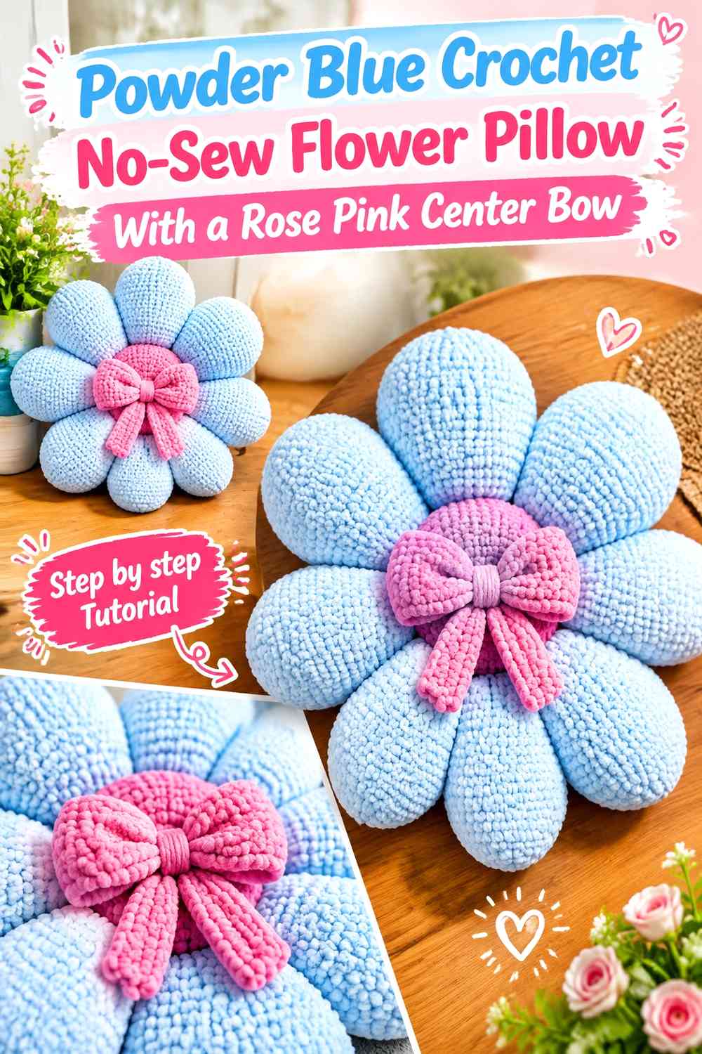
This idea uses a petal-based pillow structure with a cool powder blue outer shape and a compact rose pink center. A small bow placed at the center reinforces the Valentine theme without hiding the individual petals.
Powder Blue Keeps the Crochet Petals Visually Connected
Use powder blue on all or most petals so the pillow reads as one complete flower. Because the petal outlines already break up the outer edge, alternating colors are unnecessary unless you intentionally want a busier effect.
A consistent blue also gives the rose pink center more influence.
Rose Pink Should Stay Concentrated at the Powder Blue Flower Center
Use rose pink for the center and bow rather than scattering it over every petal. This creates a clear warm focal point surrounded by cooler blue.
If the center becomes large, keep the bow simple enough that its loops remain recognizable against the same-color background.
Creator Credit: Sahar Elkady
10. Powder Blue Crochet Valentine Heart Pillow With Rose Pink Bow Corners
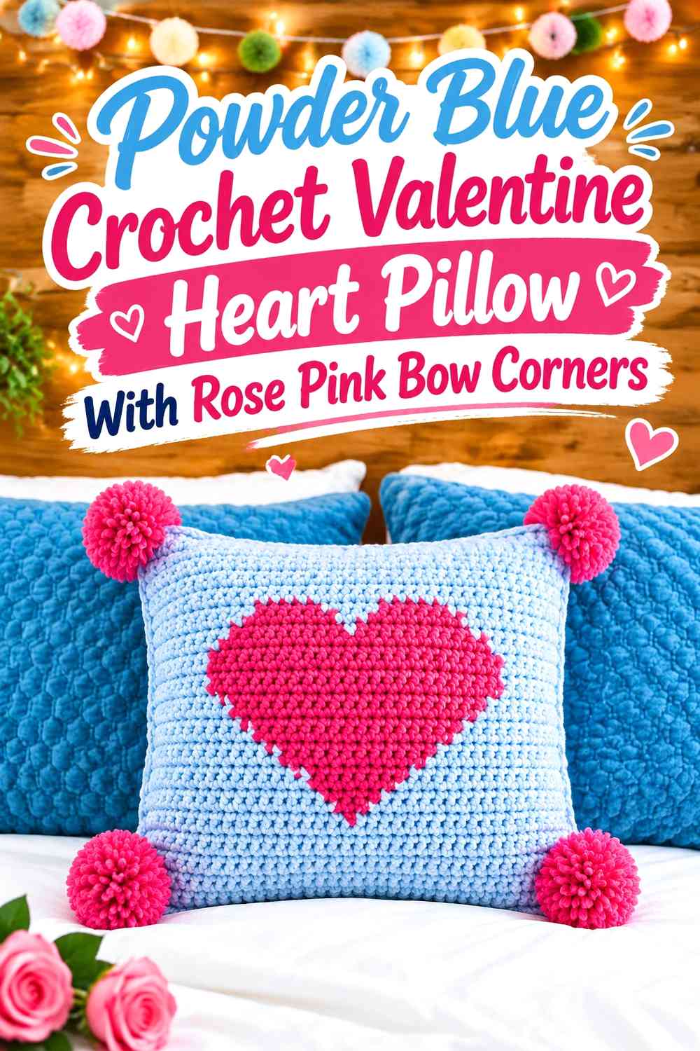
A square Valentine pillow offers space to distribute rose pink beyond a single central bow. Use powder blue for the background, a large rose pink heart on the face, and smaller bow details at selected corners rather than all four if the surface starts to feel crowded.
Powder Blue Should Surround the Rose Pink Crochet Heart
Leave a visible powder blue margin around the heart so its outline remains distinct. If the pink motif reaches too close to every pillow edge, the background loses its ability to frame the design.
This blue breathing space also gives corner decorations somewhere to sit without merging into the central heart.
Repeat Rose Pink Bows Selectively on the Powder Blue Corners
Two diagonally placed rose pink bows can create balance without surrounding the heart with four competing accents. If you use bows at every corner, consider making them smaller than the central motif.
The repeated rose pink connects the edges to the heart while powder blue remains the dominant structural color.
Creator Credit: MJ’s Off The Hook Designs
11. Rose Pink Crochet Striped Heart Pillow With a Powder Blue Bow
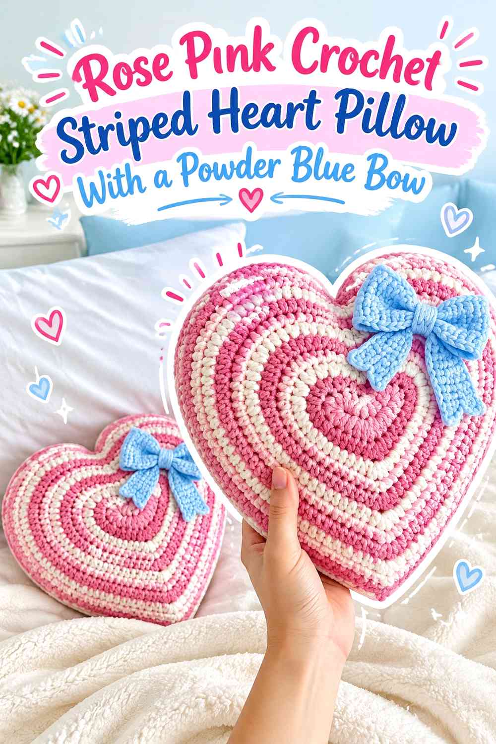
A multicolor heart construction can use rose pink as the recurring dominant stripe and powder blue as a quieter secondary stripe. Adding a powder blue bow gives the cool color a focal role even though pink occupies more of the body.
Keep Rose Pink More Frequent Than Powder Blue in the Crochet Heart
If the heart alternates the two colors equally, the pillow can become strongly striped and less overtly romantic. Repeating rose pink more often lets the heart retain a warm Valentine identity.
Powder blue can then appear at planned intervals instead of dividing every pink section.
Tie the Powder Blue Crochet Bow Into Existing Blue Stripes
Use the same powder blue for the bow and selected body stripes so the bow feels integrated rather than added afterward.
Place it where it touches or visually aligns with one of the blue sections when possible, but keep enough rose pink surrounding it for the bow silhouette to remain visible.
Creator Credit: mahumcrochets
12. Powder Blue Crochet Flower Bow Pillow With Rose Pink Petal Accents
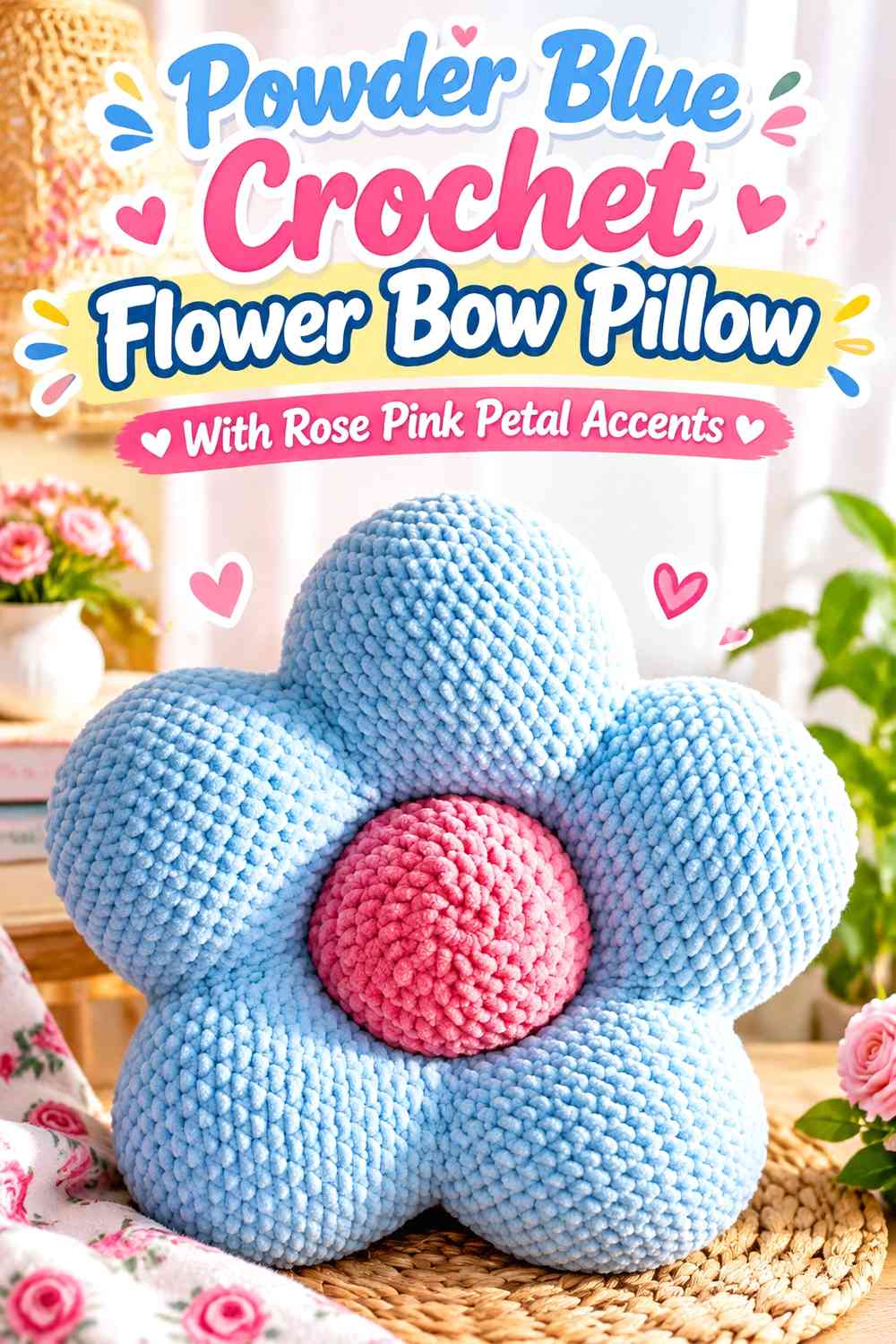
This version uses powder blue as a continuous flower base but gives rose pink a more distributed role through selected petal accents and the bow. It suits readers who want more pink than a single center accent without moving to a fully pink flower.
Powder Blue Should Still Connect the Crochet Flower Shape
Keep powder blue present on every petal, even if rose pink is introduced as a secondary section. The repeated blue creates continuity around the entire pillow and stops individual petals from looking disconnected.
A shared base color is especially helpful on a shape with many separate outer curves.
Repeat Rose Pink From the Crochet Petals Into the Bow
Use the same rose pink on several evenly distributed petal details and the main bow. This repetition moves the eye around the pillow before returning to the bow focal point.
Avoid using rose pink on every available edge; enough powder blue should remain visible to preserve the two-level color hierarchy.
Creator Credit: Fable Crochet Toys
13. Powder Blue Crochet Star Bow Pillow With a Rose Pink Valentine Bow
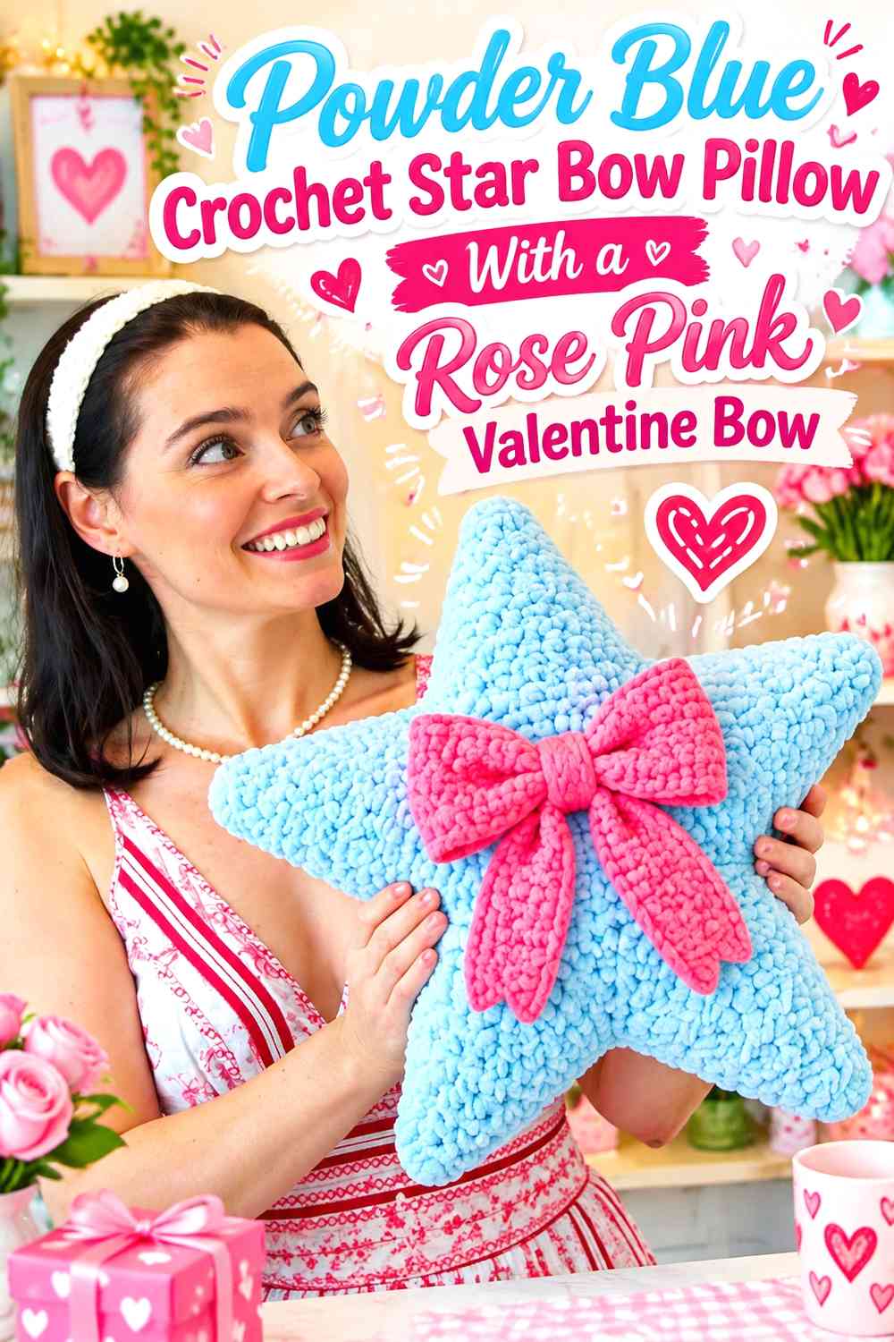
A star-shaped pillow gives the Valentine palette a playful variation while the bow supplies the romantic cue. Powder blue works well across the star because it keeps the unusual silhouette clear, while rose pink can be concentrated in one substantial center bow.
Use Powder Blue Across Every Crochet Star Point
Keeping all star points powder blue prevents the outer shape from being broken into separate colored sections. The continuous blue also lets the silhouette remain the first structural feature the viewer notices.
If additional Valentine details are wanted, keep them toward the center instead of decorating every star point.
Center the Rose Pink Crochet Bow on the Powder Blue Star
The center of a star is the natural visual anchor, making it a useful position for a rose pink bow. A bow here connects all points without favoring one side.
Keep the bow smaller than the overall central area so enough powder blue remains visible around it to define the loops.
Creator Credit: Jayda InStitches
14. Rose Pink Crochet Bobble Pillow With a Powder Blue Statement Bow
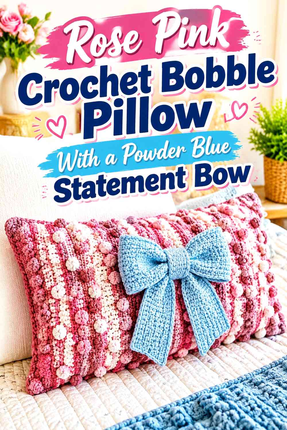
The final idea uses texture rather than shape as its main distinction. Make the pillow face rose pink and allow bobbles or other raised sections to create shadow and dimension. A smooth powder blue bow placed over the textured field creates a strong contrast between both color and surface treatment.
Rose Pink Keeps the Crochet Bobble Surface Cohesive
Use rose pink consistently through most raised texture so the bobbles remain part of one continuous pillow face. Alternating colors on every raised section can make the texture look scattered.
A single warm field also provides enough visual quiet for a contrasting bow.
Powder Blue Can Separate the Crochet Bow From Rose Pink Bobbles
A powder blue bow creates both color contrast and a smoother visual shape against the raised rose pink surface. Keep some open pink area around the bow so its loops do not get lost among surrounding texture.
If both shades are pale, check the pillow from a distance before final assembly to make sure the bow remains recognizable.
Creator Credit: The Crochet Crowd
Which Powder Blue and Rose Pink Bow Pillow Direction Should You Choose?
For the clearest bow-focused design, the powder blue square pillow with one large rose pink bow keeps the palette simple and gives the bow maximum attention. The woven-texture and bobble versions follow the same principle while adding more interest to the pillow surface.
If the Valentine theme should be obvious even before the bow is noticed, choose one of the heart-shaped, surface-heart, pixel-heart, or striped-heart directions. Rose pink can dominate for a warmer result, while powder blue can take the larger role when you want a softer, less conventional Valentine palette.
Flower and petal pillows work well when you want the colors distributed around a rounded silhouette. Granny squares give the most opportunity for repeated color placement, while the star pillow is a playful option for a bow-centered design that does not depend on another heart.
Conclusion
Powder blue and rose pink can make a romantic Valentine crochet pillow without relying on the usual high-contrast red palette. The main decision is how much visual space each shade receives.
For stronger bow emphasis, keep the pillow body powder blue and let rose pink appear primarily in the bow. For a warmer Valentine look, reverse the balance and use powder blue for edging, smaller bows, or cool accent sections. Heart pillows naturally support a more literal Valentine theme, while flower, granny-square, woven, bobble, and star constructions let the colors create the romantic direction.
Whatever construction you choose, check the complete color placement before adding multiple small embellishments. A clear dominant shade and one well-positioned contrasting bow usually create more impact than distributing powder blue and rose pink equally across every available detail.
Frequently Asked Questions
Should Powder Blue or Rose Pink Dominate a Valentine Crochet Bow Pillow?
Rose pink creates the warmer and more immediately Valentine-oriented direction, while powder blue makes the overall pillow softer and gives a rose pink bow stronger separation. Choose the dominant shade according to whether you want the pillow body or the bow to attract attention first.
How Can a Rose Pink Crochet Bow Stand Out on Powder Blue?
Give the bow enough visual area and leave some uninterrupted powder blue around its loops. If both yarns are similarly light, choose a deeper rose pink or lighter powder blue to increase value contrast. A very narrow neutral outline can also help when needed.
Where Should Powder Blue Go on a Mostly Rose Pink Crochet Pillow?
Powder blue works well on edging, a central bow, selected granny-square sections, flower centers, stripes, or small repeated accents. Repeat it in at least two visually connected places when possible so the cool shade does not look isolated.
Can Powder Blue and Rose Pink Work Without White or Cream?
Yes. A two-color pillow can look more cohesive because both shades have clearly defined roles. Add a light neutral only when the blue and pink need more separation or when small motifs are difficult to distinguish.
How Do I Keep a Powder Blue and Rose Pink Bow Pillow From Looking Too Busy?
Reduce the number of color changes before removing the bow or heart motif. Give one shade most of the pillow face and use the second on a few larger, intentional details. Texture, ruffles, granny clusters, bobbles, and flower petals already add visual information.
Should the Crochet Bow Match the Pillow Border?
It can, especially when you want the accent color repeated around the design. A rose pink bow with a narrow rose pink border can connect a powder blue pillow face, while a powder blue bow and blue edging can cool a mostly pink pillow. Keep the border narrower than the bow if the bow is intended to remain the focal point.