
Introduction
Cranberry and buttercream give crochet pumpkin pie amigurumi a less traditional Thanksgiving palette without losing the familiar dessert shape. Instead of relying on expected pumpkin orange, cranberry can become the filling, face, or darkest visual anchor, while buttercream can highlight whipped topping, lattice details, edging, or lighter sections of the crust.
The main decision is not simply which two yarn colors to choose. It is how much space each color receives. A cranberry-heavy pie feels richer and more dramatic, while a buttercream-heavy version looks lighter. Tan, brown, oatmeal, sage, dusty rose, or golden accents can change that balance again. The ideas below treat those color relationships, placements, and contrast levels as meaningful project differences.
Quick List
- Classic Cranberry Filling and Buttercream Topping Crochet Pumpkin Pie Amigurumi
- Buttercream Crust and Cranberry Center Crochet Pumpkin Pie Slice Amigurumi
- Cranberry Filling and Buttercream Lattice Crochet Pumpkin Pie Amigurumi
- Muted Cranberry and Buttercream Crochet Pumpkin Pie Slice Amigurumi
- Cranberry, Dusty Rose, and Buttercream Crochet Pumpkin Pie Amigurumi
- Cranberry, Sage, and Buttercream Crochet Pumpkin Pie Amigurumi
- Cranberry, Golden Ochre, and Buttercream Crochet Pumpkin Pie Amigurumi
- Dark Cranberry, Espresso, and Buttercream Crochet Pumpkin Pie Amigurumi
- Soft Cranberry, Oatmeal, and Buttercream Crochet Pumpkin Pie Amigurumi
- Repeated Cranberry and Buttercream Mini Crochet Pumpkin Pie Amigurumi
- Buttercream-Dominant and Cranberry-Accent Crochet Pumpkin Pie Amigurumi
How to Keep Cranberry and Buttercream Reading as Pumpkin Pie
Because cranberry moves away from the usual orange filling, the pie structure has to do more visual work. Keeping a recognizable crust color around the outer edge, back of a slice, or lower portion helps identify the object before the viewer focuses on the unusual filling color. Buttercream can then reinforce the dessert theme through a whipped topping or decorative top detail.
Avoid spreading cranberry, buttercream, and the crust color across the pie in equal amounts without a clear plan. On a small amigurumi piece, three equally strong color zones can fragment the shape. Decide whether cranberry or buttercream is the main visual field, let the crust neutral support it, and reserve the remaining color for details that benefit from contrast.
Check Cranberry and Buttercream Contrast on Small Amigurumi Details
Buttercream is useful around small cranberry features because the light-versus-dark difference can make edging, topping, facial embroidery, and decorative pie details easier to distinguish. If your chosen cranberry is relatively pale, however, the contrast may be softer than expected. Place the yarns together and view them from a short distance before committing.
For a simple value check, compare the yarns in grayscale. Different hues can still appear nearly identical when their lightness is close. This matters especially on miniature pie faces, narrow crust edges, and lattice strips, where a color change needs enough separation to remain visible.
1. Classic Cranberry Filling and Buttercream Topping Crochet Pumpkin Pie Amigurumi

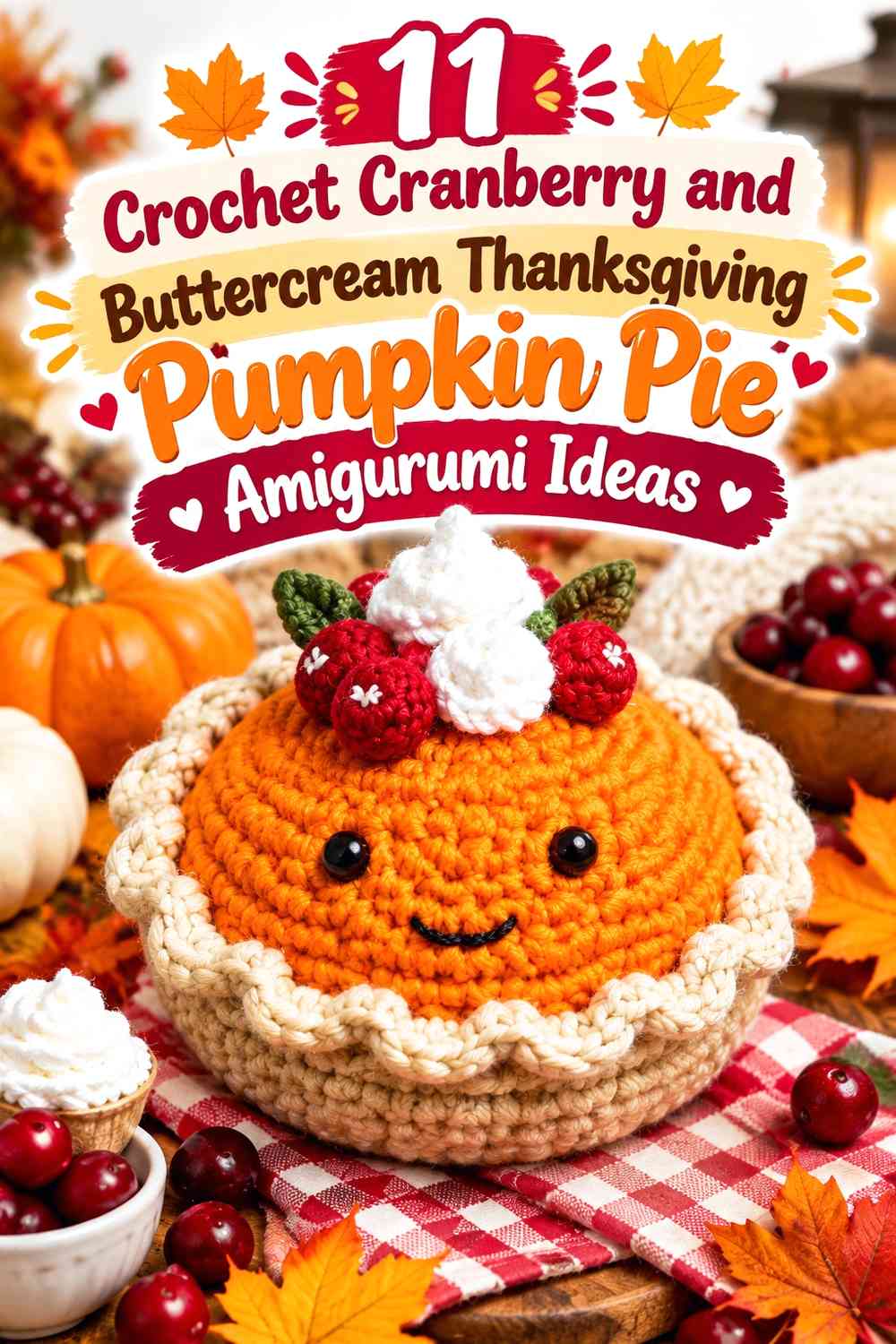
This is the most direct cranberry-and-buttercream interpretation: let cranberry occupy most of the visible pie filling, use a warm neutral for the crust, and reserve buttercream for the topping. That hierarchy keeps the unusual cranberry filling intentional rather than making the pie look randomly multicolored. The tutorial reference shows a complete pumpkin pie amigurumi form with a separate crust and whipped-cream detail, making it a strong base for this recoloring concept.
Let Cranberry Carry the Pumpkin Pie Filling
Use cranberry across the broad upper surface so it becomes the first color the eye reads. Because the filling is one of the largest uninterrupted areas on a small pie amigurumi, this placement gives cranberry enough visual weight to define the palette instead of reducing it to a tiny holiday accent.
Keep the crust in a noticeably different neutral rather than choosing another red-brown shade close to cranberry. Clear separation between filling and crust helps preserve the dessert structure.
Use Buttercream Where the Cranberry Topping Needs the Most Contrast
Buttercream works especially well for a whipped topping because it forms a light focal point against a darker cranberry surface. If the topping has raised or curled texture, the value change also helps its outline remain distinct.
Avoid repeating buttercream across too many unrelated parts of the pie. Keeping it concentrated near the top gives the lightest color a clear job instead of breaking up the cranberry filling.
Creator Credit: Heather Corinne Crochets
2. Buttercream Crust and Cranberry Center Crochet Pumpkin Pie Slice Amigurumi
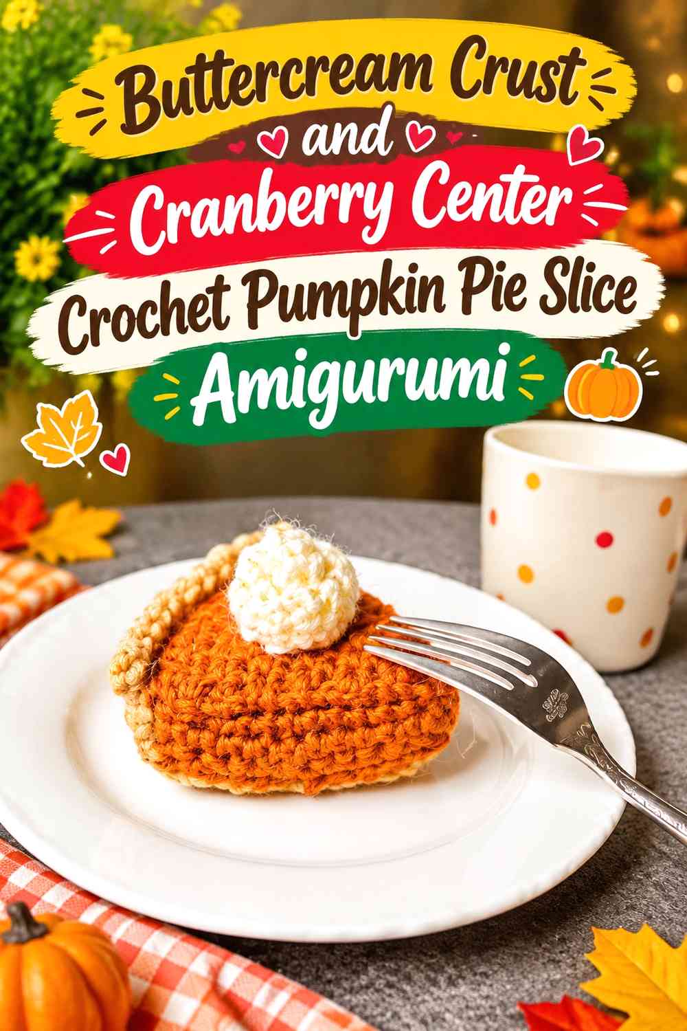
This version reverses part of the usual visual hierarchy by making buttercream more prominent around the pie slice while cranberry remains concentrated in the filling. A slightly deeper neutral can still be introduced at the outer crust edge so the buttercream section does not disappear into other pale details. The source tutorial demonstrates a stuffed pumpkin pie slice with a separate whipped-cream element, so the triangular surfaces provide clear areas for deliberate color division.
Buttercream Can Lead the Crust Around a Cranberry Pie Center
If you want a lighter Thanksgiving piece, expand buttercream beyond the topping and into part of the crust or side treatment. This reduces the amount of dark color without taking cranberry away from the most recognizable filling area.
The important checkpoint is separation. If both buttercream and your crust neutral are very light, place a medium tan or brown between them where possible so the structural edge does not visually disappear.
Keep Cranberry Concentrated in the Pumpkin Pie Slice Center
Cranberry has more impact when it forms one coherent filling block than when it appears as many tiny marks across a pale slice. On a triangular amigurumi form, that broad central panel gives the color an obvious role and keeps the pie silhouette easy to read.
If you substitute another red, preserve the relationship rather than the exact shade: choose one that remains clearly deeper than the buttercream areas.
Creator Credit: Amy’s Amigurumi Adventure
3. Cranberry Filling and Buttercream Lattice Crochet Pumpkin Pie Amigurumi

A buttercream lattice changes the balance because the light shade is repeated across the cranberry filling rather than appearing in one topping. This creates more frequent contrast and makes the top surface visually busier, so the crust should remain relatively restrained. The linked pumpkin pie tutorial provides the amigurumi concept; the cranberry filling and buttercream lattice are an independent color direction rather than a claim about the creator’s palette.
Cranberry Looks Stronger Beneath a Buttercream Lattice
Let cranberry remain visible between the lattice sections instead of covering most of the filling with pale strips. The purpose of the lattice is to break up the red field, not erase it.
Before attaching or planning decorative top elements, look at the pie from above. If buttercream occupies nearly as much area as cranberry, reducing the width or number of pale details can restore a clearer dominant-and-supporting relationship.
Buttercream Lattice Needs a Quieter Cranberry Crust Border
Once buttercream is repeated over the top, adding more strong contrast around every outer edge can make a small amigurumi pie feel visually crowded. A medium warm neutral works well as a transition between the cranberry top and lighter lattice.
If the crust itself has pronounced texture, keeping its color relatively simple allows the texture to provide interest without introducing another competing accent.
Creator Credit: Storybook Crochet
4. Muted Cranberry and Buttercream Crochet Pumpkin Pie Slice Amigurumi

Muted cranberry creates a softer version of the palette, especially when paired with buttercream and a medium cinnamon-brown crust. Instead of relying on a sharp red-versus-cream contrast, this direction uses more closely related autumn values. The source demonstrates a crochet pie slice and specifically notes that the form can be recolored for seasonal interpretations, making it useful for a cranberry pumpkin-pie adaptation.
Muted Cranberry Softens the Pumpkin Pie Triangle
Choose a softened cranberry when you want the filling to sit more quietly beside brown crust tones. This works particularly well on a slice because the filling, sides, and back crust already divide the object into obvious geometric areas.
Do not make every area equally muted, though. At least one light buttercream detail can keep the small slice from turning into one continuous medium-value block.
Buttercream Side Details Need Separation From Muted Cranberry
Buttercream can be used for a topping, tiny trim, or other small detail, but check its boundary against both the cranberry filling and the crust. It may contrast strongly with cranberry while blending into a very pale tan crust.
If that happens, position buttercream primarily over cranberry rather than across the lightest crust area. Placement can solve a contrast problem without requiring another color.
Creator Credit: CrafteeManatee
5. Cranberry, Dusty Rose, and Buttercream Crochet Pumpkin Pie Amigurumi
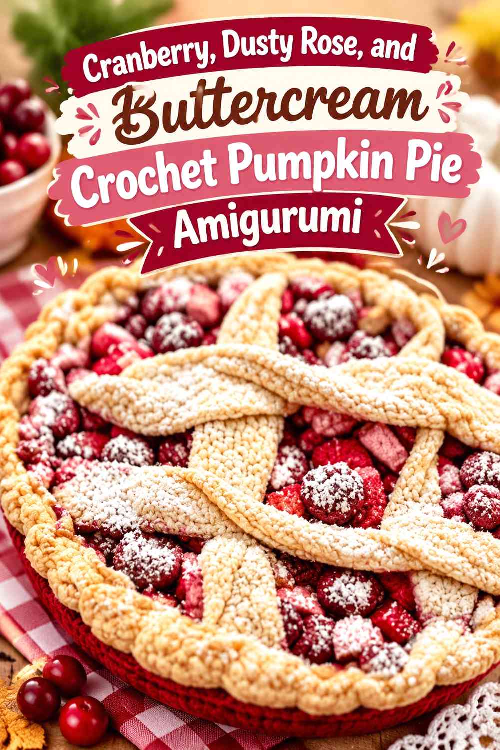
Adding dusty rose gives you a three-step red family: cranberry supplies the darkest berry note, dusty rose provides a softer secondary accent, and buttercream supplies the lightest break. This can work especially well on character-style amigurumi where a small amount of pink can be used around facial or decorative details. The linked tutorial is a cherry pie amigurumi rather than a pumpkin pie, so use it for the stuffed pie form and apply this Thanksgiving palette independently.
Dusty Rose Should Support Cranberry, Not Replace It
Use dusty rose in a noticeably smaller area than cranberry. Tiny cheeks, an inner decorative detail, or another limited accent can soften the dark filling without making the pie look like two competing red sections.
If cranberry and dusty rose appear almost identical from a distance, lighten the dusty rose choice rather than increasing its quantity. The distinction should come from value as well as hue.
Buttercream Keeps Cranberry and Dusty Rose Details Separated
Buttercream can act as visual breathing room between the two red-family shades. A topping or pale detail near a cranberry-and-rose face prevents the center of the pie from becoming one dense cluster of similar colors.
Because buttercream is the lightest shade here, repeat it intentionally rather than randomly. One strong topping plus perhaps a very small secondary detail is usually enough to establish the light end of the palette.
Creator Credit: Craft Cube
6. Cranberry, Sage, and Buttercream Crochet Pumpkin Pie Amigurumi

Sage introduces a cooler, botanical note to the Thanksgiving palette. Cranberry should still define the pie filling, while buttercream remains the light neutral and sage appears only in carefully chosen decorative details. The tutorial source demonstrates a small stuffed pie amigurumi; its original flavor treatment can be recolored into a pumpkin-pie-inspired cranberry scheme without implying the creator used these colors.
Sage Works Best as a Small Accent Beside Cranberry
Keep sage away from the broad filling surface if the goal is still clearly a cranberry pumpkin-pie palette. A small leaf-inspired detail, decorative stitch area, or tiny trim is enough to introduce the cooler color.
Cranberry and sage are both visually distinctive, so equal amounts can compete. Let cranberry cover the large dessert area and use sage as a controlled secondary note.
Buttercream Prevents Cranberry and Sage From Competing
Buttercream is useful between two stronger hues because it gives the eye a neutral stopping point. A pale topping over cranberry, with sage appearing only nearby in a small detail, is easier to read than placing sage directly across large areas of cranberry.
If your sage is particularly dark, reduce its coverage rather than automatically making the buttercream section larger. The palette should still look cranberry-led.
Creator Credit: Little Crochet Farm
7. Cranberry, Golden Ochre, and Buttercream Crochet Pumpkin Pie Amigurumi
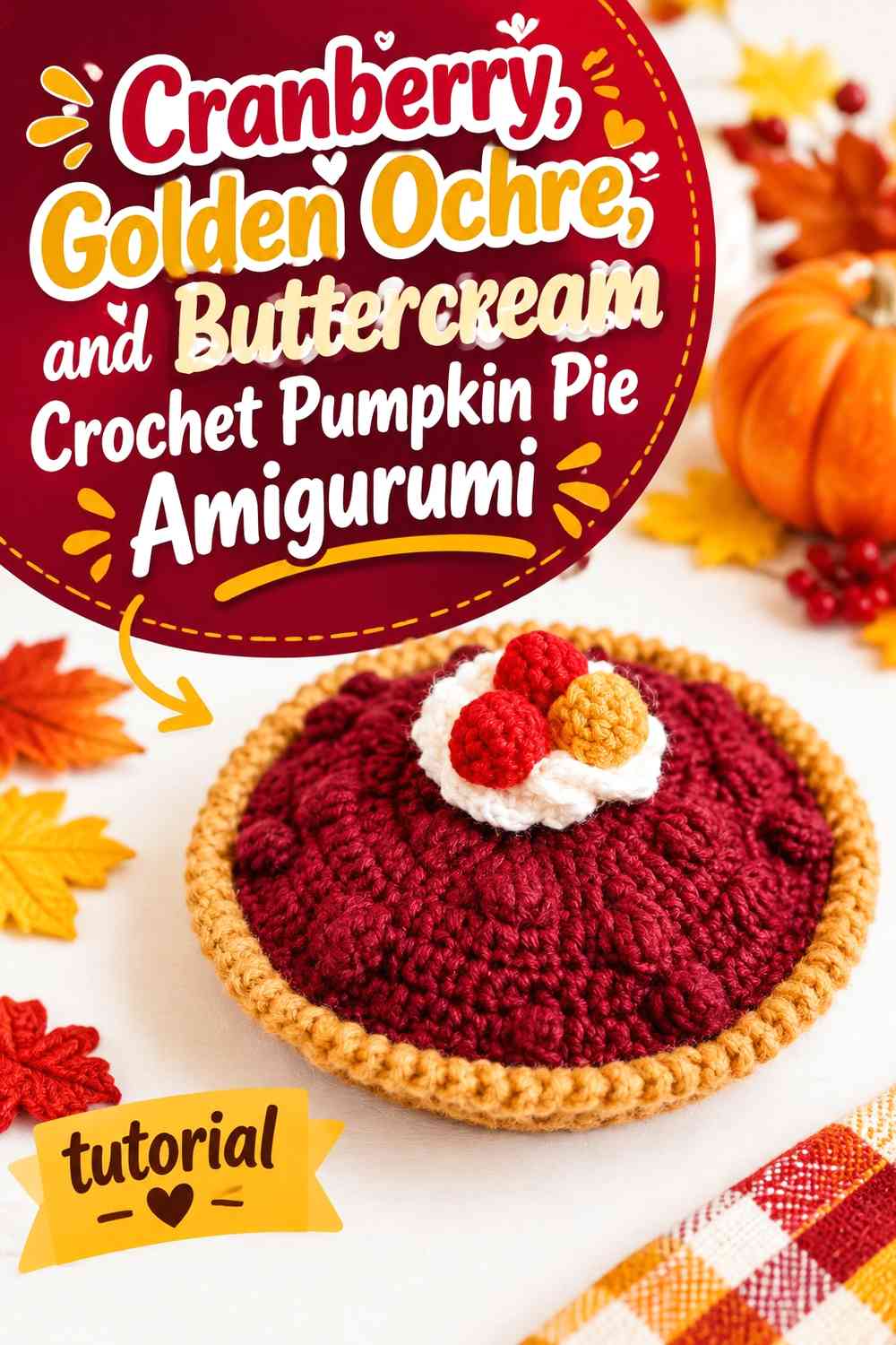
Golden ochre pushes the crust warmer and gives the cranberry-and-buttercream combination a stronger harvest direction. Use cranberry for the filling, golden ochre around the pie shell or edge, and buttercream at the top. The supporting tutorial shows a complete crochet pie used as play food or decoration, providing a useful pie structure for this pumpkin-inspired recoloring.
Golden Ochre Warms the Crust Around Cranberry
A golden crust can create more separation from cranberry than a reddish brown crust does. This matters because cranberry already carries warm red undertones; a crust that is too similar can visually merge into the filling.
Keep the ochre slightly more restrained than the cranberry surface. Its job is to define the baked outer structure, not become a second dominant filling color.
Buttercream Gives Golden Ochre and Cranberry a Clean Break
Buttercream creates the lightest point in an otherwise medium-to-dark autumn palette. Position it where you want the eye to land first, such as the top center or another clearly defined dessert detail.
If both cranberry and ochre are fairly saturated, the buttercream area becomes even more important. A clean neutral break keeps the finished amigurumi from feeling overly dense.
Creator Credit: CraftyBest
8. Dark Cranberry, Espresso, and Buttercream Crochet Pumpkin Pie Amigurumi

This is the darkest palette in the group. Deep cranberry leads the filling, espresso can outline or deepen the crust, and buttercream keeps the top from becoming visually heavy. Because the source tutorial creates a tart-style amigurumi rather than an exact pumpkin pie, use its dimensional dessert form as construction inspiration while applying the Thanksgiving colors separately.
Dark Cranberry Needs Buttercream for Clear Pumpkin Pie Definition
A very deep cranberry can absorb stitch shadows and make small surface details less noticeable. A buttercream topping or top detail gives you a high-value contrast point that remains visible even when the filling is visually dense.
Place the palest detail over the broad cranberry section rather than against another pale neutral. That maximizes the contrast you are intentionally creating.
Espresso Should Frame Cranberry Instead of Overpowering It
Use espresso along the outer crust, underside, or another structural boundary rather than giving it the same surface area as cranberry. Two large dark regions can make the amigurumi look heavier than intended and obscure the separation between filling and shell.
If cranberry and espresso look too similar in grayscale, move toward a slightly lighter crust brown instead of relying only on the hue difference.
Creator Credit: Crocheting channel
9. Soft Cranberry, Oatmeal, and Buttercream Crochet Pumpkin Pie Amigurumi
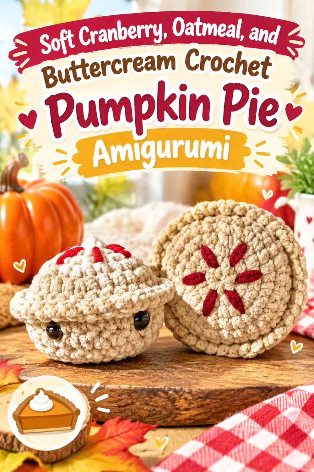
Soft cranberry, oatmeal, and buttercream create the lowest-contrast direction in this collection. The goal is a quieter transition between filling, crust, and topping rather than sharply outlined color blocks. The source tutorial demonstrates a small pie amigurumi that can be treated as a flexible dessert form; the pumpkin-pie color placement here is an independent adaptation.
Soft Cranberry and Oatmeal Create a Low-Contrast Pumpkin Pie
Choose oatmeal for the crust when you want less visual weight than a dark brown would add. Against softened cranberry, it creates a gentler change at the pie edge while still separating the filling from the shell.
The risk is that all three shades become too close in value. Compare cranberry, oatmeal, and buttercream together before starting, not just in pairs.
Buttercream Needs Separation From an Oatmeal Cranberry Palette
Buttercream and oatmeal can look nearly identical under some lighting. If that happens, avoid placing them directly beside each other across a broad area. Position the buttercream topping mainly over cranberry, where its lighter value can do more useful visual work.
Alternatively, choose an oatmeal that is clearly darker or warmer than your buttercream while preserving the same understated neutral role.
Creator Credit: chantelle
10. Repeated Cranberry and Buttercream Mini Crochet Pumpkin Pie Amigurumi

A miniature pie gives you less surface area, so repetition matters more than complicated color placement. Cranberry can define the top, buttercream can create one small high-contrast detail, and a neutral crust can frame both. The source tutorial demonstrates a tiny pie amigurumi and is especially useful as a construction reference for a compact Thanksgiving interpretation.
Repeat Cranberry Around the Mini Pie Instead of Adding More Colors
On a tiny amigurumi, every additional shade occupies a significant percentage of the visible surface. Repeating cranberry across the main filling keeps the miniature pie readable and avoids turning a small object into a patchwork of isolated colors.
If you want extra variation, change the cranberry value slightly between multiple finished pies rather than adding several new accent colors to one piece.
Buttercream Can Highlight the Mini Cranberry Pie Without Taking Over
A small buttercream detail may be enough to establish the light end of the palette. Because the entire object is miniature, the topping does not need to occupy much area to contrast clearly with cranberry.
Check the finished piece from several feet away. If the buttercream is still the only thing you notice, reduce its visual area so the pie filling remains the dominant feature.
Creator Credit: Club Crochet
11. Buttercream-Dominant and Cranberry-Accent Crochet Pumpkin Pie Amigurumi

The final idea deliberately reverses the hierarchy. Buttercream becomes the largest light surface, while cranberry appears in smaller but strategically repeated details. This can suit a tiny pie charm or Thanksgiving accessory where you want a pale overall appearance rather than a dark berry-red object. The source tutorial demonstrates a crochet pumpkin pie keychain, making it a useful small-format reference for this reverse-balance treatment.
Buttercream Can Lead While Cranberry Becomes the Accent Color
Let buttercream cover a broad decorative or structural area and move cranberry into the filling center, border detail, or other small focal point. The key is repetition: one isolated speck of cranberry may look accidental, while two or three connected placements can make the reversed hierarchy feel deliberate.
Keep the crust distinguishable from buttercream by choosing a neutral with enough warmth or darkness to create an edge.
Use Cranberry on Small Buttercream Details That Need Definition
Cranberry is useful for tiny details because its deeper value can remain visible against buttercream without requiring a large area. This is especially helpful on a small charm where there is limited room for elaborate color blocking.
Do not add another equally dark accent unless it has a clear function. The strength of this direction comes from a simple light field with controlled cranberry definition.
Creator Credit: Basicstitchcolorado
Which Cranberry and Buttercream Thanksgiving Pumpkin Pie Palette Should You Choose?
For the clearest cranberry statement, choose the classic cranberry filling, the lattice version, or the dark cranberry and espresso idea. The soft cranberry and oatmeal scheme is better when you want less contrast, while the sage and dusty rose combinations introduce a third color without giving up the cranberry-and-buttercream foundation.
If you prefer a lighter finished object, start with the buttercream-crust or buttercream-dominant ideas. For small ornaments and charms, the repeated mini-pie palette keeps the color plan simple enough to remain readable at a reduced scale.
Conclusion
Cranberry and buttercream can give Thanksgiving pumpkin pie amigurumi a distinctive color direction while still preserving the familiar pie shape. The most dependable approach is to assign each shade a specific role: cranberry can define the filling, buttercream can create light contrast, and a crust neutral can separate the two.
Choose dark cranberry and espresso when you want stronger definition, oatmeal and soft cranberry for a quieter palette, or sage, dusty rose, and golden ochre when you want a controlled third color. Whichever direction you choose, check the color balance on the actual pie surfaces before committing. Broad filling areas, narrow crust edges, lattice details, and small toppings do not carry color in the same way.
Use the credited tutorials for their exact construction methods and treat the cranberry-and-buttercream suggestions here as independent color adaptations.
Frequently Asked Questions
Can cranberry replace orange in a crochet Thanksgiving pumpkin pie amigurumi?
Yes, as a stylized color choice. Because cranberry is less expected than orange, keep recognizable pie features such as a distinct crust, filling area, slice or round-pie silhouette, and optional buttercream topping. Those structural cues help the finished object continue reading as pumpkin pie rather than an unidentified berry dessert.
Should cranberry or buttercream dominate a crochet pumpkin pie amigurumi?
Cranberry is the stronger choice when you want the filling to define the piece, while buttercream can dominate when you want a lighter, more neutral Thanksgiving decoration. Avoid giving both colors exactly the same visual area unless the design intentionally depends on a balanced two-color treatment.
How can I keep buttercream visible against a pale crochet pie crust?
Compare the values of the two yarns before starting. If buttercream and the crust neutral look nearly identical, place most buttercream details directly over cranberry, or choose a crust color that is noticeably warmer or darker. Changing placement can be just as effective as changing the yarn color.
What can I use if I cannot find the exact cranberry shade?
Preserve the role of cranberry rather than chasing an exact commercial color. Choose a deep or medium softened red that remains clearly darker than buttercream and still separates from the crust. If your substitute is lighter, you may need a darker crust or more limited buttercream placement to preserve the original contrast hierarchy.
Can I add another Thanksgiving color to cranberry and buttercream?
Yes, but give the third color a specific job. Sage can work as a small cool accent, golden ochre can warm the crust, dusty rose can soften facial details, and espresso can deepen an outer edge. Avoid distributing all three colors equally on a small amigurumi pie unless a deliberately multicolor look is the goal.
How do I tell whether cranberry and buttercream have enough contrast?
Place the yarns side by side and view them from a distance, then compare them in grayscale if necessary. If their light and dark values remain clearly different, small details such as topping, trim, or edging are more likely to stay visible. If the two shades blend together, change either the value or the placement before committing to the project.