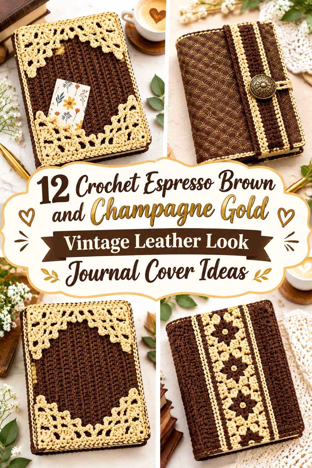

Espresso Brown and Champagne Gold can give a crochet journal cover a vintage leather-inspired direction without pretending yarn is leather. Espresso Brown is the natural choice for the largest areas because a deep brown field can resemble the visual weight of an old journal binding, while Champagne Gold works better in smaller amounts as edging, closure tabs, spine lines, surface details, and decorative framing.
The main decision is restraint. If Champagne Gold occupies half the journal surface, the cover can lose the darker bookbinding look that makes the palette feel vintage. Keeping Espresso Brown dominant and repeating Gold at specific structural points—such as the spine, flap, border, or closure—usually produces a clearer result.
The tutorials below include true book covers as well as book sleeves whose construction can inspire a fitted journal wrap. Where a tutorial teaches a sleeve rather than an attached cover, the color guidance is presented as an adaptation rather than implying the creator made this exact journal design.
Quick List
- Espresso Brown and Champagne Gold Vintage Crochet Wrap Journal Cover
- Espresso Brown and Champagne Gold Crochet Composition Journal Cover
- Espresso Brown and Champagne Gold Button-Flap Crochet Journal Cover
- Espresso Brown and Champagne Gold Bow-Trim Crochet Journal Cover
- Espresso Brown and Champagne Gold Pocket Crochet Journal Cover
- Espresso Brown and Champagne Gold Wrap-Strap Crochet Journal Cover
- Espresso Brown and Champagne Gold Cluster-Stitch Crochet Journal Cover
- Espresso Brown and Champagne Gold Heart-Medallion Crochet Journal Cover
- Espresso Brown and Champagne Gold Tapestry-Panel Crochet Journal Cover
- Espresso Brown and Champagne Gold Granny-Rectangle Crochet Journal Cover
- Espresso Brown and Champagne Gold Handle-Tab Crochet Journal Cover
- Espresso Brown and Champagne Gold Knit-Look Crochet Journal Cover
Let Espresso Brown Create the Vintage Leather-Look Base
For this palette, Espresso Brown usually works best across the front, back, and spine-facing areas. A large uninterrupted brown field makes the cover feel more like one bound object instead of a patchwork accessory.
Texture can strengthen that direction, but it does not need to imitate leather literally. Dense crochet, subtle ribs, surface lines, and clean borders can give the brown area enough structure while still looking unmistakably handmade.
Use Champagne Gold Like Vintage Hardware or Bookbinding Detail
Champagne Gold becomes more convincing when it behaves like a finishing detail rather than a second background color. Good locations include a narrow spine stripe, edge stitching, button loop, fastening tab, corner accent, small medallion, or one decorative round.
If the Gold yarn is highly reflective, use even less of it. A thin metallic-looking line can visually dominate a much larger Espresso Brown panel, especially under direct light.
Check Espresso Brown and Champagne Gold Around the Journal Spine
The spine is one of the most important areas on a cover because it visually connects the front and back. A Champagne Gold line placed there can make separate Brown panels feel like one finished journal cover.
Before finishing, wrap the crochet around the actual journal and check the colors while the book is closed. A Gold section that looks centered when flat may shift toward one side once the cover bends around the spine.
1. Espresso Brown and Champagne Gold Vintage Crochet Wrap Journal Cover
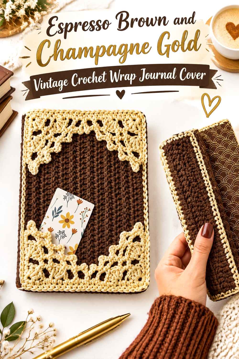
A full wrap is the most direct way to create the look of an old bound journal. Use Espresso Brown across nearly the entire exterior and reserve Champagne Gold for the outer border and one narrow line near the spine. The supporting tutorial teaches a decorative vintage book-cover construction, making it a strong base for this restrained color treatment.
Espresso Brown Should Cover Most of the Vintage Crochet Journal Surface
Keep the front and back predominantly Espresso Brown so the journal reads as one dark bound object. Avoid alternating wide Brown and Gold bands across the cover; that would shift the emphasis from vintage binding to color blocking.
A subtle change in stitch texture can create more interest within the Brown area without adding another color.
Champagne Gold Can Trace the Espresso Brown Crochet Journal Edge
A narrow Champagne Gold border can act like decorative tooling around an old book cover. Keep it thin enough that Brown still reaches close to the outer edge.
Repeat the Gold once near the spine or closure so the border does not feel isolated.
Creator Credit: Sirin’s Crochet YouTube tutorial
2. Espresso Brown and Champagne Gold Crochet Composition Journal Cover
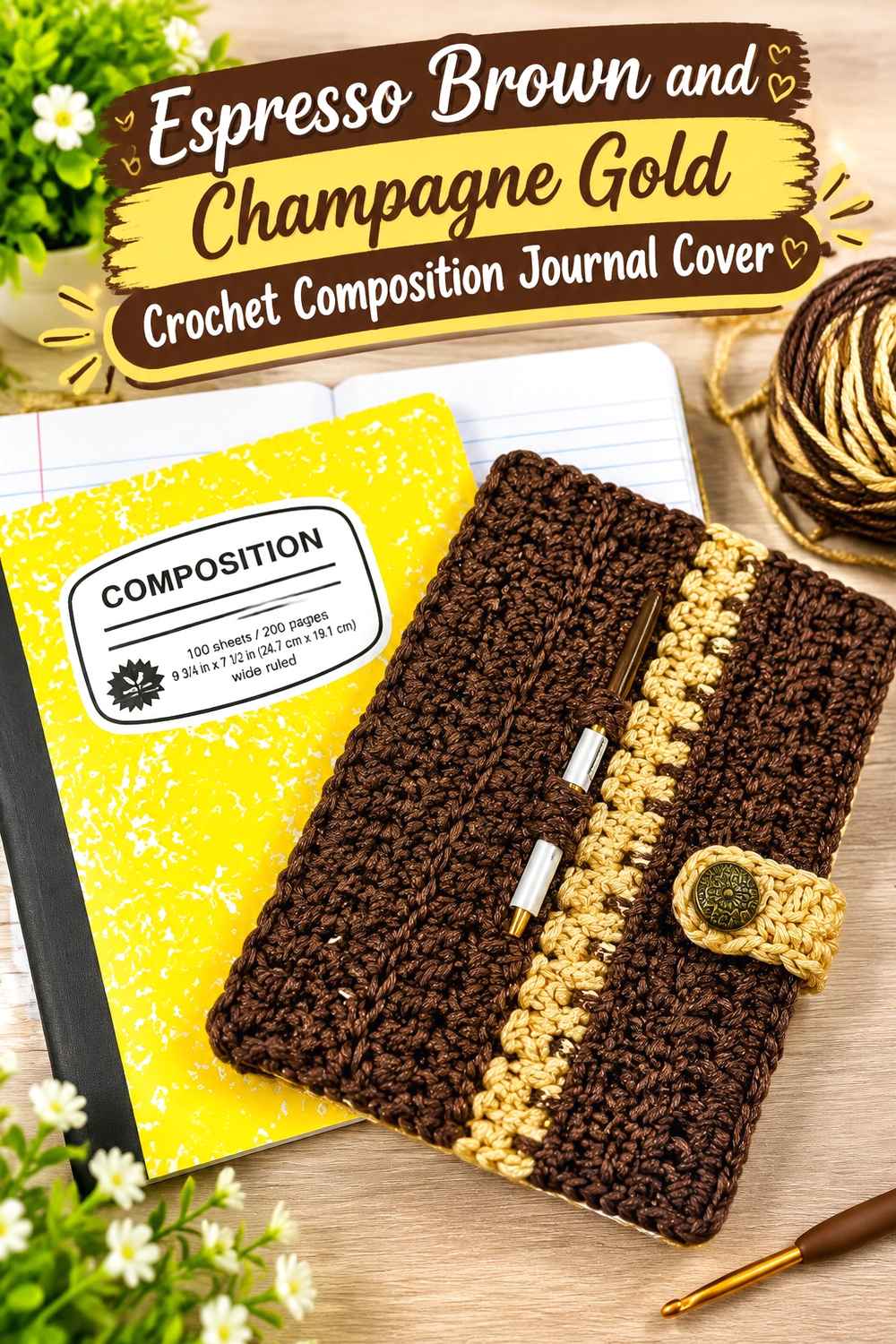
A fitted composition-book cover gives the palette a practical everyday form. Espresso Brown can fill the main panel while Champagne Gold defines the flap or fastening detail. Because this tutorial is designed around an actual removable book cover rather than a pouch, it suits a journal that should remain covered while being written in.
Espresso Brown Can Make the Crochet Journal Look More Like a Bound Cover
Use Brown continuously across the front, spine, and back whenever the construction allows. The uninterrupted color helps hide the visual division between separate crochet sections.
If you want extra detail, create it through stitch direction or a narrow Gold accent instead of introducing another main shade.
Champagne Gold Can Mark the Espresso Brown Crochet Closure Tab
A Gold closure tab creates a useful focal point because it sits directly over the front cover. Keep the button or fastening area visually simple so the tab reads as functional rather than purely decorative.
A second Gold line along the outer edge can connect the closure back to the rest of the journal.
Creator Credit: Ahsel Anne by Felicia YouTube tutorial
3. Espresso Brown and Champagne Gold Button-Flap Crochet Journal Cover
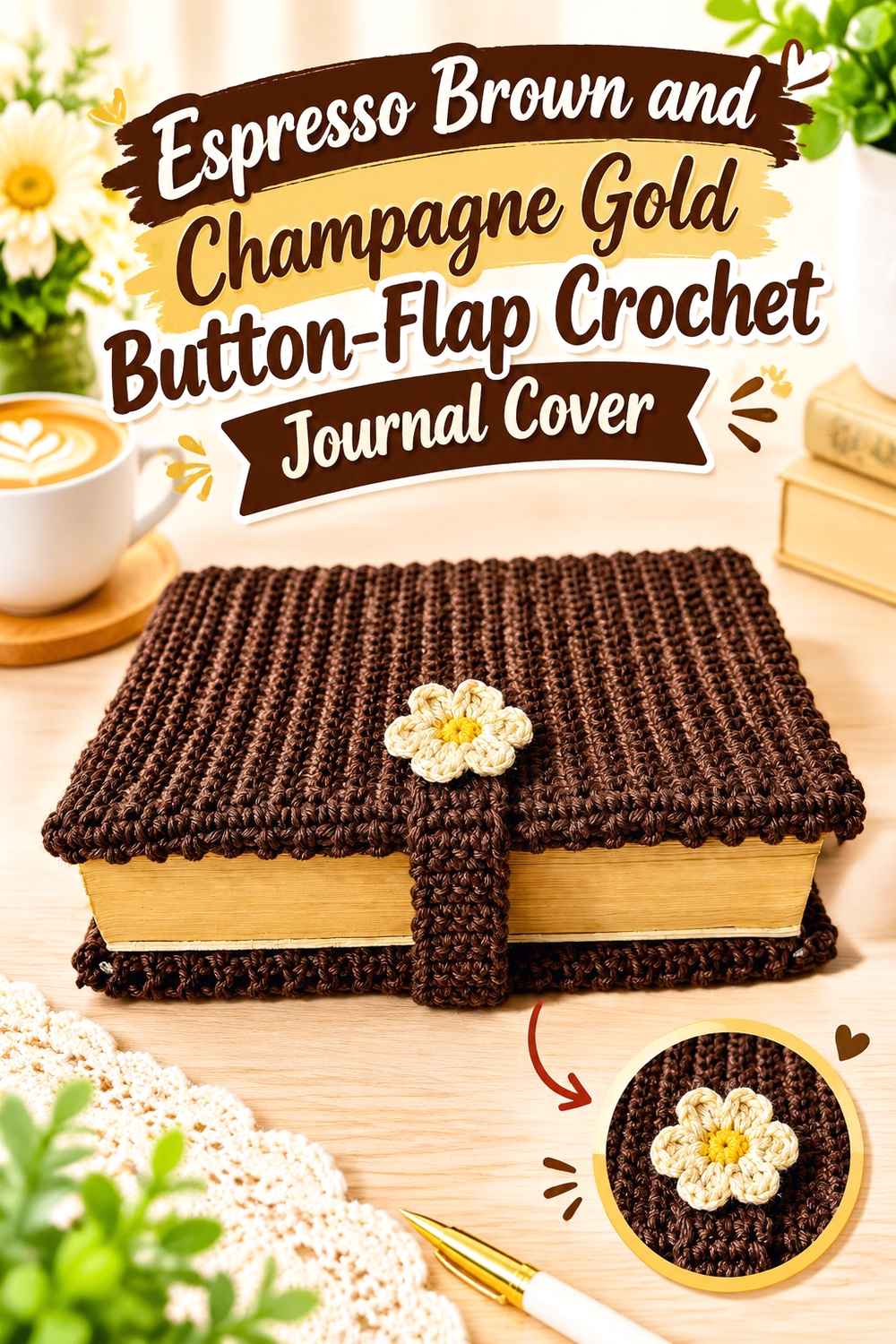
A buttoned cover naturally supports a vintage-leather interpretation because the fastening tab resembles the closures often associated with travel journals and old notebooks. Let Espresso Brown carry the main body and use Champagne Gold on the flap edge, button loop, or narrow border. The tutorial itself teaches a book-cover form with a magnetic closure, giving the color plan a clear structural focus.
Espresso Brown Gives the Buttoned Crochet Journal Its Main Visual Weight
Keep the large front and back surfaces Brown so the closure remains the secondary feature. If the flap is also Brown, a Gold outline can make its shape easier to distinguish when closed.
Check the journal from the front with the flap fastened; the overlap changes how much Brown remains visible.
Champagne Gold Can Emphasize the Espresso Brown Crochet Fastening Area
Place Gold where the flap meets the front cover rather than spreading it randomly around the journal. That makes the metallic-looking shade appear connected to the closure.
If the button itself already has a strong finish, reduce the amount of Champagne Gold around it so the two details do not compete.
Creator Credit: Lya Bags Jardim YouTube tutorial
4. Espresso Brown and Champagne Gold Bow-Trim Crochet Journal Cover
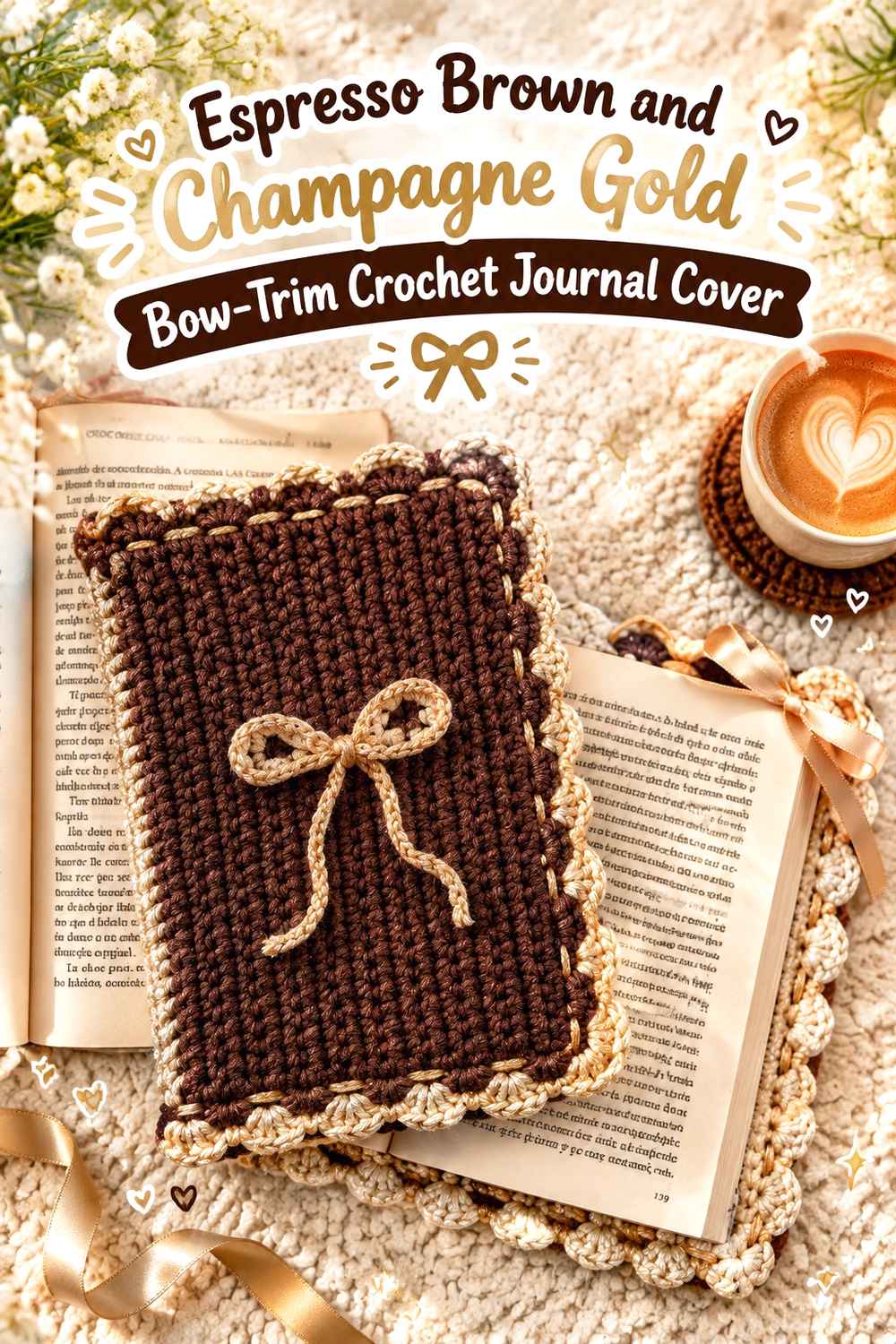
A bow changes the vintage direction toward a softer stationery look, so the palette needs to keep the journal grounded. Make the main cover Espresso Brown and the bow Champagne Gold, using only a small amount of Gold elsewhere. The supporting tutorial includes both the cover and decorative bow treatment.
Espresso Brown Should Remain Dominant Behind the Champagne Gold Crochet Bow
A dark Brown background gives the lighter bow enough separation to be visible without enlarging it. Keep the cover surface simple behind the bow so the focal detail remains easy to read.
If the Brown stitch texture is already decorative, avoid adding Gold stripes beneath the bow.
Champagne Gold Works Best as One Focused Accent on the Espresso Brown Journal
Use Champagne Gold for the bow and perhaps one narrow border. Repeating Gold across every edge, flap, and spine can make the bow feel less special.
Place the bow where it does not interfere with opening the journal or writing comfortably.
Creator Credit: byyynicolette YouTube tutorial
5. Espresso Brown and Champagne Gold Pocket Crochet Journal Cover
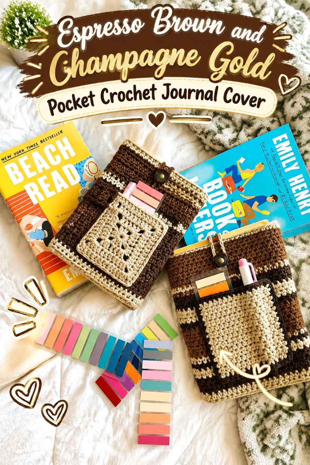
A journal cover with an exterior pocket can give the vintage palette a practical reason for color blocking. Use Espresso Brown for the main sleeve or wrap and Champagne Gold on the pocket edge, button loop, or a narrow pocket panel. The supporting tutorial includes a customizable book sleeve with both a closure and optional pocket, which can inform a journal-focused adaptation.
Espresso Brown Should Keep the Crochet Journal Pocket Visually Integrated
If the pocket itself is Brown, outline only the upper edge in Gold. That keeps the pocket connected to the cover while still showing where it begins.
A fully Gold pocket can become the largest focal point on the journal, which may work against the aged-leather direction.
Champagne Gold Can Define the Espresso Brown Crochet Pocket Opening
A narrow Champagne Gold line at the pocket opening gives the functional edge a finished appearance. Repeat that Gold in the fastening loop if the journal also has a closure.
For a journaling cover, check that the pocket placement does not make the book awkward to hold when writing.
Creator Credit: Strong Earth Creations YouTube tutorial
6. Espresso Brown and Champagne Gold Wrap-Strap Crochet Journal Cover
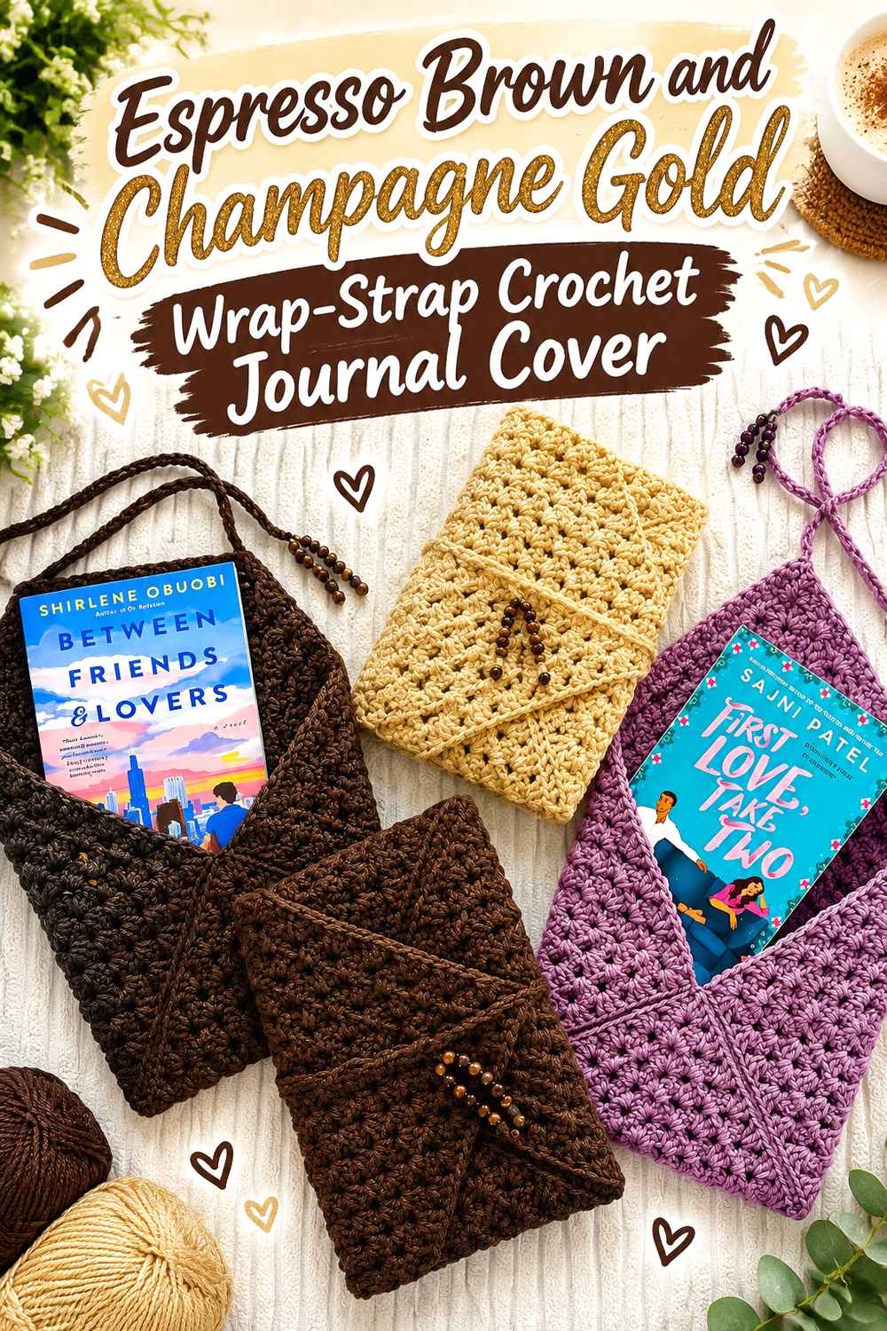
A wrap-around strap is one of the strongest constructions for this color story because it immediately supports a travel-journal look. Keep the journal body Espresso Brown and make the long fastening strap Champagne Gold, or reverse only a small section of the strap back to Brown so it remains tied visually to the cover. The supporting tutorial uses a wrap-around closure on a granny-based book sleeve.
Champagne Gold Can Turn the Espresso Brown Crochet Strap Into the Main Vintage Detail
A Gold strap crossing a Brown cover creates a clear front-facing line without needing appliqués or extra motifs. Because the strap moves around the journal, check its color placement while fully wrapped rather than laid straight.
If Champagne Gold is especially reflective, a thinner strap may preserve the darker leather-look effect better.
Espresso Brown Should Stay Visible Beneath the Champagne Gold Crochet Wrap
Leave enough uninterrupted Brown on the front that the strap reads as an accent. Several Gold wraps around a narrow journal can cover more of the surface than expected.
Adjust the visible wrap placement before deciding whether the journal needs any additional Gold edging.
Creator Credit: Kendall Tai YouTube tutorial
7. Espresso Brown and Champagne Gold Cluster-Stitch Crochet Journal Cover
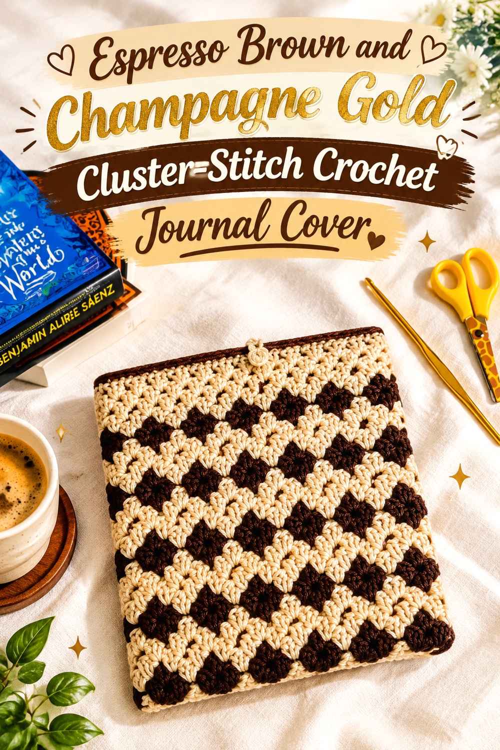
A cluster-based book sleeve can create a more decorative vintage texture while still staying within the two-color palette. Use Espresso Brown for most clusters and Champagne Gold in occasional horizontal sections or along the opening. The tutorial supports a customizable book-sleeve format that can be planned around a journal’s dimensions.
Espresso Brown Lets the Crochet Cluster Texture Carry the Journal Design
When stitch texture is already noticeable, keep long sections Brown so the surface can be read without constant color interruption. This gives the journal visual depth without making it striped.
If Gold is used inside the textured field, choose one repeated location rather than changing colors unpredictably.
Champagne Gold Can Break the Espresso Brown Crochet Surface Near the Edge
A narrow Gold band close to the opening or flap gives the journal a bookbinding-like finish. Avoid placing several equally wide Gold bands across the middle if the goal is a leather-inspired appearance.
Gold at the top edge can also help distinguish the journal opening from the side seams.
Creator Credit: Dariarsii YouTube tutorial
8. Espresso Brown and Champagne Gold Heart-Medallion Crochet Journal Cover
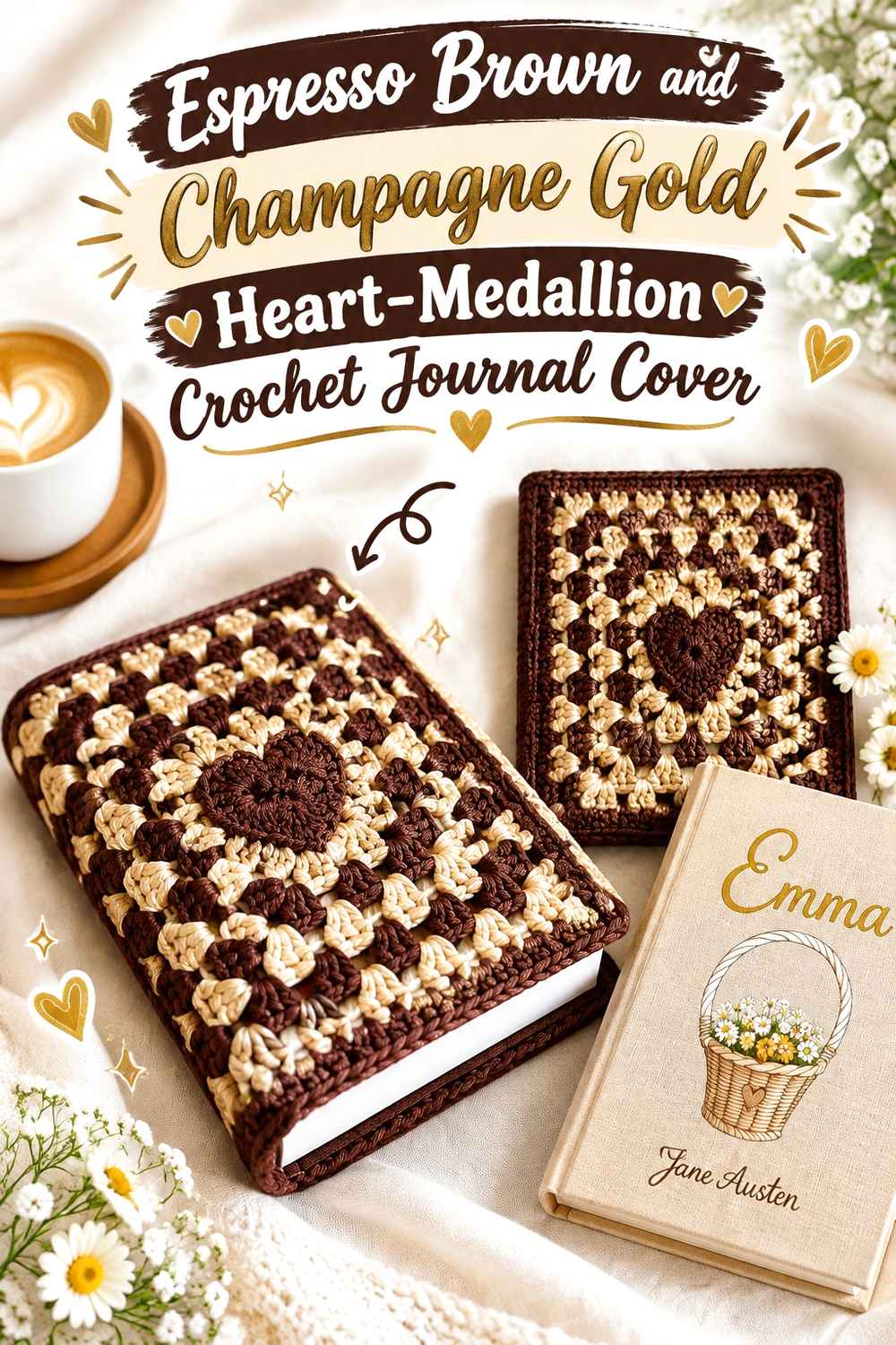
A heart granny-square cover can be adapted away from a cute pastel direction by treating the central motif like an embossed medallion. Use Espresso Brown through most of the square and Champagne Gold only in the heart or one framing round. The supporting tutorial turns a heart granny square into a functional book cover.
Champagne Gold Can Make the Espresso Brown Crochet Heart Read Like a Medallion
Keep the heart Gold and the surrounding field Brown if you want the motif to resemble a decorative stamped emblem. A strong border of Brown around the heart prevents the central shape from taking over the full cover.
If the heart feels too bright, introduce Brown into part of the motif and keep Gold around its outline instead.
Espresso Brown Should Frame the Champagne Gold Crochet Journal Center
Use Brown on enough outer rounds that the front cover remains visually dark. That outer frame is especially important when the heart itself occupies a large portion of the panel.
Repeat only a small amount of Gold at the spine or closure so the medallion remains the strongest accent.
Creator Credit: crochet with mahum YouTube tutorial
9. Espresso Brown and Champagne Gold Tapestry-Panel Crochet Journal Cover
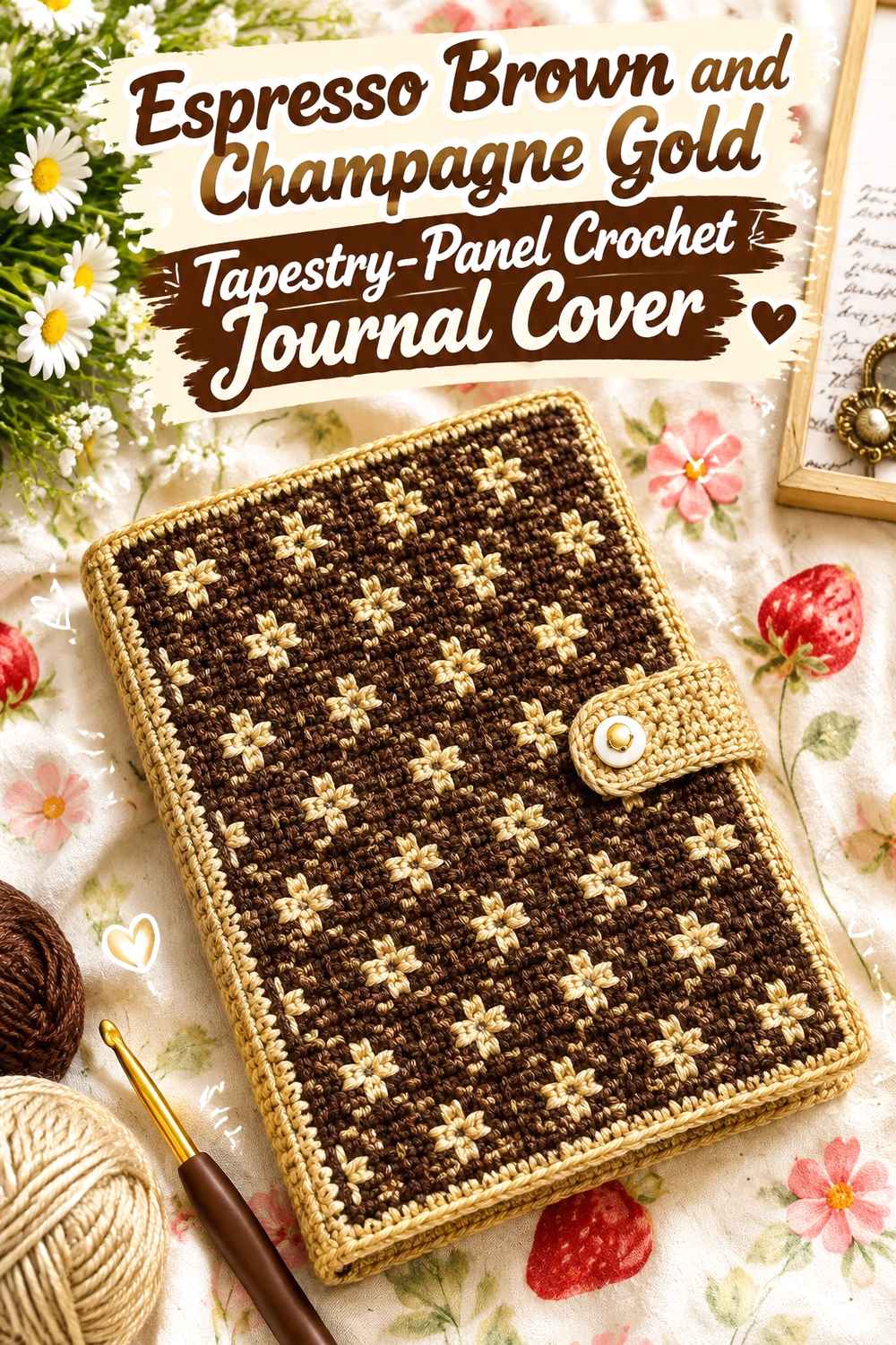
Tapestry crochet offers a way to create a faux-tooled surface without copying any actual leather pattern. Use Espresso Brown as the ground and Champagne Gold for a restrained geometric border, simple corner marks, or a centered vintage-inspired motif. The supporting floral book-sleeve tutorial demonstrates a graph-based tapestry approach that can be adapted to a different original motif.
Espresso Brown Should Fill Most of the Crochet Tapestry Background
A dark continuous background gives the Gold motif room to be read from a distance. Keep the Champagne Gold design relatively simple if the journal is narrow.
Dense repeated Gold marks can make the panel appear patterned rather than leather-inspired.
Champagne Gold Can Create Faux-Tooling Contrast on Espresso Brown Crochet
Think of Gold as a line or stamped detail rather than a filled second background. A narrow geometric frame, small corner motif, or centered emblem can give the front cover enough decoration.
Keep the back quieter if the front already carries a strong tapestry motif.
Creator Credit: artist1c_kat YouTube tutorial
10. Espresso Brown and Champagne Gold Granny-Rectangle Crochet Journal Cover
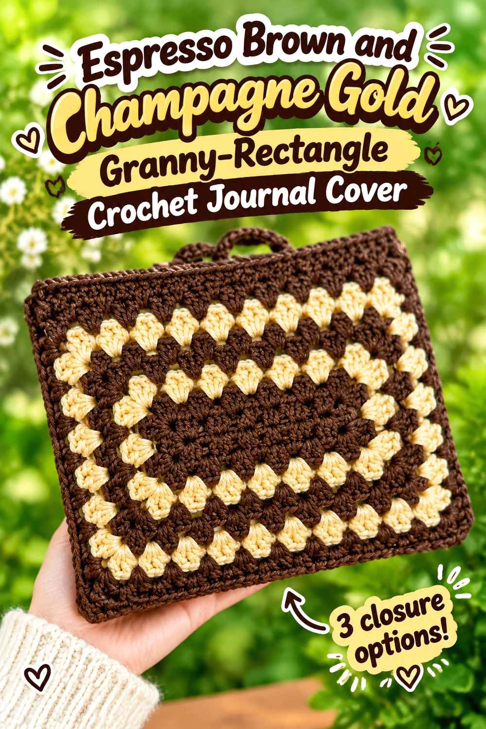
A granny rectangle introduces visible open structure, so the palette should be simplified to keep the journal from looking too casual. Work most of the rectangle in Espresso Brown and place Champagne Gold only around one outer round or closure detail. The supporting tutorial uses a granny-rectangle book sleeve with multiple tie options.
Espresso Brown Can Make an Open Granny Crochet Journal Feel More Grounded
Using Brown through most of the rectangle reduces the visual fragmentation created by the granny spaces. This is helpful when the goal is a vintage journal rather than a multicolor granny-square accessory.
Let stitch openings provide the variation instead of alternating Brown and Gold in every round.
Champagne Gold Should Finish the Espresso Brown Crochet Rectangle Sparingly
One Gold outer round can define the rectangular shape without breaking up the whole surface. If the cover also includes a tie, repeat the same Gold there.
Avoid a wide Gold perimeter if you want the Espresso Brown field to remain the first thing noticed.
Creator Credit: Ashten Stitches YouTube tutorial
11. Espresso Brown and Champagne Gold Handle-Tab Crochet Journal Cover
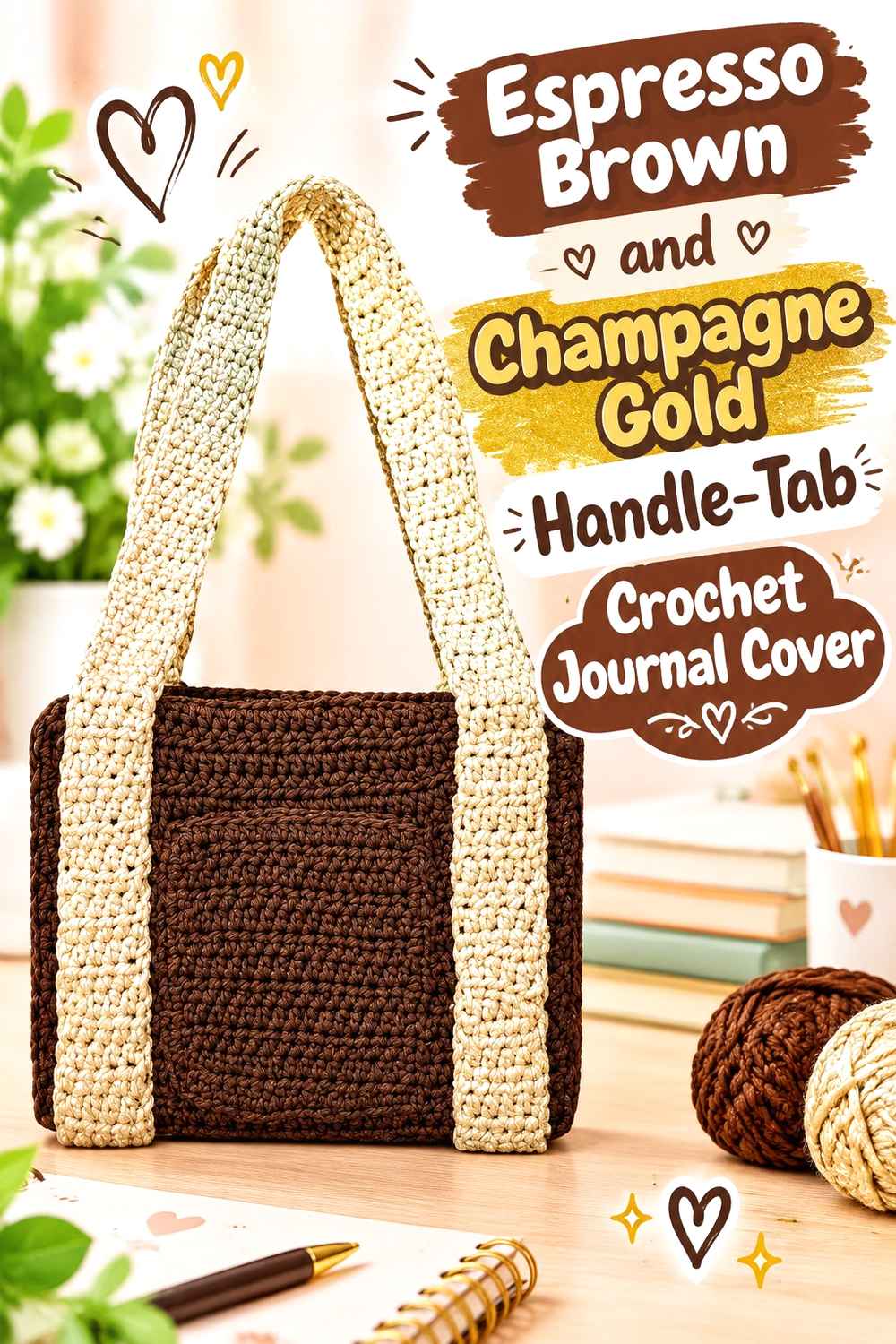
A book-sleeve construction with handles can be adapted into a journal cover with a shorter carrying tab or decorative spine loop rather than a full bag-like handle. Keep the main cover Espresso Brown and use Champagne Gold on the tab so the functional feature becomes a small vintage accent. The source tutorial demonstrates two book-purse sleeve approaches with handles.
Espresso Brown Should Keep the Crochet Journal From Looking Like a Small Bag
If adapting a handled sleeve into a journal cover, let the Brown body stay flat and visually simple. A large contrasting handle can shift the object toward a purse, so reduce the scale of the feature when the journal itself should remain central.
Use Brown on any substantial structural section and Gold only on the smaller tab or loop.
Champagne Gold Can Mark the Espresso Brown Crochet Spine Tab
A short Gold loop near the spine can suggest a decorative bookbinding detail while also giving the cover a recognizable accent. It is more restrained than running Gold handles across the full journal.
Repeat Champagne Gold in a narrow edge line if the tab otherwise appears isolated.
Creator Credit: itskenken1 YouTube tutorial
12. Espresso Brown and Champagne Gold Knit-Look Crochet Journal Cover
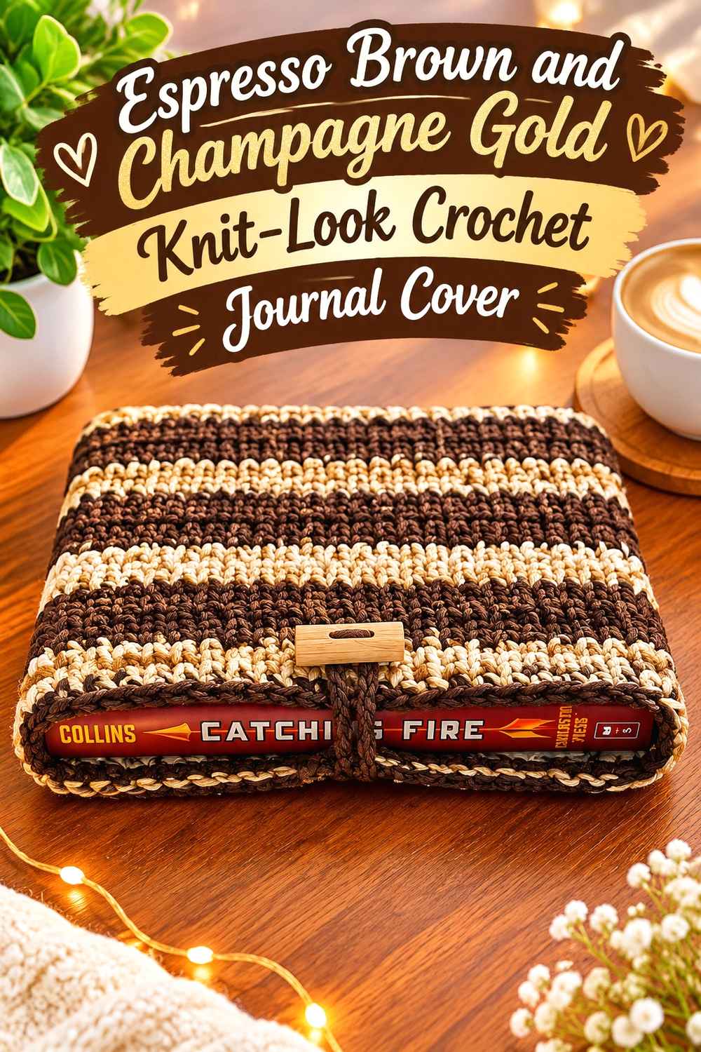
A tight knit-look crochet surface is especially useful for a faux-leather direction because the fabric can appear visually smoother than a highly open granny construction. Use Espresso Brown for almost the entire cover and add Champagne Gold through the top edge, spine detail, or one minimal closure. The supporting YARNutopia sleeve uses a waistcoat-stitch construction that creates a knit-like appearance.
Espresso Brown Lets the Knit-Look Crochet Journal Stay Visually Smooth
Keep the dense surface Brown from edge to edge across most of the journal. This creates the strongest leather-inspired direction in the collection because color changes do not interrupt the compact texture.
If you want extra surface interest, add it at structural boundaries rather than through frequent stripes.
Champagne Gold Can Finish the Espresso Brown Crochet Spine and Opening
A thin Gold top edge or vertical spine detail gives the dense Brown surface enough contrast without changing its overall character. This is also a useful place to repeat Gold if a closure tab uses the same shade.
Compare the cover while open and closed to make sure the Gold line remains where you want it after the fabric bends around the journal.
Creator Credit: Fuad Azmat / YARNutopia by Nadia YouTube tutorial
Which Espresso Brown and Champagne Gold Journal Cover Direction Works Best?
For the strongest vintage leather-look effect, choose the full wrap, composition-book cover, button-flap cover, wrap-strap version, or knit-look cover. These constructions give Espresso Brown large continuous surfaces and allow Champagne Gold to behave like hardware, stitching, or bookbinding detail.
For a more decorative vintage result, the heart medallion, tapestry panel, granny rectangle, or bow-trim versions give the front cover a stronger focal point. Keep Gold concentrated in that feature rather than repeating it over every edge.
If the journal is used for writing rather than simply carried as a protected book, a fitted wrap or removable cover is usually a more natural concept than a full sleeve. Sleeve tutorials are most useful here as construction inspiration for panels, pockets, closures, and straps rather than as an exact replacement for a fitted journal jacket.
Conclusion
Espresso Brown does most of the work in creating this vintage leather-inspired palette. Give it the largest surfaces—the front, back, spine area, or dense textured panel—then treat Champagne Gold like a finishing material rather than an equal background color.
A wrap strap gives the palette an old travel-journal direction, a narrow Gold border suggests decorative bookbinding, and a medallion or tapestry detail can create a more ornamental cover. If you prefer a quieter journal, the dense knit-look or simple fitted cover lets the Brown surface remain almost uninterrupted.
Before finishing any version, wrap it around the actual journal and check the front, back, spine, and closure together. The best color placement is the one that keeps Espresso Brown clearly dominant while repeating Champagne Gold just enough to make the edging, fastening, or decorative detail feel intentional.
Frequently Asked Questions
How much Champagne Gold should I use on an Espresso Brown crochet journal cover?
There is no fixed ratio, but Champagne Gold usually works better as the smaller color in this particular leather-inspired palette. Start with the border, spine, closure, or one front detail before adding Gold elsewhere.
Where should Champagne Gold go on an Espresso Brown vintage crochet journal?
Useful locations include the spine line, fastening tab, wrap strap, outer border, pocket opening, corner details, or a small center medallion. Repeating the Gold in two related areas can make the palette feel connected without taking over the cover.
How can I make Espresso Brown crochet look more like a vintage journal and less like a pouch?
Use broad uninterrupted Brown panels and keep the exterior structure relatively flat. A fitted front-and-back wrap, clear spine, narrow border, and restrained closure generally support the journal-cover look more strongly than a bulky drawstring or oversized handle.
Can Champagne Gold metallic yarn be used across the whole crochet border?
It can, but first compare the yarn against Espresso Brown under normal lighting. Highly reflective Gold can appear much stronger than its actual stitch area, so a narrow border may provide all the contrast the cover needs.
Should the crochet journal spine be Espresso Brown or Champagne Gold?
Use Espresso Brown when you want the journal to appear like one continuous dark binding. Use Champagne Gold when you want the spine to become a decorative feature. A narrow Gold line on an otherwise Brown spine offers a middle ground.
How can I make an Espresso Brown and Champagne Gold granny journal cover look more vintage?
Reduce the number of color changes. Use Espresso Brown across most rounds and reserve Champagne Gold for a center, one outer round, or joining line. A simple two-color hierarchy usually feels more controlled than alternating both shades equally.
Can a crochet book-sleeve tutorial be used for a journal cover?
It can provide useful construction ideas for panels, closures, pockets, straps, or shaping, but a sleeve normally encloses the entire journal rather than remaining attached while you write. If you want a true working cover, adapt the concept so the journal can open comfortably and its front and back covers remain secured inside the crochet wrap.