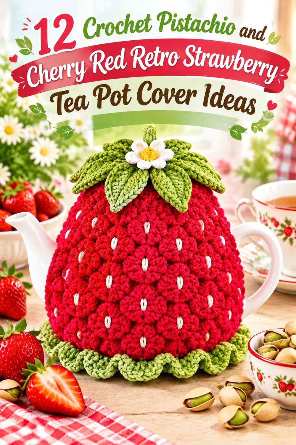

Pistachio and cherry red give a crochet strawberry tea pot cover an immediately recognizable retro direction. Cherry red can supply the ripe-berry color, while pistachio gives leaves, edging, stripes, or the main background a softer green counterpoint. The challenge is deciding which color should lead, because using both in equal amounts everywhere can make a small tea cosy look busier than intended.
These 12 ideas approach the same palette in different ways. Some make cherry red the dominant strawberry color, some reverse the balance with a pistachio body, and others use cream, blush, or brown sparingly to separate the two main shades. The linked tutorials provide useful crochet tea-cosy or strawberry-project construction references; the pistachio-and-cherry-red color plans below are independent palette adaptations.
Quick List
- How to Balance Pistachio and Cherry Red on a Strawberry Tea Pot Cover
How to Balance Pistachio and Cherry Red on a Strawberry Tea Pot Cover
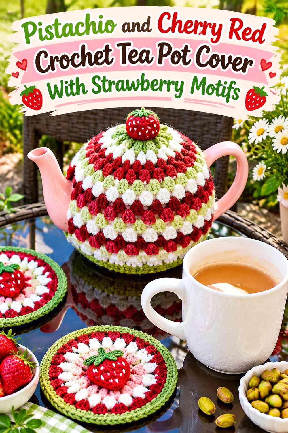
A tea pot cover has limited surface area, so pistachio and cherry red need clear jobs. For the most literal strawberry effect, let cherry red cover most of the body and reserve pistachio for the top, leaves, border, or openings. For a softer retro-kitchen look, reverse that hierarchy and place cherry red in repeated strawberries, stripes, or small surface details over a pistachio field.
Before committing, look at the colors from several feet away. If both shades have similar visual weight, small strawberry details may disappear into the background. Increasing the area of one color, rather than simply adding more colors, is often enough to make the design easier to read.
Conclusion
Pistachio and cherry red can produce very different strawberry tea pot covers depending on which shade receives the most space. A cherry-red body with pistachio at the lid gives the most literal fruit effect, while a pistachio body with repeated red berries creates a lighter retro-print look. Granny stripes, checks, panel divisions, and raised details move the combination toward graphic vintage styling.
Cream or ivory is useful when the main colors need more separation, blush can soften a garden-inspired version, and chocolate brown can add a darker frame. Keep those supporting colors limited so pistachio and cherry red remain the identity of the project. Use the linked creator tutorials for exact construction guidance, then plan the color placement around the shape and visible sections of your own teapot.
Frequently Asked Questions
Should pistachio or cherry red dominate a retro strawberry tea pot cover?
Choose according to the effect you want. Cherry red as the dominant shade makes the entire cover read more like a strawberry. Pistachio as the dominant shade gives you a calmer background for repeated cherry red strawberries, borders, or other accents. Avoid automatically giving both colors equal surface area; a clear hierarchy generally makes the small cover easier to read.
How can I make cherry red strawberries stand out on pistachio crochet?
Compare the two yarn colors before committing to many motifs. If their light-dark values are too similar, the strawberry outline may lose definition even though one yarn is red and the other green. A narrow cream or ivory separation can help, or you can choose a lighter pistachio or deeper cherry red while preserving the same palette idea.
Does a pistachio and cherry red crochet tea pot cover need cream?
No. A two-color version can be very effective when pistachio and cherry red already have enough contrast. Cream becomes useful when you want a visual pause between stripes, a light outline around small motifs, or a quieter trim. Keep it secondary if you want the red-and-green combination to remain dominant.
Where should cherry red go on a pistachio-led crochet tea pot cover?
Place cherry red where you want the eye to land first: strawberry motifs, a compact topper, selected stripes, raised details, or a controlled border. Avoid spreading tiny red accents uniformly over every surface unless you intentionally want an all-over print.
How can I keep pistachio and cherry red crochet from looking too busy?
Reduce the number of competing color changes before removing motifs. One shade can cover most of the body while the other repeats in fewer, larger accents. Leave some uninterrupted surface around the handle and spout, where the shape of the teapot already creates visual breaks.
Can I substitute different shades for pistachio and cherry red?
Yes. Preserve their roles rather than searching for exact shade names. For pistachio, choose a softened green that remains clearly different from the red. For cherry red, select a strong red that still provides enough contrast against the chosen green. Compare the yarns side by side, and check them from a distance before working large sections.