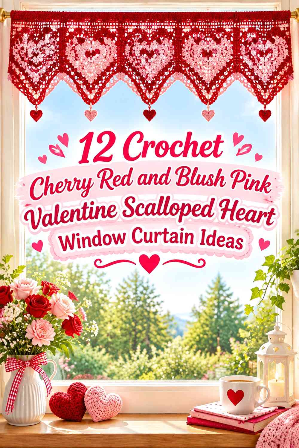
12 Crochet Cherry Red and Blush Pink Valentine Scalloped Heart Window Curtain Ideas

A Valentine crochet window curtain gives cherry red and blush pink enough surface area to do more than simply alternate colors. Cherry red can define heart motifs, lower borders, side edges, or a compact valance, while blush pink can soften the larger curtain field and leave the darker hearts easy to recognize against daylight.
Scalloped edging needs the same planning as the hearts. A cherry red scalloped hem can give a pale curtain a strong lower boundary, while blush pink scallops can soften a mostly red panel. Because a window places crochet against changing daylight, compare the two yarn colors both against a solid background and while held near the actual window. Two shades that look clearly different on a table may appear closer together when light passes through an open crochet fabric.
The tutorials supporting these ideas include complete crochet curtain constructions plus heart, heart-square, garland, and scalloped-edge tutorials that can supply individual design components. The cherry red and blush pink layouts below are independent adaptations rather than claims about the colors used by each creator.
Quick List
- Cherry Red Heart Crochet Window Curtain With Blush Pink Scalloped Hem
- Blush Pink Crochet Window Curtain With Cherry Red Heart Border
- Cherry Red Heart-Panel and Blush Pink Crochet Window Curtain
- Blush Pink Heart Crochet Window Valance With Cherry Red Scallops
- Cherry Red and Blush Pink Heart-Square Crochet Window Curtain
- Blush Pink Crochet Café Curtain With Cherry Red Heart Hem
- Cherry Red Border and Blush Pink Heart Crochet Window Curtain
- Blush Pink Scalloped Heart Crochet Window Curtain With Cherry Red Tie Details
- Blush Pink Crochet Window Curtain With Cherry Red Heart Garland Edge
- Cherry Red Top-Band Crochet Curtain With Blush Pink Hearts
- Cherry Red and Blush Pink Graduated Heart Crochet Window Curtain
- Cherry Red Crochet Window Curtain With Blush Pink Raised Hearts and Scallops
Use Cherry Red Where the Heart Shape Needs Strong Definition
Cherry red is the deeper visual anchor in this palette, so it can be especially useful for heart centers, motif outlines, lower borders, and other areas that need to remain recognizable against a lighter curtain field. On an openwork panel, a dark heart surrounded by blush pink usually creates more immediate separation than two colors distributed in equal narrow stripes.
That does not mean cherry red has to cover most of the curtain. A smaller amount placed consistently across repeating hearts can give the entire window treatment a clear Valentine direction while leaving the larger surface softer.
Let Blush Pink Keep Cherry Red Scallops and Hearts From Becoming Too Heavy
A full window panel in cherry red can create a much stronger block of color than the same shade used on small motifs. Blush pink gives you a way to create negative visual space between repeated red hearts and around a dark scalloped hem.
For a lighter result, make blush pink the dominant panel color and reserve cherry red for the lowest edge and motifs. If you prefer a richer curtain, reverse that balance but leave enough blush pink around heart shapes to keep them distinct.
Plan Cherry Red and Blush Pink Placement With the Curtain Hanging
A curtain is viewed vertically, so color areas that feel balanced on a table can look very different once suspended. The upper section may sit close to the rod and receive less attention, while scallops and hearts along the lower edge remain clearly visible.
Before repeating a large motif layout, hold a sample against the window. Check whether cherry red still separates from blush pink in daylight and whether the scalloped outline remains recognizable from normal viewing distance.
1. Cherry Red Heart Crochet Window Curtain With Blush Pink Scalloped Hem
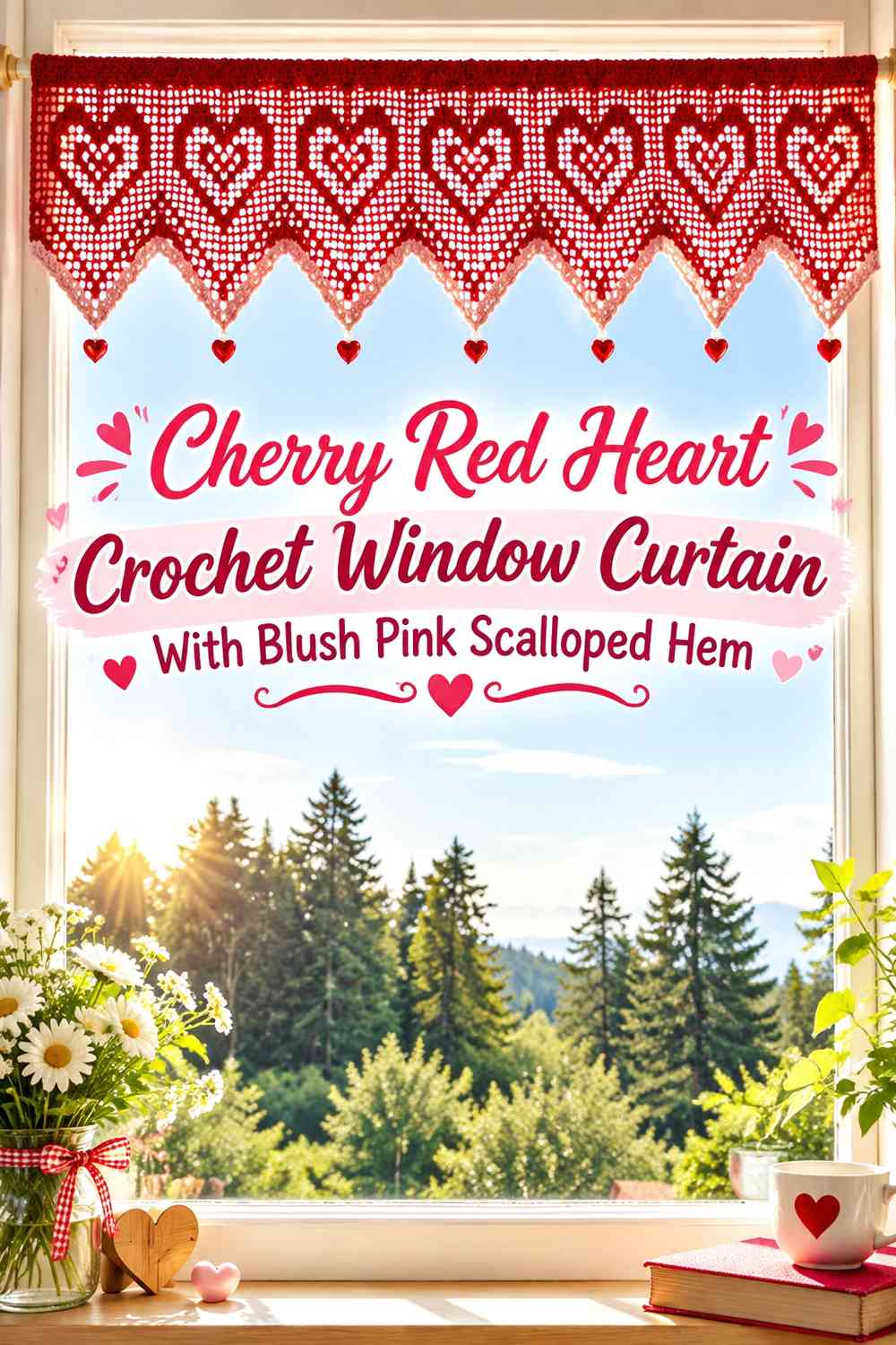
Let cherry red carry the repeating hearts while blush pink forms the surrounding openwork and the final scalloped edge. This keeps the Valentine motif strong without turning the whole curtain into a solid red field. The blush pink hem also gives the bottom of the curtain a softer transition than a second heavy red border.
Cherry Red Hearts Need Enough Blush Pink Space Between Repeats
Leave visible blush pink around each cherry red heart so adjacent motifs do not merge into a continuous dark band. This matters especially when several hearts repeat across the curtain width.
If the hearts begin to dominate the entire panel, reduce their visual frequency rather than making each motif smaller. A clearer heart separated by more blush pink usually reads better than many cramped motifs.
Blush Pink Scallops Can Soften the Cherry Red Heart Curtain Edge
Carry blush pink into the lowest scalloped section so the edge remains connected to the background rather than competing with the heart row above it.
When the window sill sits close to the curtain hem, make sure the blush pink scallops have enough contrast against the wall or trim behind them to remain visible.
Creator Credit: HandmadebyRaine — YouTube tutorial
2. Blush Pink Crochet Window Curtain With Cherry Red Heart Border
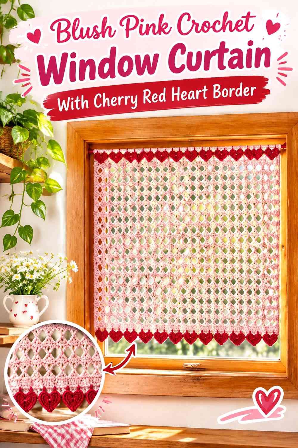
This version treats blush pink as the main curtain color and concentrates cherry red in a heart border near the bottom. The layout is useful when you want a Valentine curtain that still looks relatively light across most of the window.
Blush Pink Should Remain Continuous Above the Cherry Red Heart Border
Keep the upper blush pink area relatively uninterrupted so the eye reaches the heart border naturally. Several additional red stripes above the motifs can weaken the distinction between the plain curtain field and decorative lower section.
If the crochet fabric is very open, test the blush pink against daylight before assuming it will look as saturated as it does in the skein.
Cherry Red Hearts Can Anchor the Blush Pink Curtain Bottom
Place cherry red where the heart silhouettes will remain visible below the main blush pink panel. A darker motif row near the lower edge gives the curtain a clear endpoint without requiring a solid red hem.
If you add scallops beneath the hearts, consider returning to blush pink so the red motifs stay visually separate from the final edge.
Creator Credit: Gemma Crochet — YouTube tutorial
3. Cherry Red Heart-Panel and Blush Pink Crochet Window Curtain
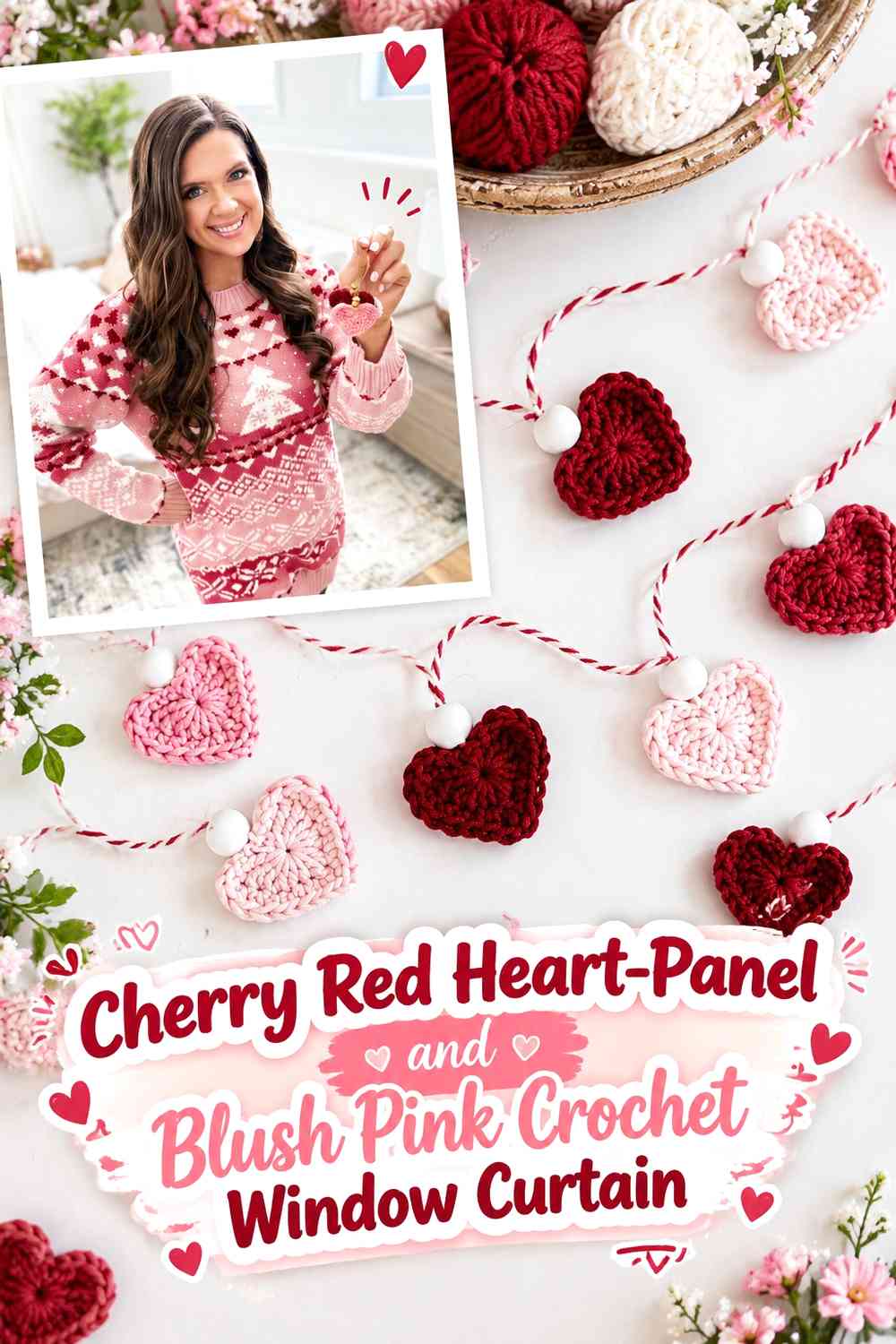
Instead of spreading hearts throughout the curtain, organize them into distinct cherry red focal areas against a blush pink foundation. A centered panel or spaced motif groups can give the hearts more emphasis while preserving a calm background.
Cherry Red Heart Panels Need Blush Pink Around Their Outer Edges
Give each cherry red motif group enough blush pink margin to define its shape. If a heart touches a dark side border, another heart, and the lower edging at once, the silhouette can become harder to identify.
Use the blush pink as genuine breathing room rather than only as a thin line between red elements.
Blush Pink Can Connect Separate Cherry Red Heart Sections
Continue the blush pink base consistently between the decorative areas. That repeated neutral-pink field helps multiple red hearts feel like one planned composition instead of isolated appliqués added afterward.
If you adapt separate heart pieces, check their placement on the hanging curtain before permanently attaching them so the visual spacing remains even vertically.
Creator Credit: MJ’s Off The Hook Designs — YouTube tutorial
4. Blush Pink Heart Crochet Window Valance With Cherry Red Scallops
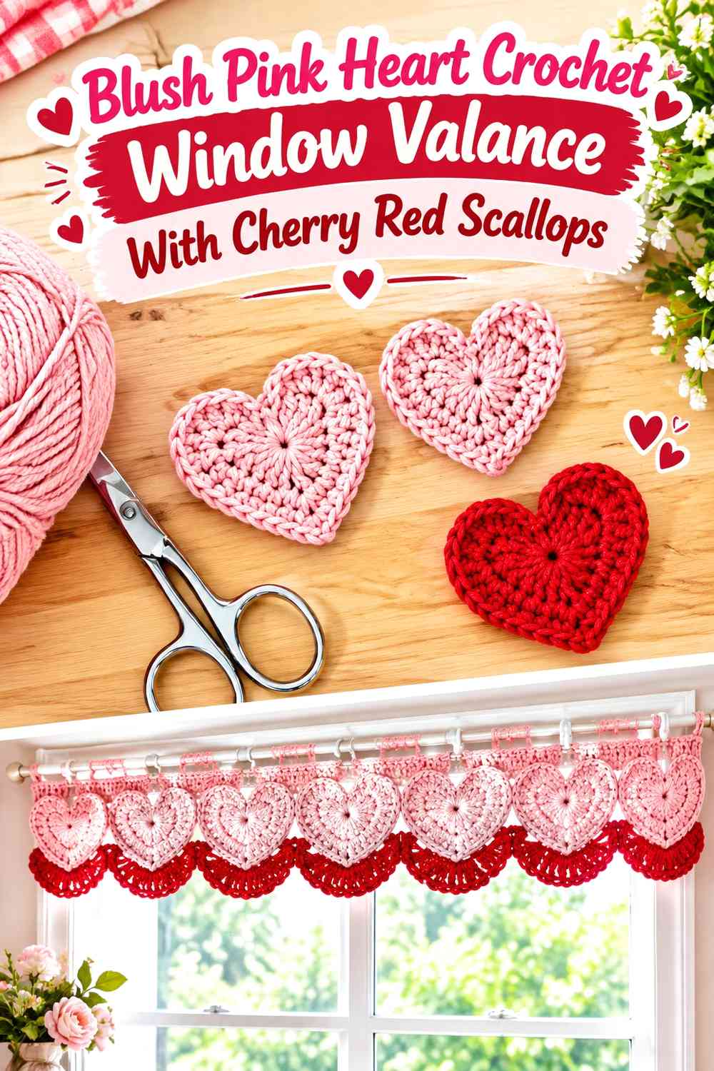
A shorter valance puts all of the color near the top of the window, so the border becomes especially important. Use blush pink for the heart-rich main section and cherry red for the scalloped lower edge. The darker hem gives the short curtain enough definition without requiring a deep red background.
Blush Pink Hearts Keep the Valentine Valance Visually Light
Use blush pink across most of the valance when you want the window to retain a softer appearance. Heart shapes can come from the motif structure itself rather than every heart needing a separate dark fill.
If a blush-on-blush heart becomes too subtle, introduce cherry red selectively inside a few motif centers instead of outlining every stitch.
Cherry Red Scallops Give the Blush Pink Valance a Strong Bottom Line
A cherry red scalloped edge creates a visible finish along the portion of the valance most likely to be seen against daylight.
Keep the scallops reasonably consistent across the width. Because the red is darker, uneven points or crowded curves may be more noticeable than they would be in blush pink.
Creator Credit: hibouchoucaillou — YouTube tutorial
5. Cherry Red and Blush Pink Heart-Square Crochet Window Curtain
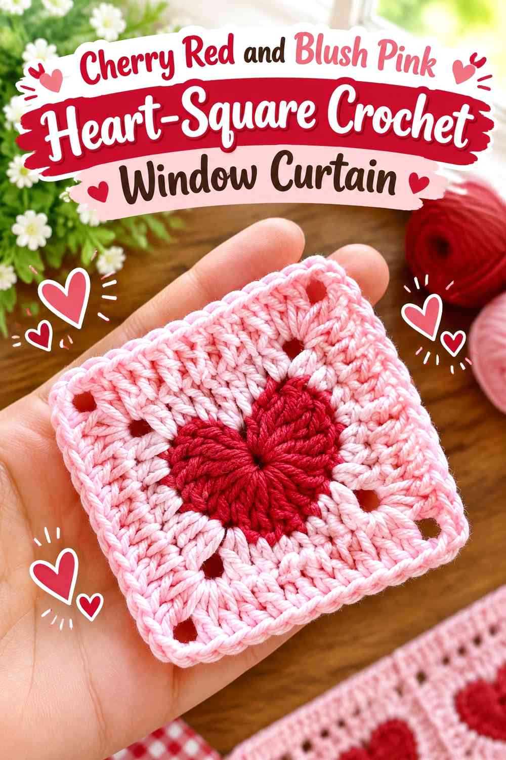
Heart granny squares create natural color blocks, making it possible to alternate cherry red hearts and blush pink backgrounds without introducing random stripes. The joining color becomes especially important because it determines whether the individual motifs read separately or as one larger curtain panel.
Cherry Red Hearts Need a Consistent Blush Pink Square Background
Use blush pink repeatedly around cherry red centers if you want the individual hearts to remain the main design feature. Switching the surrounding color on every square can make the grid compete with the hearts.
A repeated blush pink frame also creates a clearer transition when multiple squares are joined into vertical curtain rows.
Blush Pink Joins Can Keep Cherry Red Heart Squares Connected
If the squares already contain strong cherry red centers, blush pink is a useful candidate for the visible joining areas. It prevents dark grid lines from surrounding every heart.
For a more graphic curtain, reverse that decision and use cherry red at the joins, but check that the heart centers still remain visually separate from the grid.
Creator Credit: Crochê das Irmãs! — YouTube tutorial
6. Blush Pink Crochet Café Curtain With Cherry Red Heart Hem
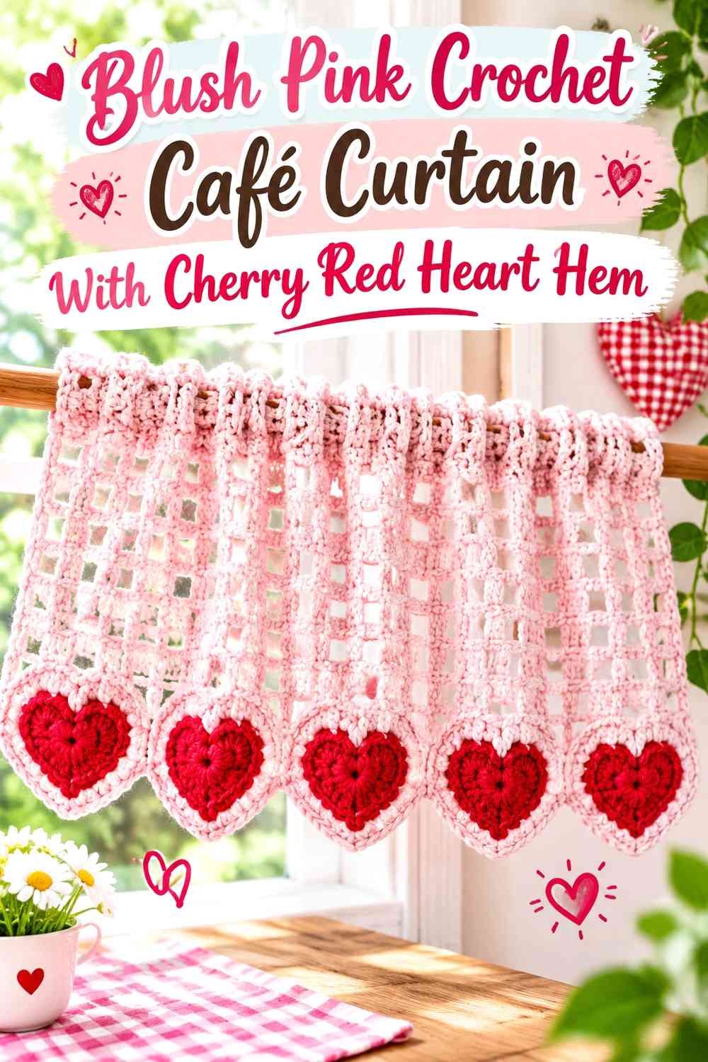
A café curtain covers the lower portion of a window, so its hem naturally becomes a focal point. Keep most of the panel blush pink and arrange cherry red hearts directly above or within the lower scalloped section.
Cherry Red Hearts Should Sit Where the Blush Pink Café Curtain Is Most Visible
Position the red motif row far enough from the window frame or sill that the hearts are not visually crowded by surrounding trim.
A café curtain is often viewed at fairly close range, so a smaller number of clearly defined cherry red hearts can be more effective than a dense motif repeat.
Blush Pink Scallops Can Separate Cherry Red Hearts From the Sill
Return to blush pink beneath the heart row to create a small visual buffer before the curtain ends. This prevents the red hearts and red edge from merging into one heavy lower band.
If the sill or wall is also pale pink-toned, a narrow cherry red finishing line can be added carefully while still leaving the scallops predominantly blush.
Creator Credit: Nukumori Crochet — YouTube tutorial
7. Cherry Red Border and Blush Pink Heart Crochet Window Curtain
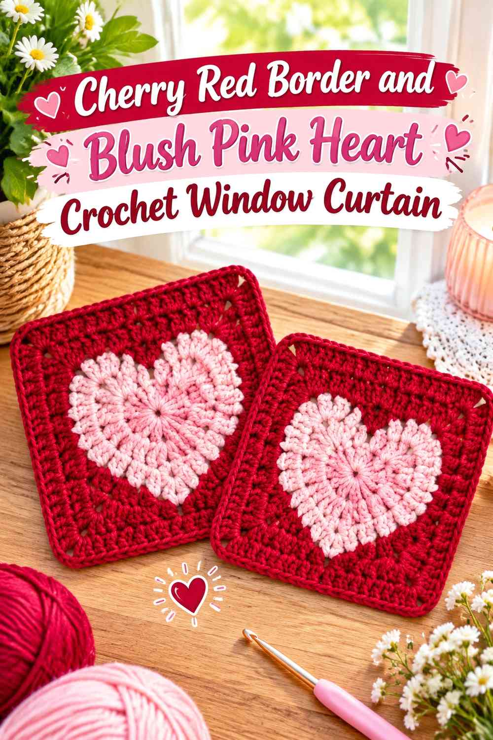
Here the darkest color frames the curtain rather than filling the hearts. Use blush pink heart motifs across the interior and cherry red down the sides and around the bottom. The result reverses the usual Valentine hierarchy and gives the overall curtain silhouette stronger definition.
Cherry Red Side Borders Can Frame Blush Pink Heart Motifs
Keep the red side edges consistent so they act as a true frame. If the width changes unpredictably, the border may compete with the heart layout instead of containing it.
Leave blush pink space between the hearts and side borders. This prevents the light motifs from looking squeezed between two dark vertical lines.
Blush Pink Hearts Need Enough Contrast Inside a Cherry Red Frame
A blush heart on an open or similarly light background can be subtle, so evaluate its value contrast before making an entire panel.
If the heart disappears, use a small cherry red outline or center detail rather than replacing the entire blush motif. That preserves the reversed color concept.
Creator Credit: Adore Crea Crochet — YouTube tutorial
8. Blush Pink Scalloped Heart Crochet Window Curtain With Cherry Red Tie Details
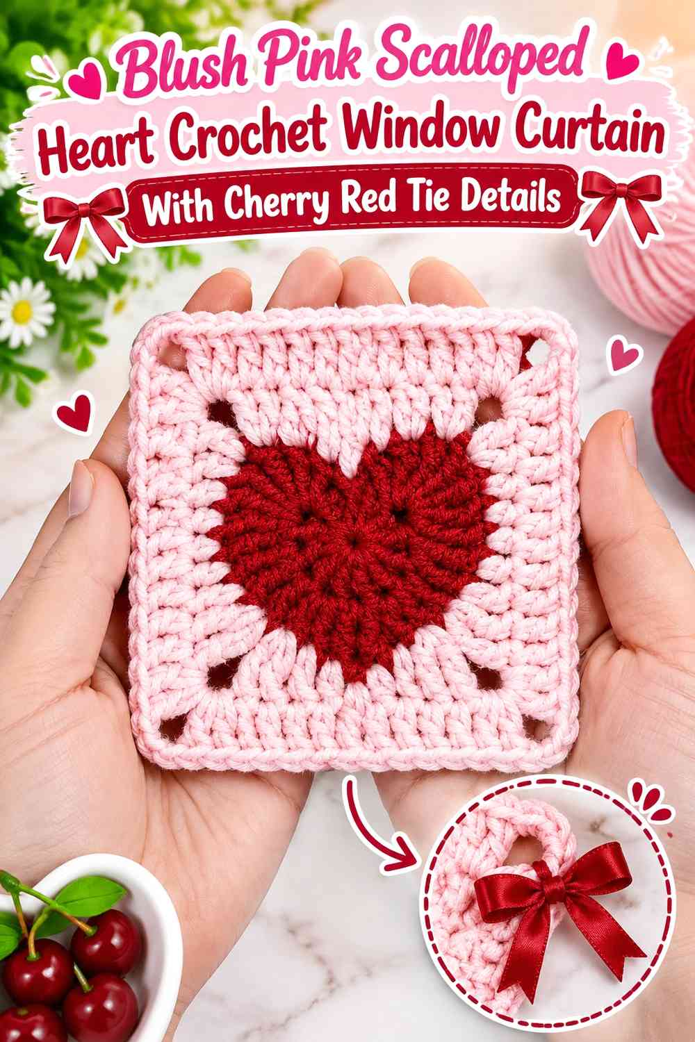
Let blush pink control the complete curtain panel, including heart motifs and scalloped lower sections, then reserve cherry red for small tie, loop, or side accents. This gives the Valentine colors a softer hierarchy than a heavily red motif curtain.
Blush Pink Can Carry Both Hearts and Scallops Without Looking Fragmented
When the same blush shade forms the body, hearts, and scallops, texture and openwork become more important than color changes. Use the heart placement to organize the panel rather than adding red to every motif.
This approach can work particularly well when the window already has dark trim or nearby red Valentine decorations.
Cherry Red Details Should Repeat on the Blush Pink Curtain
If cherry red appears in only one tiny spot, it may feel disconnected from the rest of the curtain. Repeat it in a controlled way at matching side details, small loops, or another deliberate accent point.
Do not let those accents spread into every scallop if the goal is to preserve a blush-dominant curtain.
Creator Credit: Creggy’s Crochet — YouTube tutorial
9. Blush Pink Crochet Window Curtain With Cherry Red Heart Garland Edge
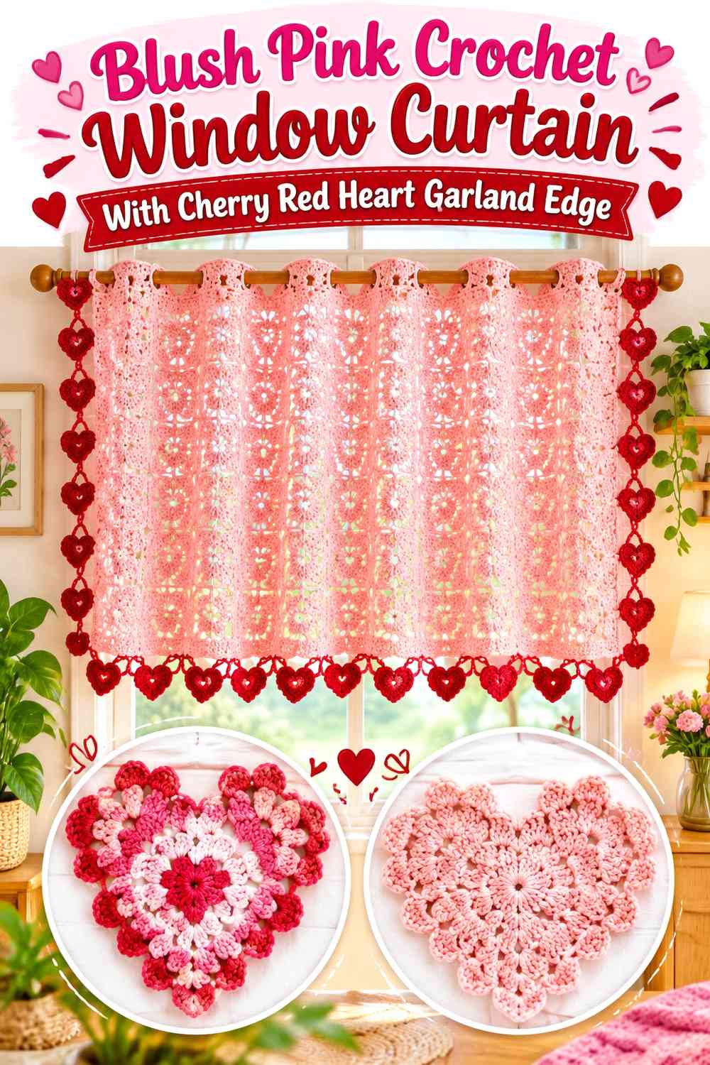
A heart garland can inspire a curtain edge where individual cherry red hearts appear to hang or repeat along the lower blush pink panel. This creates a more dimensional visual rhythm than hearts worked evenly throughout the entire curtain.
Cherry Red Garland Hearts Need Clear Gaps Against Blush Pink
Preserve visible space between each red heart so the lower edge reads as a sequence of motifs rather than a continuous red mass.
If the hearts hang below the main panel, check their final position relative to the sill, handles, or nearby furniture before deciding how low the motif edge should appear.
Blush Pink Should Keep the Cherry Red Garland Connected to the Curtain
Use blush pink in the connecting section above or between the hearts. This keeps the garland visually attached to the main curtain rather than looking like a separate decoration placed in front of it.
A blush scalloped transition can also work between the main panel and red hearts if the extra texture does not make the lower edge too crowded.
Creator Credit: Crochet with Tuula Maaria — YouTube tutorial
10. Cherry Red Top-Band Crochet Curtain With Blush Pink Hearts
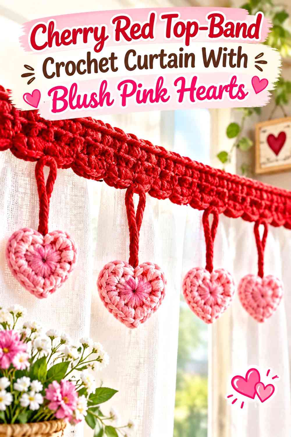
Most of the previous ideas concentrate cherry red near the bottom, but this version moves the dark color upward. A cherry red band near the curtain rod creates a strong top anchor, while blush pink carries the body and heart motifs below.
Cherry Red Can Define the Top of a Blush Pink Window Curtain
Use the red band as one continuous area rather than alternating colors repeatedly at the rod. A solid upper boundary gives the curtain a clear starting point and balances lighter motifs farther down.
Check how much of the top band is actually visible once the curtain is installed. Rods, folds, or hardware may conceal more of it than expected.
Blush Pink Hearts Should Have Space Below the Cherry Red Band
Do not place the first heart motif immediately against the dark upper area. A short blush pink transition gives the eye enough separation to distinguish the hearts from the top band.
That spacing also helps the curtain feel vertically balanced when additional heart motifs appear toward the center or hem.
Creator Credit: HappyBerry Crochet — YouTube tutorial
11. Cherry Red and Blush Pink Graduated Heart Crochet Window Curtain
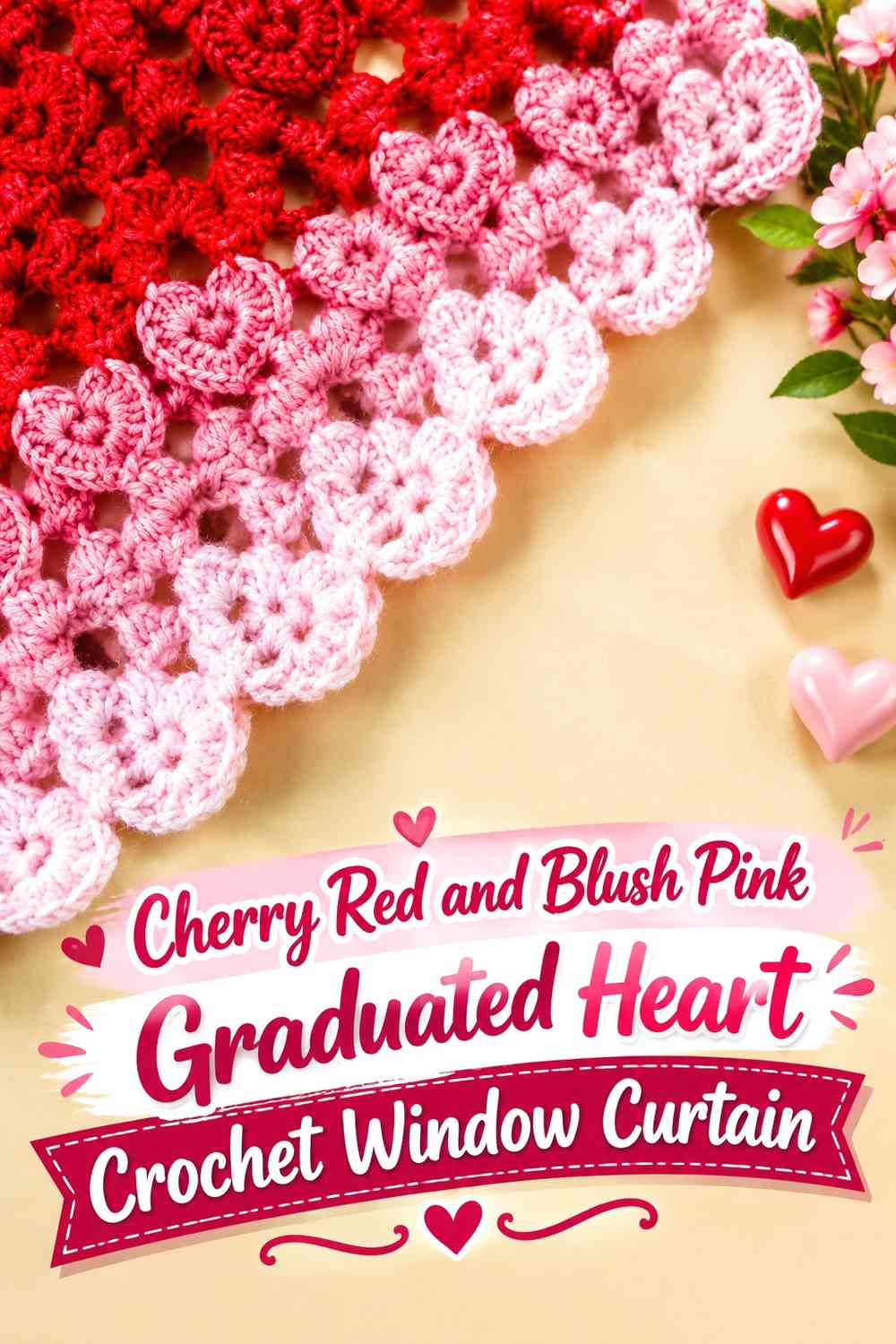
Use both colors across the heart motifs but change their visual weight from top to bottom. Blush pink can dominate higher on the curtain, with cherry red becoming more prominent toward the scalloped lower edge. This creates progression without relying on narrow stripes.
Blush Pink Hearts Can Keep the Upper Curtain Visually Open
Place lighter hearts or larger blush areas toward the top so the strongest color does not occupy the entire window height.
If daylight reduces the visibility of blush motifs, retain cherry red in small centers or outlines rather than increasing every motif to the same dark value.
Cherry Red Hearts Can Increase Toward the Blush Pink Scalloped Bottom
Allow cherry red to become more noticeable in the lower motif rows, where the curtain benefits from a stronger visual anchor.
Keep the final scallops blush pink if you want a soft ending after the darker heart section. Using cherry red for both the lower motifs and entire hem would create a much heavier base.
Creator Credit: Bella Coco — YouTube tutorial
12. Cherry Red Crochet Window Curtain With Blush Pink Raised Hearts and Scallops
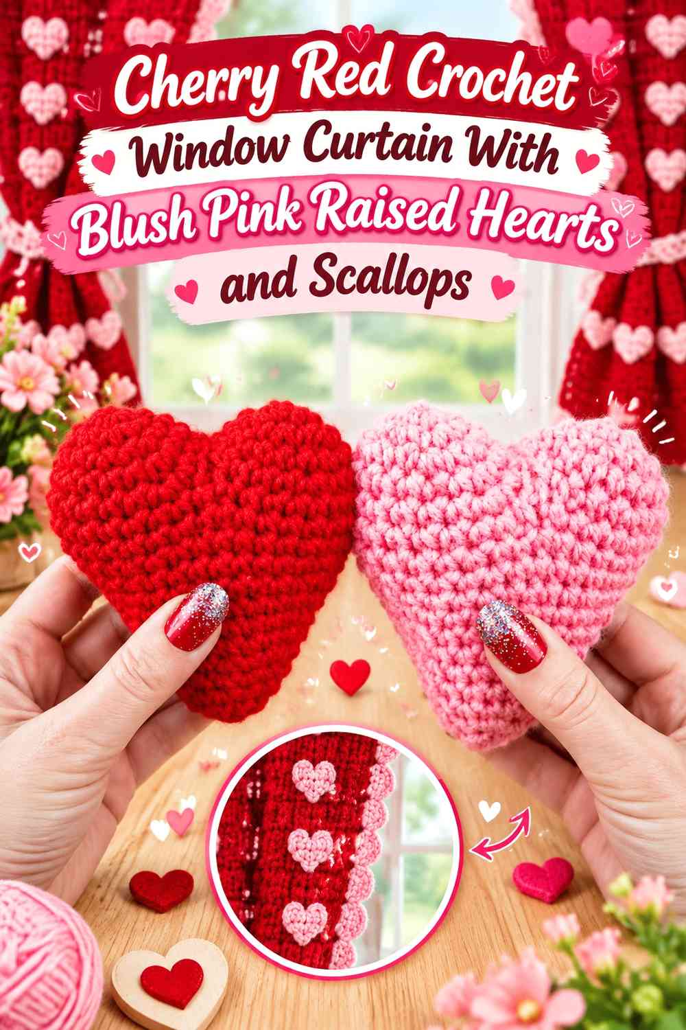
For the richest version, let cherry red control most of the curtain and use blush pink for dimensional heart accents and the scalloped finish. Because the red background already has strong visual weight, the lighter motifs should be placed selectively rather than covering every section.
Blush Pink Raised Hearts Need Clear Placement on Cherry Red
Use dimensional blush hearts where they can be appreciated without making the curtain unnecessarily crowded. A spaced row or a few repeated focal points is easier to read than raised embellishments covering the full panel.
Consider how any dimensional motif hangs when the curtain moves or folds. An accent that sits neatly on a flat sample may project differently once suspended.
Blush Pink Scallops Can Lighten a Cherry Red Curtain Hem
Finish with blush pink so the dark curtain does not end in another dense cherry red block. The light scallops create a visible change at the lowest edge and repeat the heart-accent color.
Keep both the raised hearts and scallops in the same blush family so the supporting shade looks intentional across the curtain.
Creator Credit: naztazia — YouTube tutorial
Comparing the Cherry Red and Blush Pink Valentine Curtain Layouts
For the strongest heart contrast, Ideas 1, 2, 3, 6, and 9 place cherry red motifs against substantial blush pink areas. These are useful when you want the hearts to be immediately recognizable rather than woven subtly into the background.
Ideas 4, 7, 8, and 10 shift attention toward the curtain structure itself. Cherry red may define scallops, side borders, a top band, or smaller accents while blush pink controls more of the panel.
Idea 5 works especially well when you want a modular heart-square appearance, while Idea 11 gives the two colors a gradual visual progression instead of assigning each shade to only one element.
Idea 12 is the darkest direction because cherry red occupies the main curtain field. Choose it when you want blush pink to function as a lighter embellishment rather than the background color.
Conclusion
Cherry red and blush pink produce the clearest Valentine window curtain when each shade has a defined role. For a lighter treatment, let blush pink cover the main curtain and reserve cherry red for heart rows, scalloped borders, or framing. For a stronger statement, use cherry red across larger areas and let blush pink separate motifs or soften the hem.
Also consider where the curtain will actually be viewed. Hearts need enough surrounding space to stay recognizable, scallops should remain visible against the wall or window below them, and color contrast should be checked with daylight passing through the crochet fabric.
The complete curtain tutorials and individual heart, square, garland, and edging tutorials above provide different construction references. Use their original instructions for those components, then plan your cherry red and blush pink distribution around your own window width, curtain length, motif arrangement, and desired Valentine emphasis.
Frequently Asked Questions
Should cherry red or blush pink dominate a Valentine crochet window curtain?
Use blush pink as the larger field when you want a lighter curtain with sharply defined cherry red hearts. Let cherry red dominate when you want a stronger Valentine color block and are comfortable using blush pink mainly for motifs, scallops, or borders.
Does cherry red work better than blush pink for crochet heart motifs?
Cherry red usually creates stronger light-dark separation when placed against a pale blush background, but the actual result depends on the yarns you choose and the light behind the window. Compare the colors together before making a full motif repeat.
Where should a blush pink scalloped edge go on a cherry red heart curtain?
A blush pink scalloped edge works particularly well below a darker cherry red heart section because it prevents the lower curtain from becoming one continuous dark band. It can also repeat blush pink used elsewhere in the panel.
How can I keep cherry red and blush pink hearts visible against daylight?
Hold a sample near the intended window during daylight and look at it from normal room distance. If the colors merge, increase their value difference or give each heart more surrounding background space. A grayscale photo can also help reveal whether the two shades are too similar in lightness.
Can heart granny squares be used for a cherry red and blush pink window curtain?
They can provide a modular curtain concept, but plan the joined dimensions around the window rather than assuming a particular number of squares will fit. Also consider how the joining color affects the hearts: blush pink produces a softer grid, while cherry red creates stronger divisions.
Should the cherry red scallops match the cherry red heart motifs?
They can, but they do not have to. Matching both elements creates a stronger red frame, while switching the scallops to blush pink separates the dark heart row from the curtain edge and produces a lighter finish.
How can I make a cherry red and blush pink Valentine curtain look less busy?
Choose one main color and give the second color one or two consistent jobs. For example, use blush pink for the full curtain field and cherry red only for hearts and a narrow border. Avoid alternating both colors in every motif, stripe, join, and scallop unless you deliberately want a highly patterned result.